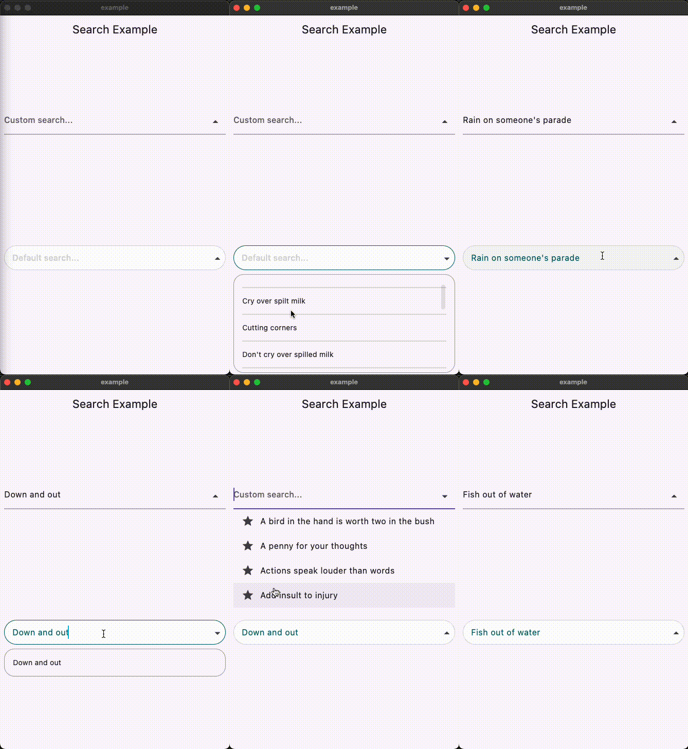
This Flutter package provides a SearchAutocomplete widget for implementing autocomplete functionality with a dropdown menu. The package offers extensive customization options for the search field, dropdown items, and includes hooks for search logic.
Installation
To use this package, add search_autocomplete as a dependency in your pubspec.yaml file:
dependencies:
  search_autocomplete: ^1.0.3
Features
Customizable search field
Customizable dropdown items
Hooks for search logic
Initial value support
Placeholder text support
Widget to display when the dropdown is empty
State Management Compatibility
Designed to work seamlessly with Cubit/Bloc and other orthodox state managers. Since the list updating logic resides higher up in the widget tree, it allows for a clean separation between UI and logic.
Usage
Here's a simple example demonstrating how to use the SearchAutocomplete widget:
Basic example:
SearchAutocomplete<String>(
  options: state.filteredItems, // Like: ['Apple', 'Banana', 'Orange'],
  initValue: state.currentItem, // Like: 'Apple',
  getString: (item) => item,
  onSearch: (query) {
    // Call your Bloc/Cubit/Provider method to filter options based on the query
    context.read<SearchCubit>().search(query);
  },
  onSelected: (item) {
    // Update your Bloc/Cubit/Provider state when an item is selected
    context.read<SearchCubit>().select(item);
  },
  hintText: 'Search fruits...',
)
Customization example:
You can customize both the search field and dropdown items appearance using provided builders: