パッケージ、リポジトリ、アプリカテゴリを検索

searchfield のカバー
パッケージ詳細v2.0.0

searchfield

Flutterアプリ用に高度にカスタマイズ可能で、シンプルかつ使いやすいAutoCompleteウィジェット

AndroidiOSWebmacOSWindowsLinux
30日間ダウンロード
2.1万
いいね数
393
Pub ポイント
150

パッケージをインストール

flutter pub add searchfield

パッケージ概要

公開情報に基づく選定ガイドです。参考としてご利用ください。

SearchField は、Flutter用に設計されたカスタマイズ可能で直感的なAutoCompleteウィジェットであり、アプリ内の検索機能を簡単に実装できるようにしています。ユーザーが入力する際に候補をフィルタリングして表示するためのクリーンで使いやすい統合ソリューションを提供します。Android、iOS、Web、macOS、Windows、Linuxなど、すべての主要プラットフォームに対応しており、どこでも一貫した動作を保証します。このパッケージは柔軟性を損なわず、シンプルさを重視し、開発者がUIや動作を自身のニーズに合わせて調整できるようになっています。

用途

  • リスト内のリアルタイム検索
  • 提案ドロップダウン付きのフォーム入力
  • データ集約型アプリにおけるユーザーエクスペリエンスの向上
  • 大規模なデータセットを動的にフィルタリングする
  • フォーム用のカスタマイズ可能な自動補完
  • クロスプラットフォーム検索コンポーネント

主な機能

  • 高度にカスタマイズ可能な外観
  • リアルタイムフィルタリング
  • 複数プラットフォームのサポート
  • 最小限のセットアップで簡単なAPI
  • カスタムロジックに拡張可能
  • 組み込みキーボードおよびフォーカス管理

適している対象

  • 検索中心のアプリを開発する開発者
  • クロスプラットフォームの整合性を重視するチーム
  • 軽量なオートコンプリートソリューションが必要なプロジェクト
  • 動的入力を備えたUI指向型アプリケーション
  • インタラクティブ検索による迅速なプロトタイピング

注意事項

  • 複雑なデザインには追加のスタイリングが必要になる場合があります
  • 非常に大きなデータセットを使用する場合、パフォーマンスは実装に依存します
  • 限定された組み込み検証機能
  • テキスト一致を超える高度なフィルタリングには適していない
  • カスタムレンダリングにはFlutterウィジェットの理解が必要です

元の README

関連するソースリポジトリの README 原文のスナップショットです。最新の内容はリポジトリをご覧ください。

searchfield: ^2.0.0

Flutter Platform Badge Pub Prerelease codecov Build MIT License Badge Sponsor @maheshj01

⭐️Show some ❤️ and star the repo.⭐

Frame 1 (1)

A highly customizable, simple and easy to use AutoComplete widget for your Flutter app. This widget allows you to

  • search 🔍 and select from a list of suggestions
  • validate the input with custom validation logic.
  • Dynamic height of each suggestion item.
  • show suggestions as a custom widget
  • Map a custom value to the suggestion list item.
  • lazy load the suggestions from Network with custom Loading widget
  • show dynamic suggestions above or below the input field
  • define max number of items visible in the viewport 📱
  • filter out the suggestions with a custom logic
  • visually customize the input and the suggestions
  • navigate through the suggestions using keyboard for Desktop 🖥 ️
  • Listen to scroll events of suggestions

Getting Started

Installation
  • Add the dependency
flutter pub add searchfield
  • Import the package
import 'package:searchfield/searchfield.dart';

Use the Widget in three steps

see complete code here

Step 1: Initialize your suggestions of any Type
  late List<SearchFieldListItem<City>> cities;
  SearchFieldListItem<City>? selectedValue;

  @override
  void initState() {
    cities = [
      City('New York', '10001'),
      City('Los Angeles', '90001'),
      ...
    ]
    super.initState();
  }
Step 2: Map the suggestions to SearchFieldListItem

see SearchFieldListItem to know more about the properties

 @override
  void initState() {
    cities = [
      City('New York', '10001'),
      City('Los Angeles', '90001'),
      ...
    ].map(
      (City ct) {
        return SearchFieldListItem<City>(
          // search will be performed on this value
          ct.name,
          // value to set in input on click, defaults to searchKey (optional)
          value: ct.zip.toString(),
          // custom object to pass in the suggestion list (optional)
          item: ct,
          // custom widget to show in the suggestion list (optional)
          child: searchChild(ct, isSelected: false),
        );
      },
    ).toList();
    super.initState();
  }
Step 3: Add SearchField to your widget tree
 SearchField(
    hint: 'Search for a city or zip code',
    maxSuggestionBoxHeight: 300,
    onSuggestionTap: (SearchFieldListItem<City> item) {
      setState(() {
        selectedValue = item;
      });
    },
    onSearchTextChanged: (searchText) {
      if (searchText.isEmpty) {
        return cities
      }
      // filter the list with your custom search logic
      final filter = List<SearchFieldListItem<City>>.from(cities)
          .where((city) {
        return city.item!.name
                .toLowerCase()
                .contains(searchText.toLowerCase()) ||
            city.item!.zip.toString().contains(searchText);
      }).toList();
      return filter;
    },
    selectedValue: selectedValue,
    suggestions: cities,
    suggestionState: Suggestion.expand,
  ),

Customizing the Search Input

 SearchField(
    hint: 'Search for a city or zip code',
    maxSuggestionBoxHeight: 300,
    onSuggestionTap: (SearchFieldListItem<City> item) {
      setState(() {
        selectedValue = item;
      });
    },
    selectedValue: selectedValue,
    ...
    /// customize the search input with wide range of properties
    /// through SearchInputDecoration
    searchInputDecoration: SearchInputDecoration(
      prefixIcon: Icon(Icons.search),
      suffix: Icon(Icons.expand_more),
      border: OutlineInputBorder(
        borderRadius: BorderRadius.all(Radius.circular(8)),
      ),
      ...
    ),
  ),

Customizing the Suggestions List

 SearchField(
    hint: 'Search for a city or zip code',
    maxSuggestionBoxHeight: 300,
    onSuggestionTap: (SearchFieldListItem<City> item) {
      setState(() {
        selectedValue = item;
      });
    },
    selectedValue: selectedValue,
    ...
    /// customize the decoration of the suggestions list
    suggestionsDecoration: SuggestionDecoration(
      border: Border.all(color: Colors.grey),
      hoverColor: Colors.grey.shade200,
      borderRadius: BorderRadius.all(Radius.circular(2)),
    ),
  ),

Customizing the Suggestions Item

 SearchField(
    hint: 'Search for a city or zip code',
    maxSuggestionBoxHeight: 300,
    onSuggestionTap: (SearchFieldListItem<City> item) {
      setState(() {
        selectedValue = item;
      });
    },
    selectedValue: selectedValue,
    ...
    /// customizes the decoration of each suggestion item
    suggestionItemDecoration: SuggestionDecoration(
      padding: EdgeInsets.all(8),
      borderRadius: BorderRadius.all(Radius.circular(2)),
      color: Colors.grey.shade200,
    ),
  ),
Example 2 (Network demo)

Ability to load suggestions from the network with a custom loading widget

SearchField(
    onSearchTextChanged: (query) {
    final filter = suggestions
        .where((element) =>
            element.toLowerCase().contains(query.toLowerCase()))
        .toList();
    return filter
        .map((e) =>
            SearchFieldListItem<String>(e, child: searchChild(e)))
        .toList();
    },
    onTap: () async {
    final result = await getSuggestions();
    setState(() {
        suggestions = result;
    });
    },
    /// widget to show when suggestions are empty
    emptyWidget: Container(
        decoration: suggestionDecoration,
        height: 200,
        child: const Center(
            child: CircularProgressIndicator(
        color: Colors.white,
        ))),
    hint: 'Load suggestions from network',
    itemHeight: 50,
    scrollbarDecoration: ScrollbarDecoration(),
    suggestionStyle: const TextStyle(fontSize: 24, color: Colors.white),
    searchInputDecoration: SearchInputDecoration(...),
    border: OutlineInputBorder(...)
    fillColor: Colors.white,
    filled: true,
    contentPadding: const EdgeInsets.symmetric(
        horizontal: 20,
    )),
    suggestionsDecoration: suggestionDecoration,
    suggestions: suggestions
        .map((e) => SearchFieldListItem<String>(e, child: searchChild(e)))
        .toList(),
    focusNode: focus,
    suggestionState: Suggestion.expand,
    onSuggestionTap: (SearchFieldListItem<String> x) {

    },
),
Example 3 Custom Widgets

complete code here

demo-ezgif com-video-to-gif-converter (1)

Example 4 Load suggestions from network with Pagination

Note that this also maintains the Scroll position when new items are added to list see: complete code here

output_video-ezgif com-video-to-gif-converter

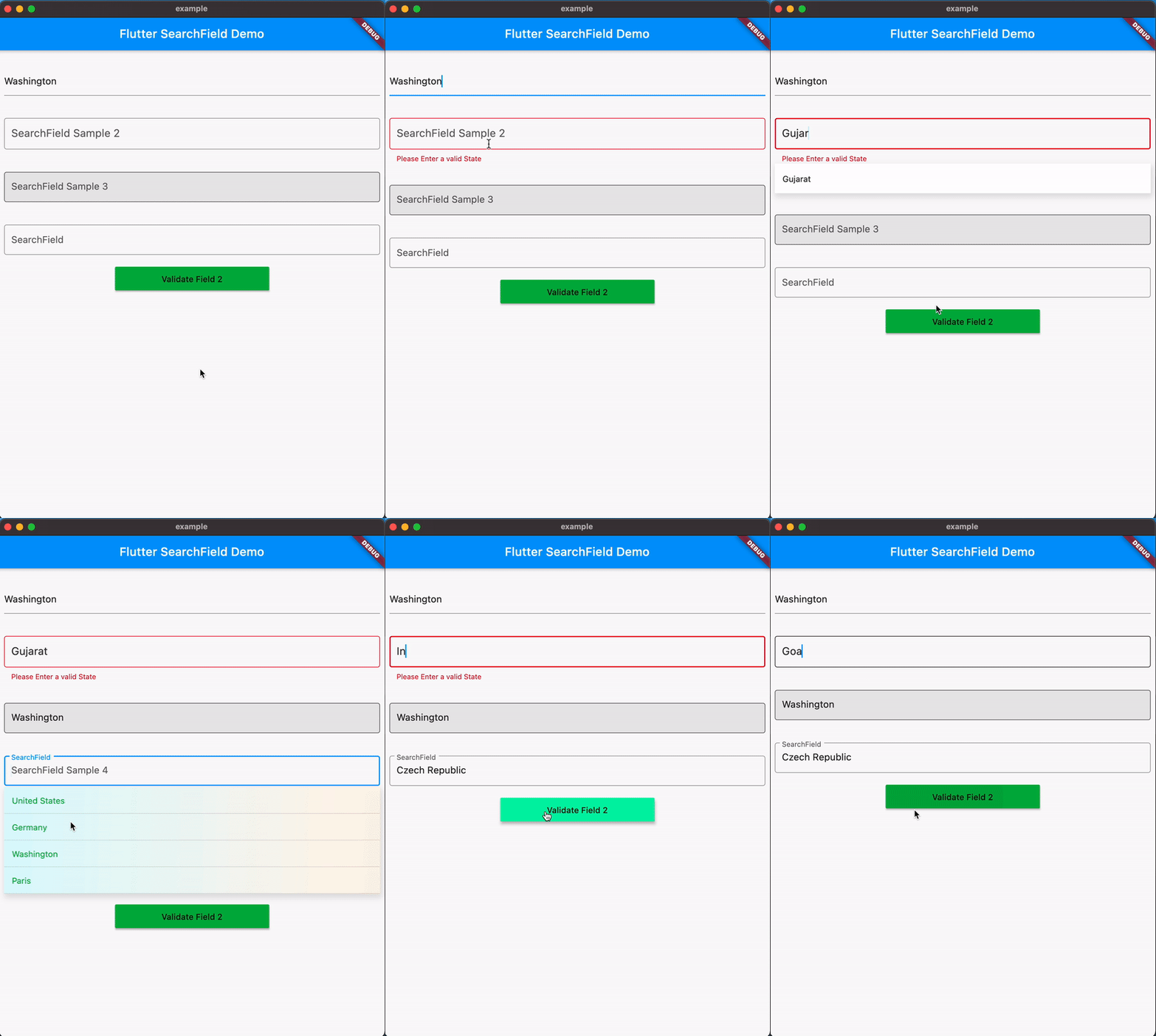
Example 5 (Validation)
Form(
  key: _formKey,
  child: SearchField(
    suggestions: _statesOfIndia
        .map((e) => SearchFieldListItem(e))
        .toList(),
    suggestionState: Suggestion.expand,
    textInputAction: TextInputAction.next,
    hint: 'SearchField Example 2',
    searchStyle: TextStyle(
      fontSize: 18,
      color: Colors.black.withValues(alpha: 0.8),
    ),
    validator: (x) {
      if (!_statesOfIndia.contains(x) || x!.isEmpty) {
        return 'Please Enter a valid State';
      }
      return null;
    },
    selectedValue: selectedValue,
      onSuggestionTap: (SearchFieldListItem<Country> x) {
        setState(() {
          selectedValue = x.item;
        });
      },
    searchInputDecoration: SearchInputDecoration(
      focusedBorder: OutlineInputBorder(
        borderSide: BorderSide(
          color: Colors.black.withValues(alpha: 0.8),
        ),
      ),
      border: OutlineInputBorder(
        borderSide: BorderSide(color: Colors.red),
      ),
    ),
    maxSuggestionsInViewPort: 6,
    itemHeight: 50,
    onTap: (x) {},
  ))
 SearchField(
    onSearchTextChanged: (query) {
      final filter = suggestions
          .where((element) =>
              element.toLowerCase().contains(query.toLowerCase()))
          .toList();
      return filter
          .map((e) => SearchFieldListItem<String>(e,
              child: Padding(
                padding: const EdgeInsets.symmetric(vertical: 4.0),
                child: Text(e,
                    style: TextStyle(fontSize: 24, color: Colors.red)),
              )))
          .toList();
    },
    selectedValue: selectedValue,
      onSuggestionTap: (SearchFieldListItem<Country> x) {
        setState(() {
          selectedValue = x.item;
        });
      },
    key: const Key('searchfield'),
    hint: 'Search by country name',
    itemHeight: 50,
    searchInputDecoration:
        SearchInputDecoration(hintStyle: TextStyle(color: Colors.red)),
    suggestionsDecoration: SuggestionDecoration(
        padding: const EdgeInsets.all(4),
        border: Border.all(color: Colors.red),
        borderRadius: BorderRadius.all(Radius.circular(10))),
    suggestions: suggestions
        .map((e) => SearchFieldListItem<String>(e,
            child: Padding(
              padding: const EdgeInsets.symmetric(vertical: 4.0),
              child: Text(e,
                  style: TextStyle(fontSize: 24, color: Colors.red)),
            )))
        .toList(),
    focusNode: focus,
    suggestionState: Suggestion.expand,
    selectedValue: selectedValue,
    onSuggestionTap: (SearchFieldListItem<String> x) {
      setState(() {
          selectedValue = x.item;
        });
    },
  ),

Customize the suggestions the way you want

Suggestions can be passed as a widget using the child property of SearchFieldListItem

SearchField(
  suggestions: _statesOfIndia
     .map((e) => SearchFieldListItem(e,
        child: Align(
          alignment: Alignment.centerRight,
          child: Padding(
             padding: const EdgeInsets.symmetric(horizontal:16.0),
               child: Text(e,
                 style: TextStyle(color: Colors.red),
               ),
             ),
          ))).toList(),
    ...
    ...
)
Support for Keyboard Navigation

With v0.9.5 Searchfield now adds support for Keyboard navigation, you can now navigate through the suggestions using the keyboard.

Shortcuts:

  • Up/Down Arrow keys are circular, i.e. if you reach the last item and press down, it will take you to the first item. Similarly, if you reach the first item and press up, it will take you to the last item.
  • ctr/option + down to scroll to last item in the list
  • ctr/option + up to scroll to first item in the list
Support for Dynamic positioning of suggestions

The position of suggestions is dynamic based on the space available for the suggestions to expand within the viewport.

SearchFieldListItem

SearchFieldListItem is a generic class that is used to create the suggestions list. It takes a searchKey and an optional value and item which can be used to pass a custom object to the suggestion list.

  • searchKey required: This value is used to search the list, and will be shown in the suggestions list and also shown in input field when a suggestion is selected.
  • value optional: The value to set in the input on suggestion click,if not specified searchKey will be used
  • item optional: The custom object to pass in the suggestion list, this can be used to show a value different from the searchKey in the suggestion list.
  • child optional: The custom widget to show in the suggestion list, this can be used to pass a custom widget to the suggestion list.

Properties

  • animationDuration: Duration for the animation of the suggestions list.
  • autoCorrect: Defines whether to enable autoCorrect defaults to true
  • autofocus: Defines whether to enable autofocus defaults to false
  • autoValidateMode: Used to enable/disable this form field auto validation and update its error text.defaults to AutoValidateMode.disabled
  • contextmenubuilder: Creates a [FormField] that contains a [TextField]. When a [controller] is specified, [initialValue] must be null (the default). If [controller] is null, then a [TextEditingController] will be constructed automatically and its text will be initialized to [initialValue] or the empty string. For documentation about the various parameters, see the [TextField] class and [TextField.new], the constructor.
  • controller: TextEditing Controller to interact with the searchfield.
  • comparator property to filter out the suggestions with a custom logic (Comparator is deprecated Use onSearchTextChanged instead).
  • dynamicHeight: Set to true to opt-in to dynamic height, defaults to false (itemHeight : 51)
  • emptyWidget: Custom Widget to show when search returns empty Results or when showEmpty is true. (defaults to SizedBox.shrink)
  • enabled: Defines whether to enable the searchfield defaults to true
  • focusNode : FocusNode to interact with the searchfield.
  • hint : hint for the search Input.
  • readOnly : Defines whether to enable the searchfield defaults to false
  • selectedValue : The initial value to be set in searchfield when its rendered, if not specified it will be empty.
  • inputType: Keyboard Type for SearchField
  • inputFormatters: Input Formatter for SearchField
  • itemHeight : height of each suggestion Item, (defaults to 51.0).
  • keepSearchOnSelection: Boolean to keep the search text in the searchfield when a suggestion is selected. Defaults to false.
  • marginColor : Color for the margin between the suggestions.
  • maxSuggestionBoxHeight: Specifies a maximum height for the suggestion box when dynamicHeight is set to true.
  • maxSuggestionsInViewPort : The max number of suggestions that can be shown in a viewport.
  • offset : suggestion List offset from the searchfield, The top left corner of the searchfield is the origin (0,0).
  • onOutSideTap : callback when the user taps outside the searchfield.
  • onSaved : An optional method to call with the final value when the form is saved via FormState.save.
  • onScroll : callback when the suggestion list is scrolled. It returns the current scroll position in pixels and the max scroll position.
  • onSearchTextChanged: callback when the searchfield text changes, it returns the current text in the searchfield.
  • onSuggestionTap : callback when a sugestion is tapped, it returns the tapped value which can be used to set the selectedValue.
  • onSubmit : callback when the searchfield is submitted, it returns the current text in the searchfield.
  • onTap: callback when the searchfield is tapped or brought into focus.
  • scrollbarDecoration: decoration for the scrollbar.
  • scrollController: ScrollController to interact with the suggestions list.
  • showEmpty: Boolean to show/hide the emptyWidget.
  • suggestions(required) : List of SearchFieldListItem to search from. each SearchFieldListItem in the list requires a unique searchKey, which is used to search the list and an optional Widget, Custom Object to display custom widget and to associate a object with the suggestion list.
  • suggestionState: enum to hide/show the suggestion on focusing the searchfield defaults to SuggestionState.expand.
  • searchStyle : textStyle for the search Input.
  • searchInputDecoration : decoration for the search Input (e.g to update HintStyle) similar to built in textfield widget.
  • suggestionsDecoration : decoration for suggestions List with ability to add box shadow background color and much more.
  • suggestionDirection : direction of the suggestions list, defaults to SuggestionDirection.down.
  • suggestionItemDecoration : decoration for suggestionItem with ability to add color and gradient in the background.
  • SuggestionAction : enum to control focus of the searchfield on suggestion tap.
  • suggestionStyle:Specifies TextStyle for suggestions when no child is provided.
  • textInputAction : An action the user has requested the text input control to perform throgh the submit button on keyboard.
  • textCapitalization : Configures how the platform keyboard will select an uppercase or lowercase keyboard on IOS and Android.
  • textAlign: specifies the alignment of the text in the searchfield. Defaults to TextAlign.start.
You can find all the code samples here
Contributing

You are welcome to contribute to this package, to contribute please read the contributing guidelines.

Contributors

Thanks to all the contributors who have helped in improving this package.

Support

If you like this package, consider supporting it by Sponsorship or Donation through github sponsors here

カテゴリー

ソースリポジトリ

このパッケージを使用しているプロジェクト