パッケージ、リポジトリ、アプリカテゴリを検索

simple_circular_progress_bar のカバー
パッケージ詳細v1.0.2

simple_circular_progress_bar

オープンソースのFlutterパッケージ、シンプルな円形プログレスインジケーター。

AndroidiOSWebmacOSWindowsLinux
30日間ダウンロード
7200
いいね数
194
Pub ポイント
160

パッケージをインストール

flutter pub add simple_circular_progress_bar

パッケージ概要

公開情報に基づく選定ガイドです。参考としてご利用ください。

シンプルな円形プログレスインジケーターを作成するための軽量でオープンソースのFlutterパッケージです。最小限のセットアップでロード状態や進捗をクリーンかつカスタマイズ可能な方法で表示できます。このパッケージはAndroid、iOS、Web、macOS、Windows、Linuxなどすべての主要プラットフォームをサポートしています。複雑なプログレスUIの代替として使いやすく設計されており、スムーズなアニメーションと簡単な設定オプションを提供します。フォーム、データ読み込み画面、または進行中のプロセスに対する視覚的なフィードバックが必要なあらゆるシナリオに最適です。

用途

  • 読み込み状態インジケーター
  • フォーム送信の進行状況
  • データ取得の可視化
  • ゲームまたはアプリのレベル進行状況
  • カスタマイズ可能な UI 要素

主な機能

  • シンプルな API
  • クロスプラットフォーム対応
  • スムーズなアニメーション
  • カスタマイズ可能な色とサイズ
  • 最小限の依存関係
  • 簡単な統合

適している対象

  • 初心者のFlutter開発者
  • シンプルなロードUI
  • パフォーマンスに敏感なアプリ
  • 迅速なプロトタイピング
  • 軽量なプログレスインジケーターを必要とするアプリ

注意事項

  • 高度なパッケージと比較してカスタマイズの選択肢が限られている
  • 組み込みのテキストラベルなし
  • 複雑な進行状況のトラッキングには適していません
  • 動的値の手動処理が必要です
  • 基本的な円形プログレスのニーズに最適

元の README

関連するソースリポジトリの README 原文のスナップショットです。最新の内容はリポジトリをご覧ください。

Simple circular progress bar

Open source Flutter package, simple circular progress bar.

Getting Started

Installing

Add in pubspec.yaml:

dependencies:
  flutter:
    sdk: flutter
  simple_circular_progress_bar: ^1.0.2

Now in your code, you can import:

import 'package:simple_circular_progress_bar/simple_circular_progress_bar.dart';

Basic examples

See the full example here. Most of the examples are in the rows_in_progress_bar_example folder.

Example numbers correspond to their numbers in the code. To quickly find examples in the repository, look in the code: 'EXAMPLE CODE'.

Colors

Example 01, 02, 03

Dart code
// Example 1
SimpleCircularProgressBar(
    progressColors: const [Colors.cyan],
)

// Example 2
SimpleCircularProgressBar(
    progressColors: const [Colors.cyan, Colors.purple],
),

// Example 3
SimpleCircularProgressBar(
    progressColors: const [
        Colors.cyan,
        Colors.green,
        Colors.amberAccent,
        Colors.redAccent,
        Colors.purpleAccent
    ],
    backColor: Colors.blueGrey,
),

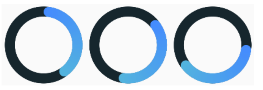
Start angle

Example 04, 05, 06

Dart code
// Example 4
SimpleCircularProgressBar(
    startAngle: 45,
),

// Example 5
SimpleCircularProgressBar(
    startAngle: 90,
),

// Example 6
SimpleCircularProgressBar(
    startAngle: -180,
),
 

Thickness of the lines

Example 07, 08, 09

Dart code
// Example 7
SimpleCircularProgressBar(
    size: 80,
    progressStrokeWidth: 25,
    backStrokeWidth: 25,
),

// Example 8
SimpleCircularProgressBar(
    progressStrokeWidth: 20,
    backStrokeWidth: 10,
),

// Example 9
SimpleCircularProgressBar(
    backStrokeWidth: 0,
),

Merge mode

Example 10, 11, 12

Dart code
// Example 10
SimpleCircularProgressBar(
    progressColors: const [Colors.cyan],
    mergeMode: true,
),

// Example 11
SimpleCircularProgressBar(
    progressColors: const [Colors.cyan],
    fullProgressColor: Colors.deepOrangeAccent,
    mergeMode: true,
),

// Example 12
SimpleCircularProgressBar(
    progressColors: const [Colors.cyan, Colors.purpleAccent],
    mergeMode: true,
),

Animation time

Example 13, 14, 15

If you don't need animation, set animationDuration = 0.

Dart code
// Example 13
SimpleCircularProgressBar(
    mergeMode: true,
    animationDuration: const Duration(milliseconds: 500),
),

// Example 14
SimpleCircularProgressBar(
    mergeMode: true,
    animationDuration: const Duration(seconds: 3),
),

// Example 15
SimpleCircularProgressBar(
    mergeMode: true,
    animationDuration: const Duration(minutes: 1),
),

Text

Example 16, 17, 18

Dart code
// Example 16
SimpleCircularProgressBar(
    mergeMode: true,
    onGetText: (double value) {
        return Text('${value.toInt()}%');
    },
),

// Example 17
SimpleCircularProgressBar(
    valueNotifier: valueNotifier,
    mergeMode: true,
    onGetText: (double value) {
        return Text(
            '${value.toInt()}',
            style: const TextStyle(
                fontSize: 30,
                fontWeight: FontWeight.bold,
                color: Colors.white,
            ),
        );
    },
),

// Example 18
SimpleCircularProgressBar(
    valueNotifier: valueNotifier,
    mergeMode: true,
    onGetText: (double value) {
        TextStyle centerTextStyle = TextStyle(
            fontSize: 30,
            fontWeight: FontWeight.bold,
            color: Colors.greenAccent.withOpacity(value * 0.01),
        );
        
        return Text(
            '${value.toInt()}',
            style: centerTextStyle,
        );
    },
),

Value Notifier Example

Example value notifier

You can read about how ValueNotifier works here.

The source code of the example can be found here.

Parameters description

Parameter Default Description
size
double
100 Widget size.
maxValue
double
100 The maximum value of the progress bar. The values will vary from 0 to [maxValue].
startAngle
double
0 The angle from which the countdown of progress begins.
progressStrokeWidth
double
15 Thickness of the progress line.
backStrokeWidth
double
15 Line thickness of the background circle. If you don't need a background circle, set this parameter to 0.
progressColors
List
Progress bar can be either with or without a gradient. For a gradient, specify more than one color in the [progressColors] field and if a gradient is not needed specify only one color.
fullProgressColor
Color
The color of the circle at 100% value. It only works when [mergeMode] equal to true.
backColor
Color
The color of the background circle.
animationDuration
int
Duration(seconds: 6) Animation duration. If you don't need animation, set this parameter to zero Duration.
mergeMode
bool
false When this mode is enabled the progress bar with a 100% value forms a full circle with [fullProgressColor]. If no [fullProgressColor] is specified, the last color from [progressColors] is taken.
valueNotifier
ValueNotifier
The object designed to update the value of the progress bar. By default, creates a ValueNotifier with the maximum value.
onGetText
Text Function(double)
Callback to generate a new Text widget located in the center of the progress bar. The callback input is the current value of the progress bar.

YouTube video

You can see how the application works from the example in this video.

カテゴリー

ソースリポジトリ

このパッケージを使用しているプロジェクト