パッケージ、リポジトリ、アプリカテゴリを検索

simple_progress_indicators のカバー
パッケージ詳細v0.2.0

simple_progress_indicators

固体色とグラデーションを備えたシンプルなプログレスインジケーターパッケージ。進捗の表示や簡単なアニメーションに使用できます。

AndroidiOSWebmacOSWindowsLinux
30日間ダウンロード
7010
いいね数
40
Pub ポイント
140

パッケージをインストール

flutter pub add simple_progress_indicators

パッケージ概要

公開情報に基づく選定ガイドです。参考としてご利用ください。

実装が軽量なFlutterパッケージで、単純なプログレスインジケータを、固体色とグラデーションのサポート付きで提供します。アプリでの読み込み状態の表示や、繊細なアニメーションの作成に最適です。このパッケージは簡単に統合でき、複数のプラットフォームでクリーンでカスタマイズ可能な視覚フィードバックを提供します。Android、iOS、Web、macOS、Windows、Linuxをサポートしており、クロスプラットフォーム開発に非常に便利です。複雑な設定なしに最小限ながら効果的なプログレス可視化を求める開発者向けに設計されています。

用途

  • 読み込み状態インジケーター
  • アニメーション付きプログレス表示
  • シンプルなUIフィードバック
  • クロスプラットフォームのプログレスバー
  • カスタマイズ可能な読み込みアニメーション
  • アプリのスプラッシュ画面

主な機能

  • 単色プログレスバー
  • グラデーションのサポート
  • 最小構成
  • クロスプラットフォーム互換性
  • 簡単な統合
  • 軽量サイズ

適している対象

  • 初心者のFlutter開発者
  • シンプルなアプリインターフェース
  • 読み込み時のユーザーエクスペリエンスの向上
  • 迅速なプロトタイピング
  • 軽量インジケータを必要とするアプリ
  • フォームまたはダウンロードにおける視覚フィードバック

注意事項

  • カスタマイズオプションが限定的
  • 高度なスタイリング機能なし
  • 複雑なアニメーションには適していません
  • 基本的な進行状況のニーズに最適
  • 組み込みの一時停止/再開コントロールなし
  • 外部の依存関係管理に依存しています

元の README

関連するソースリポジトリの README 原文のスナップショットです。最新の内容はリポジトリをご覧ください。

Simple progress indicators package with solid colors and gradients. Can be used to show progress or for simple progress bar animation.

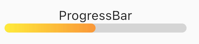
How it looks

Table of contents

Usage

Linear Progress indicator

ProgressBar

ProgressBar is a basic linear indicator widget. It's a Stateless Widget that produces basic horizontal rounded rectangle with optional background rounded rectangle underneath. Include it in your build method like:

  @override
  Widget build(BuildContext context) {
    return const MaterialApp(
      home: Scaffold(
        body: Center(
          child: ProgressBar(
            value: 0.5,
            //specify only one: color or gradient
            //color:Colors.red,
            gradient: LinearGradient(
              begin: Alignment.topLeft,
              end: Alignment.bottomRight,
              colors: [Colors.yellowAccent, Colors.deepOrange],
            ),
          ),
        ),
      ),
    );
  }

It has several configurable parameters:

  • value - current indicator value, where 0.0 is 0% progress, 1.0 is 100% progress
  • width - indicator width, defaults to 200.0
  • height - indicator height, defaults to 10.0
  • color - solid indicator fill color
  • gradient - gradient fill, accepts Gradient class
  • backgroundColor - solid indicator background color, defaults to transparent

Minimum working widget requires only a value and color OR gradient property. NOTE: Specifying both properties is not accepted.

ProgressBarAnimation

ProgressBarAnimation is a simple animating progress bar widget. It animates ProgressBar widget for a given duration. Animation starts at the time the widget is built.

It has several configurable parameters:

  • duration - 0% to 100% animation duration
  • width - indicator width, defaults to 200.0
  • height - indicator height, defaults to 10.0
  • color - solid indicator fill color
  • gradient - gradient fill, accepts Gradient class
  • backgroundColor - solid indicator background color, defaults to transparent
  • curve - animation curve, defaults to linear. For other curves check Curves
ProgressBarAnimation(  
  duration: const Duration(seconds: 2),  
  gradient: const LinearGradient(  
    colors: [  
      Colors.blue,  
      Colors.purple,  
    ],  
  ),  
  backgroundColor: Colors.grey.withOpacity(0.4),  
),
AnimatedProgressBar

AnimatedProgressBar is a ImplicitlyAnimatedWidget. It behaves like other flutter AnimatedFoo widgets. This animates value parameter changes for a given duration. Animation starts only when one (initial) value changes to other (final) value. See the example below.

It has several configurable parameters:

  • value - value widget animates to, need to be changed
  • duration - initial value to final value animation duration
  • width - indicator width, defaults to 200.0
  • height - indicator height, defaults to 10.0
  • color - solid indicator fill color
  • gradient - gradient fill, accepts Gradient class
  • backgroundColor - solid indicator background color, defaults to transparent
  • curve - animation curve, defaults to linear. For other curves check Curves
  • onEnd - callback to trigger additional actions (e.g. another animation) at the end of the current animation
AnimatedProgressBar(  
  value: full ? 1.0 : 0.0,  
  duration: const Duration(seconds: 3),  
  gradient: const LinearGradient(  
    colors: [  
      Colors.amber,  
      Colors.red,  
    ],  
  ),  
  backgroundColor: Colors.grey.withOpacity(0.4),  
),

For full demo check examples folder.

Animation demo

Additional information

For issues and animation ideas visit issues section on github homepage.

カテゴリー

ソースリポジトリ

このパッケージを使用しているプロジェクト