パッケージ、リポジトリ、アプリカテゴリを検索

slidable_bar のカバー
パッケージ詳細v1.1.1

slidable_bar

サイドバーを表示・非表示にし、クリック動作をカスタマイズできるFlutterパッケージ。

AndroidiOSWebmacOSWindowsLinux
30日間ダウンロード
61
いいね数
48
Pub ポイント
150

パッケージをインストール

flutter pub add slidable_bar

パッケージ概要

公開情報に基づく選定ガイドです。参考としてご利用ください。

SlidableBar は、複数のプラットフォームでカスタマイズ可能なスライド式サイドバーのナビゲーションコンポーネントを実装できるFlutterパッケージです。滑らかなアニメーションを使ってサイドバーを表示または非表示にすることができ、デザインとインタラクションに柔軟性を提供します。サイドバーの外観や挙動に関するさまざまなカスタマイズオプションをサポートしており、直感的なナビゲーションが必要なアプリに最適です。Flutterプロジェクトへの統合がスムーズで、Android、iOS、Web、macOS、Windows、Linuxで動作します。

用途

  • 折りたたみ可能なナビゲーションメニューの実装
  • モバイルおよびウェブ用のレスポンシブレイアウトを作成する
  • サイドバー制御のスワイプジェスチャーを追加
  • カスタムドロワーインターフェースの設計
  • ダッシュボードスタイルのアプリケーションの構築
  • アニメーション付きのトランジションでユーザー体験を向上させる

主な機能

  • スムーズなスライドアニメーション
  • カスタマイズ可能なサイドバーの外観
  • スワイプジェスチャーのサポート
  • クロスプラットフォーム互換性
  • 既存のFlutterアプリとの簡単な統合
  • カスタマイズ可能な開閉動作

適している対象

  • ナビゲーション中心のアプリを開発する開発者
  • インタラクティブなUIコンポーネントを探しているデザイナー
  • 複数のプラットフォームをターゲットにするプロジェクト
  • 軽量なナビゲーションソリューションを必要とするアプリ
  • Flutterをフルスタック開発に使用するチーム
  • 動的UIレイアウトのプロトタイピング

注意事項

  • 複雑なデザインには追加のスタイリングが必要になる場合があります
  • サイドバーに重いウィジェットが含まれる場合のパフォーマンスへの影響
  • 他のパッケージと比較して、組み込みテーマが限られている
  • ジェスチャーの衝突を慎重に処理する必要があります
  • 非常に大きなナビゲーション項目には最適化されていません
  • 中程度のナビゲーション構造に最適

元の README

関連するソースリポジトリの README 原文のスナップショットです。最新の内容はリポジトリをご覧ください。

slidable_bar

A Flutter side bar slider can be with any widget you want

review

Features

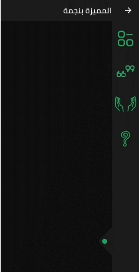
  • The SlidableBar can have four positions: top, bottom, right and left.
  • Customizable clicker, you can change the clicker widget with what you want.
  • Just like Flutter's Drawer, but with new way.

Things to note

  • The SlidableBar should have specific width and height, it works fine with scaffold's body.
  • The SlidableBar doesn't create it's own context, so it will appear under floating action button if you add one.

Usage

    final SlidableBarController controller = SlidableBarController(initialStatus: true);
    
    SlidableBar(
        size: 50, // this will be bar's height in case Side is bottom or top and width in case Side is left or right 
        children: <Widget>[], // here is the widgets inside the bar
        child: Container(), // here is your widget that will be under the bar 
        // optional
        frontColor: Colors.green, // the color of the cycle inside the default clicker
        slidableController: controller, // the contoller to change and listen to the bar status
        barRadius: const BorderRadius.circular(10.0), // the contoller to change and listen to the bar status
        side: Side.bottom, // Side.right is the default
        clickerPosition: 1.0, // the position of the clicker, 0.0 is the default
        clickerSize: 60, // the sizer of the default clicker, 55 is the default
        onChange: (int index){
            print(index); // this will print the index of the widget you clicked inside the bar
        },
        duration: Duration(milliseconds: 500), // the duration of the animation, (300 mil) is the default
        isOpenFirst: true, // the initial state of the bar, false is default
        backgroundColor: Colors.black, // primary color is default
        curve: Curves.ease, // the animation curve, linear is defualt
        clicker: Icon(Icons.arrow_forward_ios), // this will build instead of the default clicker
      )

Getting started

In the pubspec.yaml of your flutter project, add the following dependency:

dependencies:
  slidable_bar: "^1.1.0"

Then run $ flutter pub get. In your library, add the following import:

import 'package:slidable_bar/slidable_bar.dart';

Preview Images (The positions)

right left

top bottom

Custom Clicker

custom-clicker

Author

Mahmoud Haj Ali - GitHub

カテゴリー

ソースリポジトリ

このパッケージを使用しているプロジェクト

データはまだありません。