パッケージ、リポジトリ、アプリカテゴリを検索

slide_drawer のカバー
パッケージ詳細v1.0.3

slide_drawer

Flutterでクールなスライドアニメーション付きのドロワーを使用する簡単な方法。

30日間ダウンロード
30
いいね数
49
Pub ポイント
70

パッケージをインストール

flutter pub add slide_drawer

パッケージ概要

公開情報に基づく選定ガイドです。参考としてご利用ください。

slide_drawer は、滑らかなスライドアニメーションを備えたドロワーの実装を簡単にしてくれるFlutterパッケージです。サイドナビゲーションメニューをFlutterアプリに統合するための使いやすいAPIを提供し、スムーズな遷移によりユーザー体験を向上させます。軽量でカスタマイズ可能なドロワー解決策を探している開発者向けに設計されており、最小限の設定で左側および右側のドロワーをサポートしています。パフォーマンスと美しさに注力しており、直感的なナビゲーションが必要なアプリに最適です。洗練されたコードベースと継続的なメンテナンスにより、さまざまなプロジェクトでの信頼性が確保されています。

用途

  • サイドナビゲーションメニューの実装
  • アニメーション付きドロワー遷移の追加
  • 折りたたみパネルを使用したレスポンシブレイアウトの作成
  • モバイルアプリダッシュボードの構築
  • スライド効果によるUIインタラクティビティの向上

主な機能

  • スムーズなスライドアニメーション
  • 左側および右側の引き出しのサポート
  • 最小構成が必要
  • 軽量でパフォーマンスに優れる
  • カスタマイズ可能な外観と動作

適している対象

  • モバイルアプリ開発者
  • アニメーションの向上を求めるUI/UXデザイナー
  • シンプルなドロワーファンクションを必要とするプロジェクト
  • Flutterの初心者がナビゲーションパターンを探求しています
  • 動的なサイドバーコンテンツを持つアプリ

注意事項

  • 基本的なドロワー機能に限定
  • ネストされたドロワーの組み込みサポートなし
  • 複雑なレイアウトには追加のスタイル設定が必要になる場合があります
  • 大規模なナビゲーション構造に最適化されていません
  • 高度なカスタマイズには外部の依存関係に依存します

元の README

関連するソースリポジトリの README 原文のスナップショットです。最新の内容はリポジトリをご覧ください。

SlideDrawer

An easy way to use drawer in Flutter with cool sliding animation.

Getting Started

Add dependency in your flutter project.

$ flutter pub add slide_drawer

or

dependencies:
  slide_drawer: ^1.0.3

Then run flutter pub get.

Example

You can see the example folder to learn many different ways of using SlideDrawer in your app.

Usage

As usual, we need to import the package.

import 'package:slide_drawer/slide_drawer.dart';

Then wrap the app home page with SlideDrawer.

To use the basic SlideDrawer, you only need to define items (List of MenuItem) to generate menu in your drawer. The drawer will use your default theme color as drawer background, and theme brightness as drawer brightness.

class App extends StatelessWidget {
  @override
  Widget build(BuildContext context) {
    return MaterialApp(
      title: title,
      // SlideDrawer will use style from this theme
      theme: ThemeData(
        brightness: Brightness.dark,
        primarySwatch: Colors.blue,
        visualDensity: VisualDensity.adaptivePlatformDensity,
      ),
      // wrap your HomePage with SlideDrawer
      home: SlideDrawer(
        items: [
          MenuItem('Home', onTap: (){}),
          MenuItem('Project', onTap: (){}),
          MenuItem('Favourite', onTap: (){}),
          MenuItem('Profile', onTap: (){}),
          MenuItem('Setting', onTap: (){}),
        ],
        child: HomePage(),
      ),
    );
  }
}

Then set onPressed in your AppBar menu button to toggle SlideDrawer.

appBar: AppBar(
  title: Text(title),
  leading: IconButton(
    icon: Icon(Icons.menu),
    // call toggle from SlideDrawer to alternate between open and close
    // when pressed menu button
    onPressed: () => SlideDrawer.of(context).toggle(),
  ),
),
Icons

We can also use icon for menu items.

home: SlideDrawer(
  items: [
    MenuItem('Home', icon: Icons.home, onTap: (){}),
    MenuItem('Project', icon:Icons.rss_feed, onTap: (){}),
    MenuItem('Favourite', icon: Icons.favorite_border, onTap: (){}),
    MenuItem('Profile', icon: Icons.person_outline, onTap: (){}),
    MenuItem('Setting', icon: Icons.settings, onTap: (){}),
  ],
  child: HomePage(),
),
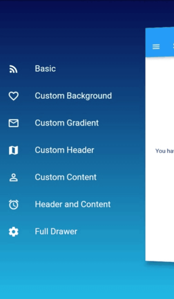
Custom Background

SlideDrawer also come with parameter backgroundColor and backgroundGradient.

If we specify backgroundGradient, the drawer will use it as background. If not, it will use backgroundColor. If we also not specify backgroundColor, it will use the default theme color as background.

It's good practice to specify brightness (dark or light) if we use backgroundGradient or backgroundColor. If we set dark color in your backgroundGradient or backgroundColor, use Brightness.dark. If we set light color, use Brightness.light.

// SlideDrawer with custom gradient as background.
home: SlideDrawer(
  items: [
    MenuItem('Home', icon: Icons.home, onTap: (){}),
    MenuItem('Project', icon:Icons.rss_feed, onTap: (){}),
    MenuItem('Favourite', icon: Icons.favorite_border, onTap: (){}),
    MenuItem('Profile', icon: Icons.person_outline, onTap: (){}),
    MenuItem('Setting', icon: Icons.settings, onTap: (){}),
  ],
  brightness: Brightness.dark,
  backgroundGradient: LinearGradient(
    begin: Alignment.topCenter,
    end: Alignment.bottomCenter,
    stops: [0.0, 1.0], 
    colors: [
      Color(0xFF000046),
      Color(0xFF1CB5E0),
    ],
  ),
  child: HomePage(),
),
// SlideDrawer with custom color as background.
home: SlideDrawer(
  items: [
    MenuItem('Home', icon: Icons.home, onTap: (){}),
    MenuItem('Project', icon:Icons.rss_feed, onTap: (){}),
    MenuItem('Favourite', icon: Icons.favorite_border, onTap: (){}),
    MenuItem('Profile', icon: Icons.person_outline, onTap: (){}),
    MenuItem('Setting', icon: Icons.settings, onTap: (){}),
  ],
  brightness: Brightness.dark,
  backgroundColor: Colors.blue[900],
  child: HomePage(),
),
Custom Head Drawer

It's advisable to set alignment to SlideDrawerAlignment.start when you use headDrawer.

home: SlideDrawer(
  alignment: SlideDrawerAlignment.start,
  headDrawer: Image.asset('boys.png'),
  items: [
    MenuItem('Home', icon: Icons.home, onTap: (){}),
    MenuItem('Project', icon:Icons.rss_feed, onTap: (){}),
    MenuItem('Favourite', icon: Icons.favorite_border, onTap: (){}),
    MenuItem('Profile', icon: Icons.person_outline, onTap: (){}),
    MenuItem('Setting', icon: Icons.settings, onTap: (){}),
  ],
  brightness: Brightness.dark,
  backgroundColor: Colors.blue[900],
  child: HomePage(),
),
Custom Content Drawer

In the previous example, we use items and let the SlideDrawer generate menu in the content drawer. But we can also set any custom widget as the content drawer.

home: SlideDrawer(
  brightness: Brightness.dark,
  contentDrawer: Container(
    padding: EdgeInsets.symmetric(horizontal: 5),
    child: Column(
      children: [
        ListTile(title: 'Home', icon: Icons.home, onTap: (){}),
        ListTile(title: 'Project', icon:Icons.rss_feed, onTap: (){}),
        ListTile(title: 'Favourite', icon: Icons.favorite_border, onTap: (){}),
        ListTile(title: 'Profile', icon: Icons.person_outline, onTap: (){}),
        ListTile(title: 'Setting', icon: Icons.settings, onTap: (){}),
      ],
    ),
  ),
  child: HomePage(),
),
Custom Full Drawer

If you have your own creative idea for the full widget inside the drawer, don't worry. We can use it in SlideDrawer by passing it to drawer. In this way, SlideDrawer will use style of custom drawer and ignore any value in backgroundColor, gradientColor, and brightness.

home: SlideDrawer(
  drawer: Container(
    color: Colors.teal,
    padding: EdgeInsets.symmetric(vertical: 36, horizontal: 15),
    child: Theme(
      data: ThemeData(brightness: Brightness.dark),
      child: Column(
        mainAxisAlignment: MainAxisAlignment.end,
        crossAxisAlignment: CrossAxisAlignment.stretch,
        children: [
          ListTile(title: 'Home', icon: Icons.home, onTap: (){}),
          ListTile(title: 'Project', icon:Icons.rss_feed, onTap: (){}),
          ListTile(title: 'Favourite', icon: Icons.favorite_border, onTap: (){}),
          ListTile(title: 'Profile', icon: Icons.person_outline, onTap: (){}),
          ListTile(title: 'Setting', icon: Icons.settings, onTap: (){}),
        ],
      ),
    ),
  ),
  child: HomePage(),
),
Others

The default SlideDrawer animate home page by move it to the right (offsetFromRight default to 60), scale it, and rotate it at y axis with some small angle (pi / 24 radian or 180 / 24 degree = 7.5 degree).

If don't want to rotate, we can disable the rotation by setting isRotate to false.

home: SlideDrawer(
  isRotate: false,
  items: [
    MenuItem('Home', icon: Icons.home, onTap: (){}),
    MenuItem('Project', icon:Icons.rss_feed, onTap: (){}),
    MenuItem('Favourite', icon: Icons.favorite_border, onTap: (){}),
    MenuItem('Profile', icon: Icons.person_outline, onTap: (){}),
    MenuItem('Setting', icon: Icons.settings, onTap: (){}),
  ],
  child: HomePage(),
),

Or use a custom rotateAngle if we want to rotate it at a spesific angle.

home: SlideDrawer(
  isRotate: true,
  rotateAngle: pi / 36,
  items: [
    MenuItem('Home', icon: Icons.home, onTap: (){}),
    MenuItem('Project', icon:Icons.rss_feed, onTap: (){}),
    MenuItem('Favourite', icon: Icons.favorite_border, onTap: (){}),
    MenuItem('Profile', icon: Icons.person_outline, onTap: (){}),
    MenuItem('Setting', icon: Icons.settings, onTap: (){}),
  ],
  child: HomePage(),
),

Or change offsetFromRight to make it move a little closer or farther.

home: SlideDrawer(
  offsetFromRight: 80.0,
  items: [
    MenuItem('Home', icon: Icons.home, onTap: (){}),
    MenuItem('Project', icon:Icons.rss_feed, onTap: (){}),
    MenuItem('Favourite', icon: Icons.favorite_border, onTap: (){}),
    MenuItem('Profile', icon: Icons.person_outline, onTap: (){}),
    MenuItem('Setting', icon: Icons.settings, onTap: (){}),
  ],
  child: HomePage(),
),

We can also use custom curve and duration. The default values are linear and 300ms. We can specify curveReverse and durationReverse to change curve and duration of animation in the reverse direction.

home: SlideDrawer(
  curve: Curves.easeInOut,
  duration: Duration(milliseconds: 200),
  items: [
    MenuItem('Home', icon: Icons.home, onTap: (){}),
    MenuItem('Project', icon:Icons.rss_feed, onTap: (){}),
    MenuItem('Favourite', icon: Icons.favorite_border, onTap: (){}),
    MenuItem('Profile', icon: Icons.person_outline, onTap: (){}),
    MenuItem('Setting', icon: Icons.settings, onTap: (){}),
  ],
  child: HomePage(),
),

There it is. Have fun!!!

カテゴリー

依存関係

依存関係一覧 1 件

  • curved_animation_controller^1.1.0+1

ソースリポジトリ

このパッケージを使用しているプロジェクト

データはまだありません。