パッケージ、リポジトリ、アプリカテゴリを検索

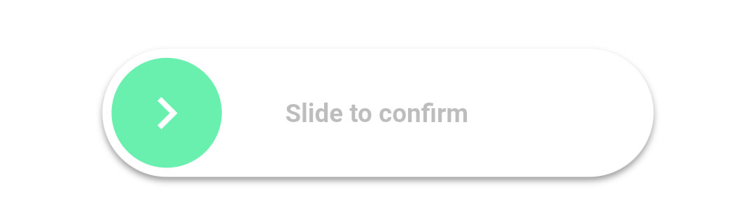
slide_to_confirm のカバー
パッケージ詳細v1.1.0

slide_to_confirm

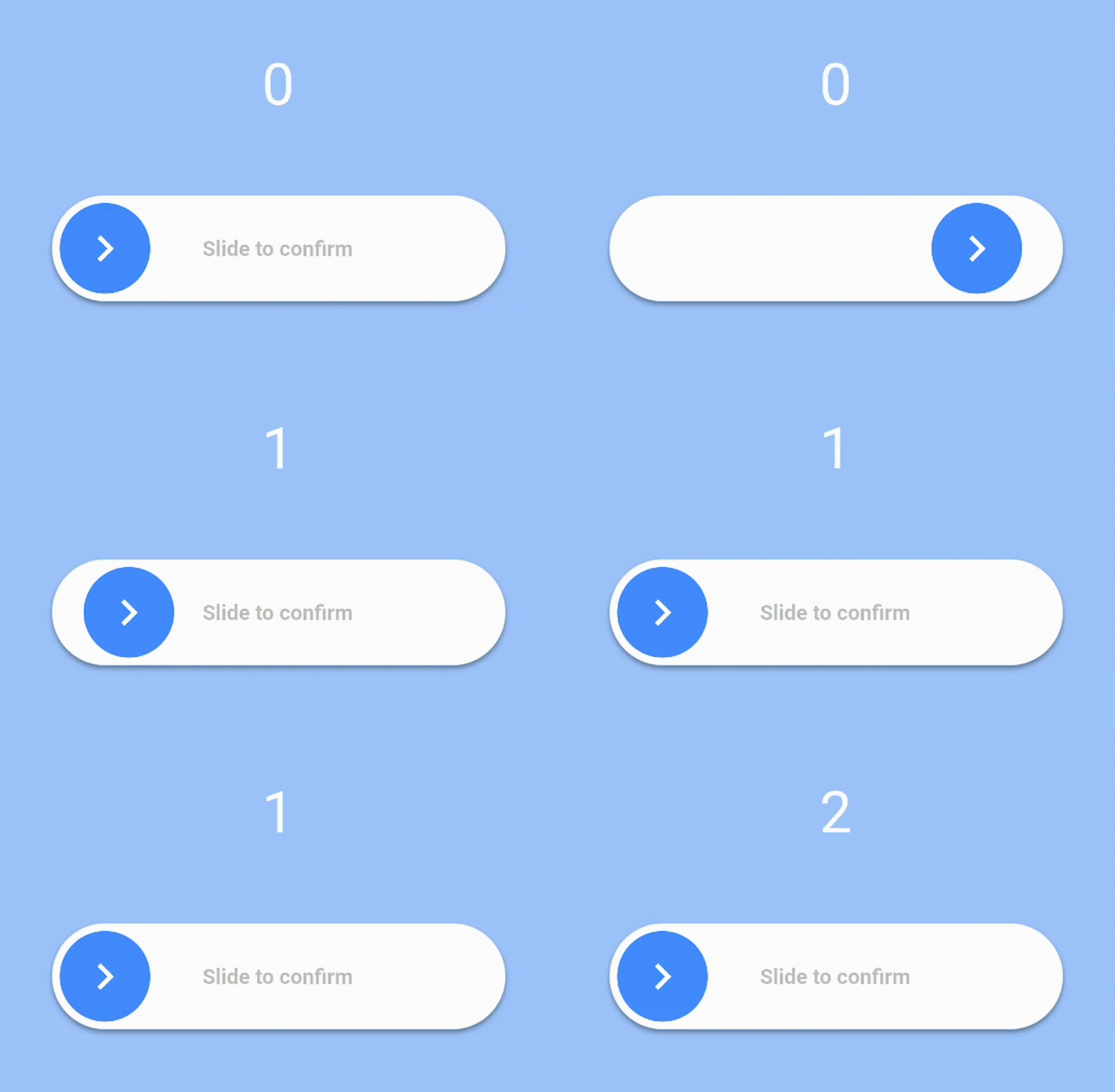
ユーザーがスライダーを100%までスライドするとコールバックが実行されるスライダーです。

AndroidiOSWebmacOSWindowsLinux
30日間ダウンロード
4600
いいね数
150
Pub ポイント
140

パッケージをインストール

flutter pub add slide_to_confirm

パッケージ概要

公開情報に基づく選定ガイドです。参考としてご利用ください。

ユーザーがスライダーを完全に100%までスライドしたときにコールバックをトリガーするように設計されたカスタマイズ可能なスライダーウィジェットを提供するFlutterパッケージです。削除やフォーム送信などのアクションの確認に一般的に使用される、意図的なジェスチャーを要求することで、ユーザーインタラクションを強化します。スムーズなアニメーションをサポートし、カスタムカラー、サイズ、ラベルでスタイル設定できます。Android、iOS、Web、macOS、Windows、Linuxなど、すべての主要プラットフォームで動作します。

用途

  • 破壊的行動の確認
  • 提出前のユーザー確認
  • フォームのインタラクションを強化する
  • 誤タップを防ぐ
  • インタラクティブなフィードバックの追加
  • カスタム確認ジェスチャー

主な機能

  • 完全な100%スライドアクティベーション
  • カスタマイズ可能な色とサイズ
  • 完了時のコールバック
  • スムーズなアニメーション
  • クロスプラットフォーム対応
  • カスタマイズ可能なラベルテキスト

適している対象

  • フォームの確認
  • 削除アクションのプロンプト
  • インタラクティブなUI要素
  • ユーザー参加機能
  • アクセシビリティを強化したコントロール
  • シンプルながら効果的なジェスチャー入力

注意事項

  • 完了するためにユーザーの注意が必要です
  • アクセシビリティの調整が必要になる場合があります
  • 単方向へのスライドに制限される
  • 高速入力には適していない
  • 視覚的なフィードバックは明確であるべきです
  • 複雑なレイアウトにおけるパフォーマンスへの影響

元の README

関連するソースリポジトリの README 原文のスナップショットです。最新の内容はリポジトリをご覧ください。

slide_to_confirm

A customizable slider that will activate a callback when the user slides it to 100%.

Installation

In the dependencies: section of your pubspec.yaml, add the following line:

slide_to_confirm: <latest_version>

Usage

import 'package:slide_to_confirm/slide_to_confirm.dart';

class MyWidget extends StatelessWidget {

    void confirmed(){
        print('Slider confirmed!');
    }

    Widget build(BuildContext context) {
        return ConfirmationSlider(
            onConfirmation: () => confirmed(),
        );
    }
}

Properties

  • height double: Height of the slider. Defaults to 70.
  • width double: Width of the slider. Defaults to 300.
  • backgroundColor Color: The color of the background of the slider. Defaults to Colors.white.
  • backgroundColorEnd Color: The color of the background of the slider when it has been slide to the end. By giving a value here, the background color will gradually change from backgroundColor to backgroundColorEnd when the user slides. Is not used by default.
  • foregroundColor Color: The color of the moving element of the slider. Defaults to Colors.blueAccent.
  • iconColor Color: The color of the icon on the moving element if icon is IconData. Defaults to Colors.white.
  • sliderButtonContent Widget or : The icon widget used on the moving element of the slider. Defaults to Icon(Icons.chevron_right).
  • shadow BoxShadow: The shadow below the slider. Defaults to BoxShadow(color: Colors.black38, offset: Offset(0, 2),blurRadius: 2,spreadRadius: 0,).
  • text String: The text showed below the foreground. Used to specify the functionality to the user. Defaults to "Slide to confirm".
  • textStyle TextStyle: The style of the text. Defaults to TextStyle(color: Colors.black26, fontWeight: FontWeight.bold,).
  • onConfirmation VoidCallback: The callback when slider is completed. This is the only required field.
  • onTapDown VoidCallback: The callback when slider is pressed.
  • onTapUp VoidCallback: The callback when slider is release.
  • foregroundShape BorderRadius: The shape of the foreground (the moving element of the slider). Defaults to a circular border radius.
  • backgroundShape BorderRadius: The shape of the background of the slider. Defaults to a circular border radius.
  • stickToEnd bool: Bool that indicates if stick or not the cursor at end of slide

Example

View the Flutter app in the example directory to see a working example of how to use and implement the slider.


Screenshots

Slider Gif

Slider Gif

Slider Gif

Slider Gif

Slider Gif

カテゴリー

ソースリポジトリ

このパッケージを使用しているプロジェクト

データはまだありません。