パッケージ、リポジトリ、アプリカテゴリを検索

slideable のカバー
パッケージ詳細v0.0.4

slideable

Flutterアプリ向けの柔軟でカスタマイズ可能なスライド可能なリストアイテム。複数のアクションボタンを追加し、アニメーションを制御し、開いているアイテムを簡単に自動的に閉じられます。

AndroidiOSWebmacOSWindowsLinux
30日間ダウンロード
320
いいね数
29
Pub ポイント
160

パッケージをインストール

flutter pub add slideable

パッケージ概要

公開情報に基づく選定ガイドです。参考としてご利用ください。

Slideable は、複数のアクションボタンを備えたスワイプ可能なリストアイテムを可能にする柔軟でカスタマイズ可能な Flutter パッケージです。開発者はカスタムアクションを定義でき、アニメーションの挙動を制御し、新しいアイテムがアクティブになると開いているアイテムを自動的に閉じることができます。削除、アーカイブ、編集などのコンテキストに応じた操作を持つインタラクティブなリストを作成するのに最適です。このパッケージは Android、iOS、Web、macOS、Windows、Linux などすべての主要プラットフォームをサポートしており、デバイス間で一貫した動作を保証します。

用途

  • インタラクティブなタスクリストアイテム
  • スワイプでメッセージを削除
  • カスタマイズ可能なアクションパネル
  • リスト項目の管理
  • コンテキストエディットインターフェース

主な機能

  • アイテムごとに複数のアクションボタン
  • カスタマイズ可能なアニメーション
  • 開いているアイテムの自動クローズ
  • クロスプラットフォーム対応
  • ListView との簡単な統合
  • 設定可能なスライドしきい値

適している対象

  • インタラクティブなリストを構築する開発者
  • スワイプジェスチャーを必要とするアプリ
  • UI重視のアプリケーション
  • 動的リストを備えたモバイルおよびウェブアプリ
  • 一貫したUXを重視するチーム

注意事項

  • 大規模なリストではパフォーマンスチューニングが必要になる場合があります
  • アニメーションのカスタマイズには注意が必要です
  • 基本的な使用法以外のドキュメントは限られている
  • 他のジェスチャー検出器との潜在的な競合
  • 非常に複雑なレイアウトには最適化されていない

元の README

関連するソースリポジトリの README 原文のスナップショットです。最新の内容はリポジトリをご覧ください。

Slideable

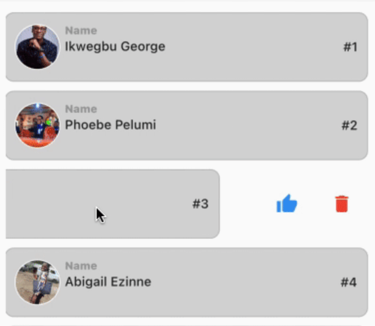
This is a flexible slideable implementation that will allow you to pass simple widgets(icons or anything at all) as action items, and also control various backgrounds for the action item, and closes an already slide item in your list.

This is a side project that I have reused severally on lots of my project and decided to turn it into a package for anyone that wants more flexibility than the usual flutter_slidable package.

Features

  • Control flexibility on the type of widget to use as your action item.

  • A predefined callback function that automatically closes an already slid item in your list.

  • Can contain a maximum of 6 action items.

  • You can control the animation curver and animation speed.

Getting started

In the pubspec.yaml of you flutter project, add the following dependency:

dependencies:
 slideable: <latest_version>

In your screen or page, add the below import, to expose the package:

import 'package:slideable/Slideable.dart';

Basic Usage

Slideable

ActionItems, controls the actions widget you would want to have in the display. This is a List<ActionItems>, where, each actionItem consists of the required icon widget, which can be any accepted Flutter Widget, a required onPress function, that executes what you want that ActionItem to do, a defaulted backgroundColor of transparent, which is totally flexible to change and a radius, just incase you want to add a tweak to your design to match the Slidable child's borderRadius.

 ActionItems(
    icon: const Icon(
       Icons.thumb_up,
       color: Colors.blue,
    ),
    onPress: () {},
    backgroudColor: Colors.transparent,
),

Slideable, requires the ActionItems item widget list and the child, which will be the initial point of contact in our case.

The other values includes the backgroundColor, which by default is set to transparent' but can be changed to suit your design. resetSlide, which is a boolean value used to notifiy the Slideable to close all the slid item, unless set to false by an external false. A duration, which is used to control the the slide time and the curve, which is used to control the speed or motion of the slide animation.

// This is used to monitor the item index in the list, and later used to closeup or leave open the slide.

int resetSlideIndex = 0;

Slideable(
 resetSlide: resetSlide,
 items: <ActionItems>[
    ActionItems(
      icon: const Icon(
         Icons.thumb_up,
         color: Colors.blue,
      ),
      onPress: () {},
      backgroudColor: Colors.transparent,
    ),
 ],
 child: Container(
   padding: const EdgeInsets.symmetric(
      horizontal: 10,
      vertical: 12,
   ),
   decoration: BoxDecoration(
      color: const Color.fromARGB(255, 214, 214, 214),
      border: Border.all(
         width: 1,
         color: const Color.fromARGB(124, 158, 158, 158),
      ),
      borderRadius: BorderRadius.circular(10),
      ),
   child: Row(
     crossAxisAlignment: CrossAxisAlignment.center,
     children: [
       Container(
         height: 50,
         width: 50,
         decoration: BoxDecoration(
            color: Colors.grey[350],
            shape: BoxShape.circle,
            border: Border.all(
               width: 1,
               color: Colors.white,
            ),
         ),
         child: ClipRRect(
            borderRadius: BorderRadius.circular(100),
            child: Image.network(         "https://images.pexels.com/photos/2379429/pexels-photo-2379429.jpeg?auto=compress&cs=tinysrgb&w=1600",
            fit: BoxFit.cover,
           ),
         ),
     ),
       const SizedBox( width: 5),
       Expanded(
          child: Column(
            crossAxisAlignment: CrossAxisAlignment.start,
            children: [
               const Text(
                  "Name",
                  style: TextStyle(
                    color: Colors.grey,
                    fontSize: 12,
                    fontWeight: 
                    FontWeight.w800,
                  ),
               ),
               const SizedBox(height: 2),
               const Text(
                  "George Ikwegbu",
                  style: const TextStyle(
                    fontWeight: FontWeight.w500,
                  ),
               ),
          ]
        ),
       ),
       Text(
         "#1",
         style: const TextStyle(
            fontWeight: FontWeight.w500,
         ),
       ),
     ],
    ),
   ),
  );

Example

import 'package:flutter/material.dart';
import 'package:slideable/Slideable.dart';

void main() => runApp(const MyApp());

class MyApp extends StatelessWidget {
  const MyApp({
    Key? key,
  }) : super(key: key);

  @override
  Widget build(BuildContext context) {
    return const MaterialApp(
      debugShowCheckedModeBanner: false,
      title: 'Slideable Widget',
      home: Home(),
    );
  }
}

class Home extends StatefulWidget {
  const Home({
    Key? key,
  }) : super(key: key);

  @override
  State<Home> createState() => _HomeState();
}

class _HomeState extends State<Home> {
  // This is used to monitor the item index in the list, and later used to closeup or leave open the slide.
  int resetSlideIndex = 0;

  @override
  Widget build(BuildContext context) {
    return Scaffold(
      appBar: AppBar(
        title: const Text("Class List"),
      ),
      body: ListView.separated(
        itemCount: _classList.length,
        padding: const EdgeInsets.symmetric(
          horizontal: 16,
          vertical: 20,
        ),
        itemBuilder: (context, index) {
          Map<String, dynamic> _student = _classList[index];
          return GestureDetector(
            onLongPressDown: (val) {
              // This allows you the time taken for a user to slide upon the widget in the list.
              // NB: Using the onTap or onHorizontalDragStart seemed to have caused a seizure in the widget, hence my resulting to onLongPressDown
              setState(() {
                // This updates the widget, and inturn rebuilds it, thereby notifying the Slidable widget to close an already slide item
                resetSlideIndex = index;
              });
            },
            child: _listItem(
              context: context,
              student: _student,
              index: index,
              resetSlide: index == resetSlideIndex ? false : true, 
              // Reverse engineering the notion, meaning the Slidable widget will close all slid item, except one with false, i.e the currently slide item
            ),
          );
        },
        separatorBuilder: (context, index) => const SizedBox(height: 10),
      ),
    );
  }

  Slideable _listItem({
    required BuildContext context,
    required Map<String, dynamic> student,
    required int index,
    required bool resetSlide,
  }) {
    return Slideable(
      resetSlide: resetSlide,
      items: <ActionItems>[
        ActionItems(
          icon: const Icon(
            Icons.thumb_up,
            color: Colors.blue,
          ),
          onPress: () => _likeUser(student["name"]),
          backgroudColor: Colors.transparent,
        ),
        ActionItems(
          icon: const Icon(
            Icons.delete,
            color: Colors.red,
          ),
          onPress: () => _deleteUser(student["name"]),
          backgroudColor: Colors.transparent,
        ),
      ],
      child: Container(
        padding: const EdgeInsets.symmetric(
          horizontal: 10,
          vertical: 12,
        ),
        decoration: BoxDecoration(
          color: const Color.fromARGB(255, 214, 214, 214),
          border: Border.all(
            width: 1,
            color: const Color.fromARGB(124, 158, 158, 158),
          ),
          borderRadius: BorderRadius.circular(10),
        ),
        child: Row(
          crossAxisAlignment: CrossAxisAlignment.center,
          children: [
            Container(
              height: 50,
              width: 50,
              decoration: BoxDecoration(
                color: Colors.grey[350],
                shape: BoxShape.circle,
                border: Border.all(
                  width: 1,
                  color: Colors.white,
                ),
              ),
              child: ClipRRect(
                borderRadius: BorderRadius.circular(100),
                child: Image.network(
                  student["img"],
                  fit: BoxFit.cover,
                ),
              ),
            ),
            const SizedBox(
              width: 5,
            ),
            Expanded(
              child: Column(
                crossAxisAlignment: CrossAxisAlignment.start,
                children: [
                  const Text(
                    "Name",
                    style: TextStyle(
                      color: Colors.grey,
                      fontSize: 12,
                      fontWeight: FontWeight.w800,
                    ),
                  ),
                  const SizedBox(height: 2),
                  Text(
                    student["name"],
                    style: const TextStyle(
                      fontWeight: FontWeight.w500,
                    ),
                  ),
                ],
              ),
            ),
            Text(
              "#${index + 1}",
              style: const TextStyle(
                fontWeight: FontWeight.w500,
              ),
            ),
          ],
        ),
      ),
    );
  }

  _deleteUser(user) {
    ScaffoldMessenger.of(context).showSnackBar(
      SnackBar(
        content: Text("$user, will be deleted."),
        backgroundColor: Colors.grey[450],
      ),
    );
  }

  _likeUser(user) {
    ScaffoldMessenger.of(context).showSnackBar(
      SnackBar(
        content: Text("You gave $user a thumbs up, pretty cool 🥰"),
        backgroundColor: Colors.grey[450],
      ),
    );
  }

  final List<Map<String, dynamic>> _classList = [
    {
      "name": "Ikwegbu George",
      "img":
          "https://images.pexels.com/photos/2379429/pexels-photo-2379429.jpeg?auto=compress&cs=tinysrgb&w=1600",
    },
    {
      "name": "Phoebe Pelumi",
      "img":
          "https://images.pexels.com/photos/3986672/pexels-photo-3986672.jpeg?auto=compress&cs=tinysrgb&w=1600&lazy=load",
    },
    {
      "name": "James Mike",
      "img":
          "https://images.pexels.com/photos/11828983/pexels-photo-11828983.jpeg?auto=compress&cs=tinysrgb&w=1600&lazy=load",
    },
    {
      "name": "Abigail Ezinne",
      "img":
          "https://images.pexels.com/photos/3030252/pexels-photo-3030252.jpeg?auto=compress&cs=tinysrgb&w=1600&lazy=load",
    },
    {
      "name": "Chioma Chinedu",
      "img":
          "https://images.pexels.com/photos/4491630/pexels-photo-4491630.jpeg?auto=compress&cs=tinysrgb&w=1600",
    },
  ];
}

Example

You can find the example code here

カテゴリー

ソースリポジトリ

このパッケージを使用しているプロジェクト

データはまだありません。