パッケージ、リポジトリ、アプリカテゴリを検索

パッケージ詳細v0.0.5

slider_controller

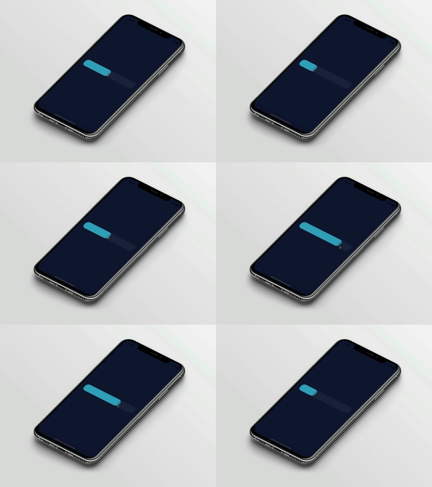
スライダーコントローラーとカスタムウィジェットを提供するパッケージです。このウィジェットは、スライダーウィジェットの簡単なカスタマイズに使用されます。

AndroidiOSWebmacOSWindowsLinux
30日間ダウンロード
36
いいね数
40
Pub ポイント
160

パッケージをインストール

flutter pub add slider_controller

パッケージ概要

公開情報に基づく選定ガイドです。参考としてご利用ください。

slider_controller パッケージは、Flutter アプリケーション向けにカスタマイズ可能なスライダーコントローラーとウィジェットを提供します。外観や挙動に対する強化された制御により、スライダーの作成と管理を簡素化します。開発者は、特定のデザイン要件に合わせてスライダーの見た目と機能を簡単に調整できます。このパッケージは、Android、iOS、Web、macOS、Windows、Linux といったすべての主要プラットフォームをサポートしており、デバイス間で一貫したパフォーマンスを確保します。直感的な API を備えており、既存プロジェクトへのスムーズな統合が可能です。

用途

  • カスタムスライダーのデザイン
  • インタラクティブなUI要素
  • 範囲選択付きのフォーム入力
  • クロスプラットフォームスライダーコンポーネント
  • 動的値の調整

主な機能

  • 簡単なカスタマイズ
  • クロスプラットフォーム対応
  • 組み込みコントローラー論理
  • レスポンシブデザインの統合
  • 拡張可能なウィジェット構造

適している対象

  • UI開発者
  • Flutter ビギナー
  • デザイン重視のアプリ
  • インタラクティブフォーム
  • マルチプラットフォームプロジェクト

注意事項

  • 基本的なFlutterの知識が必要です
  • スライダー固有の用途に限定
  • 複雑なレイアウトには追加のスタイリングが必要になる場合があります
  • 高度な機能には外部の依存関係に依存しています
  • スライダー以外のウィジェットには適していません

元の README

関連するソースリポジトリの README 原文のスナップショットです。最新の内容はリポジトリをご覧ください。

slider_controller

Flutter Website Dart Website MIT License

A package that gives us a slider controller a custom widget. This widget is used for easy customization for the slider widget.

Key Features

  • Ready to use custom slider widget.
  • Easy customization for the slider widget.

Preview

slider_controller

Basic Usage

Import it to your project file

import 'package:slider_controller/slider_controller.dart';

And add it in its most basic form like it:

SliderController(
  value: 50.0,
  onChanged: (value) {
    print('slider value : $value');
  },
);
Required parameters of SliderController

Parameter Description
double value Indicates the default slider thumb value between the 0.0 to 100.0
ValueChanged onChanged Called during a drag when the user is selecting a new value for the slider by dragging
Optional parameters of SliderController

Parameter Default Description
ValueChanged? onChangeEnd - Called when the user is done selecting a new value for the slider
ValueChanged? onChangeStart - Called when the user starts selecting a new value for the slider
double min 0.0 Indicates the Minimum value for the slider
double max 100.0 Indicates the Maximum value for the slider
SliderDecoration sliderDecoration -- Used to Decorate the Slider Widget
bool isDraggable true Used to Enable or Disable Drag Gesture of Slider
Optional parameters of SliderDecoration

Parameter Default Description
Color inactiveColor Colors.blueGrey Defines the background color of the inactive part of the slider
Color activeColor Colors.blue Defines the background color of the active part of the slider
Color thumbColor Colors.white Defines the thumb color of the slider
double borderRadius 20.0 Indicates the rounded border radius for the slider
double height 50.0 Indicates the height of the slider
bool isThumbVisible true Indicates that slider thumb is visible or not
double thumbHeight 25.0 Indicates the height of the slider thumb
double thumbWidth 5.0 Indicates the width of the slider thumb
Guideline for contributors

  • Contribution towards our repository is always welcome, we request contributors to create a pull request for development.
Guideline to report an issue/feature request

It would be great for us if the reporter can share the below things to understand the root cause of the issue.

  • Library version
  • Code snippet
  • Logs if applicable
  • Device specification like (Manufacturer, OS version, etc)
  • Screenshot/video with steps to reproduce the issue
  • Library used

LICENSE!

slider_controller is MIT-licensed.

Let us know!

We’d be really happy if you send us links to your projects where you use our component. Just send an email to sales@mindinventory.com And do let us know if you have any questions or suggestion regarding our work.

カテゴリー

ソースリポジトリ

このパッケージを使用しているプロジェクト

データはまだありません。