パッケージ、リポジトリ、アプリカテゴリを検索

sliding_clipped_nav_bar のカバー
パッケージ詳細v3.1.1

sliding_clipped_nav_bar

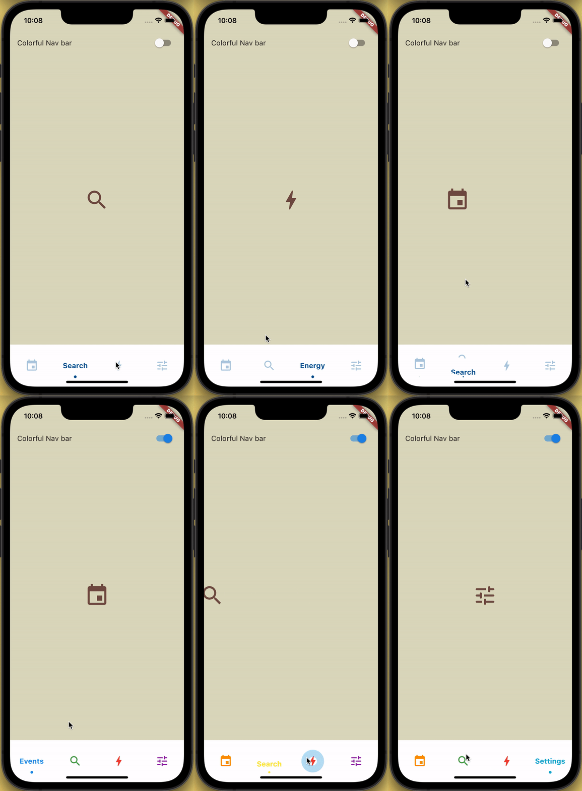
スライディングメニューのアイコンとクリッピング効果を備えたボトムナビゲーションバーで、タップ時にリーパル効果も発生します。

AndroidiOSWebmacOSWindowsLinux
30日間ダウンロード
233
いいね数
339
Pub ポイント
150

パッケージをインストール

flutter pub add sliding_clipped_nav_bar

パッケージ概要

公開情報に基づく選定ガイドです。参考としてご利用ください。

アイコンとラベルにスライドアニメーションを備えたカスタマイズ可能な下部ナビゲーションバーで、クリッピング効果とタップ時のリップルフィードバックにより強化されています。モダンでインタラクティブなUI向けに設計されており、Android、iOS、Web、macOS、Windows、Linuxなど複数のプラットフォームをサポートしています。滑らかなトランジションと視覚的な仕上げを提供し、ダイナミックなフィードバックを伴う直感的なナビゲーションが必要なアプリに最適です。pub.dev経由でFlutterプロジェクトにシームレスに統合できます。

用途

  • モバイルアプリのナビゲーション
  • Webアプリケーションインターフェース
  • クロスプラットフォームUIデザイン
  • インタラクティブな下部バー
  • モダンなアプリの美学

主な機能

  • スライドアイコンとテキストアニメーション
  • 視覚的奥行きのためのクリッピング効果
  • タップ時のリップル効果
  • クロスプラットフォーム互換性
  • カスタマイズ可能な外観
  • スムーズなトランジションアニメーション

適している対象

  • アニメーション付きのボトムナビを求めるFlutter開発者
  • デザイン重視のアプリケーション
  • 高いユーザーインタラクションを持つアプリ
  • 複数のプラットフォームをターゲットにする開発者
  • UI/UX向上プロジェクト

注意事項

  • 古いデバイスではパフォーマンスチューニングが必要になる場合があります
  • コア機能を超えるカスタマイズは限定的
  • 複雑なウィジェットにおける潜在的なレイアウトの衝突
  • 非常に大きなナビゲーションセットには最適化されていません
  • Flutter のレンダリングパイプラインに依存しています

元の README

関連するソースリポジトリの README 原文のスナップショットです。最新の内容はリポジトリをご覧ください。

Loading Animation Widget

YouTube Badge Twitter Badge Patreon Badge BMC Badge pub package WateryDesert


How to use?

Add sliding_clipped_nav_bar: to your pubspec.yaml dependencies then run flutter pub get

Add from git [Latest and experimental version]

 dependencies:
  sliding_clipped_nav_bar:
    git:
      url: https://github.com/watery-desert/sliding_clipped_nav_bar  

Add from pub [Stable]

 dependencies:
  sliding_clipped_nav_bar:

Then import the package to use

import 'package:sliding_clipped_nav_bar/sliding_clipped_nav_bar.dart';

Add SlidingClippedNavBar() to bottomNavigationBar property of Scaffold() and add PageView() to body with NeverScrollableScrollPhysics() don't try to upate the seleted index from onPageChanged or will see some weird behaviour. You can use Stack() or AnimatedSwitcher() for custom page transition animation.

API reference

barItems → List<BarItem>

  • List of bar items that shows horizontally, Minimum 2 and maximum 4 items.
    required

selectedIndex → int

  • Selected index of the bar items.
    required

iconSize → double

  • Size of all icons (inactive items), don't make it too big or will be clipped.
    optional [30]

fontSize → double

  • FontSize of the text.
    optional [16]

fontWeight → FontWeight

  • FontWeight of the text.
    optional [FontWeight.bold]

fontStyle → FontStyle

  • FontStyle of the text.
    optional [null]

activeColor → Color

  • Color of the selected item which indicate selected.
    required

inactiveColor → Color?

  • Inactive color of item, which actually color icons.
    nullable

onButtonPressed → OnButtonPressCallback

  • Callback when item is pressed.
    required

backgroundColor → Color

  • background color of the bar.
    optional [Colors.white]

Design Credit & screen recording

Toolbar icons animation by Cuberto

Do and don't
  • Don't make icon size too big.

    • FontAwesomeIcons: 24
    • MaterialIcons: 30
  • Using SlidingClippedNavBar() when you want global active and inactive color.

 return Scaffold(
     
      body: PageView(
      physics: NeverScrollableScrollPhysics(),       
      controller: controller,
...
      ),
      bottomNavigationBar: SlidingClippedNavBar(
        backgroundColor: Colors.white,
        onButtonPressed: (index) {
          setState(() {
            selectedIndex = index;
          });
          controller.animateToPage(selectedIndex,
              duration: const Duration(milliseconds: 400),
              curve: Curves.easeOutQuad);
        },
        iconSize: 30,
        activeColor: Color(0xFF01579B),
        selectedIndex: selectedIndex,
        barItems: [
          BarItem(
            icon: Icons.event,
            title: 'Events',
          ),
          BarItem(
            icon: Icons.search_rounded,
            title: 'Search',
          ),
           /// Add more BarItem if you want
        ],
      ),
    );
  • Using SlidingClippedNavBar.colorful() when you want to set individual item active & inactive color.
return Scaffold(
    
     body: PageView(
     physics: NeverScrollableScrollPhysics(),
     controller: controller,
...
     ),
     bottomNavigationBar: SlidingClippedNavBar.colorful(
       backgroundColor: Colors.white,
       onButtonPressed: (index) {
         setState(() {
           selectedIndex = index;
         });
         controller.animateToPage(selectedIndex,
             duration: const Duration(milliseconds: 400),
             curve: Curves.easeOutQuad);
       },
       iconSize: 30,
       selectedIndex: selectedIndex,
       barItems: [
         BarItem(
           icon: Icons.event,
           title: 'Events',
           activeColor: Colors.amber,
           inactiveColor: Colors.red,
         ),
         BarItem(
           icon: Icons.search_rounded,
           title: 'Search',
           activeColor: Colors.red,
           inactiveColor: Colors.green,
         ),
        /// Add more BarItem if you want

       ],
     ),
   );
FAQ
  • How do I change the height?

The height must be constant because the animation is in vertical direction. According to me 60 is perfect. But if you think needs to be reduced then please create an issue with a screenshot. I will see if I can do something.

  • How do I add drop shadow?

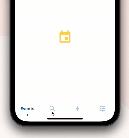
Wrap SlidingClippedNavBar with DecoratedBox or Container and pass BoxDecoration to decoration property. BoxDecoration takes list of boxShadow there you can pass your drop shadow.

DecoratedBox(
    decoration: BoxDecoration(
      boxShadow: [
        BoxShadow(
            color: Colors.black.withOpacity(0.2),
            offset: Offset(0, 4),
            blurRadius: 8.0)
      ],
    ),
    child: SlidingClippedNavBar()
)
  • How do I change the corner radius of the navigation bar?

Wrap SlidingClippedNavBar with ClipRRect and pass BorderRadius to borderRadius property.

  ClipRRect(
      borderRadius: const BorderRadius.vertical(
        top: Radius.circular(16),
      ),
      child: SlidingClippedNavBar(
    )                

All flutter packages

➜ Sliding Clipped Nav Bar
● Water Drop Nav Bar
● Swipeable Tile
● Loading Animation Widget


カテゴリー

ソースリポジトリ

このパッケージを使用しているプロジェクト

データはまだありません。