パッケージ、リポジトリ、アプリカテゴリを検索

sliding_switch のカバー
パッケージ詳細v1.1.0

sliding_switch

スライディングスイッチ - 単純なスイッチウィジェットです。希望の幅、色、テキストなどを完全にカスタマイズできます。選択状態も維持します。

AndroidiOSWebmacOSWindowsLinux
30日間ダウンロード
731
いいね数
33
Pub ポイント
130

パッケージをインストール

flutter pub add sliding_switch

パッケージ概要

公開情報に基づく選定ガイドです。参考としてご利用ください。

SlidingSwitch は、Flutter用のカスタマイズ可能なスイッチウィジェットで、ユーザーがスライド操作で2つの状態を切り替えることを可能にします。幅、色、テキストラベル、アニメーションの完全なカスタマイズをサポートしています。再構築時に選択状態を保持し、一貫したユーザー体験を確保します。シンプルさと柔軟性を重視して設計されており、Android、iOS、Web、macOS、Windows、Linux プラットフォームでシームレスに動作します。アプリ内の設定、好み、オン/オフ切り替えに最適です。

用途

  • ユーザー設定のトグル
  • 設定パネル
  • オン/オフスイッチ
  • フォームコントロール
  • ダークモードスイッチ

主な機能

  • 完全にカスタマイズ可能な外観
  • 状態の永続化
  • クロスプラットフォーム対応
  • スムーズなスライドアニメーション
  • テキストラベルのサポート
  • 幅と色のカスタマイズ

適している対象

  • シンプルなトグルUI
  • カスタマイズ可能なフォーム要素
  • マルチプラットフォームアプリ
  • 好みの設定
  • 軽量スイッチコンポーネント

注意事項

  • 二状態スイッチングに限定
  • 組み込みのアクセシビリティ機能なし
  • 複雑なシナリオでは状態の手動管理が必要です
  • 複数選択には適していない

元の README

関連するソースリポジトリの README 原文のスナップショットです。最新の内容はリポジトリをご覧ください。

sliding_switch

Sliding Switch - A simple switch widget. It can be fully customized with desired width, colors, text etc. It also maintains selection state.

Live Demo (Codeapprun)

codeapprun.io

Getting Started

In the pubspec.yaml of your flutter project, add the following dependency:

dependencies:
  ...
  sliding_switch: "latest"

Import it:

import 'package:sliding_switch/sliding_switch.dart';

Usage Examples

Minimum sliding switch configuration
SlidingSwitch(
 value: false,
 width: 250,
 onChanged: (bool value) {
   print(value);
 },
)

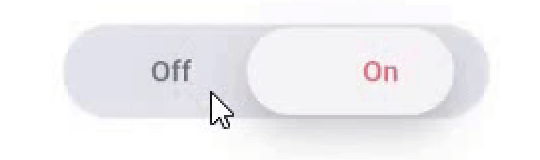
sliding switch

sliding switch other configurations
SlidingSwitch(
 value: false,
 width: 250,
 onChanged: (bool value) {
   print(value);
 },
 height : 55,
 animationDuration : const Duration(milliseconds: 400),
 onTap:(){},
 onDoubleTap:(){},
 onSwipe:(){},
 textOff : "Female",
 textOn : "Male",
 iconOff: Icons.human-female,
 iconOn: Icons.human-male,
 contentSize: 17,
 colorOn : const Color(0xffdc6c73),
 colorOff : const Color(0xff6682c0),
 background : const Color(0xffe4e5eb),
 buttonColor : const Color(0xfff7f5f7),
 inactiveColor : const Color(0xff636f7b),
),

If iconOn or iconOff are not null, they will be displayed in lieu of the respective textOn and textOff. The values for textOn and textOff are used as semantic labels for the icons for accessibility. The icons in the example are not in the default material icon set, but are from [Material Design Icons] (https://materialdesignicons.com/), available on pub.dev here.

contentSize drives the height of the text or icons.

Licensed Under the MIT License.

Inspiration

Jitu Raut

カテゴリー

ソースリポジトリ

このパッケージを使用しているプロジェクト

データはまだありません。