パッケージ、リポジトリ、アプリカテゴリを検索

step_progress_indicator のカバー
パッケージ詳細v1.0.2

step_progress_indicator

選択済みおよび未選択ステップのシリーズで構成されるバーインジケーター

AndroidiOSWebmacOSWindowsLinux
30日間ダウンロード
4.1万
いいね数
926
Pub ポイント
150

パッケージをインストール

flutter pub add step_progress_indicator

パッケージ概要

公開情報に基づく選定ガイドです。参考としてご利用ください。

Flutterパッケージで、カスタマイズ可能なステッププログレスバーを提供し、一連のステップにおける進行状況を視覚的に表現します。各ステップは選択済みまたは未選択としてマークでき、フォームやオンボーディングフロー、チェックアウトなど複数段階のプロセスでのユーザー誘導に最適です。インジケーターはスムーズなアニメーションをサポートしており、色、サイズ、ステップ間隔などのオプションで高レベルにカスタマイズ可能です。Android、iOS、Web、macOS、Windows、Linuxなどすべての主要プラットフォームで動作します。

用途

  • オンボーディングウィザード
  • 複数ステップフォーム
  • チェックアウトプロセスのトラッキング
  • タスク完了ワークフロー
  • チュートリアル進行状況インジケーター

主な機能

  • カスタマイズ可能なステップの外観
  • ステップ間のアニメーション遷移
  • 複数プラットフォームのサポート
  • カスタマイズ可能な色とサイズ
  • レスポンシブデザイン
  • 既存のUIとのスムーズな統合

適している対象

  • ガイド付きユーザー体験を構築するアプリ開発者
  • 視覚的な進捗フィードバックが必要なデザイナー
  • クロスプラットフォームの一貫性を必要とするプロジェクト
  • ユーザー体験に焦点を当てたアプリケーションと順次タスク
  • シンプルながらも洗練された進行状況の可視化

注意事項

  • 線形ステップ進行に制限
  • 動的なステップの追加/削除に対応する組み込み機能なし
  • ステップの更新には手動での状態管理が必要です
  • 非線形ワークフローには適していません
  • 複雑なテーマには追加のスタイリングが必要になる場合があります

元の README

関連するソースリポジトリの README 原文のスナップショットです。最新の内容はリポジトリをご覧ください。

Step Progress Indicator

GitHub: SandroMaglione Twitter: SandroMaglione

Open source Flutter package, bar indicator made of a series of selected and unselected steps.

Made by Sandro Maglione, check out his personal official website sandromaglione.com

Check out the full step_progress_indicator tutorial

See the full example here

Check out the official dartdoc for the package here

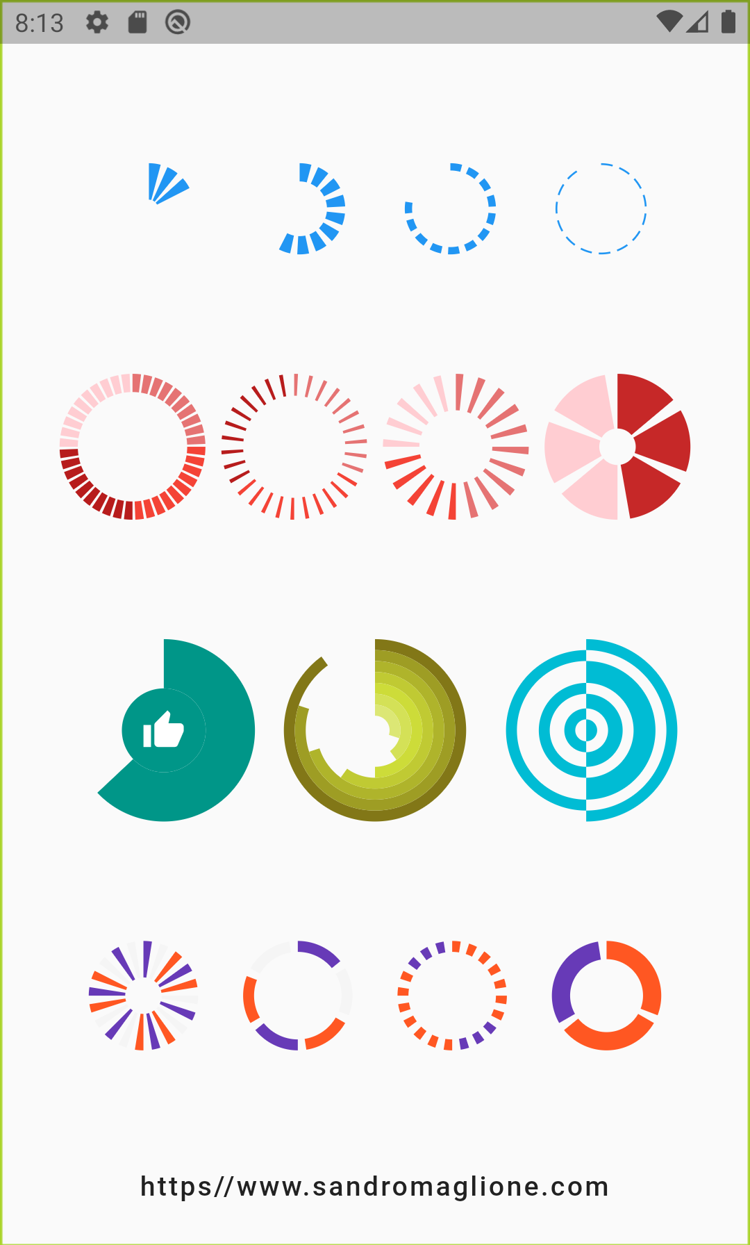
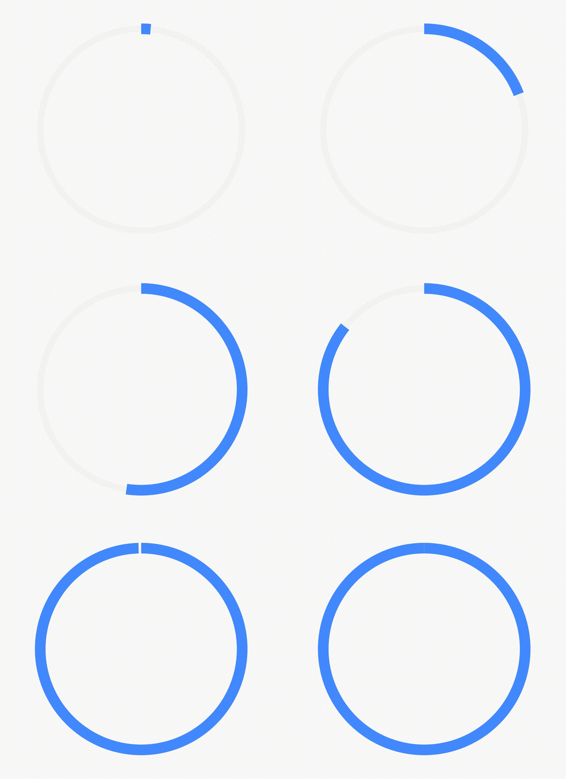
Screenshots

Install and import the package. Then just customize its parameters.

dependencies:
  flutter:
    sdk: flutter
  step_progress_indicator: ^1.0.2

The last no null-safe version of the package was v0.2.5+8

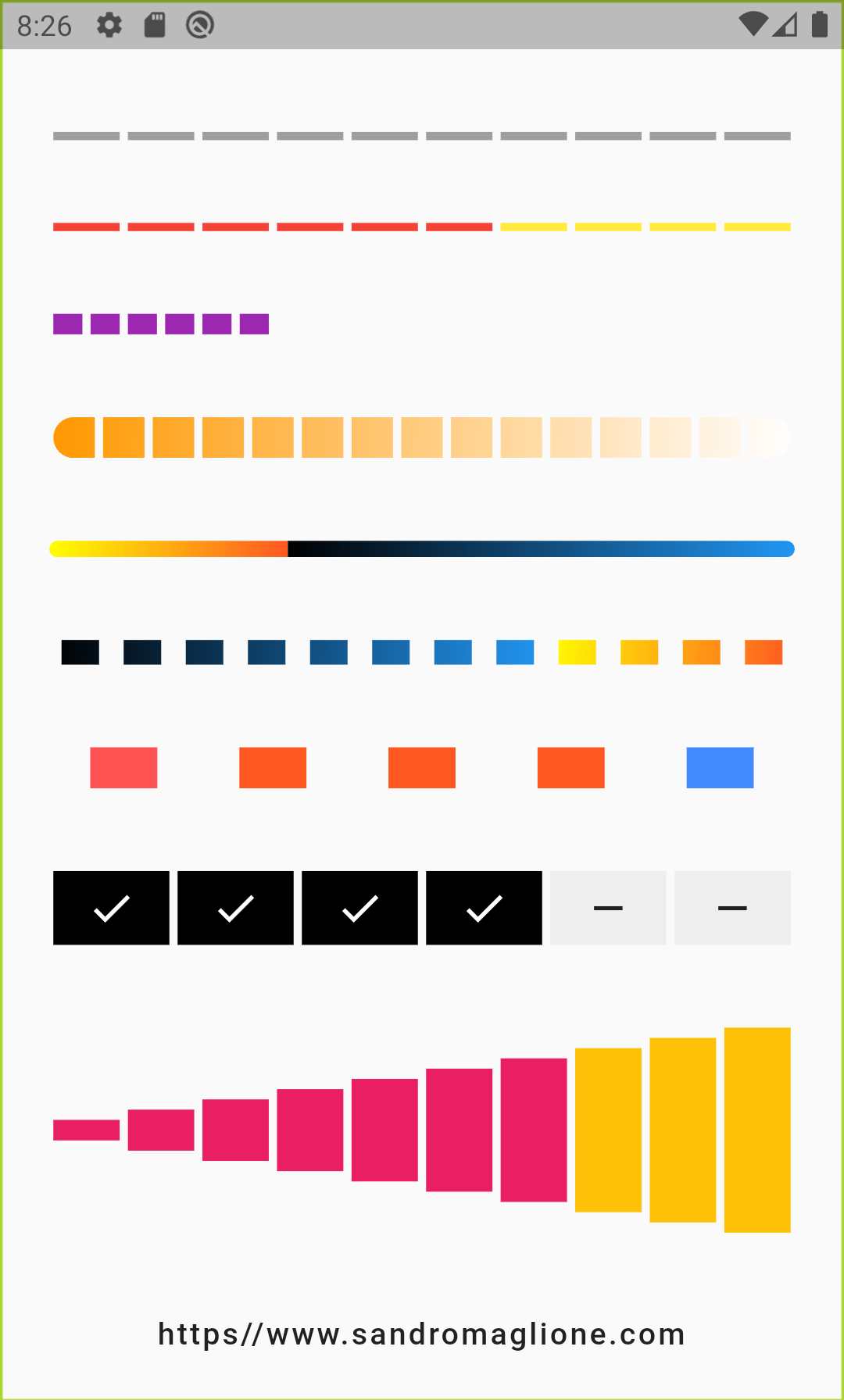
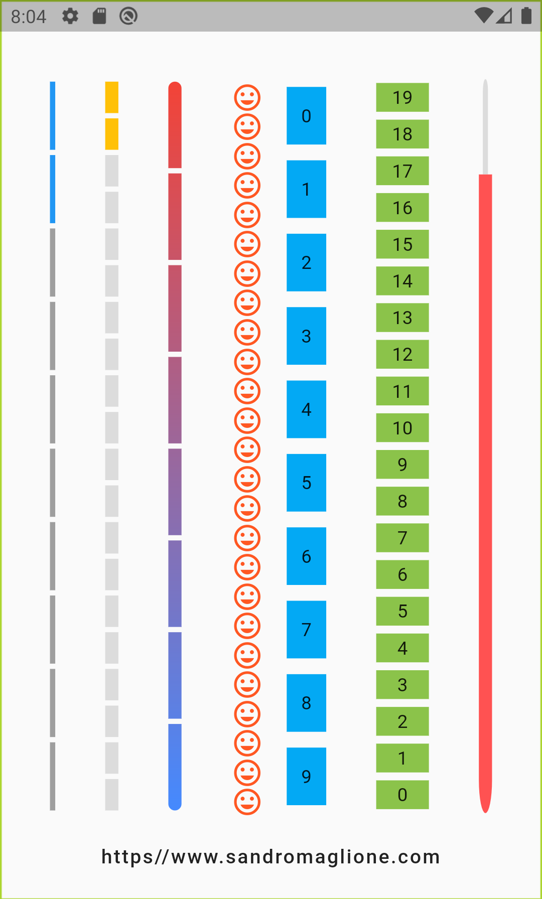
Horizontal Vertical
Horizontal indicator screen Vertical indicator screen
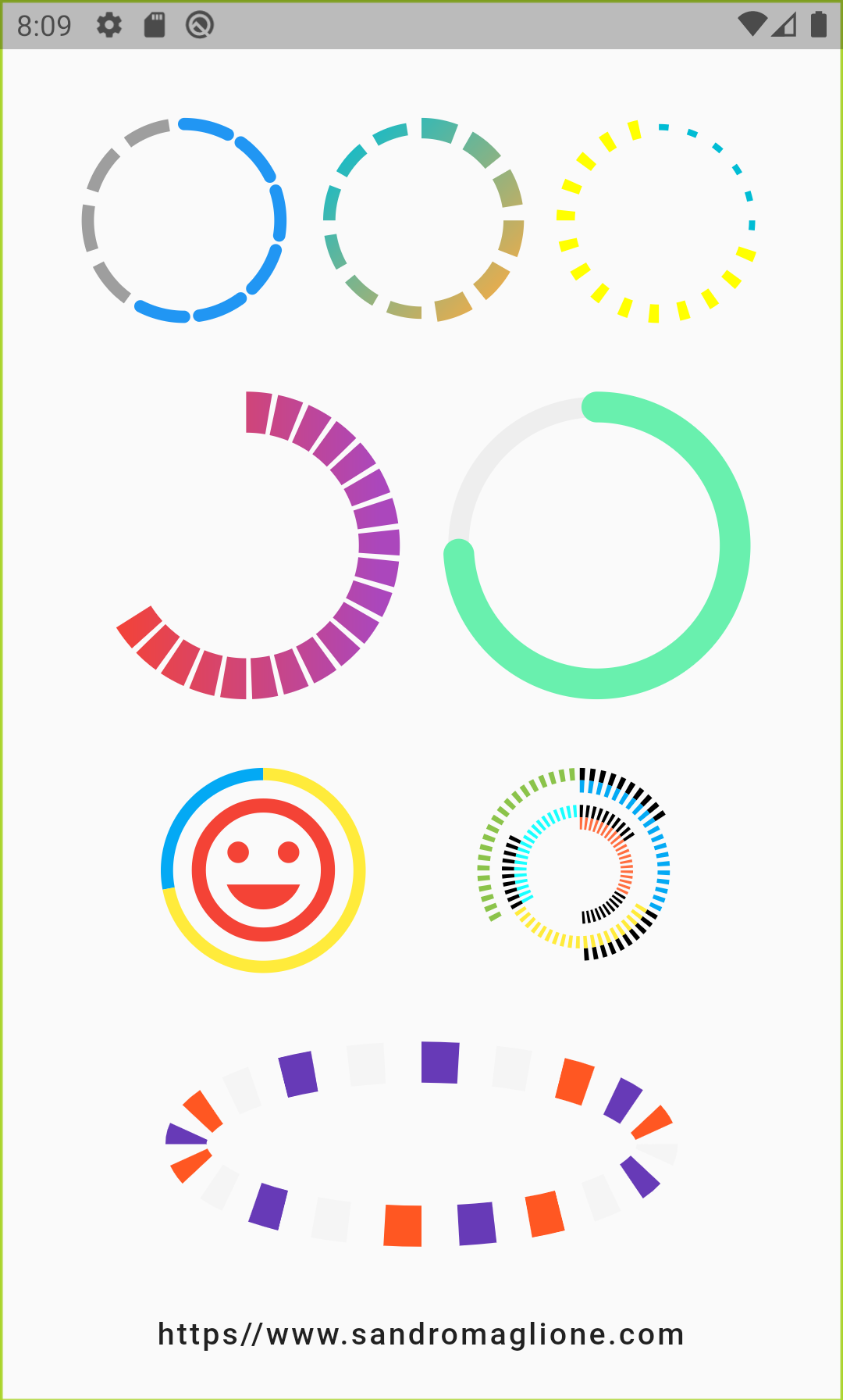
Circular1 Circular2
Circular step progress indicator screen 1 Circular step progress indicator screen 2
Circular step progress indicator screen 1 Circular step progress indicator example 1

Examples

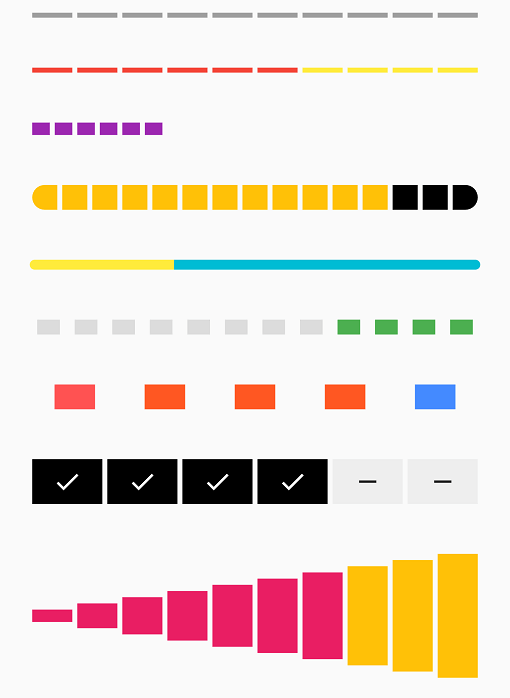
StepProgressIndicator - Example 1

Step Progress Indicator - Example 1

StepProgressIndicator(
    totalSteps: 10,
)
StepProgressIndicator - Example 2

Step Progress Indicator - Example 2

StepProgressIndicator(
    totalSteps: 10,
    currentStep: 6,
    selectedColor: Colors.red,
    unselectedColor: Colors.yellow,
)
StepProgressIndicator - Example 3

Step Progress Indicator - Example 3

StepProgressIndicator(
    totalSteps: 20,
    currentStep: 6,
    size: 10,
    selectedColor: Colors.purple,
    unselectedColor: Colors.transparent,
)
StepProgressIndicator - Example 4

Step Progress Indicator - Example 4

StepProgressIndicator(
    totalSteps: 15,
    currentStep: 12,
    size: 20,
    selectedColor: Colors.amber,
    unselectedColor: Colors.black,
    roundedEdges: Radius.circular(10),
    gradientColor: LinearGradient(
        begin: Alignment.topLeft,
        end: Alignment.bottomRight,
        colors: [Colors.orange, Colors.white],
    ),
),
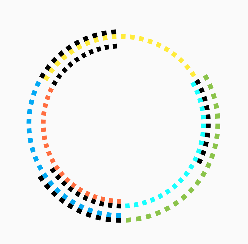
StepProgressIndicator - Example 5

Step Progress Indicator - Example 5

StepProgressIndicator(
    totalSteps: 100,
    currentStep: 32,
    size: 8,
    padding: 0,
    selectedColor: Colors.yellow,
    unselectedColor: Colors.cyan,
    roundedEdges: Radius.circular(10),
    selectedGradientColor: LinearGradient(
        begin: Alignment.topLeft,
        end: Alignment.bottomRight,
        colors: [Colors.yellowAccent, Colors.deepOrange],
    ),
    unselectedGradientColor: LinearGradient(
        begin: Alignment.topLeft,
        end: Alignment.bottomRight,
        colors: [Colors.black, Colors.blue],
    ),
),
StepProgressIndicator - Example 6

Step Progress Indicator - Example 6

StepProgressIndicator(
    totalSteps: 12,
    currentStep: 4,
    padding: 6.0,
    size: 12,
    progressDirection: TextDirection.rtl,
    selectedColor: Colors.green,
    unselectedColor: Colors.black12,
    selectedGradientColor: LinearGradient(
        begin: Alignment.topLeft,
        end: Alignment.bottomRight,
        colors: [Colors.yellowAccent, Colors.deepOrange],
    ),
    unselectedGradientColor: LinearGradient(
        begin: Alignment.topLeft,
        end: Alignment.bottomRight,
        colors: [Colors.black, Colors.blue],
    ),
)
StepProgressIndicator - Example 7

Step Progress Indicator - Example 7

StepProgressIndicator(
    totalSteps: 5,
    padding: 20.0,
    size: 20,
    customColor: (index) => index == 0
        ? Colors.redAccent
        : index == 4 ? Colors.blueAccent : Colors.deepOrange,
)
StepProgressIndicator - Example 8

Step Progress Indicator - Example 8

StepProgressIndicator(
    totalSteps: 6,
    currentStep: 4,
    size: 36,
    selectedColor: Colors.black,
    unselectedColor: Colors.grey[200],
    customStep: (index, color, _) => color == Colors.black
        ? Container(
            color: color,
            child: Icon(
            Icons.check,
            color: Colors.white,
            ),
        )
        : Container(
            color: color,
            child: Icon(
            Icons.remove,
            ),
        ),
)
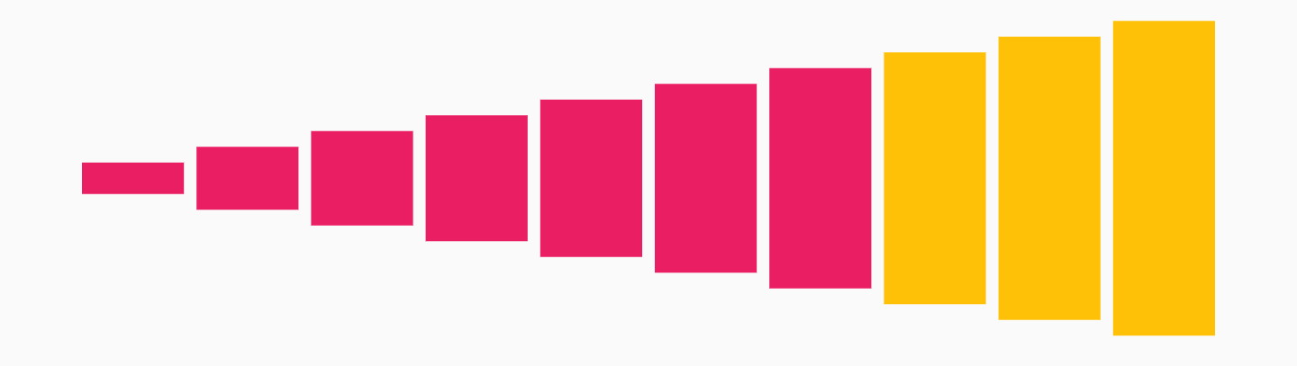
StepProgressIndicator - Example 9

Step Progress Indicator - Example 9

StepProgressIndicator(
    totalSteps: 10,
    currentStep: 7,
    selectedColor: Colors.pink,
    unselectedColor: Colors.amber,
    customSize: (index) => (index + 1) * 10.0,
)

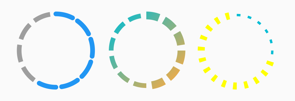
CircularStepProgressIndicator - Example 1

Circular Step Progress Indicator - Example 1

Row(
    mainAxisAlignment: MainAxisAlignment.spaceEvenly,
    children: <Widget>[
        CircularStepProgressIndicator(
            totalSteps: 10,
            currentStep: 6,
            width: 100,
            roundedCap: (_, isSelected) => isSelected,
        ),
        CircularStepProgressIndicator(
            totalSteps: 12,
            currentStep: 6,
            selectedColor: Colors.redAccent,
            unselectedColor: Colors.grey[200],
            selectedStepSize: 10.0,
            width: 100,
            gradientColor: LinearGradient(
                begin: Alignment.topLeft,
                end: Alignment.bottomRight,
                colors: [Colors.cyan, Colors.orangeAccent],
            ),
        ),
        CircularStepProgressIndicator(
            totalSteps: 20,
            currentStep: 6,
            padding: math.pi / 15,
            selectedColor: Colors.cyan,
            unselectedColor: Colors.yellowAccent,
            selectedStepSize: 3.0,
            unselectedStepSize: 9.0,
            width: 100,
        ),
    ],
)
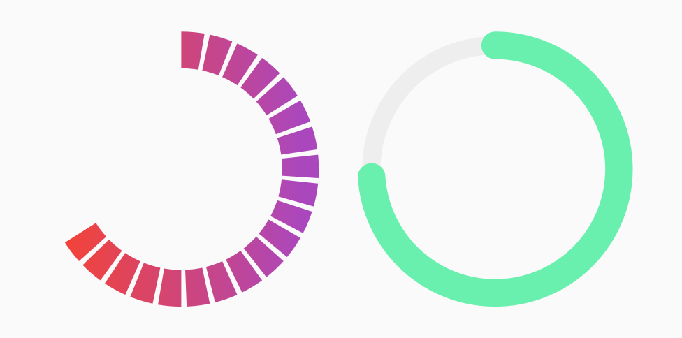
CircularStepProgressIndicator - Example 2

Circular Step Progress Indicator - Example 2

Row(
    mainAxisAlignment: MainAxisAlignment.spaceEvenly,
    children: <Widget>[
    CircularStepProgressIndicator(
        totalSteps: 20,
        currentStep: 12,
        stepSize: 20,
        selectedColor: Colors.red,
        unselectedColor: Colors.purple[400],
        padding: math.pi / 80,
        width: 150,
        height: 150,
        startingAngle: -math.pi * 2 / 3,
        arcSize: math.pi * 2 / 3 * 2,
        gradientColor: LinearGradient(
            colors: [Colors.red, Colors.purple[400]],
        ),
    ),
    CircularStepProgressIndicator(
        totalSteps: 100,
        currentStep: 74,
        stepSize: 10,
        selectedColor: Colors.greenAccent,
        unselectedColor: Colors.grey[200],
        padding: 0,
        width: 150,
        height: 150,
        selectedStepSize: 15,
        roundedCap: (_, __) => true,
    ),
    ],
),
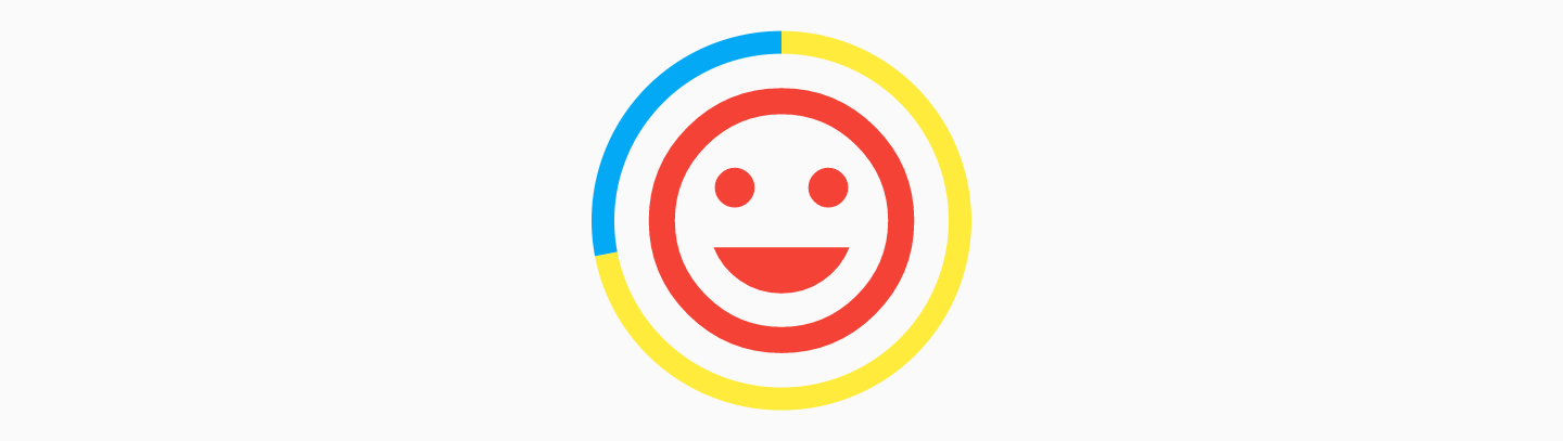
CircularStepProgressIndicator - Example 3

Circular Step Progress Indicator - Example 3

CircularStepProgressIndicator(
    totalSteps: 100,
    currentStep: 72,
    selectedColor: Colors.yellow,
    unselectedColor: Colors.lightBlue,
    padding: 0,
    width: 100,
    child: Icon(
        Icons.tag_faces,
        color: Colors.red,
        size: 84,
    ),
)
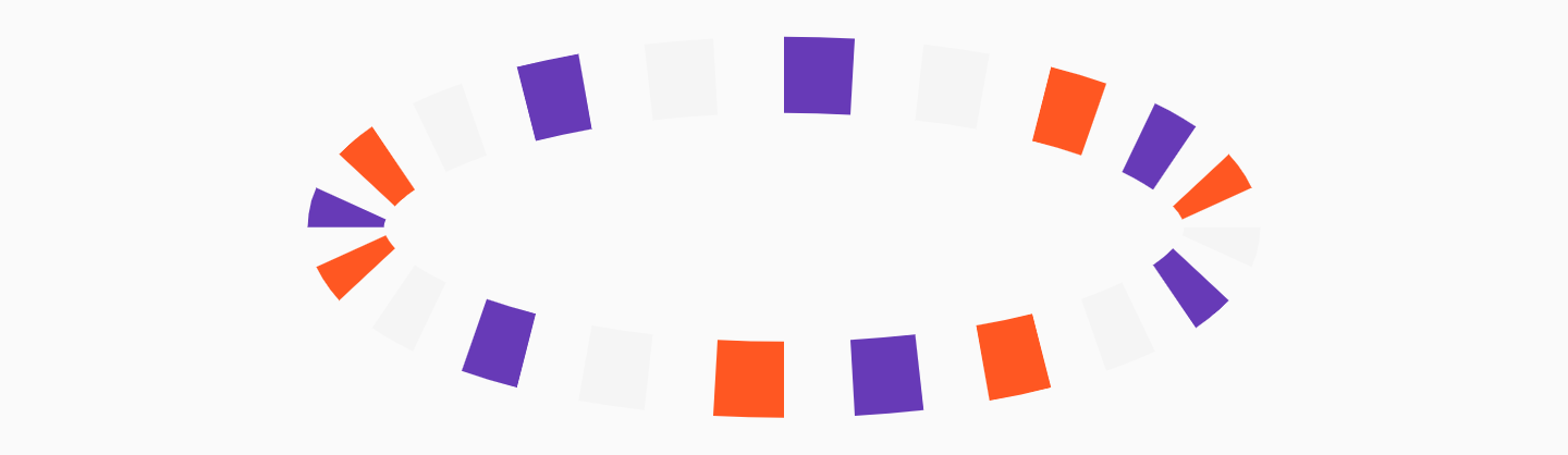
CircularStepProgressIndicator - Example 4

Circular Step Progress Indicator - Example 4

CircularStepProgressIndicator(
    totalSteps: 20,
    stepSize: 20,
    customColor: (index) => index % 3 == 0
        ? Colors.deepPurple
        : index % 2 == 0
            ? Colors.deepOrange
            : Colors.grey[100],
    width: 250,
)

StepProgressIndicator Parameters

Parameter Type Description Default
totalSteps int Total number of step of the complete indicator. @required
currentStep int Number of steps to underline, all the steps with index <= currentStep will have Color equal to selectedColor. 0
customStep(int, Color, double) Widget Defines a custom Widget to display at each step, given the current step index, the Color, which could be defined with selectedColor and unselectedColor or using customColor, and its size, which could be defined using size, selectedSize, unselectedSize, or customSize. -
onTap(int) void Function() Defines onTap function given index of the pressed step. -
customColor(int) Color Assign a custom Color for each step. -
customSize(int) double Assign a custom size for each step. -
selectedColor Color Color of the selected steps. Colors.blue
unselectedColor Color Color of the unselected steps. Colors.grey
gradientColor Gradient Apply gradient color to the indicator. -
selectedGradientColor Gradient Apply gradient color to the selected steps of the indicator. -
unselectedGradientColor Gradient Apply gradient color to the unselected steps of the indicator. -
blendMode BlendMode Apply BlendMode to ShaderMask when gradientColor, selectedGradientColor, or unselectedGradientColor defined. -
direction Axis Defines if indicator is horizontal or vertical. Axis.horizontal
progressDirection TextDirection Defines if steps grow from left-to-right / top-to-bottom TextDirection.ltr or right-to-left / bottom-to-top TextDirection.rtl. TextDirection.ltr
size double Size of the indicator (height if direction is Axis.horizontal, width if Axis.vertical). 4.0
padding double Spacing, left-right if horizontal, top-bottom if vertical, of each step. 2.0
fallbackLength double Length of the progress indicator in case the main axis (based on direction attribute) has no size limit i.e. double.infinity. 100.0
selectedSize double Specify a custom size for selected steps. -
unselectedSize double Specify a custom size for unselected steps. -
roundedEdges Radius Add rounded edge corners to first and last step. -
mainAxisAlignment MainAxisAlignment Assign alignment MainAxisAlignment for indicator's container. MainAxisAlignment.center
crossAxisAlignment CrossAxisAlignment Assign alignment CrossAxisAlignment for indicator's container. CrossAxisAlignment.center
stepMainAxisAlignment MainAxisAlignment Assign alignment MainAxisAlignment for a single step. MainAxisAlignment.center
stepCrossAxisAlignment CrossAxisAlignment Assign alignment CrossAxisAlignment for a single step. CrossAxisAlignment.center

CircularStepProgressIndicator Parameters

Parameter Type Description Default
totalSteps int Total number of step of the complete indicator. @required
currentStep int Number of steps to underline, all the steps with index <= currentStep will have Color equal to selectedColor. 0
child Widget Widget child contained inside the indicator. -
selectedColor Color Color of the selected steps. Colors.blue
unselectedColor Color Color of the unselected steps. Colors.grey
customColor(int) Color Assign a custom Color for each step. -
gradientColor Gradient Apply a gradient color to the indicator. -
customStepSize(int, bool) double Assign a custom size for each step. -
selectedStepSize double Specify a custom size for selected steps. -
unselectedStepSize double Specify a custom size for unselected steps. -
circularDirection CircularDirection Defines if steps grow clockwise (CircularDirection.clockwise) or counterclockwise (CircularDirection.counterclockwise) CircularDirection.clockwise
stepSize double Size of the each step of the indicator. 6.0
height double Height of the indicator's container. -
width double Width of the indicator's container. -
padding double Spacing between each step. math.pi / 20
startingAngle double Angle in which is placed the starting point of the indicator. 0
roundedCap(int, bool) bool Adds rounded edges at the beginning and at the end of the circular indicator given int index of each step and a bool telling if the step is selected. (_, __) => false
removeRoundedCapExtraAngle bool Removes extra angle caused by StrokeCap.butt when roundedCap is applied #20. false
arcSize double Angle in radiants which represents the size of the arc used to display the indicator. math.pi * 2
fallbackHeight double Height of the indicator's container in case the parent height has no size limit i.e. double.infinity. 100.0
fallbackWidth double Width of the indicator's container in case the parent width has no size limit i.e. double.infinity. 100.0

Roadmap

I am always open for suggestions and ideas for possible improvements or fixes.

Feel free to open a Pull Request if you would like to contribute to the project.

If you would like to have a new feature implemented, just write a new issue.

Versioning

  • v1.0.2 - 2 January 2022
  • v1.0.1 - 16 June 2021
  • v1.0.0 - 10 May 2021
  • v0.2.5+8 - 01 December 2020
  • v0.2.4+7 - 25 August 2020
  • v0.2.3+6 - 20 May 2020
  • v0.2.2+5 - 26 April 2020
  • v0.2.1+4 - 25 February 2020
  • v0.2.0+3 - 24 February 2020
  • v0.1.1+2 - 24 January 2020
  • v0.1.0+1 - 23 January 2020

Support

If you would like to support my work, why don't you buy me a coffee?

License

MIT License, see the LICENSE.md file for details.

カテゴリー

ソースリポジトリ

このパッケージを使用しているプロジェクト