swipable_stack
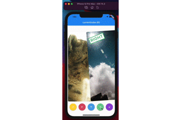
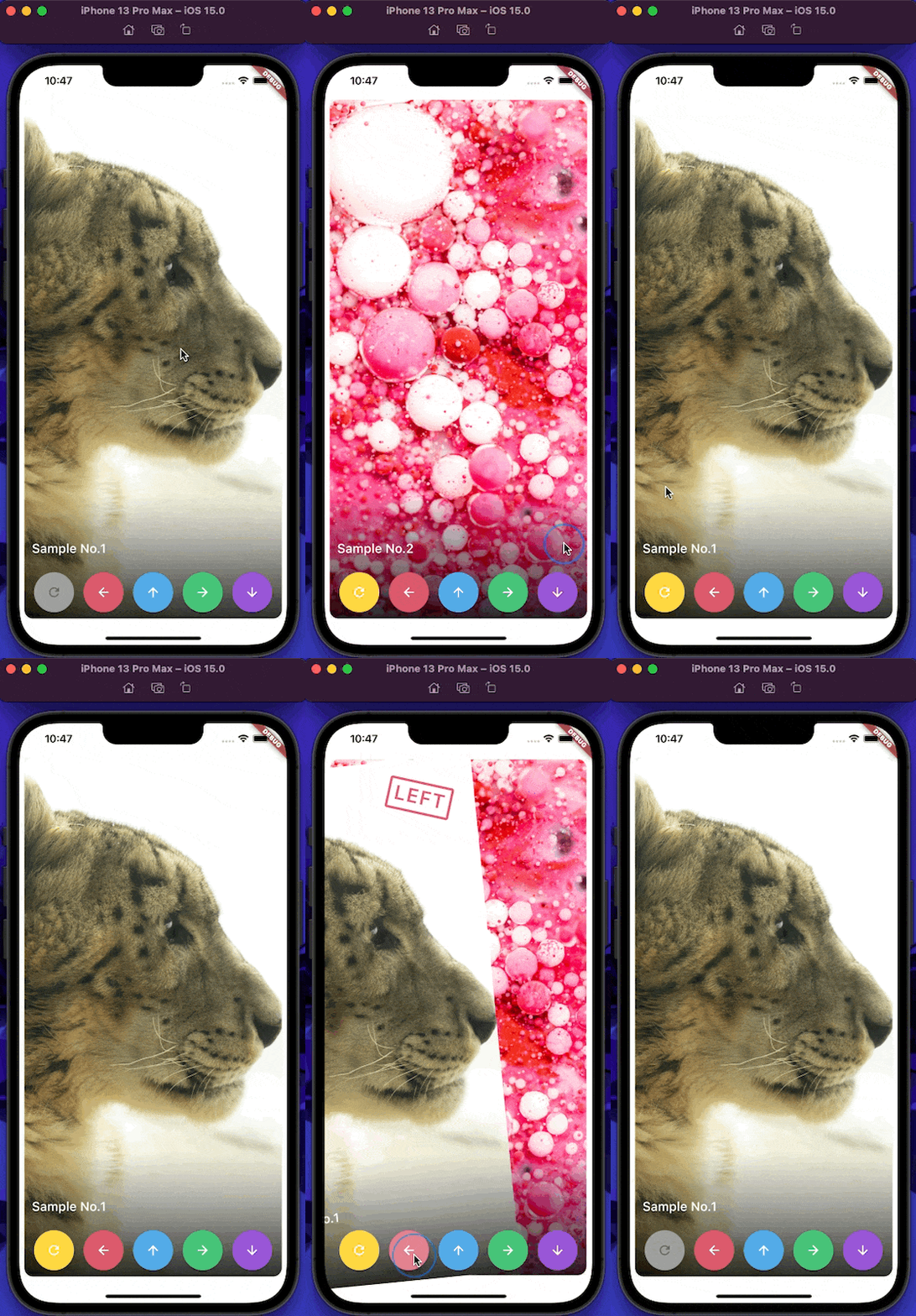
A widget for stacking cards, which users can swipe horizontally and vertically with beautiful animations like Tinder UI.
(Sorry, the package name swipable_stack is typo of swipeable stack)
Usage
builderA SwipableStack uses a builder to display widgets.
SwipableStack (
builder: (context, properties) {
return Image .asset (imagePath);
},
),
onSwipeCompletedYou can get completion event with onSwipeCompleted.
SwipableStack (
onSwipeCompleted: (index, direction) {
print ('$index , $direction ' );
},
)
overlayBuilderYou can show overlay on the front card with overlayBuilder.
SwipableStack (
overlayBuilder: (context, properties) {
final opacity = min (properties.swipeProgress, 1.0 );
final isRight = properties.direction == SwipeDirection .right;
return Opacity (
opacity: isRight ? opacity : 0 ,
child: CardLabel .right (),
);
},
)
controllerSwipableStackController allows you to control swipe action & also rewind recent action.
final controller = SwipableStackController ();
SwipableStack (
controller:controller,
builder: (context, properties) {
return Image .asset (imagePath);
},
);
controller.next (
swipeDirection: SwipeDirection .right,
);
controller.rewind ();
SwipableStackController provides to access currentIndex of SwipableStack.
final controller = SwipableStackController ();
controller.addListener (() {
print ('${_controller.currentIndex} ' );
});
onWillMoveNextYou can also restrict user actions according to index or action with onWillMoveNext.
SwipableStack (
onWillMoveNext: (index, direction) {
final allowedActions = [
SwipeDirection .right,
SwipeDirection .left,
];
return allowedActions.contains (direction);
},
);
swipeAssistDurationYou can set the speed the user is able to swipe through Widgets with the swipeAssistDuration.
SwipableStack (
swipeAssistDuration: Duration (milliseconds: 100 ),
)
The default is 650ms.
stackClipBehaviourYou can set the clipBehaviour of the stack with the stackClipBehaviour.Clip.none to exceed the boundaries of parent widget size.
SwipableStack (
stackClipBehaviour: Clip .none,
)
The default is Clip.hardEdge.
allowVerticalSwipeDisable vertical swipe with allowVerticalSwipe.false disable vertical swipe capabilities
SwipableStack (
allowVerticalSwipe: false ,
)
The default is true.
swipeTopAnchorSet the swipe anchor with swipeAnchor with the following enum
SwipeAnchor.top : card rotation on bottom and anchored on top
SwipeAnchor.bottom : card rotation on top and anchored on bottom
SwipableStack (
swipeAnchor: SwipeAnchor .top,
)
The default is SwipeAnchor.top.