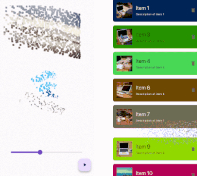
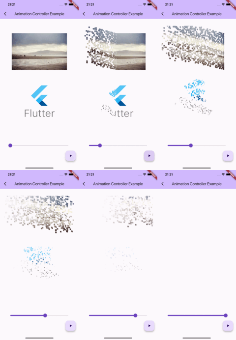
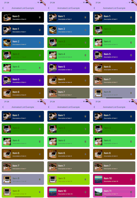
The thanos_snap_effect パッケージは、Flutter アプリ向けに高パフォーマンスでカスタマイズ可能な「トゥーノス・スナップ」アニメーションを提供します。開発者が、Android、iOS、Web、macOS、Windows、Linux など複数のプラットフォームで、要素がドラマティックに消えるという象徴的なスナップ効果を簡単に実装できるようにします。滑らかな遷移と豊富なカスタマイズオプションにより、ゲームやインタラクティブUI、遊び心のあるアプリ機能におけるユーザー参加度を向上させます。このパッケージは軽量で、ドキュメントも充実しており、柔軟性を損なわずシンプルさを重視しています。
This package provides a 'Snappable' widget.
The principle of using this widget is similar to "Transition" widgets, like "FadeTransition", "ScaleTransition", etc.
Just wrap your widget with the Snappable widget and pass the AnimationController (or any Animation descendant) object to the "animation" property.
Then just start the animation and see the magic!
Snappable(
  animation: animationController, // AnimationController object, or any other animation object with double tween from 0.0 to 1.0
  child: MyWidget(), // Your widget that you want to animate
);
You can customize the effect by passing the "outerPadding" or "style" properties to the Snappable widget.
Snappable(
animation: _animationController,
child: MyWidget(),
outerPadding: constEdgeInsets.all(40.0), // The padding around the widget where particles can appear. Default value is EdgeInsets.all(40.0)
style: SnappableStyle(
particleLifetime: 0.6, // Lifetime of particle before it disappears. Default value is 0.6. Must be between 0.0 and 1.0
fadeOutDuration: 0.3, // Duration of fade out animation of particle. Fade out effect starts in particleLifetime - fadeOutDuration and ends when particleLifetime ends. Default value is 0.3. Must be between 0.0 and particleLifetime
particleSpeed: 1.0, // Speed of particles. Default value is 1.0
particleSize: constSnappableParticleSize.squareFromRelativeWidth(0.01), // Size of 1 particle
),
);
Mastering the particleSize property
There are 2 ways to define the size of particles:
Relative to the size of the widget
SnappableParticleSize.relative(width: 0.01, height: 0.02) // 1% of the width and 2% of the height of the widgetSnappableParticleSize.squareFromRelativeWidth(0.01) // 1% of the width of the widget. The height will be calculated to keep the square shapeSnappableParticleSize.squareFromRelativeHeight(0.01) // 1% of the height of the widget. The width will be calculated to keep the square shape
Absolute size (in dp)
SnappableParticleSize.absoluteDp(width: 16, height: 8) // 16dp width and 8dp height