パッケージ、リポジトリ、アプリカテゴリを検索

timeline_tile のカバー
パッケージ詳細v2.0.0

timeline_tile

Flutter で高度にカスタマイズ可能なタイムラインを構築するのを支援するパッケージです。

AndroidiOSWebmacOSWindowsLinux
30日間ダウンロード
6.3万
いいね数
1920
Pub ポイント
150

パッケージをインストール

flutter pub add timeline_tile

パッケージ概要

公開情報に基づく選定ガイドです。参考としてご利用ください。

timeline_tile は、簡単に高カスタマイズ可能なタイムラインを作成できるように設計されたFlutterパッケージです。垂直または水平のタイムラインを構築するための柔軟なウィジェットを提供し、さまざまなスタイル、色、コンテンツレイアウトに対応しています。開発者はタイムラインのインジケーター、コネクター、タイルの外観をアプリのデザインに合わせてカスタマイズできます。このパッケージは軽量で、既存のFlutterプロジェクトにスムーズに統合でき、イベント履歴やプロジェクトの進行状況、時系列データを魅力的に表示するのに最適です。

用途

  • イベント履歴の表示
  • プロジェクトのマイルストーンを表示しています
  • ステップバイステップのプロセスの可視化
  • インタラクティブなタイムラインの作成
  • 歴史的データの提示
  • オンボーディングフローの強化

主な機能

  • 高度カスタマイズ可能なタイムラインデザイン
  • 垂直および水平レイアウトのサポート
  • カスタマイズ可能なインジケーターとコネクタ
  • 柔軟なタイルコンテンツ配置
  • 軽量で簡単に統合可能
  • 拡張可能なウィジェット構造

適している対象

  • 時系列UIを構築する開発者
  • 視覚的な進捗追跡を必要とするアプリ
  • 教育またはオンボーディングインターフェース
  • プロジェクト管理ツール
  • コンテンツ豊富なアプリケーション

注意事項

  • 複雑なデザインには手動レイアウト設定が必要です
  • 制限された組み込みアニメーション
  • 静的または単純な動的タイムラインに最適
  • 応答性の動作を実現するために追加のスタイルが必要になる場合があります
  • パフォーマンスチューニングなしでは非常に長いタイムラインには最適化されていない

元の README

関連するソースリポジトリの README 原文のスナップショットです。最新の内容はリポジトリをご覧ください。

TimelineTile

A package to help build customisable timelines in Flutter.


Example

Some use cases:


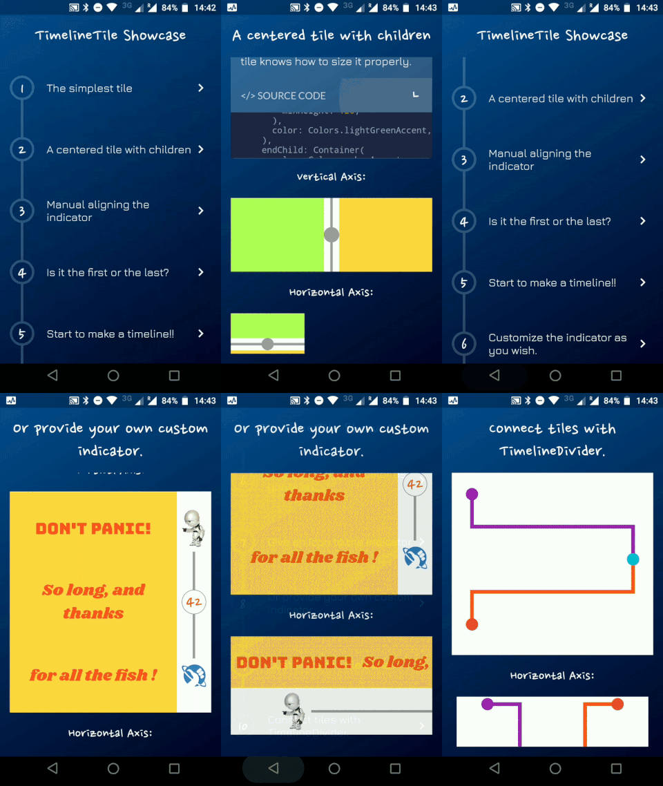
Timeline Showcase

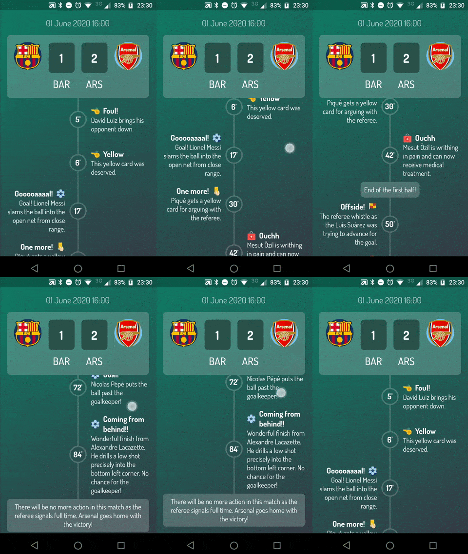
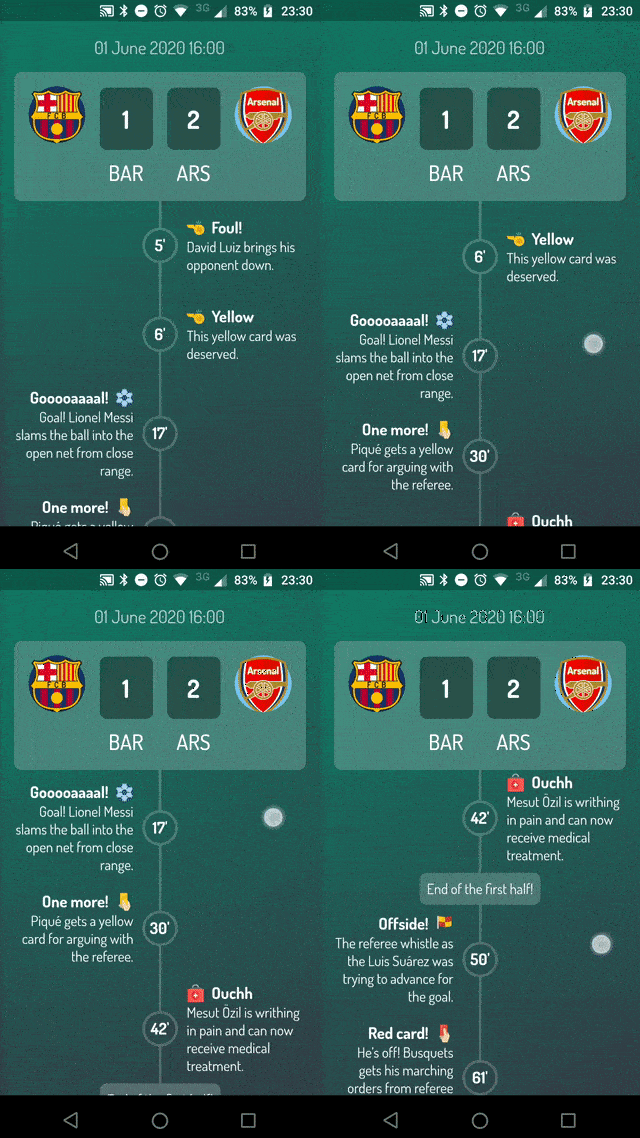
Football Timeline

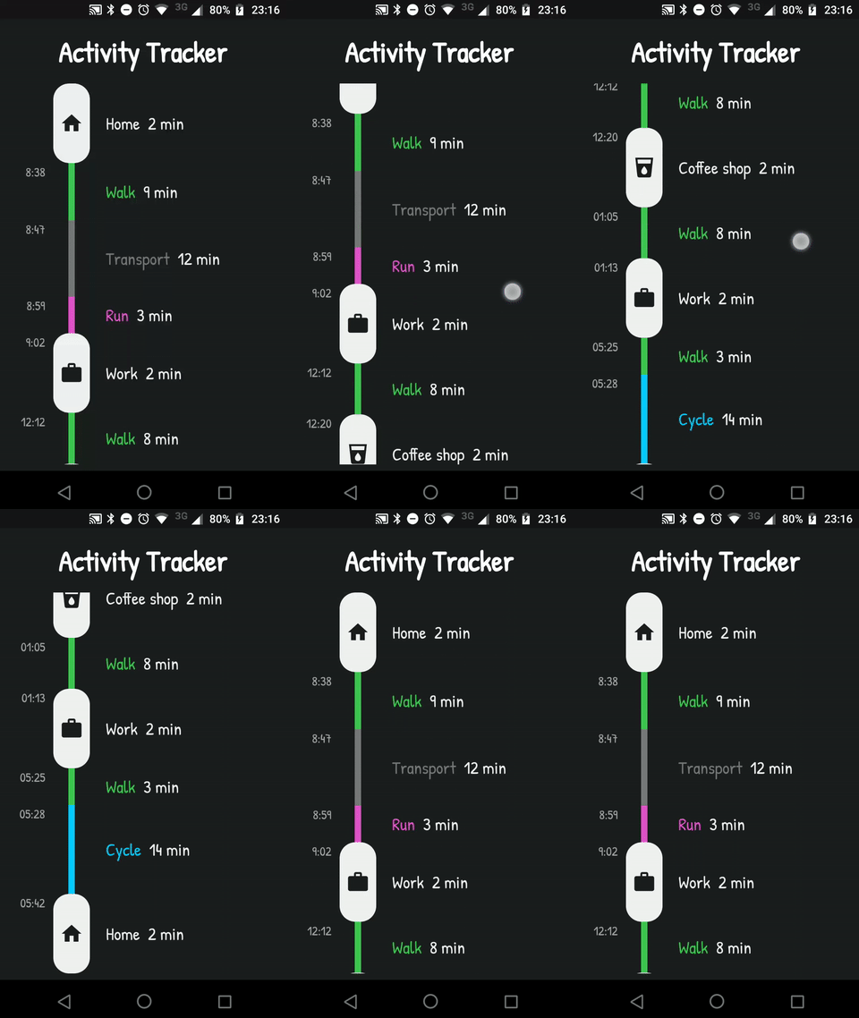
Activity Timeline

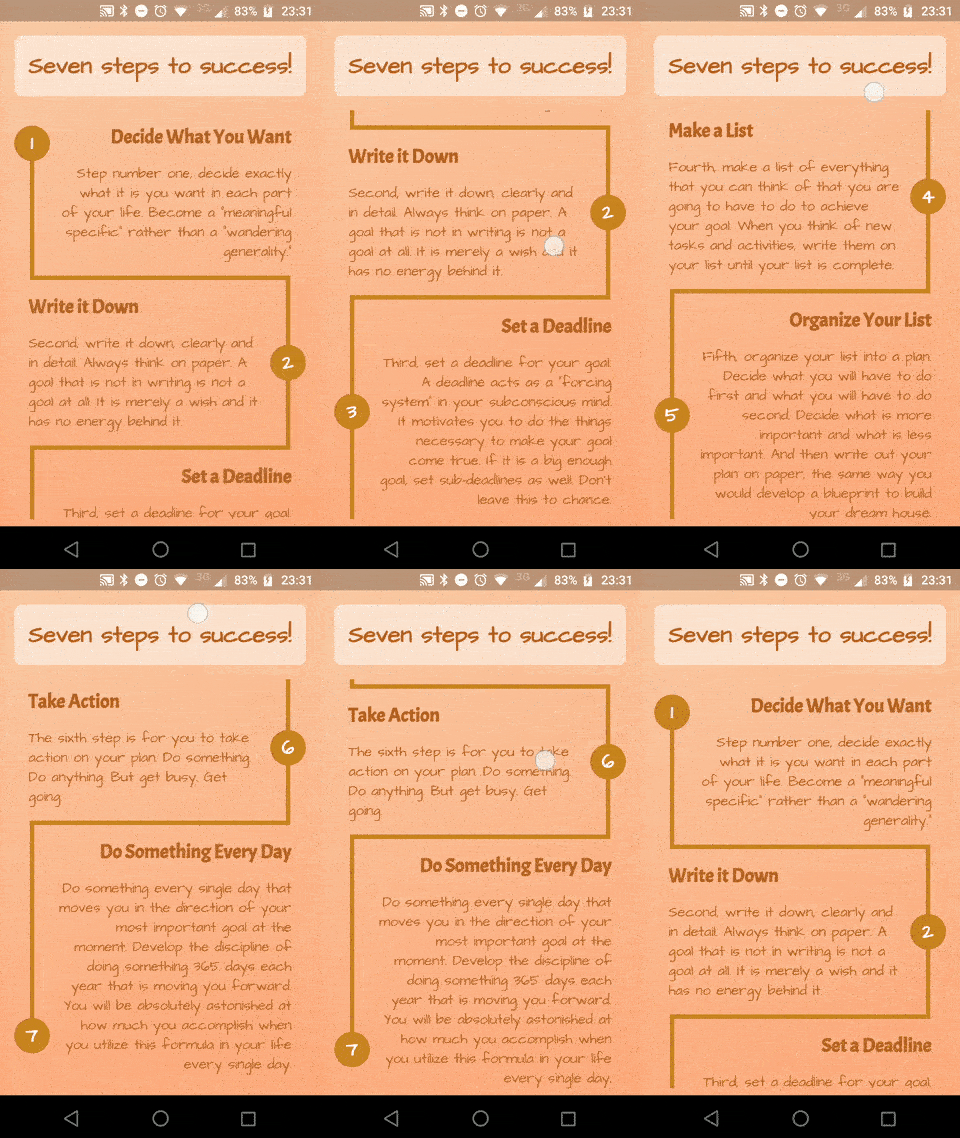
Success Timeline

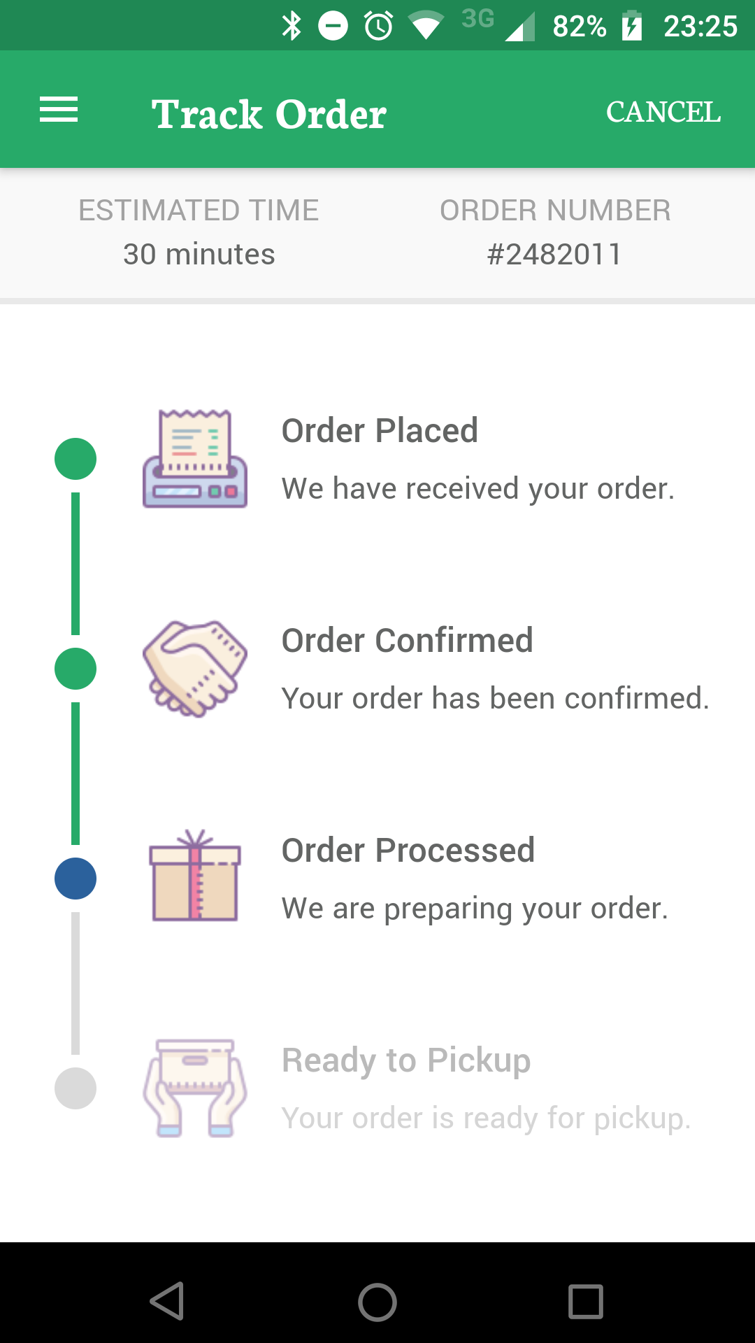
Delivery Timeline

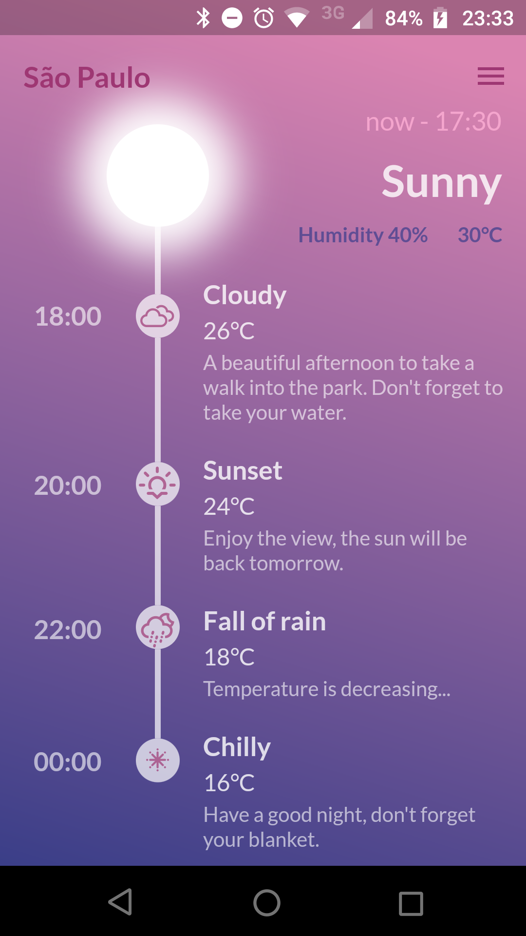
Weather Timeline

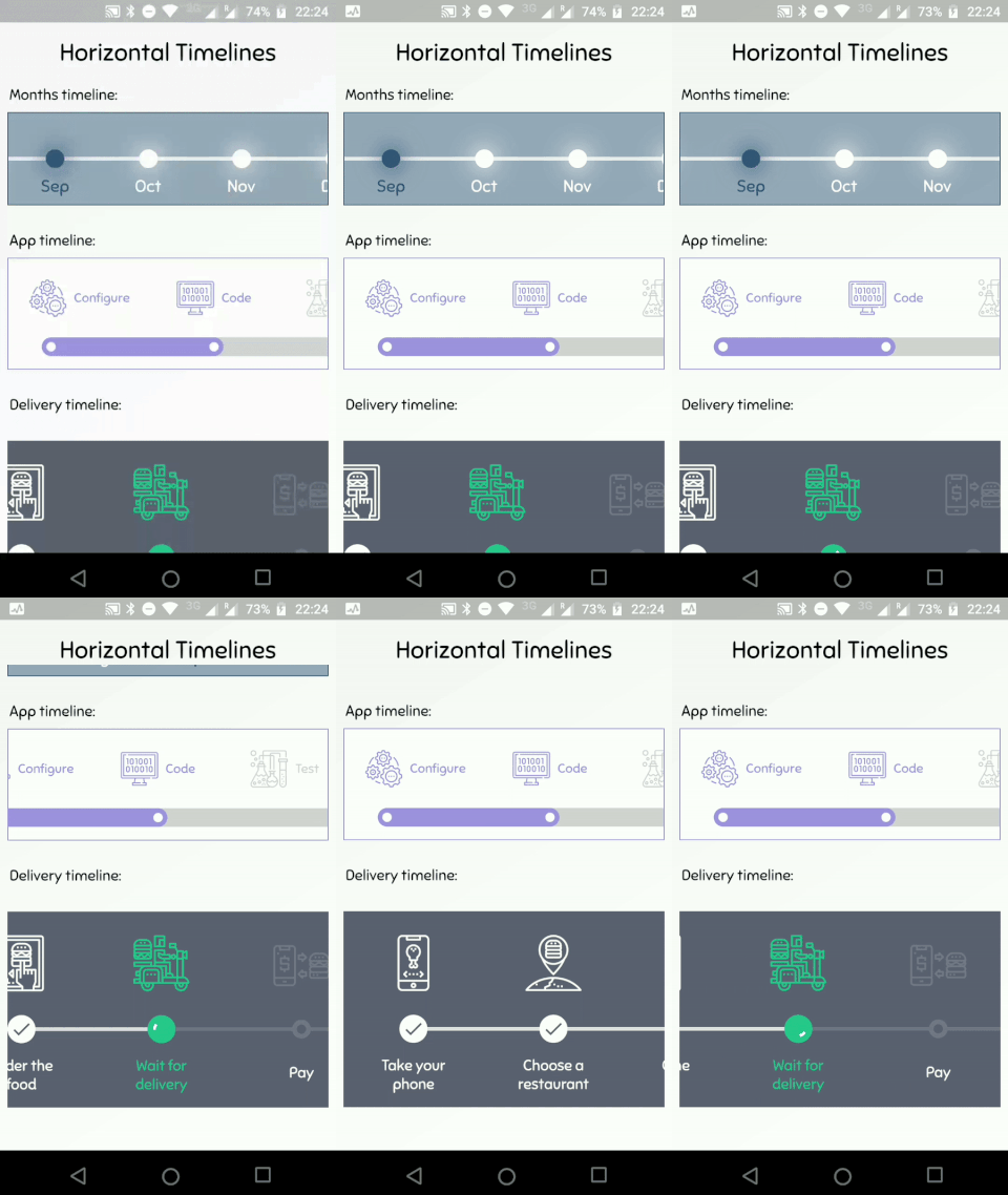
Horizontal Timelines

Getting Started

A Timeline consists in a group of TimelineTiles. To build a tile you can simply use:

TimelineTile()

Which will build a default tile with a vertical axis, that aligns to the start, with a height of 100:

Simple Timeline

The axis can be switched to render an horizontal tile, aligned to the start, with a default width of 100:

TimelineTile(axis: TimelineAxis.horizontal)

Horizontal Simple Timeline

There are 4 types of alignment.

  • TimelineAlign.start
  • TimelineAlign.end
  • TimelineAlign.center
  • TimelineAlign.manual

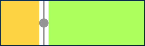
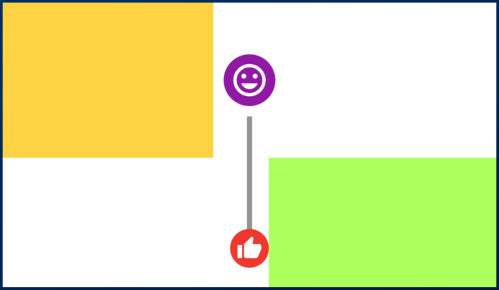
The start and end alignment allows a child in their opposite sides. On the other hand, both center and manual allows children on both sides. For example, one tile with alignment to the center:

TimelineTile(
  alignment: TimelineAlign.center,
  endChild: Container(
    constraints: const BoxConstraints(
      minHeight: 120,
    ),
    color: Colors.lightGreenAccent,
  ),
  startChild: Container(
    color: Colors.amberAccent,
  ),
);

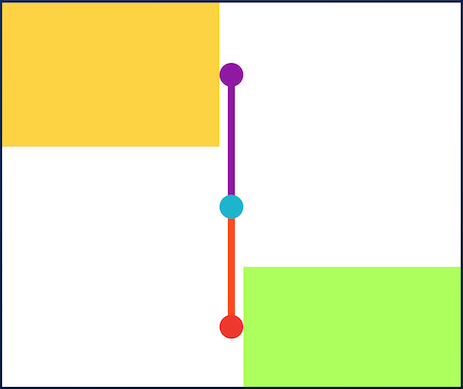
When providing children to the vertical tile, the height will be as minimum as possible, so you can control it with a height constraint (at least minHeight). This way the tile knows how to size it properly.

Centered Tile

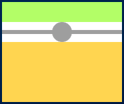
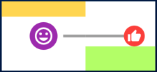
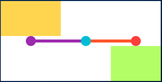
If the axis is horizontal, the things are the opposite. The width will be as minimum as possible, so you can control it with a width constraint (at least minWidth). This way the tile knows how to size it properly.

TimelineTile(
  axis: TimelineAxis.horizontal,
  alignment: TimelineAlign.center,
  endChild: Container(
    constraints: const BoxConstraints(
      minWidth: 120,
    ),
    color: Colors.lightGreenAccent,
  ),
  startChild: Container(
    color: Colors.amberAccent,
  ),
);

Horizontal Centered Tile

Manual aligning the idicator

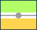
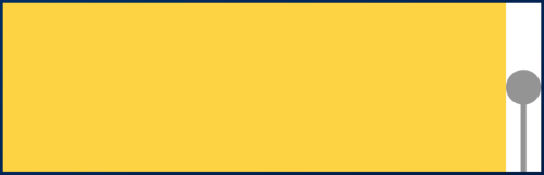
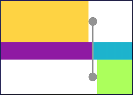
With TimelineAlign.manual you can provide the lineXY, which allows you to specify a value from 0.0 to 1.0, that represents a size percentage. For example, aligning at 30% of the width or height:

TimelineTile(
  alignment: TimelineAlign.manual,
  lineXY: 0.3,
  endChild: Container(
    constraints: const BoxConstraints(
      minHeight: 120,
    ),
    color: Colors.lightGreenAccent,
  ),
  startChild: Container(
    color: Colors.amberAccent,
  ),
);

Manual align indicator

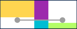
TimelineTile(
  axis: TimelineAxis.horizontal,
  alignment: TimelineAlign.manual,
  lineXY: 0.3,
  endChild: Container(
    constraints: const BoxConstraints(
      minWidth: 120,
    ),
    color: Colors.lightGreenAccent,
  ),
  startChild: Container(
    color: Colors.amberAccent,
  ),
);

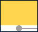
Horizontal manual align indicator

Is it the first or the last?

You can decide if a tile is the first os the last in a timeline. This way you control whether a before or after line must be rendered.

First and last

Horizontal first and last

See the implementation here

Start to make a timeline

You can finally start to combine some tiles to make a Timeline. The flag hasIndicator can control whether an indicator should or shouldn't be rendered.

Timeline

Horizontal timeline

See the implementation here

Customize the indicator as you wish

The default indicator is a circle, and you can customize it as you wish. With IndicatorStyle you can change the color, the X/Y position based on values from 0.0 to 1.0 or give it a padding. You must explicitly provide its width (vertical) or height (horizontal) though.

Custom indicator

Horizontal custom indicator

See the implementation here

Give an icon to the indicator

With IconStyle you can provide an Icon to be rendered inside the default indicator.

Icon indicator

Horizontal icon indicator

See the implementation here

Or provide your custom indicator

With the indicator parameter you can customize the tile with your own indicator. However, you must control its size through both width and height parameters.

Custom indicator

Horizontal custom indicator

See the implementation here

Customize the tile's line

With LineStyle you can customize both beforeLine and afterLine.

Custom line

Horizontal custom line

See the implementation here

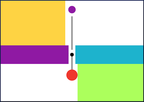
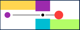
Connect tiles with TimelineDivider

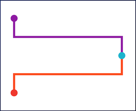
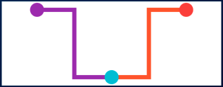
The TimelineDivider widget allows you to connect tiles that are aligned in different X/Y axis, when combined with TimelineAlign.manual.

Timeline divider

Timeline divider

See the implementation here

カテゴリー

ソースリポジトリ

このパッケージを使用しているプロジェクト