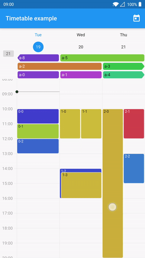
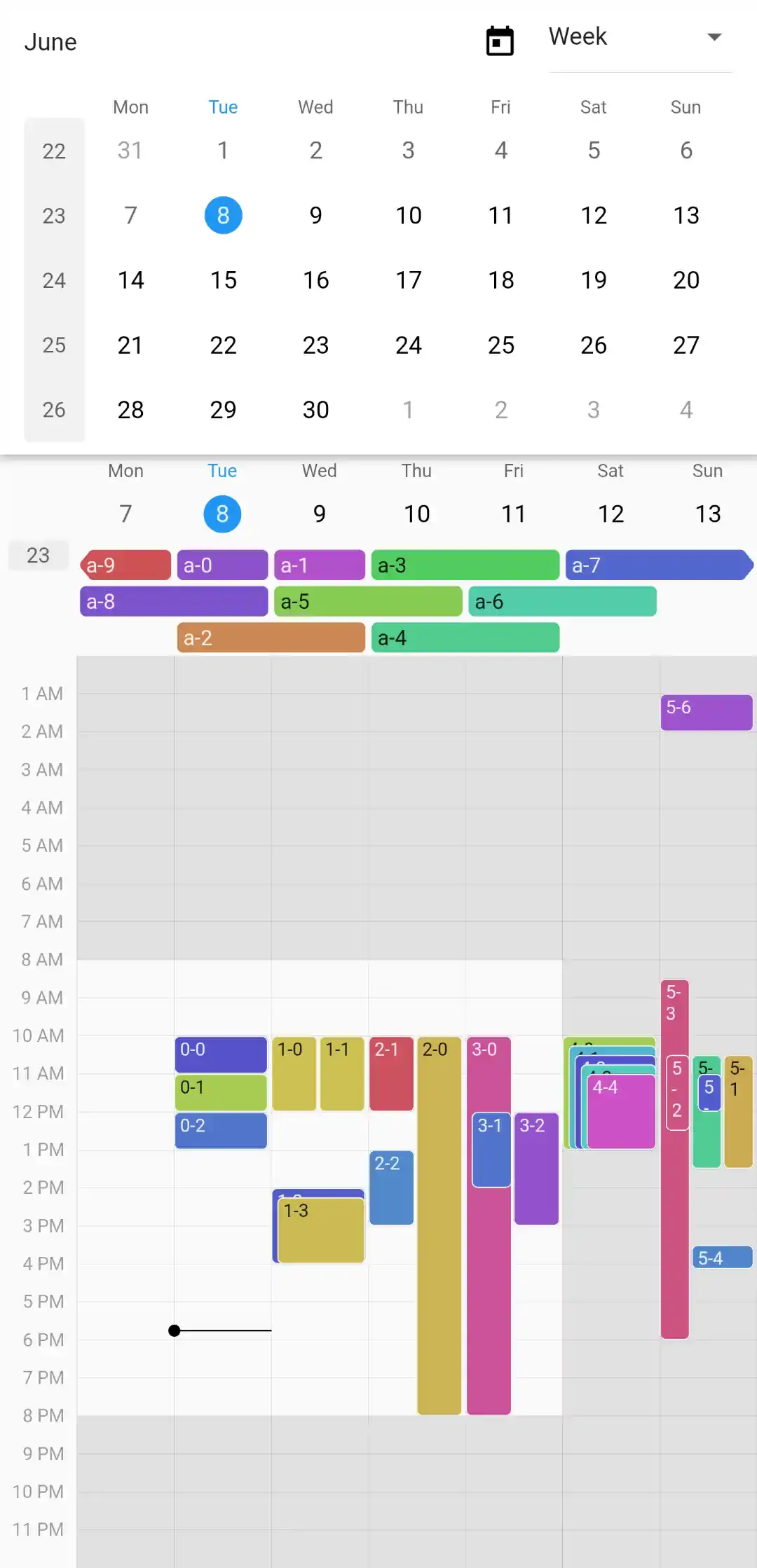
A Timetable widget that displays MonthWidgets in a page view.
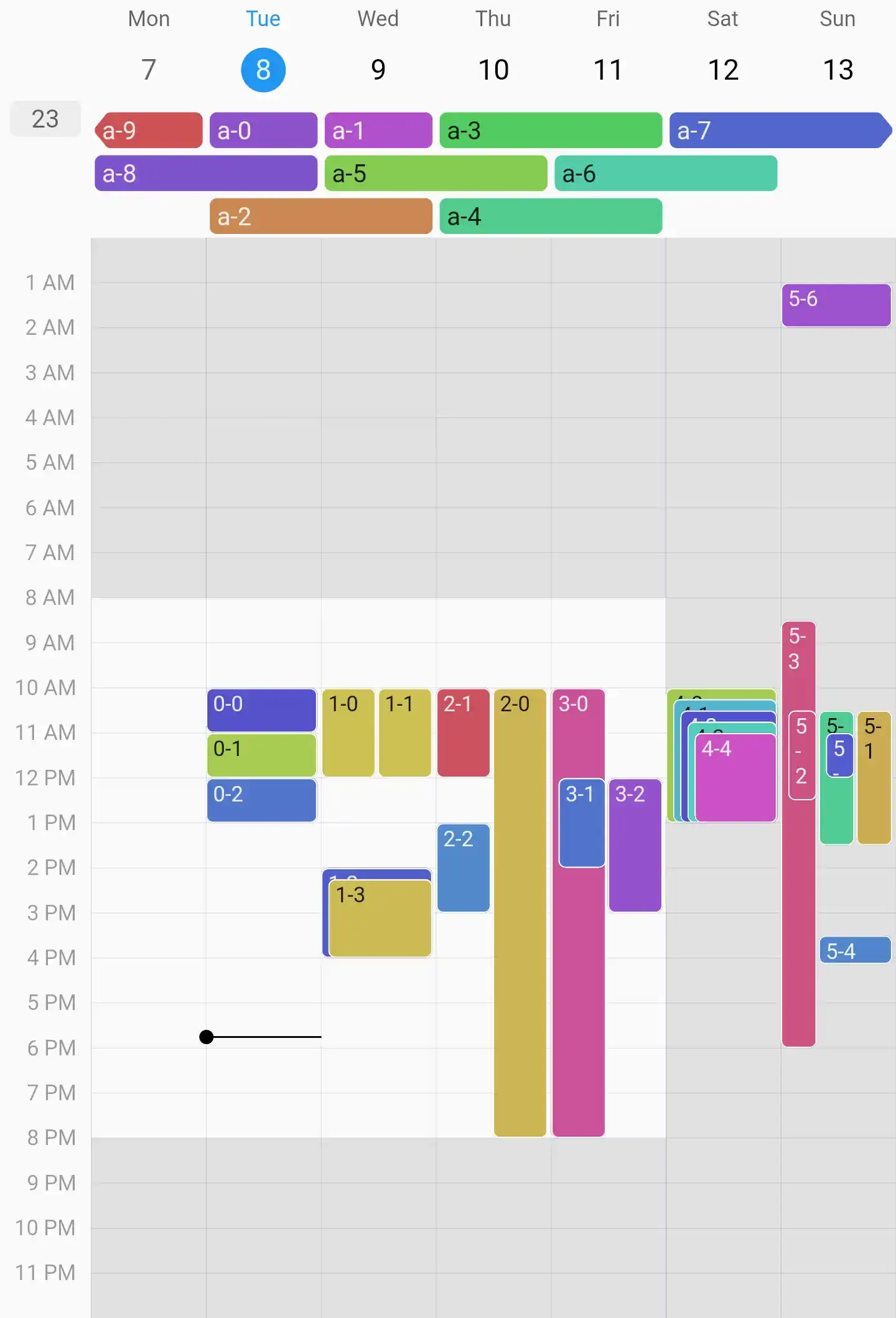
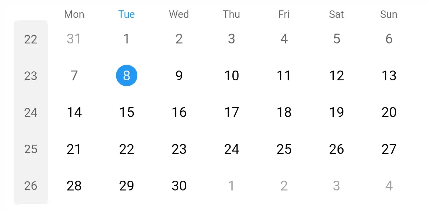
Light Mode
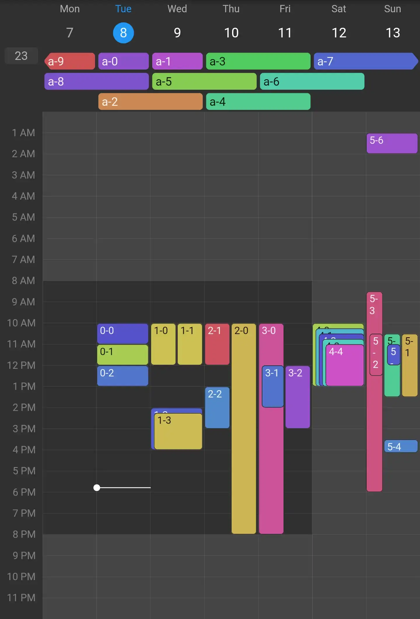
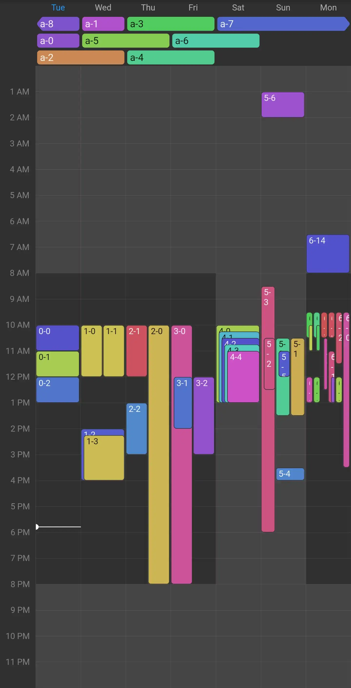
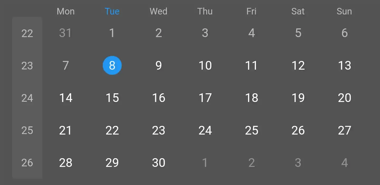
Dark Mode
Getting started
0. General Information
Timetable doesn't care about any time-zone related stuff.
All supplied DateTimes must have isUtc set to true, but the actual time zone is then ignored when displaying events.
Some date/time-related parameters also have special suffixes:
date: A DateTime with a time of zero.
month: A DateTime with a time of zero and a day of one.
Timetable currently offers localizations for Chinese, English, French, German, Hungarian, Italian, Japanese, Portuguese, and Spanish.
Even if you're just supporting English in your app, you have to add Timetable's localization delegate to your MaterialApp/CupertinoApp/WidgetsApp:
Events are provided as instances of Event.
To get you started, there's the subclass BasicEvent, which you can instantiate directly.
If you want to be more specific, you can also implement your own class extending Event.
⚠️ Most of Timetable's classes accept a type-parameter E extends Event.
Please set it to your chosen Event-subclass (e.g., BasicEvent) to avoid runtime exceptions.
In addition, you also need a Widget to display your events.
When using BasicEvent, this can simply be BasicEventWidget.
Similar to a ScrollController or a TabController, a DateController is responsible for interacting with Timetable's widgets and managing their state.
As the name suggests, you can use a DateController to access the currently visible dates, and also animate or jump to different days.
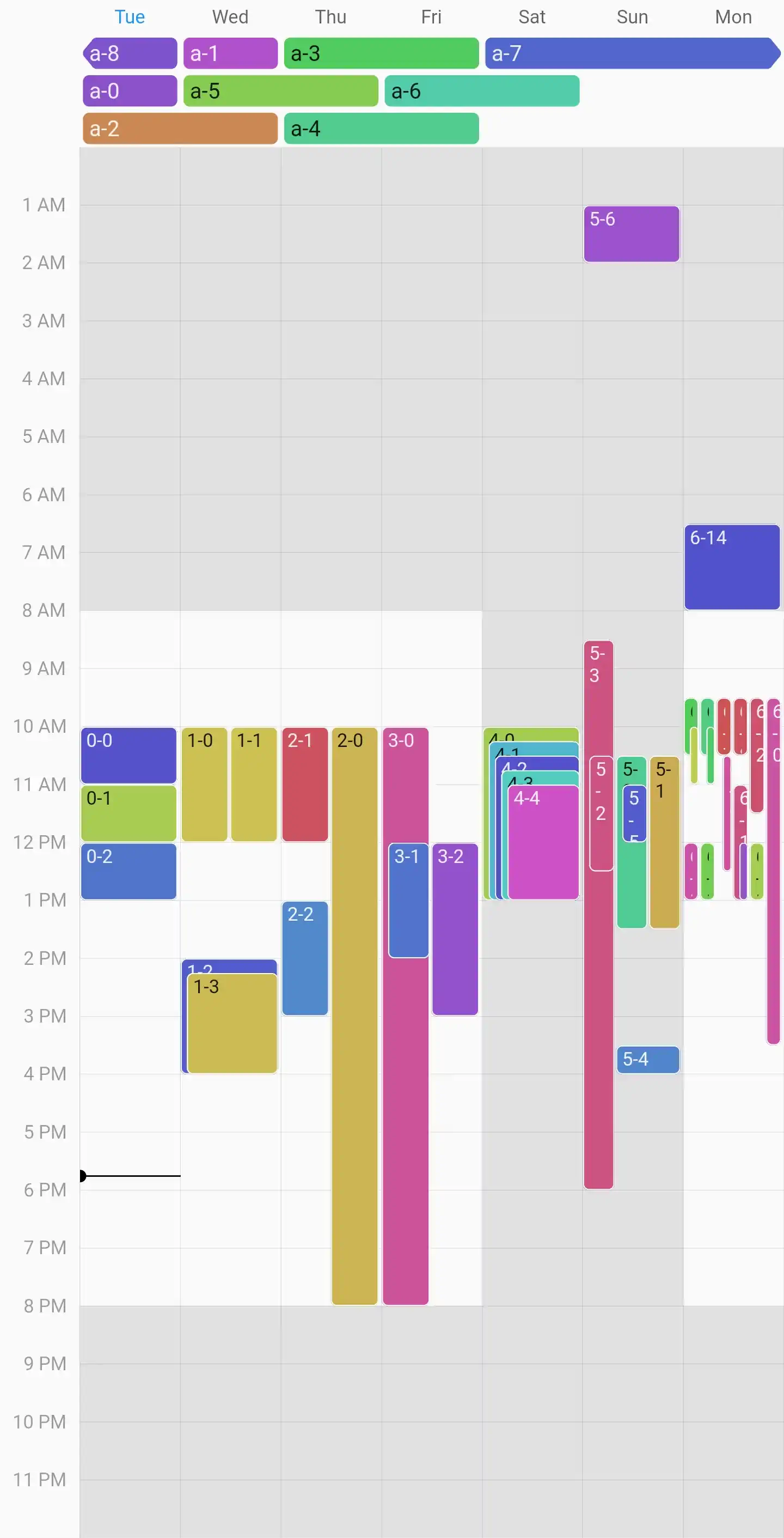
And by supplying a VisibleDateRange, you can also customize how many days are visible at once and whether they, e.g., snap to weeks.
final myDateController = DateController(
  // All parameters are optional and displayed with their default value.
  initialDate: DateTimeTimetable.today(),
  visibleRange: VisibleDateRange.week(startOfWeek: DateTime.monday),
);
VisibleDateRange.days: displays visibleDayCount consecutive days, snapping to every swipeRange days (aligned to alignmentDate) in the range from minDate to maxDate
VisibleDateRange.week: displays and snaps to whole weeks with a customizable startOfWeek in the range from minDate to maxDate
VisibleDateRange.weekAligned: displays visibleDayCount consecutive days while snapping to whole weeks with a customizable firstDay in the range from minDate to maxDate – can be used, e.g., to display a five-day workweek
Similar to the DateController above, a TimeController is also responsible for interacting with Timetable's widgets and managing their state.
More specifically, it controls the visible time range and zoom factor in a MultiDateTimetable or RecurringMultiDateTimetable.
You can also programmatically change those and, e.g., animate out to reveal the full day.
final myTimeController = TimeController(
// All parameters are optional. By default, the whole day is revealed// initially and you can zoom in to view just a single minute.
minDuration: 15.minutes, // The closest you can zoom in.
maxDuration: 23.hours, // The farthest you can zoom out.
initialRange: TimeRange(9.hours, 17.hours),
maxRange: TimeRange(0.hours, 24.hours),
);
This example uses some of time's extension methods on int to create a Duration more concisely.
Timetable already supports light and dark themes out of the box, adapting to the ambient ThemeData.
You can, however, customize the styles of almost all components by providing a custom TimetableThemeData.
TimetableConfig<BasicEvent>(
  theme: TimetableThemeData(
    context,
    startOfWeek: DateTime.monday,
    dateDividersStyle: DateDividersStyle(
      context,
      color: Colors.blue.withOpacity(.3),
      width: 2,
    ),
    dateHeaderStyleProvider: (date) =>
        DateHeaderStyle(context, date, tooltip: 'My custom tooltip'),
    nowIndicatorStyle: NowIndicatorStyle(
      context,
      lineColor: Colors.green,
      shape: TriangleNowIndicatorShape(color: Colors.green),
    ),
    // See the "Theming" section below for more.
  ),
  // Other properties...
)
TimetableThemeData and all component styles provide two constructors each:
The default constructor takes a BuildContext and sometimes a day or month, using information from the ambient theme and locale to generate default values.
You can still override all options via optional, named parameters.
The named raw constructor is usually const and has required parameters for all options.
PartDayDraggableEvent(
// The user started dragging this event.
onDragStart: () {},
// The event was dragged to the given [DateTime].
onDragUpdate: (dateTime) {},
// The user finished dragging the event and landed on the given [DateTime].
onDragEnd: (dateTime) {},
child: MyEventWidget(),
// By default, the child is displayed with a reduced opacity when it's// dragged. But, of course, you can customize this:
childWhileDragging: OptionalChildWhileDragging(),
)
Timetable doesn't automatically show a moving feedback widget at the current pointer position.
Instead, you can customize this and, e.g., snap event starts to multiples of 15 minutes.
Have a look at the included example app where we implemented exactly that by displaying the drag feedback as a time overlay.
final geometryKey = GlobalKey<MultiDateContentGeometry>();
final timetable = MultiDateTimetable(contentGeometryKey: geometryKey);
// Or `MultiDateContent(geometryKey: geometryKey)` if you build your timetable// from the provided, modular widgets.final draggableEvent = PartDayDraggableEvent.forGeometryKeys(
{geometryKey},
// `child`, `childWhileDragging`, and the callbacks are available here as// well.
);
// Alternatively, you can manually convert an offset to a `DateTime:`final dateTime = geometryKey.currentState!.resolveOffset(globalOffset);
You could even offer to drag the event into one of multiple timetables:
Give each timetable its own geometryKey and pass all of them to PartDayDraggableEvent.forGeometryKeys.
In the callbacks, you receive the geometryKey of the timetable that the event is currently being dragged over.
See PartDayDraggableEvent.geometryKeys for the exact behavior.
Time Overlays
In addition to displaying events, MultiDateTimetable and RecurringMultiDateTimetable can display overlays for time ranges on every day.
In the screenshot above, a light gray overlay is displayed on weekdays before 8 a.m. and after 8 p.m., and over the full day for weekends.
Time overlays are provided similarly to events: Just add a timeOverlayProvider to your TimetableConfig<E> (or use a DefaultTimeOverlayProvider directly).
The provider is just a function that receives a date and returns a list of TimeOverlay for that date.
The example above therefore draws a light gray background before 8 a.m. and after 8 p.m. on every day.