パッケージ、リポジトリ、アプリカテゴリを検索

vitality のカバー
パッケージ詳細v3.0.0

vitality

Vitality を使って、Flutter アプリに魅力的なリアルタイムアニメーションを簡単に追加しましょう!

AndroidiOSWebmacOSWindowsLinux
30日間ダウンロード
46
いいね数
70
Pub ポイント
130

パッケージをインストール

flutter pub add vitality

パッケージ概要

公開情報に基づく選定ガイドです。参考としてご利用ください。

Vitality は、開発者がアプリに魅力的なライブアニメーションを簡単に追加できるようにするFlutterパッケージです。動的背景効果、グラデーション、シェーダーをサポートしており、複数のプラットフォームで滑らかで魅力的なビジュアルをもってユーザーインターフェースを強化します。シンプルなコマンドを使用してFlutterプロジェクトにシームレスに統合でき、初心者から経験豊富な開発者まで利用しやすいです。軽量な設計により、アプリのスピードを損なうことなくスムーズなパフォーマンスを実現します。Vitality は、ユーザー操作や時間ベースのトリガーに応じて反応するカスタマイズ可能なリアルタイムアニメーションを通じて、静的なデザインに命を吹き込みます。

用途

  • アプリのオンボーディング画面の強化
  • 動的スプラッシュスクリーンの作成
  • ダッシュボードにアニメーション背景を追加する
  • 視覚的フィードバックによるユーザー参加の向上
  • ゲームやインタラクティブなアプリでUI要素をアニメーション化する

主な機能

  • リアルタイムライブアニメーション
  • グラデーションおよびシェーダーのサポート
  • クロスプラットフォーム互換性
  • pub add を通じたシンプルな統合
  • カスタマイズ可能なアニメーションパラメータ
  • 軽量でパフォーマンスに優れる

適している対象

  • 動的なビジュアルを求めるUIデザイナー
  • インタラクティブなアプリを開発する開発者
  • ユーザー体験に注力するチーム
  • アニメーション背景を必要とするプロジェクト
  • Flutter 初心者が高度なエフェクトを探求する

注意事項

  • 低性能デバイスでのパフォーマンスに影響を与える可能性があります
  • アニメーションの原則について理解が必要
  • 基本的な例以外のドキュメントは限られている
  • 重要なUIコンポーネントではない場合に最適
  • 非常に複雑なアニメーションシーケンスには向かない

元の README

関連するソースリポジトリの README 原文のスナップショットです。最新の内容はリポジトリをご覧ください。

vitality

  • Welcome to Vitality, a dynamic Flutter package designed to effortlessly infuse your app with captivating live animations in the background. With just 10 lines of code, you can breathe life into your UI by adding randomly moving icons, circles, rectangles, images, and more. Let's explore how you can enhance your app's visual appeal with ease.

Examples:

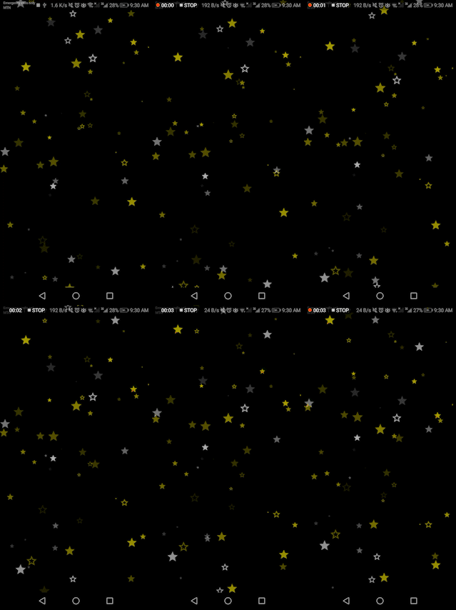
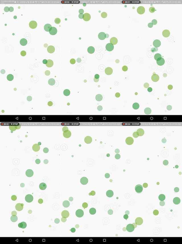
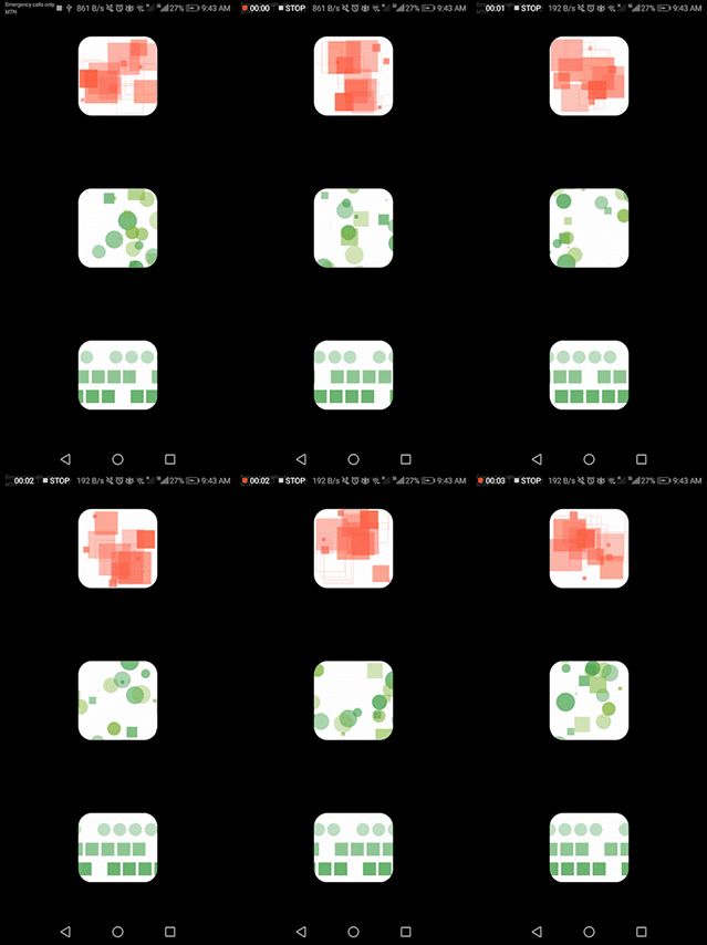
Check out these examples showcasing the versatility of the Vitality library:

  • example 1 example 6

  • example 3 example 4

  • example 5 example 2

Usage:

  • The Vitality package is designed with simplicity in mind, making integration a breeze. Take a look at the example below to quickly grasp how to use it:
Vitality.randomly(
  background: Colors.black,
  maxOpacity: 0.8,
  minOpacity: 0.3,
  itemsCount: 80,
  enableXMovements: false,
  whenOutOfScreenMode: WhenOutOfScreenMode.Teleport,
  maxSpeed: 1.5,
  maxSize: 30,
  minSpeed: 0.5,
  randomItemsColors: [Colors.yellowAccent, Colors.white],
  randomItemsBehaviours: [
    ItemBehaviour(shape: ShapeType.Icon, icon: Icons.star),
    ItemBehaviour(shape: ShapeType.Icon, icon: Icons.star_border),
    ItemBehaviour(shape: ShapeType.StrokeCircle),
  ],
)

Parameters:

  • whenOutOfScreenMode Determines how a shape behaves at the screen edge, values are:

    • none: It does nothing and continues its movements out the screen.
    • Reflect: It bounces and returns in the oppisite direction.
    • Teleport: It continues its movements to the other side of the screen.
  • randomItemsBehaviours Defines the shapes that the library can generate. Choose from the ShapeType enum (FilledCircle, StrokeCicle, FilledSquare, Icon, Image, etc.) :

    • For Icon type, pass an IconData object:

       ItemBehaviour(shape: ShapeType.Icon, icon: Icons.star)
      
    • For Image type, pass a dart:ui Image object:

       ItemBehaviour(shape: ShapeType.Image, image: /*ui.Image() here*/)
      

      Sample code to load an image from assets:

      • Convert the path into dart:ui Image object
      import 'dart:ui' as ui;
      import 'package:flutter/services.dart';
      
      Future<ui.Image> loadImage(String assetPath) async {
        ByteData data = await rootBundle.load(assetPath);
        List<int> bytes = data.buffer.asUint8List();
        ui.Codec codec = await ui.instantiateImageCodec(Uint8List.fromList(bytes));
        ui.FrameInfo fi = await codec.getNextFrame();
        return fi.image;
      }
      
      • Integrate this function into your code :
      FutureBuilder<ui.Image>(
        future: loadImage('assets/images/your_image.png'),
        builder: (context, snapshot) {
          if (snapshot.connectionState == ConnectionState.done) {
            return Vitality.randomly(
              whenOutOfScreenMode: WhenOutOfScreenMode.Reflect,
              randomItemsColors: const [Colors.yellow],
              randomItemsBehaviours: [
                ItemBehaviour(
                  shape: ShapeType.Image,
                  image: snapshot.data!,
                )
              ],
            );
          }
          return const CircularProgressIndicator();
        },
      ),
      

Full Customization:

  • If you desire even more customization in your animations, Vitality provides a custom mode that is straightforward to use. In this mode, you can specify the exact shapes, icons, or images you want to animate using the shapes parameter. Additionally, you can control the background with the background parameter.
Customizing Individual Shapes:
  • To customize individual shapes, you can pass a list of Shape objects as the shapes parameter. Each Shape object includes the following properties:
    • pos: Initial position of the shape [Offset].
    • dx: Speed on the X-axis [double].
    • dy: Speed on the Y-axis [double].
    • size: Size of the shape [double].
    • color: Color of the shape [Color].
    • whenOutOfScreenMode: Behavior of the shape at the screen edge [WhenOutOfScreenMode].
    • behaviour: Structure of the shape [ItemBehaviour].
Vitality.custom(shapes: [
  Shape(
    pos: const Offset(30, 30),
    dx: 0.3,
    dy: 0,
    size: 160,
    color: Colors.yellow,
    whenOutOfScreenMode: WhenOutOfScreenMode.Reflect,
    behaviour: ItemBehaviour(shape: ShapeType.Icon, icon: Icons.sunny),
  ),
]),
Customizing Groups of Shapes:
  • For more dynamic combinations, you can use the ShapesGenerator class. This class allows you to generate shapes with specific properties, resulting in an easier way to seamlessly combine multiple shapes, allowing you to effortlessly craft a beautiful background. The parameters include:

    • minWidth, minHeight: Minimum width and height for random generation [double].
    • maxWidth, maxHeigh: Maximum width and height for random generation [double].
    • enableXMovements, enableYMovements: Whether or not the shapes will move on the X and Y axes [bool].
    • minSize, maxSize: Minimum and maximum size values for shapes [double].
    • minOpacity, maxOpacity: Minimum and maximum opacity values for shapes (values between 0 and 1) [double].
    • minSpeed, maxSpeed: Minimum and maximum speed values for shapes [double].
    • behaviours: List of ItemBehaviour for random selection.
    • colors: List of Color for random selection.
    • whenOutOfScreenMode: What will happen when shapes reach the screen edge [WhenOutOfScreenMode].
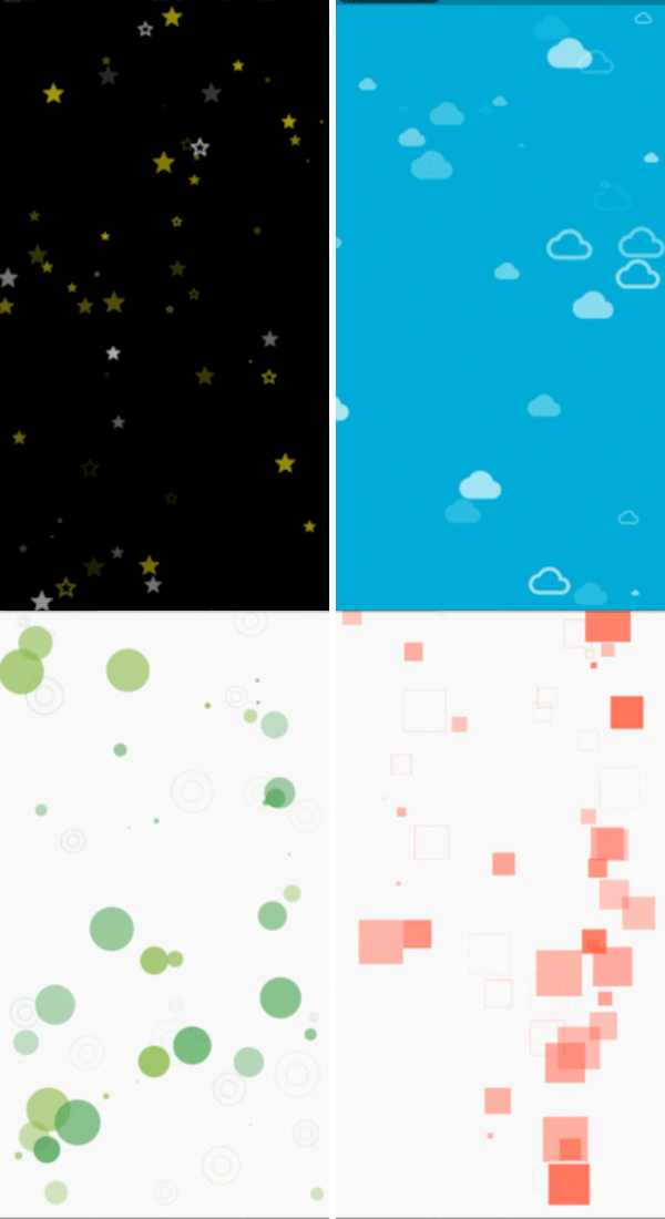
List<Shape> getClouds(Size size) {
  return ShapesGenerator.randomly(
    maxWidth: size.width,
    maxHeight: size.height / 3,
    enableYMovements: false,
    maxSize: 60,
    minSize: 50,
    maxOpacity: 0.9,
    minOpacity: 0.5,
    whenOutOfScreenMode: WhenOutOfScreenMode.Reflect,
    behaviours: [ItemBehaviour(shape: ShapeType.Icon, icon: Icons.cloud)],
    colors: const [Colors.white],
  ).getShapes(10);
}

Now, let's mix different shapes to make something truly magical.

List<Shape> getClouds(Size size) {
  return ShapesGenerator.randomly(
    maxWidth: size.width,
    maxHeight: size.height / 3,
    enableYMovements: false,
    maxSize: 60,
    minSize: 50,
    maxOpacity: 0.9,
    minOpacity: 0.5,
    whenOutOfScreenMode: WhenOutOfScreenMode.Reflect,
    behaviours: [ItemBehaviour(shape: ShapeType.Icon, icon: Icons.cloud)],
    colors: const [Colors.white],
  ).getShapes(10);
}

List<Shape> getGroundShapes(Size size) {
  return ShapesGenerator.randomly(
    minHeight: size.height - 130,
    maxWidth: size.width,
    maxHeight: size.height,
    enableYMovements: false,
    maxSize: 190,
    minSize: 90,
    maxOpacity: 1,
    minOpacity: 0.5,
    whenOutOfScreenMode: WhenOutOfScreenMode.none,
    behaviours: [
      ItemBehaviour(shape: ShapeType.Icon, icon: Icons.circle)
    ],
    colors: const [Colors.green],
    maxSpeed: 0,
    minSpeed: 0
  ).getShapes(40);
}


@override
Widget build(BuildContext context) {
  Size size = MediaQuery.of(context).size;
  return Vitality.custom(background: Colors.blue, shapes: [
    Shape(
      pos: const Offset(30, 30),
      dx: 0.3,
      dy: 0,
      size: 160,
      color: Colors.yellow,
      whenOutOfScreenMode: WhenOutOfScreenMode.Reflect,
      behaviour: ItemBehaviour(shape: ShapeType.Icon, icon: Icons.sunny),
    ),
    ...getClouds(size),
    ...getGroundShapes(size),
  ]);
}

カテゴリー

依存関係

依存関係一覧 1 件

ソースリポジトリ

このパッケージを使用しているプロジェクト

データはまだありません。