Well-Formed is a form field package designed to relieve developers of much
of the form-related coding. This is achieved by providing automatic field
validation and masking, smart trimming, and more.
In addition, this package aims to:
help developers to always keep the users' data well-formed.
improve source code readability by providing form fields with semantic
names; that is, names that convey their purpose at first glance like
EmailField, Ipv4Field, UrlField, and so on.
automate the selection of the keyboard type according to the field's purpose.
In order to be a reliable package, every class is well-documented and fully
unit-tested by a CI/CD pipeline with rigorous quality gates.
Most of the form fields in this package are built on top of the
TextFormField
widget so that they remain fully compatible with the
Form widget. This is
important to avoid erroneous (buggy) behavior, such as when a field does not
reset when its parent Form widget gets reset.
Besides supporting most of the TextFormField properties, additional properties
have been introduced to facilitate the creation of "Smarter" form fields with
stunning capabilities such as:
Required fields: any field can be made required by simply assigning
an error message to the field's blank property.
Validation: this is done automatically according to the field type. You
can use your own error messages by assigning them to properties like blank,
malformed, long, etc. In addition, you can pass extra validation steps to
the validator property.
Field masking: this is also performed automatically. For example, the
CpfField
widget displays the mask ###.###.###-## (each '#' is a digit [0–9]) as the
user enters digits; therefore, if the user enters 12345678900, the displayed
text will be 123.456.789-00.
Stripping: it is the removal of non-digit characters from masked fields.
It is enabled by default; to disable it, simply set the strip property to
false.
Smart trimming: this is when trimming — the removal of leading and
trailing white-space characters — is also applied to the callback functions.
The affected callbacks are: onSaved,onChanged, onFieldSubmitted. To
enable it, simply set the trim property to true.
Automatic keyboard type selection: the most suitable keyboard type is
selected according to the field type. For example, the
EmailField
widget sets the keyboard type to TextInputType.emailAddress, which is
optimized for entering email addresses.
Form Field in Action
The code below demonstrates how to use the
EmailField
widget with the trim property set to true. Thus, the entered value gets
trimmed before any validation takes place. Furthermore, this example also
illustrates some important features:
auto validation.
custom error messages.
length constraint.
…
// the form's mandatory state keyfinal formKey = GlobalKey<FormState>();
…
@overrideWidgetbuild(BuildContext context) {
returnForm(
key: formKey,
child: Column(children: [
EmailField.len(
50, // limits the input length to up to 50 characters
trim: true, // trims the entered email
blank: 'Inform the email', // error message if the field is left blank
malformed: 'Invalid email', // error message if the email is invalid
long: 'The email is too long', // error message for long emails
decoration: constInputDecoration(
labelText: 'Enter an email with up to 50 characters',
),
),
]),
);
}
List of Form Fields
The complete list of form fields along with more detailed information about each
one (constructors, parameters, etc.):
Most form fields in this library are masked fields, so whenever you see a '#'
character in the documentation, you should think of it as a placeholder for a
single digit [0-9].
BrMobileField
BrMobileField
is a masked (##) #####-#### form field for Brazilian mobile numbers.
BrMobileField(
  strip: true, // remove non-digit characters when submitted/saved/changed.
  blank: 'Please enter the mobile number', // the error message if the field is left blank
  malformed: 'Invalid mobile number', // the error message if the number is malformed
  decoration: InputDecoration(labelText: 'Enter a mobile number'),
);
BrPhoneField
BrPhoneField
is a masked (##) ####-#### form field for Brazilian landline telephone
numbers.
BrPhoneField(
  strip: true, // remove non-digit characters when submitted/saved/changed.
  blank: 'Please enter the phone number', // the error message if the field is left blank
  malformed: 'Invalid phone number', // the error message if the number is invalid
  decoration: InputDecoration(labelText: 'Enter a phone number'),
);
CepField
CepField
is a masked #####-### form field for CEP (Código de Endereçamento Postal —
Brazilian Postal Code).
CepField(
  strip: true, // remove non-digit characters when submitted/saved/changed.
  blank: 'Please enter the CEP', // the error message if the field is left blank
  malformed: 'Invalid CEP', // the error message if the CEP is invalid
  decoration: InputDecoration(labelText: 'Enter a CEP'),
);
CnpjField
CnpjField
is a masked ##.###.###/####-## form field for CNPJ (Cadastro Nacional da
Pessoa Jurídica — Brazilian Company's Registered Number).
CnpjField(
  strip: true, // remove non-digit characters when submitted/saved/changed.
  blank: 'Please enter the CNPJ', // the error message if the field is left blank
  malformed: 'Invalid CNPJ', // the error message if the CNPJ is invalid
  decoration: InputDecoration(labelText: 'Enter a CNPJ'),
);
CpfField
CpfField
is a masked ###.###.###-## form field for CPF (Cadastro da Pessoa Física; it
is a kind of social security number).
CnpjField(
  strip: true, // remove non-digit characters when submitted/saved/changed.
  blank: 'Please enter the CPF', // the error message if the field is left blank
  malformed: 'Invalid CPF', // the error message if the CPF is invalid
  decoration: InputDecoration(labelText: 'Enter a CPF'),
);
BasicTextField
is a text form field that can be made required and/or have its input data
trimmed.
BasicTextField.max(
  50, // limits the input length to 50 characters
  trim: true, // trims the entered data when submitted/saved/changed
  blank: 'Please enter your full name', // the error message if the field is left blank
  long: 'The name is too long', // the error message if the input is longer than 50 characters
  decoration: InputDecoration(labelText: 'Enter your full name (up to 50 chars)'),
);
WellFormed
WellFormed
is a convenient and well-formed form widget! It builds a
Form widget within a
structure consisting of a
SafeArea and a
Column.
EmailField
is a form field optimized for emails. You can limit the length of an email by
using the
EmailField.len
constructor.
EmailField.len(
  50, // limits the input length to up to 50 characters
  trim: true, // trims the entered email
  blank: 'Inform the email', // error message if the field is left blank
  malformed: 'Invalid email', // error message if the email is malformed
  long: 'The email is too long', // error message for long emails
  decoration: InputDecoration(
    labelText: 'Enter an email with up to 50 characters',
  ),
),
Numeric
Numeric:
form fields related to numbers or digits. A few examples of numeric entries are:
a three-digit code
a six-digit password
a hexadecimal value
the Minimum Order Quantity of a product
DigitField
DigitField
is a digit-only form field. It is the ideal form field for verification codes,
PIN numbers, etc. Examples of valid entries are: 0123, 1111, 090909.
DigitField(
blank: 'Please enter the verification code', // the error message if the field is left blank
malformed:'non-digit character(s)'// the error message for malformed data.
decoration: InputDecoration(labelText: 'Verification code'),
);
You can constrain the range of allowed input values in various ways through the
following named constructors:
HexField
is a hexadecimal form field. It accepts the digits 0123456789 and the letters
AaBbCcDdEeFf. Example of valid entries: 123, 45fe, CafeBabe.
HexField(
blank: 'Please enter the device hex number', // the error message if the field is left blank
malformed:'non-hex character(s)'// the error message for malformed data.
decoration: InputDecoration(labelText: 'Enter a device hex number'),
);
You can constrain the range of allowed input values in various ways through the
following named constructors:
IntField
is the form field for integers. It is the ideal form field for entering the
quantity of an item, the number of children, age, etc.
IntField(
blank: 'Please enter the number of items to purchase', // the error message if the field is left blank
malformed:'non-digit character(s)'// the error message for malformed data.
decoration: InputDecoration(labelText: 'Number of items'),
);
You can constrain the range of allowed input values in various ways through the
following named constructors:
NumField
is the floating-point form field. It is the ideal form field for displaying the
total price of a shopping cart, getting an auction bid, etc.
NumField(
blank: 'Please enter your bid amount', // the error message if the field is left blank
malformed:'non-numeric character(s)'// the error message for malformed data.
decoration: InputDecoration(labelText: 'Enter your bid'),
);
You can constrain the range of allowed input values in various ways through the
following named constructors:
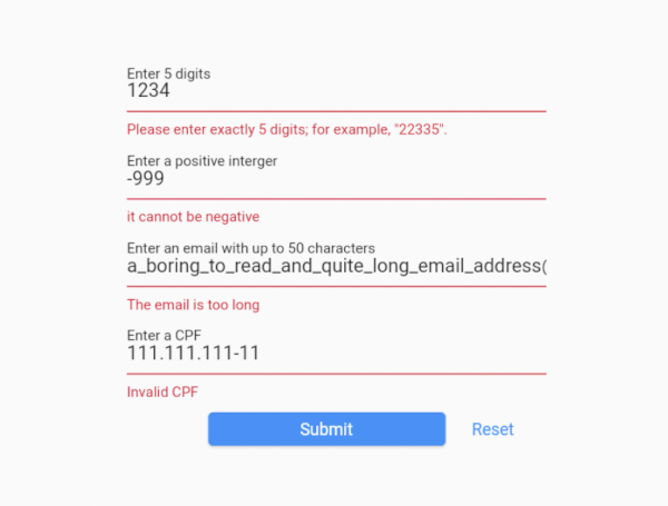
The demo application provides a fully working example, focused on demonstrating
exactly five widgets in action — WellFormed, DigitField, IntField,
EmailField, and CpfField. You can take the code in this demo and experiment
with it.
To run the demo application:
git clone https://github.com/dartoos-dev/well_formed.git
cd well_formed/example/
flutter run -d chrome
This should launch the demo application on Chrome in debug mode.
Blank Field Error Messages
Invalid Inputs
Fields With Proper Values
Left Out Properties
Regarding compatibility with the
TextFormField
class, some properties were left out for one of two reasons:
the property has been deprecated by the Flutter development team. This is the
case of the autovalidate and maxLengthEnforced properties.
the property has been considered too superfluous — it has little use in
the context of form fields. This is the case for the following properties: