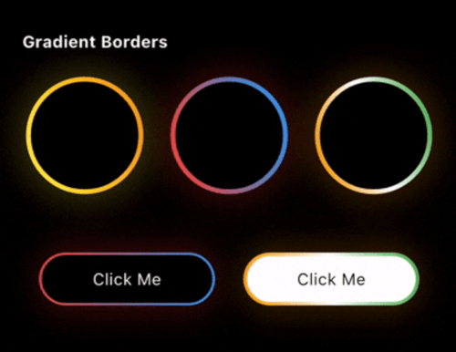
Zo Animated Border is a powerful Flutter package that brings modern UI to life with beautifully animated borders . Whether you're building a login screen, a button, or a decorative container, this package lets you wrap any widget with stylish, animated border effects.
Getting started
First, add zo_animated_border as a dependency in your pubspec.yaml file
dependencies:
  flutter:
    sdk: flutter
  zo_animated_border : ^[version]
Import the package
import 'package:zo_animated_border/zo_animated_border.dart' ;
Usage
For Gradient border
ZoAnimatedGradientBorder (
borderRadius: 100 ,
animationCurve: Curves .linear,
borderThickness: 4 ,
gradientColor: [
Colors .yellow,
Colors .orange,
],
animationDuration: const Duration (seconds: 4 ),
child: Container (
width: 100 ,
height: 100 ,
alignment: Alignment .center,
decoration: BoxDecoration (
shape: BoxShape .circle,
),
child: Text (
"Circle" ,
style: TextStyle (color: Colors .white),
),
),
);
For Fire Border
ZoFireBorder (
duration: const Duration (seconds: 3 ),
borderWidth: 4 ,
snakeLength: 0.8 ,
borderRadius: BorderRadius .circular (24 ),
gradient: const LinearGradient (
colors: [
Colors .orange,
Colors .red,
Colors .green,
],
),
particleColors: const [
Colors .orange,
Colors .orangeAccent,
Colors .white,
],
child: Container (
width: 200 ,
height: 200 ,
alignment: Alignment .center,
decoration: BoxDecoration (
color: Colors .black,
borderRadius: BorderRadius .circular (24 ),
),
child: const Icon (
Icons .local_fire_department,
color: Colors .white,
size: 60 ,
),
),
),
For Psycho Border
ZoPsychoBorder (
ringCount: 4 ,
maxSpread: 10.0 ,
borderRadius: BorderRadius .circular (75 ),
colors: const [
Color (0xFFFF2A85 ),
Color (0xFFFF992A ),
Color (0xFF00E5FF ),
Color (0xFF6B2AFF ),
],
duration: const Duration (seconds: 3 ),
child: Container (
width: 150 ,
height: 150 ,
alignment: Alignment .center,
decoration: BoxDecoration (
color: Colors .transparent,
borderRadius: BorderRadius .circular (20 ),
),
child: const Text (
'Z' ,
style: TextStyle (
color: Colors .white,
fontSize: 50 ,
fontWeight: FontWeight .bold,
),
),
),
),
For Sequential Glow Border
ZoSequentialGlowBorder (
borderRadius: BorderRadius .circular (20 ),
borderWidth: 4.0 ,
glowRadius: 10.0 ,
duration: const Duration (seconds: 4 ),
gradientPalettes: const [
[Color (0xFF6B2AFF ), Color (0xFF00E5FF )],
[Color (0xFFFF2A85 ), Color (0xFFFF992A )],
[Color (0xFF00FF87 ), Color (0xFF60EFFF )],
],
child: Container (
width: 250 ,
height: 120 ,
alignment: Alignment .center,
child: const Text (
"Sequential Glow Border" ,
style: TextStyle (
color: Colors .white,
fontSize: 18 ,
),
),
),
)
For MultiColor Border
ZoMultiColorBorder (
colors: [
Colors .orange,
Colors .white,
Colors .green,
Colors .indigo,
Colors .pink,
],
strokeWidth: 3 ,
borderRadius: 75 ,
child: Padding (
padding: const EdgeInsets .all (3.0 ),
child: Container (
width: 150 ,
height: 150 ,
alignment: Alignment .center,
decoration: BoxDecoration (
color: Colors .blue,
shape: BoxShape .circle,
),
child: Text (
"MultiColor Border" ,
style: TextStyle (color: Colors .white),
textAlign: TextAlign .center,
),
),
),
)
For Text Border
ZoTextBorder (
text: "The Zerone" ,
borderRadius: BorderRadius .circular (100 ),
padding: 12 ,
duration: const Duration (seconds: 12 ),
textStyle: const TextStyle (
color: Colors .greenAccent,
fontSize: 12 ,
),
child: Container (
width: 150 ,
height: 150 ,
decoration: BoxDecoration (
borderRadius: BorderRadius .circular (8 ),
),
child: const Icon (
Icons .shield,
color: Colors .greenAccent,
size: 50 ,
),
),
)
For Segmented Border
ZoSegmentBorder (
borderRadius: 20 ,
segmentLength: 0.2 ,
glowOpacity: 1.0 ,
glowRadius: 10 ,
colors: const [
Colors .cyanAccent,
Colors .cyanAccent,
],
child: Container (
width: 250 ,
height: 120 ,
alignment: Alignment .center,
child: const Text (
"Zo Segment Border" ,
style: TextStyle (
color: Colors .white,
fontSize: 18 ,
),
),
),
)
For Scribble Border
ZoScribbleBorder (
borderColor: Colors .white,
padding: const EdgeInsets .all (50 ),
borderRadius: 100 ,
child: ClipOval (
child: Image .asset (
'assets/pnglogo.png' ,
width: 110 ,
height: 110 ,
fit: BoxFit .cover,
errorBuilder: (context, error, stackTrace) =>
const Icon (
Icons .face,
size: 80 ,
color: Colors .orange,
),
),
),
),
For Ripple Border
ZoRippleEffect (
rippleColor: Colors .cyanAccent,
minCircleSize: 120 ,
numberOfCircles: 4 ,
animationDuration: const Duration (seconds: 4 ),
child: const CircleAvatar (
radius: 40 ,
backgroundColor: Colors .cyanAccent,
child: Icon (
Icons .home,
color: Colors .white,
size: 30 ,
),
),
);
For Color Changing Border
ZoColorChangingBorder (
borderRadius: 0 ,
segmentLength: 0.2 ,
colors: [
Colors .orange,
Colors .white,
Colors .green,
],
child: Padding (
padding: const EdgeInsets .all (3.0 ),
child: Container (
width: 150 ,
height: 150 ,
alignment: Alignment .center,
decoration: const BoxDecoration (
color: Colors .blue,
),
child: const Text (
"Color Changing Border" ,
textAlign: TextAlign .center,
style: TextStyle (color: Colors .white),
),
),
),
);
For Signal Border
ZoSignalBorder (
maxRadius: 120 ,
ringColors: [
Colors .yellow,
Colors .orange,
Colors .red,
Colors .purple,
Colors .blue,
],
child: Container (
alignment: Alignment .center,
width: 130 ,
height: 130 ,
decoration: BoxDecoration (
color: Colors .white,
shape: BoxShape .circle,
),
child: const Text ("Signal Border" ),
),
);
For Dual border
ZoDualBorder (
glowOpacity: 0.4 ,
firstBorderColor: Colors .yellow,
secondBorderColor: Colors .orange,
trackBorderColor: Colors .transparent,
borderWidth: 8 ,
borderRadius: BorderRadius .circular (10 ),
child: Container (
width: 150 ,
height: 150 ,
alignment: Alignment .center,
decoration: BoxDecoration (
color: Colors .white,
borderRadius: BorderRadius .circular (10 ),
),
child: Text (
"Dual Border" ,
style: TextStyle (
color: Colors .black,
),
),
),
);
For Dotted border
ZoDottedBorder (
child: Container (
height: 100 ,
width: 100 ,
color: Colors .red,
alignment: Alignment .center,
child: Text (
"MonoChrome" ,
style: TextStyle (fontSize: 14 , color: Colors .white),
),
),
animate: true ,
borderRadius: 10 ,
dashLength: 10 ,
gapLength: 5 ,
strokeWidth: 3 ,
color: Colors .blue,
borderStyle: BorderStyleType .monochrome,
);
For Breathing border
ZoBreathingBorder (
borderWidth: 3.0 ,
borderRadius: BorderRadius .circular (75 ),
colors: [
Colors .blue,
Colors .purple,
Colors .red,
Colors .orange,
],
animationDuration: const Duration (seconds: 4 ),
child: Container (
width: 150 ,
height: 150 ,
decoration: BoxDecoration (
color: Colors .white,
borderRadius: BorderRadius .circular (75 ),
),
alignment: Alignment .center,
child: const Text (
'Breathing Border' ,
textAlign: TextAlign .center,
style: TextStyle (
fontSize: 16 ,
fontWeight: FontWeight .bold,
),
),
),
);
For Snake Border
ZoSnakeBorder (
glowOpacity: 0 ,
snakeHeadColor: Colors .red,
snakeTailColor: Colors .blue,
snakeTrackColor: Colors .blueGrey,
borderWidth: 5 ,
borderRadius: BorderRadius .circular (10 ),
child: Container (
width: 150 ,
height: 45 ,
alignment: Alignment .center,
decoration: BoxDecoration (
color: Colors .white,
borderRadius: BorderRadius .circular (10 ),
),
child: Text (
"Snake Border" ,
style: TextStyle (color: Colors .black),
),
),
);
For GlowEdge Border
ZoGlowingEdgeBorder (
gradientColors: [
Colors .orange,
Colors .white,
Colors .green,
],
child: Padding (
padding: const EdgeInsets .all (3.0 ),
child: Container (
width: 150 ,
height: 150 ,
alignment: Alignment .center,
decoration: const BoxDecoration (
color: Colors .blue,
),
child: const Text (
"Glow Edge Border" ,
textAlign: TextAlign .center,
style: TextStyle (color: Colors .white),
),
),
),
);
For Pulsating border
ZoPulsatingBorder (
type: ZoPulsatingBorderType .pulse,
borderRadius: BorderRadius .circular (100 ),
pulseColor: Colors .blue,
child: Container (
alignment: Alignment .center,
width: 100 ,
height: 100 ,
decoration: BoxDecoration (
color: Colors .red,
borderRadius: BorderRadius .circular (50 ),
),
child: Text (
"Radar Pulse" ,
style: TextStyle (color: Colors .white),
),
),
);
For MonoChrome border
ZoMonoCromeBorder (
trackBorderColor: Colors .white,
cornerRadius: 50.0 ,
borderStyle: ZoMonoCromeBorderStyle .mirror,
borderWidth: 5.5 ,
child: Container (
width: 100 ,
height: 100 ,
alignment: Alignment .center,
decoration: BoxDecoration (
color: Colors .red,
shape: BoxShape .circle,
),
child: Text (
"Mirror" ,
style: TextStyle (color: Colors .white),
),
),
);
Feel free to post a feature requests or report a bug issues .
My Other packages
zo_micro_interactions : A curated set of high-quality Flutter micro-interactions designed for modern, polished apps.zo_screenshot : The zo_screenshot plugin helps restrict screenshots and screen recording in Flutter apps, enhancing security and privacy by preventing unauthorized screen captures.zo_collection_animation : A lightweight Flutter package to create smooth collect animations for coins cartsconnectivity_watcher : A Flutter package to monitor internet connectivity with subsecond response times, even on mobile networks.zo_app_blocker : A Flutter plugin to block specific applications on Android.ultimate_extension : Enhances Dart collections and objects with utilities for advanced data manipulation and simpler coding.theme_manager_plus : Allows customization of your app's theme with your own theme class, eliminating the need for traditionaldate_util_plus : A powerful Dart API designed to augment and simplify date and time handling in your Dart projects.pick_color : A Flutter package that allows you to extract colors and hex codes from images with a simple touch.