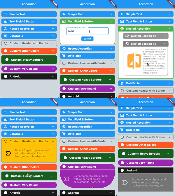
아코디언 패키지는 플러터 애플리케이션용으로 시각적으로 매력적이고 부드럽게 애니메이션되는 아코디언 목록을 제공합니다. 각 목록 항목은 단일 탭으로 확장 또는 축소되는 접을 수 있는 헤더를 갖추고 있어 콘텐츠가 많은 인터페이스에서 사용자 상호작용을 향상시킵니다. 성능과 맞춤 설정을 고려하여 제작되었으며 모바일, 웹, 데스크톱 등 다양한 플랫폼을 지원합니다. 자주 묻는 질문(FAQ), 설정 메뉴 또는 계층 구조의 콘텐츠 정리를 필요로 하는 모든 상황에 적합합니다.
사용 사례
자주 묻는 질문 섹션
설정 패널
콘텐츠 공개
접을 수 있는 탐색
동적 폼 섹션
주요 기능
부드러운 전개/접기 애니메이션
사용자 정의 가능한 헤더 및 콘텐츠
크로스 플랫폼 지원
간단한 API 통합
반응형 디자인
적합한 대상
인터랙티브 리스트를 개발하는 개발자
접을 수 있는 콘텐츠가 필요한 앱
사용자 인터페이스 중심의 Flutter 프로젝트
모바일 및 웹 애플리케이션
접근성 있는 인터페이스 디자인
고려 사항
복잡한 레이아웃을 위해 사용자 정의 스타일링이 필요할 수 있습니다
대규모 데이터 세트의 성능 영향
제한된 내장 접근성 기능
중첩된 액코디언에 최적화되지 않음
업데이트를 위해 외부 저장소에 의존합니다
원본 README
연결된 소스 저장소의 README 원문 스냅샷입니다. 최신 내용은 저장소에서 확인하세요.
accordion
An expandable Flutter widget list where each item can be expanded or collapsed simply by clicking on the header.
Simple to use accordion widget with lots of preset properties. Use the maxOpenSections property to automatically close sections when opening a new section. This is especially helpful if you always want your list to look clean -- just set this parameter to 1 and whenever you open a new section the previous one closes. scrollIntoView paramter can be set to fast, slow, or none and makes sure that just opened items will be fully visible. This parameter will only take affect if there are enough items in the list so scrolling is feasible.
Many parameters can be set globally on Accordion as well as individually on each AccordionSection (see list below).
The header consists of the left and right icons (right icon is preset to arrow down). Both can be set globally and individually.
As of version 2.1: the headerText, headerTextStyle & headerTextAlign parameters have been removed and should be replaced with the header widget parameter.
The content area basically provides the container in which you drop whatever you want to display when AccordionSection opens. Background and borders can be set globally or individually per section.
Side note: it is possible to nest an Accordion within an AccordionSection
see the example app (in the "Accordion within Accordion" section) for further info
Common mistakes
Please avoid wrapping the entire Accordion widget in your state management system since this might cause the opening animation to play each time your state changes.
Instead, only wrap the content of an AccordionSection with your state management that actually requires updating. Better yet, extract the entire content part of an
AccordionSection into its own widget and handle your state management needs there locally.
Enjoy!
The included example
Common Properties
The following properties can be set globally for all sections in Accordion or for each section individually in AccordionSection:
Property
Description
Type
Required
Default value
headerBackgroundColor
background color of the section header
Color
no
primaryColor (of theme)
headerBackgroundColorOpened
background color of the section when header is open
Color
no
headerBackgroundColor
headerBorderColor
border color of header when section is closed
Color
no
primaryColor (of theme)
headerBorderColorOpened
border color of header when section is open
Color
no
primaryColor (of theme)
headerBorderWidth
width of header border. Set to 0 if no header border is desired.
background color of the content part of the section
Color
no
Colors.white
contentBorderColor
border color of the content part of the section
Color
no
Colors.white
contentBorderWidth
border width of the content part of the section
double
no
0
contentBorderRadius
border radius of the content part of the section
double
no
20
contentHorizontalPadding
horizontal padding within the content part of the section
double
no
10
contentVerticalPadding
vertical padding within the content part of the section
double
no
10
paddingBetweenClosedSections
padding below closed sections
double
no
3
paddingBetweenOpenSections
padding below an open section to visually make it stand out more
double
no
10
scrollIntoViewOfItems
if a section should automatically be scrolled to the center of the list when opened
ScrollIntoViewOfItems
no
ScrollIntoViewOfItems.fast
initialOpeningSequenceDelay
the delay in milliseconds (when the entire accordion loads) before the individual sections open one after another. Helpful if you go to a new page in your app and then (after the delay) have a nice opening sequence.
int
no
0
sectionOpeningHapticFeedback
if to play a haptic feedback when opening a section
SectionHapticFeedback
no
SectionHapticFeedback.none
sectionClosingHapticFeedback
if to play a haptic feedback when closing a section
SectionHapticFeedback
no
SectionHapticFeedback.none
Properties for Accordion
Property
Description
Type
Required
Default value
maxOpenSections
maximum number of open sections at any given time. Opening a new section will close the "oldest" open section
int
no
1
children
the list of AccordionSection
List
YES
[]
flipLeftIconIfOpen
if the left icon in the header should be flipped when section is open
bool
no
false
flipRightIconIfOpen
if the right icon in the header should be flipped when section is open
bool
no
true
paddingListTop
padding of the Accordion list at the top
double
no
20.0
paddingListBottom
padding of the Accordion list at the bottom
double
no
40.0
paddingListHorizontal
horizontal padding of the Accordion list
double
no
10.0
disableScrolling
disables internal scrolling of the Accordion widget. Useful when the Accordion is used within a ListView or something else already scrollable
bool
no
false
openAndCloseAnimation
controls if sections should animate when opened or closed
bool
no
true
scaleWhenAnimating
controls if sections use a scale effectwhen opened or closed
bool
no
true
Properties for AccordionSection
Property
Description
Type
Required
Default value
isOpen
if this section should initially be displayed open or not
bool
no
false
header
the header widget located between leftIcon & rightIcon
Widget
no
content
the widget you want to display as the visible content when the section is open