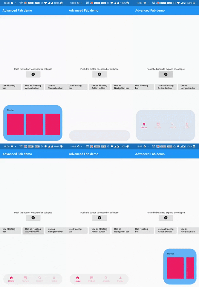
adv_fab은 표준 플로팅 액션 버튼을 확장하여 숨겨진 위젯을 표시할 수 있도록 하여 동적 상호작용을 제공하는 Flutter 패키지입니다. 사용자 정의 가능한 NavigationBar 또는 플로팅 스페이스 바로 사용할 수 있으며, 직관적인 탐색과 시각적 계층 구조가 필요한 현대적인 UI 디자인에 적합합니다. 이 패키지는 가볍고 최소한의 설정으로 기존 Flutter 프로젝트에 원활하게 통합됩니다. 확장 기능은 모바일 애플리케이션에서 접근성과 사용자 참여도를 향상시킵니다.
사용 사례
확장 가능한 작업이 있는 하단 탐색
대시보드에서 개선된 플로팅 액션 버튼
인터랙티브 앱 도구 모음
사용자 정의 가능한 탐색 막대
스크롤 가능한 레이아웃에서 부유하는 공간 바
주요 기능
부드러운 애니메이션을 가진 확장 가능한 FAB
여러 자식 위젯을 지원합니다
NavigationBar 또는 floatingSpaceBar로 재사용 가능
경량이며 간편한 통합
사용자 정의 가능한 전개 방향 및 타이밍
적합한 대상
인터랙티브한 Flutter 앱을 개발하는 개발자
현대적인 UI 패턴을 찾는 디자이너
접근 가능한 플로팅 컨트롤이 필요한 앱
복잡한 하단 탐색이 필요한 프로젝트
동적 레이아웃을 갖춘 UI 중심 애플리케이션
고려 사항
세심한 레이아웃 관리가 필요할 수 있습니다
애니메이션 성능은 장치에 따라 달라집니다
제한된 플랫폼별 사용자 지정
간단한 정적 FAB에 적합하지 않습니다
명확한 시각적 계층 구조와 함께 사용하는 것이 가장 좋습니다
원본 README
연결된 소스 저장소의 README 원문 스냅샷입니다. 최신 내용은 저장소에서 확인하세요.
AdvFAB (More Than Just A Floating Action Button)
AdvFAB is An Advanced floating action button that expands itself to reveal its hidden widget. It can also be used as an AnimatedbottomNavigationbar or just an AnimatedFloatingActionBar with the same expansion capabilities.
Have a look at the gif below
Image 1
Image 2
NOTE: This package has lots of functionalities and parameters to customize your AdvFab please refer to the example floder and the full documentation in order to take advantage of this package to the fullest. Use this quick guide to setup your work environment and understand the basics :)
Create an Advanced FLoating Action Button (AdvFab)
First import the package inside your project
import'package:adv_fab/adv_fab.dart';
In your project, create a AdvFabController
AdvFabController controller;
//now inside the inti function@overridevoidinitState() {
super.initState();
controller = AdvFabController();
}
This controller will allow you to expand, collapse and more importantly "setExpandedWidgetConfiguration". It will also give you the state of the AdvFab( true or false depending on whether the widget is expanded or not)
IMPORTANT : The "setExpandedWidgetConfiguration" shall be called at least once in the life time of your widget, to configure what has to be displayed once the AdvFab is expanded else you will get an error.
Create an AdvFab widget inside the floatingActionButton of the scaffold
Scaffold(
	floatingActionButton: AdvFab(
		//controller shall not be null (actually it can but still....)
		controller: controller
	),
)
Use flags
AdvFab allows you to create a navigation bar, an empty bar (where you can add a ny widget you want) or just a normal floating action button. To enable these functionalities, here are the flags to toggle
useAsFloatingSpaceBar: false (by default )
useAsFloatingActionButton: true ( by default )
useAsNavigationBar: false (by default )
IMPORTANT : There can be only one value as "true", if you set more than one value as true, then a priority rule will be applied and will set the flag with higher priority to true and you will get a configuration error warning
Important Note
In order to maintain the screen adaptability of this widget (to make it look even on all screens), I opted for a formula based on percentages of the screen.
This means that every width and height shall be given by you in the range [0 - 100],100 inclusive.
Example:
To help you debug your code easily, I included a log facility, You just have to set the ShowLogs property to true and you will get all of them.
When you use AdvFab as a floating Action Button, the default Icon displayed will be a warning icon in red, just use the floatingActionButtonIconColor and floatingActionButtonIcon properties to change them; The floating action button also has its idenpendent ontap property called onFloatingActionButtonTapped
To use the AnimatedBottomNavigationBar, the body of the scaffold shall be a AdvBottomBarBody
Conclusion
Thank you for using my package, if you have any question feel free to contact me on instagram or directly on my mail emile@emilecode.com