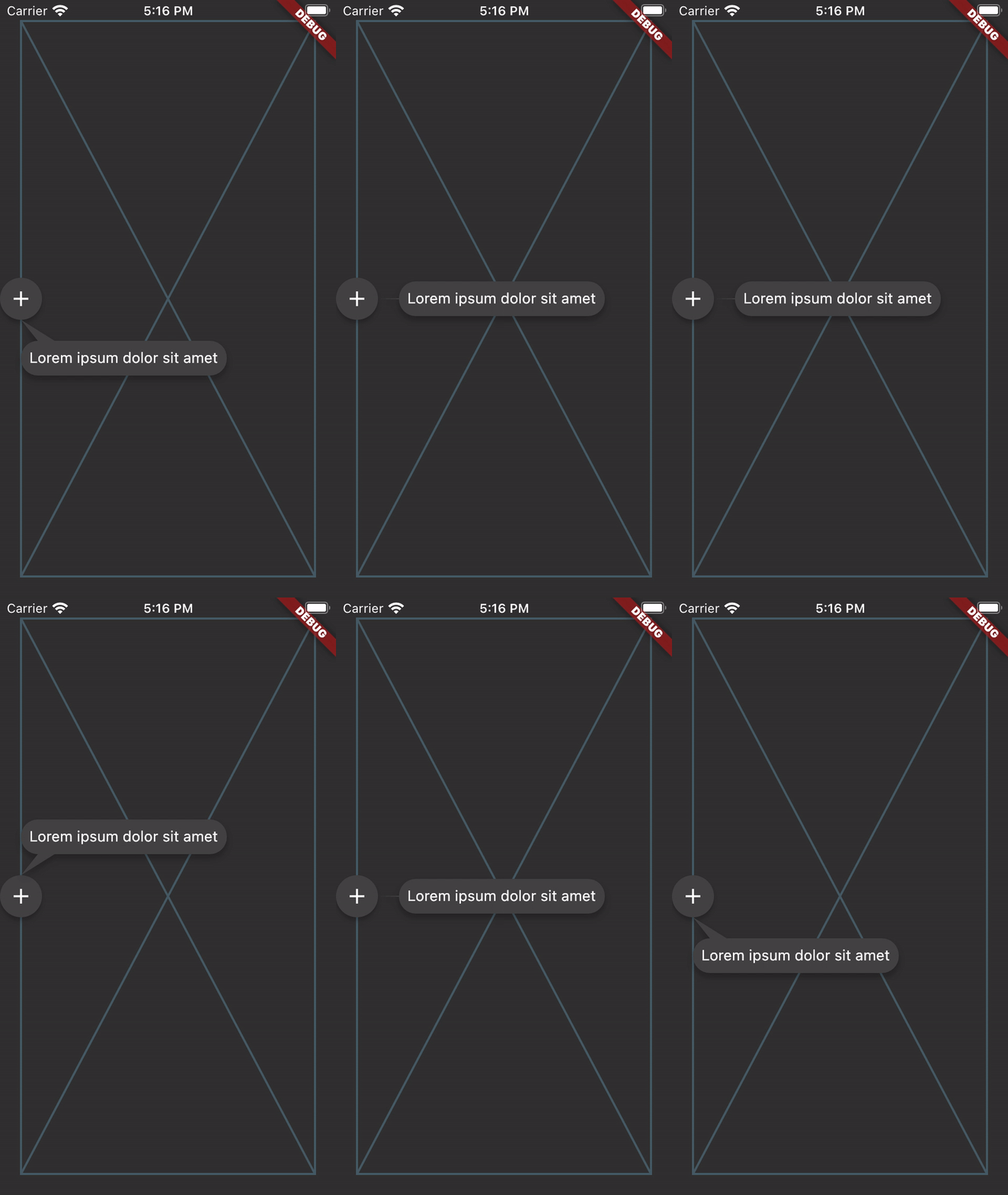
정렬된 툴팁은 사용자 정의 콘텐츠를 표시할 수 있는 유연하고 다중 방향의 툴팁 컴포넌트를 제공하는 플러터 패키지입니다. 타겟 위젯에 대해 지능적으로 위치를 조정하여 다양한 화면 방향과 레이아웃에서 최적의 가시성을 보장합니다. 사용 가능한 공간에 따라 동적으로 적응하여 오버플로우를 방지하고 가독성을 유지합니다. 깔끔하고 접근성 있는 UI를 위해 설계되었으며 모바일, 웹, 데스크톱 등 다양한 플랫폼을 지원합니다. 인터페이스를 혼잡하게 하지 않고 맥락 정보를 제공함으로써 사용자 경험을 향상시키는 데 이상적입니다.
사용 사례
폼에서 도움말 텍스트 표시
호버 또는 탭 시 추가 세부 정보 표시
맥락적 힌트를 통한 접근성 향상
다이어그램에서 상호작용 피드백 제공
복잡한 인터페이스를 통해 사용자 안내
주요 기능
다중 방향 위치 지정
사용자 지정 가능한 콘텐츠 표시
자동 오버플로 처리
크로스 플랫폼 호환성
터치 및 호버 상호작용을 지원합니다
사용자 정의 가능한 정렬 및 오프셋
적합한 대상
접근성 있는 UI를 구축하는 개발자
동적 툴팁이 필요한 디자이너
컨텍스트 기반 도움 시스템이 필요한 앱
인터랙티브 대시보드 및 데이터 시각화
교육용 또는 온보딩 애플리케이션
고려 사항
중복을 방지하기 위해 신중한 간격 조정이 필요할 수 있습니다
많은 툴팁으로 인한 성능 영향
모든 대상 플랫폼에서 테스트 필요
사용자 정의 스타일링을 위해서는 추가 코드가 필요합니다
제한된 내장 애니메이션 옵션
원본 README
연결된 소스 저장소의 README 원문 스냅샷입니다. 최신 내용은 저장소에서 확인하세요.
aligned_tooltip
aligned_tooltip gives you more flexibility over the Flutter standard Tooltip by allowing you to set arbitrary content. It also expands on their single axis layout algorithm to fit both vertically and horizontally. The tooltip can be positioned along any axis and will fall back to the opposite side if overflowed.
Breaking
Right now this package is a direct fork of this package: https://pub.dev/packages/just_the_tooltip. We will update this package to support more features in the future.
AlignedTooltip needs two arguments. The direct child widget and the content (of the tooltip). The child widget will be wrapped with a GestureDetector or MouseRegion that is responsible for showing and hiding the content. Further handling of the tooltip state can be managed explicitly through a controller:
If you'd like to create a controller to manage the state of the tooltip, you can do so by defining an instance of a AlignedController and pass it through to constructor.
The controller itself is a ValueNotifier that carries the open/close state of the tooltip. To listen to these changes, add a listener to your controller.
@overridevoidinitState() {
// Programatically display tooltip after two secondsFuture.delayed(constDuration(seconds: 2), () {
tooltipController.showTooltip(immediately: false);
});
tooltipController.addListener(() {
// Prints the enum value of [TooltipStatus.isShowing] or [TooltipStatus.isHiding]print('controller: ${tooltipController.value}');
});
}
If you'd like to simply react to open or close states, you can pass through onDismiss or onShow callbacks to the default constructor.
If you'd like to keep the user from dismissing the tooltip by clicking on the barrier, you can change barrierDismissible to true which means pressing on the scrim area will not immediately hide the tooltip.
Customization
Modal
You can further define how a Tooltip will show by defining the isModal property. A modal will only open through clicking on the child and close by clicking on the background area (referred to as the skrim here). A non-modal (the default) is a more traditional tooltip opens and closes on hovers.
Note, phone emulators do not implement mouse controls. To test hover states, use a browser.
The fallback used when no mouse region is present but isModal is false is to only open when long pressed.
Tail Builder
If you'd like a custom tail (the nub on the end dialog bubble) drawn on your tooltip, you can pass through your own tailBuilder. The AlignedInterface.defaultTailBuilder (default) shows how to simply draw and return a path for your custom tails:
The library also provides a simple bezier curved tailbuilder AlignedInterface.defaultBezierTailBuilder.
ListViews
The tooltip should also work in lists and follow the target through scrolling. For even more consideration of the available space in ListViews, a ScrollController may be passed to the just_the_tooltip to give the layout algorithm a hint as to how much space is before and after the scroll axis. This allows tooltips that would otherwise overflow to use up space offscreen in one of the scroll directions.
Non-Overlay Tooltip
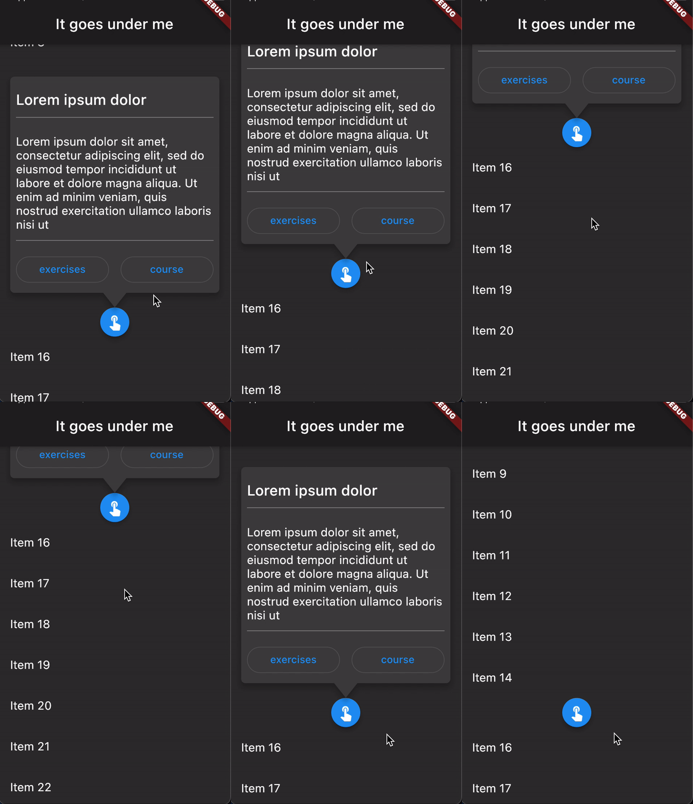
For use cases where the tooltip must be a part the widget tree rather than an overlay there is a AlignedTooltipEntry.
Scaffold(
appBar: AppBar(title: constText('It goes under me')),
body: AlignedTooltipArea(
builder: (context, tooltip, scrim) {
returnStack(
fit: StackFit.passthrough,
children: [
ListView.builder(
itemCount: 30,
itemBuilder: (context, index) {
if (index == 15) {
returnAlignedTooltipEntry(
tailLength: 10.0,
preferredDirection: AxisDirection.down,
isModal: true,
margin: constEdgeInsets.all(20.0),
child: constMaterial(
color: Colors.blue,
shape: CircleBorder(),
elevation: 4.0,
child: Padding(
padding: EdgeInsets.all(8.0),
child: Icon(
Icons.touch_app,
color: Colors.white,
),
),
),
content: Column(
mainAxisSize: MainAxisSize.min,
children: [
Container(
height: 120,
color: Colors.blue,
width: double.infinity,
),
constSizedBox(height: 8),
constText(
'Quia ducimus eius magni voluptatibus ut veniam ducimus. Ullam ab qui voluptatibus quos est in. Maiores eos ab magni tempora praesentium libero. Voluptate architecto rerum vel sapiente ducimus aut cumque quibusdam. Consequatur illo et quos vel cupiditate quis dolores at.',
),
],
),
);
}
returnListTile(title: Text('Item $index'));
},
),
// In the case of no scrim showing, this will return an SizedBox.shrink
scrim,
// In the case of no scrim showing, this will return an SizedBox.shrink
tooltip,
],
);
},
),
);
This will give you the positioned tooltip and scrim (an empty gesture detector that catches tap events and closes the tooltip) for you to enter into the tree however you like. By doing this, you can make tooltips that are visually "under" other parts of the UI such as the appbar in the above example.
API subject to change.
Contributing
Issues and PRs welcome. Unless otherwise specified, all contributions to this lib will be under MIT license.
Help wanted
If you're interested in becoming a contributor with push rights please ping me and we can talk about how to get you started ! :)