패키지, 저장소 및 앱 카테고리 검색

animated_loading_border 표지
패키지 상세v0.0.2

animated_loading_border

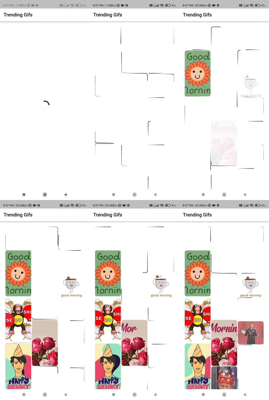
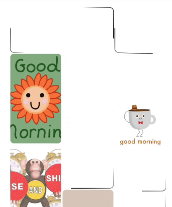
위젯을 로딩하는 동안 애니메이션된 테두리를 플레이스홀더로 표시할 수 있는 현대적인 방법을 제공하며, 간편한 사용자 정의와 즉시 사용 가능한 기능을 갖춘 패키지입니다.

AndroidiOSWebmacOSWindowsLinux
30일 다운로드
1.8천
좋아요
88
Pub 점수
150

패키지 설치

flutter pub add animated_loading_border

패키지 개요

공개 정보를 바탕으로 생성한 선택 가이드입니다.

위젯 로딩 중에 현대적이고 사용자 정의 가능한 시각적 표시로 애니메이션 경계를 제공하는 플러터 패키지입니다. 다양한 플랫폼의 UI에 원활하게 통합되어 개발자가 부드러운 애니메이션을 가진 동적 테두리를 쉽게 적용할 수 있도록 설계되었습니다. 최소한의 설정으로 간편하게 사용 가능하면서도 색상, 두께, 애니메이션 속도와 같은 광범위한 사용자 정의 옵션을 지원합니다. 비동기 작업 중 사용자 경험을 향상시키기에 이상적입니다.

사용 사례

  • 로딩 상태 표시기
  • 목록 내 플레이스홀더 위젯
  • 폼 제출 피드백
  • 이미지 또는 데이터 로딩 상태
  • 인터랙티브 컴포넌트 미리보기

주요 기능

  • 사용자 지정 가능한 테두리 색상 및 폭
  • 부드러운 애니메이션 테두리 효과
  • 크로스 플랫폼 호환성
  • 기존 위젯과의 간편한 통합
  • 사용자 정의 가능한 애니메이션 속도 및 지속 시간

적합한 대상

  • 현대적인 로딩 시각 효과를 찾는 개발자
  • 마이크로 인터랙션에 집중하는 UI/UX 디자이너
  • 자주 비동기 데이터 로딩을 하는 앱
  • 경량 플레이스홀더가 필요한 프로젝트
  • 일관된 로딩 피드백을 우선시하는 팀

고려 사항

  • 경계 기반 로딩 표시기로 제한
  • 복잡한 레이아웃을 위해 추가 스타일링이 필요할 수 있습니다
  • 애니메이션 성능은 장치 기능에 따라 달라집니다
  • 경계 외 로딩 패턴에는 적합하지 않습니다
  • 로딩 상태 로직을 수동으로 처리해야 합니다

원본 README

연결된 소스 저장소의 README 원문 스냅샷입니다. 최신 내용은 저장소에서 확인하세요.

animated_loading_border

Flutter Website Dart Website MIT License

Key Definition

  • A package that gives us a modern way to show animated border as a placeholder while loading our widget with easy customization and ready to use.

Preview

animated_loading_border animated_loading_border

Basic Usage

Import it to your project file

import 'package:animated_loading_border/animated_loading_border.dart';

And add it in its most basic form like it:

AnimatedLoadingBorder(
  child: Container(),
  controller: (animationController) {
     // Here we get animationController     
  },
);
Required parameters of AnimatedLoadingBorder

Parameter Description
Widget child The child contained by the AnimatedLoadingBorder
Optional parameters of AnimatedLoadingBorder

Parameter Default Description
ValueChanged? controller -- Callback that gives the AnimationController of the AnimatedLoadingBorder
Duration duration Duration(seconds: 4) Defines the animation duration
double cornerRadius 0.0 Defines the corner radius of the border
double borderWidth 1 Defines the width of the border
Color borderColor Colors.black Defines the color of the border
Color trailingBorderColor Colors.black Defines the color for the trailing part of the border
EdgeInsets padding EdgeInsets.zero Used to add child widget padding
bool startWithRandomPosition true Used to set starting position of SweepGradient
bool isTrailingTransparent true Used to set starting color of SweepGradient
Guideline for contributors

  • Contribution towards my repository is always welcome, i request contributors to create a pull request for development.
Guideline to report an issue/feature request

It would be great for me if the reporter can share the below things to understand the root cause of the issue.

  • Library version
  • Code snippet
  • Logs if applicable
  • Device specification like (Manufacturer, OS version, etc)
  • Screenshot/video with steps to reproduce the issue
  • Library used

LICENSE!

animated_loading_border is MIT-licensed.

카테고리

소스 저장소

이 패키지를 사용하는 프로젝트

아직 데이터가 없습니다.