패키지, 저장소 및 앱 카테고리 검색

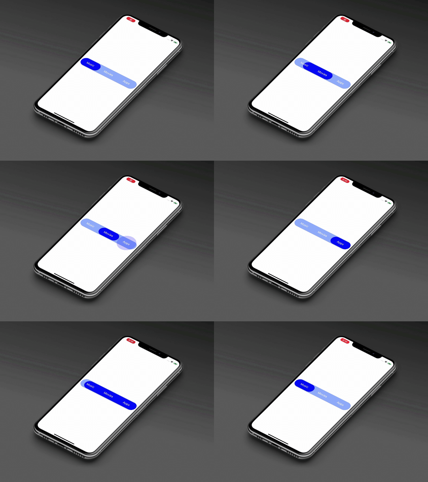
animated_segment 표지
패키지 상세v0.0.4

animated_segment

이 패키지는 현대적인 애니메이션 효과가 있는 세련된 세그먼트를 제공합니다. 탭 선택을 탄성 방식의 애니메이션으로 표시합니다.

AndroidiOSWebmacOSWindowsLinux
30일 다운로드
72
좋아요
72
Pub 점수
150

패키지 설치

flutter pub add animated_segment

패키지 개요

공개 정보를 바탕으로 생성한 선택 가이드입니다.

animated_segment 패키지는 탭 선택 시 탄성 애니메이션 효과를 갖춘 현대적이고 시각적으로 매력적인 세그먼트 컨트롤을 제공합니다. 부드럽고 동적인 전환을 통해 사용자 경험을 향상시켜 인터랙티브 인터페이스에 적합합니다. 이 패키지는 가볍고 Android, iOS, Web, macOS, Windows, Linux 등 여러 플랫폼과 호환됩니다. Flutter pub add를 통해 최소한의 설정으로 개발자는 앱에 우아하고 반응형 세그먼트 컨트롤을 쉽게 통합할 수 있습니다.

사용 사례

  • 인터랙티브 탭 탐색
  • 동적 폼 필터
  • 사용자 정의 가능한 대시보드 탭
  • 사용자 선호도 선택기
  • 강화된 사용자 인터페이스 피드백
  • 모바일 우선 인터페이스 디자인

주요 기능

  • 탭 선택 시 탄성 애니메이션
  • 크로스 플랫폼 호환성
  • Flutter와의 간단한 통합
  • 사용자 정의 가능한 외관
  • 부드러운 전환 효과
  • 경량이고 성능이 뛰어남

적합한 대상

  • 현대적인 UI 컴포넌트를 찾는 플러터 개발자
  • 매력적인 탭 상호작용을 필요로 하는 앱
  • 디자인 중심 애플리케이션
  • 반응형 모바일 및 웹 인터페이스
  • 풍부한 애니메이션을 최소한의 코드로 구현하고자 하는 개발자

고려 사항

  • 복잡한 디자인을 위해 추가적인 스타일링이 필요할 수 있습니다
  • 많은 세그먼트를 가진 저사양 기기에서의 성능 영향
  • 고급 사용자 정의 옵션이 없이 기본 세그먼트 기능에 제한됨
  • 탭 기반 네비게이션 패턴이 아닌 경우 적합하지 않습니다

원본 README

연결된 소스 저장소의 README 원문 스냅샷입니다. 최신 내용은 저장소에서 확인하세요.

animated_segment

animated_segment version MIT License MIT License

This package will animates a segment. Package provides you a modern animated fancy segment. Show selection of tab using elastic way animation.

Animated Segment

Animated Segment

Usage

Example
AnimatedSegment(
  segmentNames: [Strings.tab_1, Strings.tab_2, Strings.tab_3],
  onSegmentChanged: (index) {
    print('Selected Segment Index is: $index');
  },
  backgroundColor: AppColors.bgColor,
  segmentTextColor: AppColors.white,
  rippleEffectColor: AppColors.primary,
  selectedSegmentColor: AppColors.primary,
);
Required parameters
segmentNames:

This property takes List as a parameter and segmentNames is useful to display items in segment.

onSegmentChanged:

Call back called when the user select the new segment and return the selected segment index. Index for the initial selected segment is 0.

Optional parameters
initialSegment:

This property takes int value as a parameter. This is use to set the initial segment from [segmentNames].

backgroundColor:

This property takes Color value as a parameter. You can change the background color of animated segment. default value is Color(0xff8AADFB)

segmentTextColor:

This property takes Color value as a parameter. You can change the text color of segmented text color. default value is Color(0xff0217FD)

rippleEffectColor:

This property takes Color value as a parameter. You can change the ripple color of segment. default value is Colors.white

selectedSegmentColor:

This property takes Color value as a parameter. You can change the selected segment color of animated segment. default value is Colors.white

Guideline for contributors

Contribution towards our repository is always welcome, we request contributors to create a pull request to the develop branch only.

Guideline to report an issue/feature request

It would be great for us if the reporter can share the below things to understand the root cause of the issue.

  • Library version
  • Code snippet
  • Logs if applicable
  • Device specification like (Manufacturer, OS version, etc)
  • Screenshot/video with steps to reproduce the issue

LICENSE!

Animated Segment is MIT-licensed.

Let us know!

We’d be really happy if you send us links to your projects where you use our component. Just send an email to sales@mindinventory.com And do let us know if you have any questions or suggestion regarding our work.


카테고리

소스 저장소

이 패키지를 사용하는 프로젝트

아직 데이터가 없습니다.