패키지, 저장소 및 앱 카테고리 검색

animated_segmented_tab_control 표지
패키지 상세v2.2.0

animated_segmented_tab_control

탭 뷰와 함께 사용할 수 있는 사용자 정의 가능한 세그먼트 컨트롤입니다.

AndroidiOSWebmacOSWindowsLinux
30일 다운로드
4.1천
좋아요
100
Pub 점수
160

패키지 설치

flutter pub add animated_segmented_tab_control

패키지 개요

공개 정보를 바탕으로 생성한 선택 가이드입니다.

Flutter 앱에서 TabView와 원활하게 작동하도록 설계된 사용자 정의 가능한 애니메이션 세그먼트 컨트롤입니다. 세그먼트 간의 부드러운 전환을 제공하고 다양한 스타일링 옵션을 지원하며, 동적 시각 피드백을 통해 사용자 상호작용을 향상시킵니다. 현대적인 미학을 갖춘 직관적인 탭 탐색이 필요한 앱에 적합합니다. 이 패키지는 Android, iOS, 웹, macOS, Windows, Linux 등 모든 주요 플랫폼과 호환됩니다.

사용 사례

  • 인터랙티브 탭 탐색
  • 다이나믹 UI 전환
  • 사용자 정의 가능한 탭 인터페이스
  • 크로스 플랫폼 탭 컨트롤
  • 대시보드에서 사용자 경험 향상
  • 폼 섹션 전환

주요 기능

  • 부드러운 애니메이션 전환
  • 매우 사용자 정의 가능한 외관
  • TabView 내장 지원
  • 다양한 플랫폼 간 반응형 디자인
  • 기존 Flutter 프로젝트와의 간편한 통합
  • 가로 및 세로 레이아웃을 모두 지원합니다

적합한 대상

  • 크로스 플랫폼 앱을 개발하는 개발자
  • 현대적인 UI 컴포넌트를 찾는 디자이너
  • 여러 콘텐츠 섹션을 가진 앱
  • 인터랙티브 탭 경험을 필요로 하는 프로젝트
  • 다양한 기기 간 일관된 UX를 우선시하는 팀

고려 사항

  • 복잡한 테마에 대해 추가 스타일링이 필요할 수 있습니다
  • 대규모 세그먼트로 인한 성능 영향
  • 제한된 내장 접근성 기능
  • 외부 TabView 구현에 의존
  • 매우 높은 주기적 업데이트에 최적화되지 않음

원본 README

연결된 소스 저장소의 README 원문 스냅샷입니다. 최신 내용은 저장소에서 확인하세요.

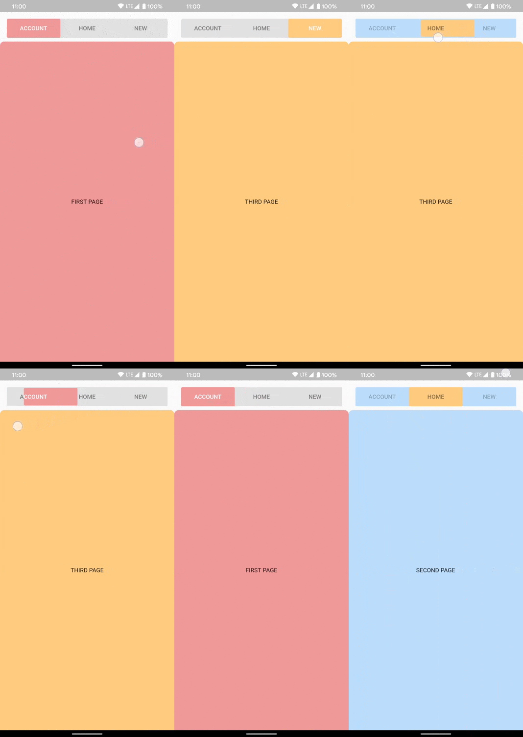
A customizable segment tab control. Can be used with or without TabView.

Made in lanars.com.

pub package

Features

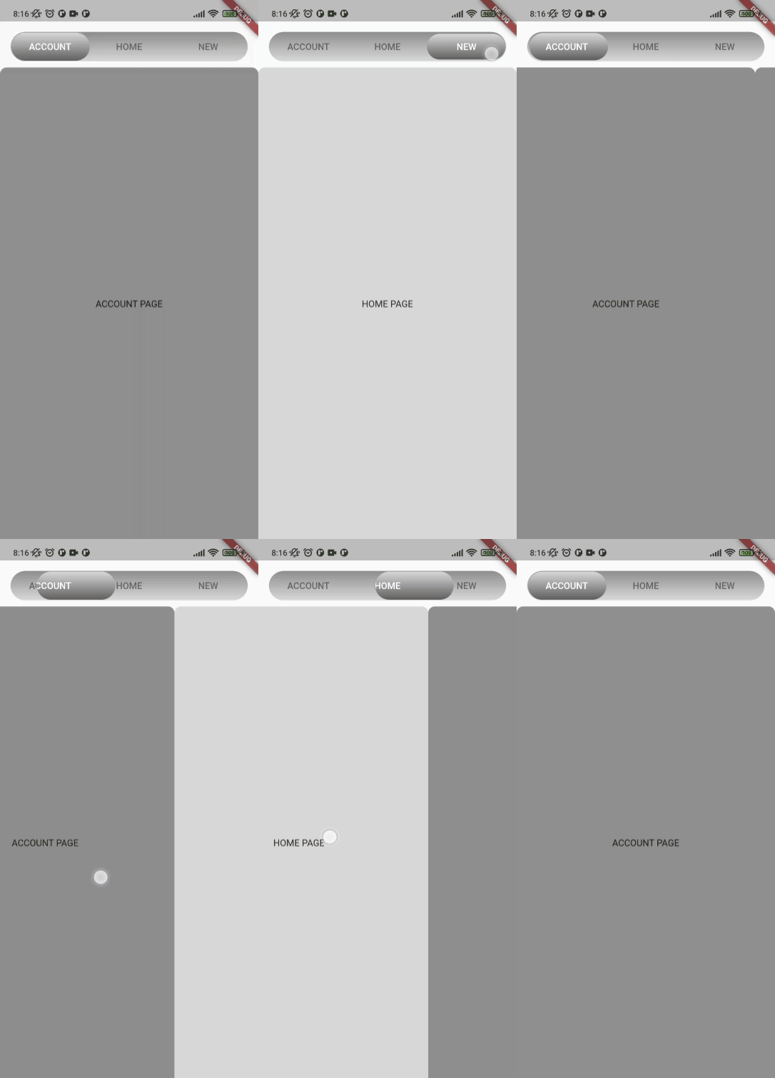
The package provides an advanced segmented control widget based on the TabController.

Usage

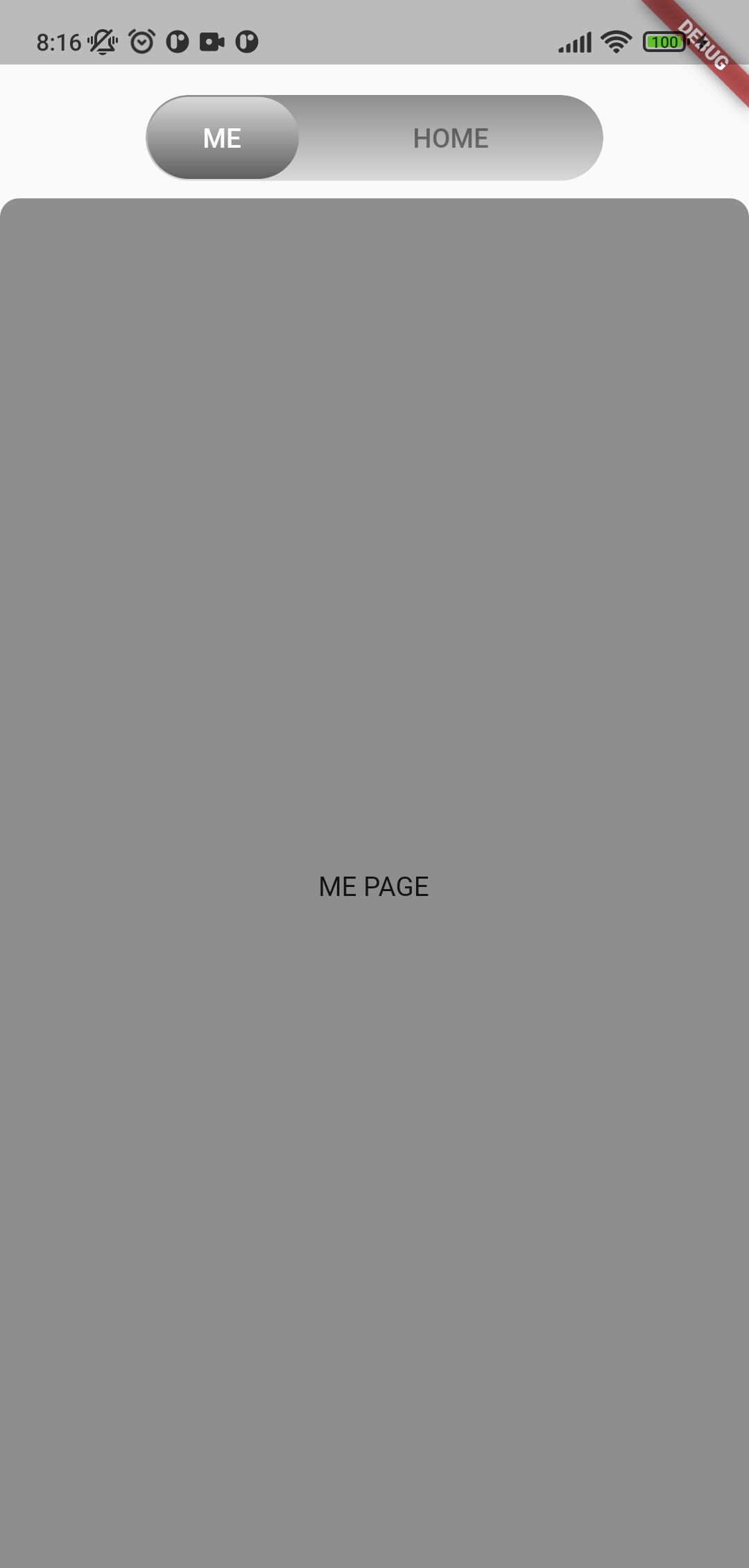
The package contains a SegmentedTabControl widget that requires a SegmentTab list.

SegmentedTabControl(
  tabs: [
    SegmentTab(
      label: 'Home',
    ),
  ],
)

SegmentedTabControl also requires a TabController. You can provide it with a DefaultTabController or instantiate a TabController instead.

DefaultTabController(
  length: 2,
  child: SegmentedTabControl(
    tabs: [
      SegmentTab(
        label: 'Home',
      ),
      SegmentTab(
        label: 'Account',
      ),
    ],
  ),
)

You can style the whole widget, an individual tab, or both. A value on the currently selected SegmentTab overrides the corresponding value on SegmentedTabControl.

SegmentedTabControl(
  barDecoration: BoxDecoration(
    color: Colors.grey.shade300,
    borderRadius: BorderRadius.circular(10),
  ),
  indicatorDecoration: BoxDecoration(
    color: Colors.orange.shade200,
    borderRadius: BorderRadius.circular(10),
  ),
  tabTextColor: Colors.black45,
  selectedTabTextColor: Colors.white,
  tabs: [
    SegmentTab(
      label: 'ACCOUNT',
      color: Colors.red.shade200,
    ),
    SegmentTab(
      label: 'HOME',
      backgroundColor: Colors.blue.shade100,
      selectedTextColor: Colors.black45,
      textColor: Colors.black26,
    ),
    const SegmentTab(label: 'NEW'),
  ],
)

Note that the text colors are read from the selected tab and applied to the whole bar, so textColor and selectedTextColor set the bar's label colors while that tab is selected rather than coloring only that one tab.

Change tracking logic is identical to TabBar logic.

DefaultTabController.of(context).index

or

_controller.index

Сustom tab content

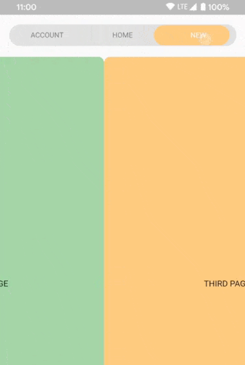
Use SegmentTab.labelBuilder to show any widget like an icon.

The selected-tab highlight is produced by painting the tab row twice and clipping the upper copy to the indicator, so the builder is called once per layer and receives the color of the layer it is painting. Plain Icon and Text children inherit that color. Use color for anything that does not inherit it, such as a border or an SVG:

SegmentTab(
  label: 'NEW',
  labelBuilder: (context, color) => Container(
    padding: const EdgeInsets.symmetric(horizontal: 8, vertical: 2),
    decoration: BoxDecoration(
      border: Border.all(color: color),
      borderRadius: BorderRadius.circular(20),
    ),
    child: Text('NEW'),
  ),
)

Interactive children are not supported.

Additional information

If you have any ideas or are running into a bug, please submit an issue on github page: https://github.com/LanarsInc/animated-segmented-tab-control/issues

카테고리

의존성

의존성 목록 1 개

소스 저장소

이 패키지를 사용하는 프로젝트

아직 데이터가 없습니다.