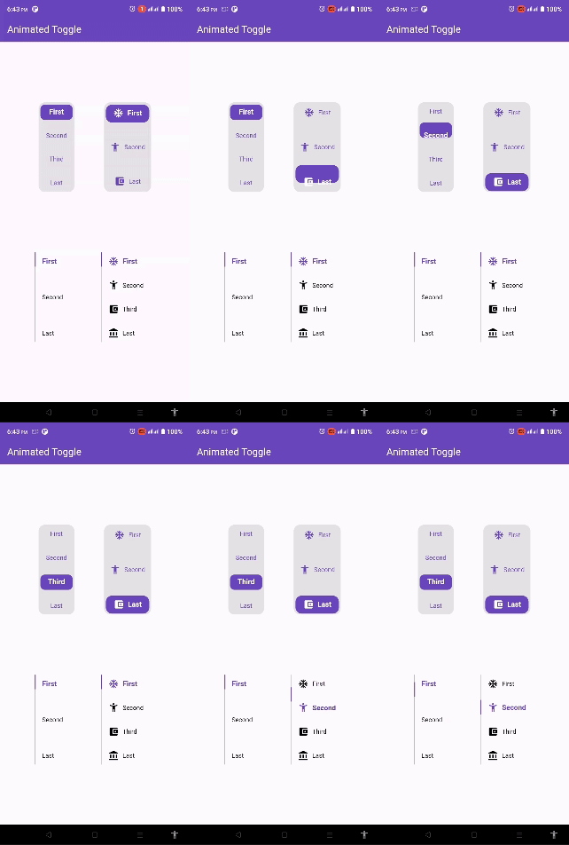
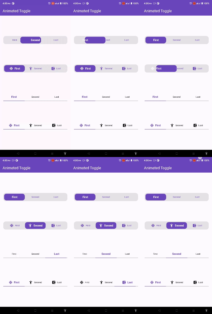
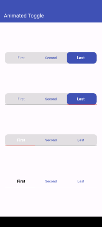
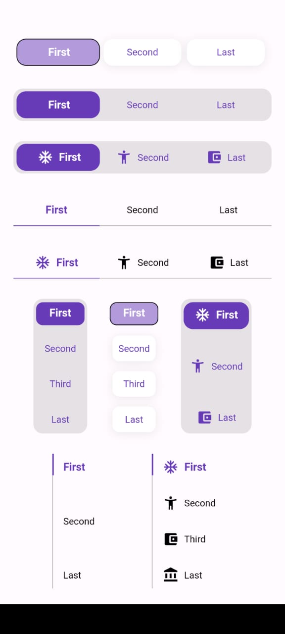
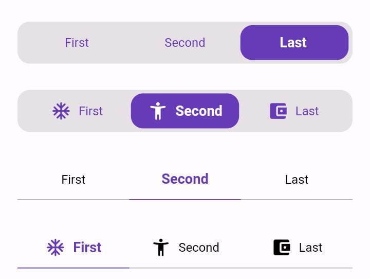
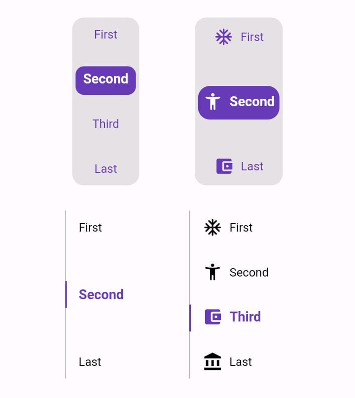
Animated Toggle는 커스터마이즈된 애니메이션 토글 스위치를 만드는 것을 단순화하는 Flutter 패키지입니다. 최소한의 설정으로 켜짐/꺼짐 상태 간에 부드럽고 시각적으로 매력적인 전환을 제공합니다. 복잡한 애니메이션 코드 없이 UI 상호작용을 향상시키고자 하는 개발자를 위한 것으로, Android, iOS, Web, macOS, Windows, Linux 등 여러 플랫폼을 지원합니다. 가볍고 간단한 추가 명령어로 기존 Flutter 프로젝트에 쉽게 통합할 수 있습니다. 설정 패널, 테마 토글 또는 어떤 인터랙티브 스위치 인터페이스에도 이상적입니다.
사용 사례
사용자 정의 테마 전환
사용자 선호 스위치
설정 UI 컴포넌트
온보딩 흐름 지표
인터랙티브 폼 요소
주요 기능
부드러운 애니메이션 전환
사용자 정의 가능한 외관
크로스 플랫폼 지원
최소한의 보일러플레이트
pub를 통한 간편한 통합
사용자 정의 가능한 토글 동작
적합한 대상
인터랙티브 요소를 찾는 UI 디자이너
설정 화면을 구축하는 개발자
시각적 피드백이 필요한 앱
Flutter 초보자가 애니메이션 탐색 중
크로스 플랫폼 요구 사항이 있는 프로젝트
고려 사항
토글 전용 사용 사례에 한정
고급 디자인을 위해 수동 스타일링이 필요합니다
내장된 접근성 기능 없음
외부 애니메이션 로직에 의존
복잡한 상태 기계에 적합하지 않습니다
완전한 사용자 지정을 위해서는 추가 패키지가 필요할 수 있습니다
원본 README
연결된 소스 저장소의 README 원문 스냅샷입니다. 최신 내용은 저장소에서 확인하세요.
Animated Toggle
Animated Toggle Give you easy way to make your custom Animated toggle.
Installation
Add this to your pubspec.yaml:
dependencies:animated_toggle:^LastVersion
Features
Easy to use the Animated Toggle Package you can handle all colors and width and the height and you can make it vertical or horizontal.
You can control the start from left or right if you need this for arabic or english or etc.
you can control the Text Style and the padding for the Animated Toggle.
Getting started
import'package:animated_toggle/animated_toggle.dart';
voidmain() {
}
// Start use th package in your State Widget
classMyAnimatedToggleextendsStatefulWidget{
constMyAnimatedToggle({super.key});
@overrideState<MyAnimatedToggle> createState() => _MyAnimatedToggleState();
}
class_MyAnimatedToggleStateextendsState<MyAnimatedToggle> {
@overrideWidgetbuild(BuildContext context) {
returnScaffold(
appBar: AppBar(
backgroundColor: Theme.of(context).colorScheme.inversePrimary,
title: constText('Animated Toggle'),
),
body: Center(
child: AnimatedHorizontalToggle(
taps: const ['First', 'Second', 'Last'],
// write you taps names
width: MediaQuery.of(context).size.width - 40,
height: 48,
duration: constDuration(milliseconds: 300),
initialIndex: 0,
background: Colors.black.withOpacity(0.1),
activeColor: Colors.deepPurple,
// here you can control the active text style
activeTextStyle: constTextStyle(
fontSize: 16, fontWeight: FontWeight.w600, color: Colors.white),
// here you can control the inactive text style
inActiveTextStyle: constTextStyle(
fontSize: 14,
fontWeight: FontWeight.w400,
color: Colors.deepPurple),
// the next 2 line if you need to put padding for the inactive buttons
horizontalPadding: 4,
verticalPadding: 4,
// the next 2 line if you need to put padding for the active button
activeHorizontalPadding: 2,
activeVerticalPadding: 4,
radius: 14,
// you can control the radius for the Animated widget
activeButtonRadius: 14,
// you can control the radius for the active button
onChange: (int currentIndex, int targetIndex) {
// write Your Personal Code Here
},
showActiveButtonColor: true,
// 'en' mean make the start from left other mean start from right
local:
'en', // her you can add the local to control the alignment like if you use en its the normal to start from left to right and if you use ar the will start from right to left
),
),
);
}
}
How to use Vertical Animated Toggle
classMyAnimatedToggleextendsStatefulWidget{
constMyAnimatedToggle({super.key});
@overrideState<MyAnimatedToggle> createState() => _MyAnimatedToggleState();
}
class_MyAnimatedToggleStateextendsState<MyAnimatedToggle> {
@overrideWidgetbuild(BuildContext context) {
returnScaffold(
appBar: AppBar(
backgroundColor: Theme.of(context).colorScheme.inversePrimary,
title: constText('Animated Toggle'),
),
body: Center(
child: AnimatedVerticalToggle(
taps: const ['First', 'Second', 'Third', 'Last'],
width: 80,
height: 200,
duration: constDuration(milliseconds: 300),
activeButtonHeight: 34,
initialIndex: 0,
background: Colors.black.withOpacity(0.1),
activeColor: Colors.deepPurple,
// here you can control the active text style
activeTextStyle: constTextStyle(
fontSize: 16,
fontWeight: FontWeight.w600,
color: Colors.white),
// here you can control the inactive text style
inActiveTextStyle: constTextStyle(
fontSize: 14,
fontWeight: FontWeight.w400,
color: Colors.deepPurple),
// the next 2 line if you need to put padding for the inactive buttons
horizontalPadding: 4,
verticalPadding: 4,
// the next 2 line if you need to put padding for the active button
activeHorizontalPadding: 4,
activeVerticalPadding: 2,
radius: 14,
// you can control the radius for the Animated widget
activeButtonRadius: 10,
// you can control the radius for the active button
onChange: (int currentIndex, int targetIndex) {
// write Your Personal Code Here
},
showActiveButtonColor: true,
// 'en' mean make the start from left other mean start from right
local:
'en', // her you can add the local to control the alignment like if you use en its the normal to start from left to right and if you use ar the will start from right to left
),
),
);
}
}
Additional information
Say to me in GitHub what you need to see in the package in the next update.
Wait for more feature soon.