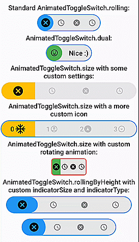
다양한 선택을 지원하고 부드러운 로딩 애니메이션을 제공하는 완전히 사용자 정의 가능한 드래그 가능한 애니메이션 토글 스위치입니다. 롤링 및 크기 전환을 위한 사전 구축된 생성자를 제공하여 시각적 피드백이 필요한 인터랙티브 UI에 이상적입니다. Android, iOS, Web, macOS, Windows, Linux를 모두 지원하는 크로스플랫폼용으로 설계되었습니다. 직관적인 API와 원활한 통합을 통해 동적이고 반응형 스위치를 통해 사용자 경험을 향상시킵니다.
사용 사례
인터랙티브 설정 패널
시각적 피드백이 있는 폼 컨트롤
사용자 지정 가능한 테마 전환
다이나믹 선택
부드러운 사용자 인터페이스 전환
크로스플랫폼 토글 컴포넌트
주요 기능
드래그 가능한 인터페이스
다중 선택 지원
사전 구축된 롤링 및 크기 애니메이션
완전히 사용자 정의 가능한 디자인
부드러운 로딩 전환
크로스 플랫폼 호환성
적합한 대상
인터랙티브 폼을 개발하는 개발자
동적 스위치를 찾는 UI 디자이너
테마 또는 선호 설정 전환을 필요로 하는 앱
크로스플랫폼 플러터 애플리케이션
시각적 완성도를 강조하는 프로젝트
고려 사항
많은 인스턴스가 있는 경우 성능에 영향을 미칠 수 있습니다
최적의 시각적 외관을 위해 신중한 스타일링이 필요합니다
토글 스타일 상호작용에 제한됨
상호작용이 없는 요소에 적합하지 않습니다
애니메이션의 복잡도는 모바일 기기의 배터리 수명에 영향을 미칠 수 있습니다
원본 README
연결된 소스 저장소의 README 원문 스냅샷입니다. 최신 내용은 저장소에서 확인하세요.
AnimatedToggleSwitch
If you like this package, please like it on pub.dev and star it on GitHub.
Fully customizable, draggable and animated switch with multiple choices and smooth loading animation. It has prebuilt constructors for rolling and size animations, but it also allows you to create your own switches with CustomAnimatedToggleSwitch. LTR and RTL are both supported. Switches without an (initial) selection and vertical switches are also possible.
Most builder arguments of AnimatedToggleSwitch have standard and a custom version. This ensures that you can get started easily and still customize a lot if necessary. There are several options for styling it.
For a slider with a similar look you can check out action_slider.
Example Usage
Examples
AnimatedToggleSwitch.dual()
Switch inspired by lite_rolling_switch (made with AnimatedToggleSwitch.dual())
Switch inspired by toggle_switch (made with AnimatedToggleSwitch.size())
Switch inspired by crazy-switch (made with CustomAnimatedToggleSwitch())
Switch inspired by load_switch (made with CustomAnimatedToggleSwitch())
AnimatedToggleSwitch.rolling()
You can build any other switch with CustomAnimatedToggleSwitch()
AnimatedToggleSwitch.size()
AnimatedToggleSwitch.size() with custom rolling animation
AnimatedToggleSwitch.rolling() with custom indicatorSize, borderRadius and indicatorBorderRadius
Easy Usage
Easy to use and highly customizable.
Simple rolling animation
AnimatedToggleSwitch<int>.rolling(
  current: value,
  values: [0, 1, 2, 3],
  onChanged: (i) => setState(() => value = i),
  iconBuilder: iconBuilder,
  // iconList: [...], you can use iconBuilder, customIconBuilder or iconList
  style: ToggleStyle(...), // optional style settings
  ... // many more parameters available
)
Styling
Styling with constructor
style, styleBuilder, customStyleBuilder and styleList can be used to style an AnimatedToggleSwitch.
For the general look of the switch, you can use style.
For parameters that should change with the selection, you can use styleBuilder or styleList.
If you need additional parameters, you can use customStyleBuilder.
AnimatedToggleSwitch<int>.rolling(
  ...
  style: ToggleStyle(backgroundColor: Colors.red), // backgroundColor is set independently of the current selection
  styleBuilder: (value) => ToggleStyle(indicatorColor: value.isEven ? Colors.yellow : Colors.green)), // indicatorColor changes and animates its value with the selection
  ...
)
Styling with Theme
You can also add ToggleStyle to ThemeData.
This overwrites the default ToggleStyle values in all AnimatedToggleSwitch widgets in your MaterialApp.
To use the loading animation, you simply have to return a Future in onChanged or onTap.
You can alternatively control the loading manually with the loading parameter.
Hence, to disable the loading animation, loading: false must be set.
AnimatedToggleSwitch<int>.rolling(
current: value,
values: [0, 1, 2, 3],
onChanged: (i) async {
setState(() => value = i);
awaitFuture.delayed(Duration(seconds: 3));
},
loading: false, // for deactivating loading animation
iconBuilder: iconBuilder,
... // many more parameters available
)
Nullable selection
To use this feature, you simply have to set allowUnlistedValues to true.
AnimatedToggleSwitch<int?>.rolling(
   allowUnlistedValues: true,
   current: nullableValue, // no selection if nullableValue is not contained in values
   values: const [0, 1, 2, 3],
   onChanged: (i) => setState(() => nullableValue = i),
   iconBuilder: iconBuilder,
   indicatorAppearingBuilder: ..., // appearing animation is fully customizable (optional)
)
Vertical switches
You can get a vertical version of any switch by calling vertical() on it.
AnimatedToggleSwitch<int>.rolling(...).vertical()
Fully customizable toggle switch with CustomAnimatedToggleSwitch
CustomAnimatedToggleSwitch<int>(
  current: value,
  values: [0, 1, 2, 3],
  wrapperBuilder: ..., // the builder for the wrapper around the whole switch
  iconBuilder: ..., // the builder for the icons
  foregroundIndicatorBuilder: ..., // a builder for an indicator in front of the icons
  backgroundIndicatorBuilder: ..., // a builder for an indicator behind the icons
  ... // many more parameters available
)