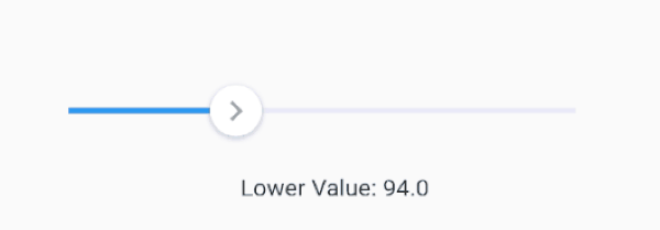
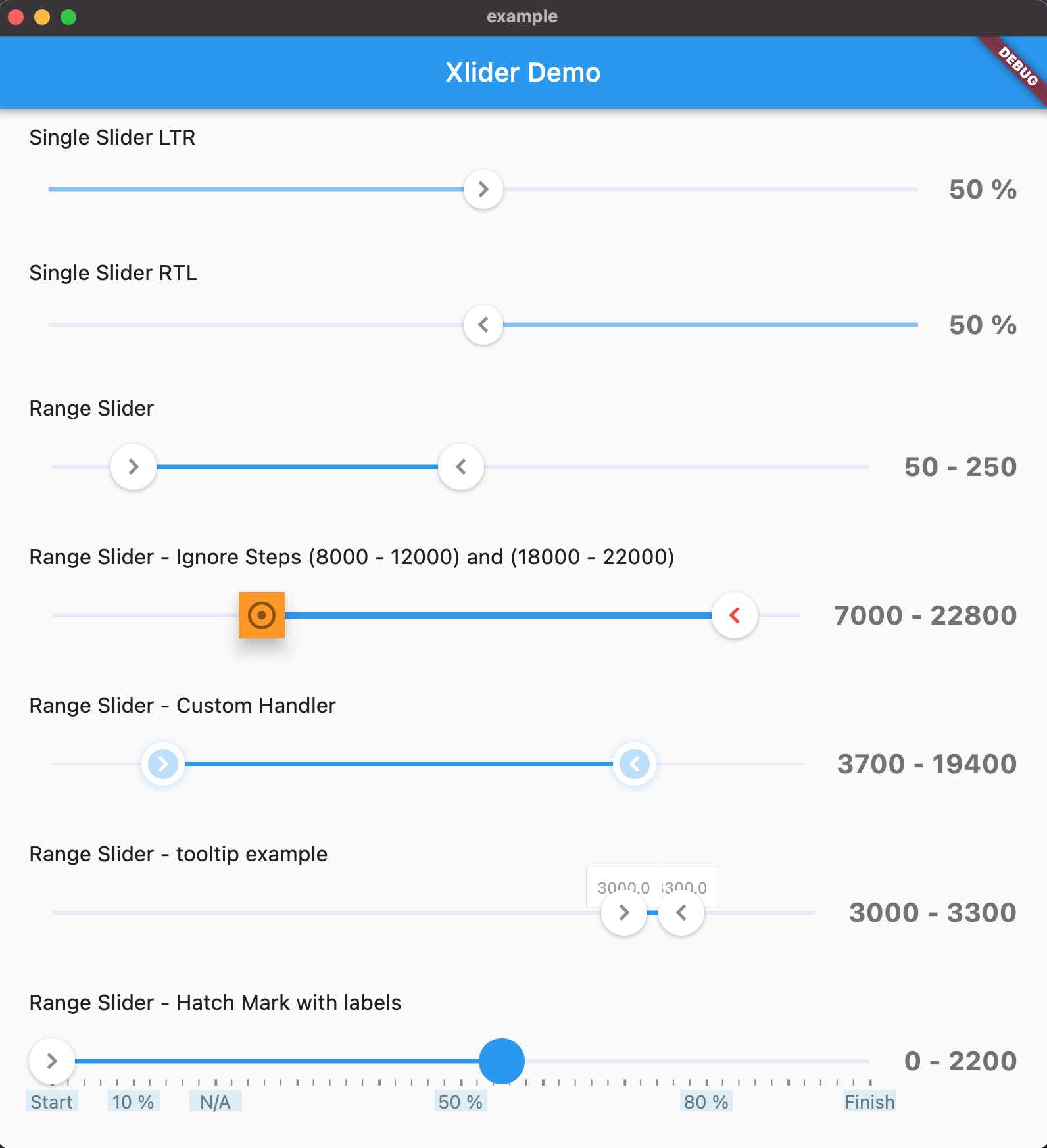
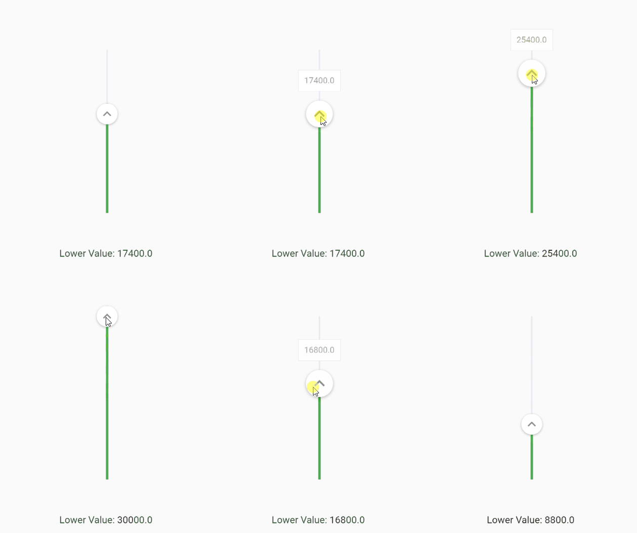
Another Xlider는 Flutter용 사용자 정의 가능한 마테리얼 디자인 슬라이더 및 범위 슬라이더로, 수평 및 수직 방향을 모두 지원하며 완전한 RTL(오른쪽에서 왼쪽) 레이아웃 호환성을 갖추고 있습니다. 스타일, 동작, 상호작용에 대한 광범위한 옵션을 제공하여 정밀한 사용자 입력 제어가 필요한 애플리케이션에 적합합니다. 이 패키지는 크로스플랫폼으로 Android, iOS, Web, macOS, Windows, Linux에서 원활하게 작동합니다. 직관적인 API와 풍부한 커스터마이징 기능을 통해 다양한 앱 환경에서 UI 일관성과 사용자 경험을 향상시킵니다.
사용 사례
값 선택이 가능한 폼 입력
인터랙티브 설정 슬라이더
사용자 지정 가능한 범위 선택기
RTL 언어 인터페이스 지원
크로스플랫폼 UI 컴포넌트
주요 기능
수평 및 수직 슬라이더 지원
RTL 레이아웃 호환성
풍부한 사용자 정의 옵션
Material Design 호환성
범위 선택 지원
크로스 플랫폼 호환성
적합한 대상
국제화 앱을 개발하는 개발자
유연한 슬라이더 UI가 필요한 디자이너
정밀한 입력 제어가 필요한 앱
복잡한 폼 상호작용을 가진 Flutter 프로젝트
다중 플랫폼을 대상으로 하는 팀
고려 사항
비 매터리얼 테마의 경우 추가 스타일링이 필요할 수 있습니다
많은 인스턴스로 인한 성능 영향
기본 사용법 외에 문서가 제한적
사용자 정의는 빌드 복잡성을 증가시킬 수 있습니다
매우 높은 주파수 업데이트에 최적화되지 않음
원본 README
연결된 소스 저장소의 README 원문 스냅샷입니다. 최신 내용은 저장소에서 확인하세요.
another_xlider
(Flutter Slider) A material design slider and range slider, horizontal and vertical, with rtl support and lots of options and customizations for flutter
IMPORTANT: Breaking Changes!
Flutter Version 2.x - Take any version up to 1.1.1
You can change the axis of your slider by setting axis to Axis.vertical. Default is horizontal
FlutterSlider(
  ...
  axis: Axis.vertical,
  ...
)
Handlers
You can customize handlers using handler and rightHandler properties.
Both handler and rightHandler accept FlutterSliderHandler class which has following properties:
child: is a widget
disabled: to disable the handler
decoration, foregroundDecoration and transform are come from Container() widget
You can control the scale animation type of your handlers, it's duration and it's scale size using handlerAnimation handlerAnimation accepts a FlutterSliderHandlerAnimation class which has 4 properties as following
If you want to have a non-linear slider with different steps, simply use rangeStep feature.
FlutterSlider(
  min: 0,
  max: 1000000,
  ...
  step: FlutterSliderStep(
    step: 1, // default
    isPercentRange: true, // ranges are percents, 0% to 20% and so on... . default is true
    rangeList: [
      FlutterSliderRangeStep(from: 0, to: 20, step: 10000),
      FlutterSliderRangeStep(from: 20, to: 100, step: 200000),
    ]
  ),
  ...
)
Ignore Steps
If your configurations requires that some steps are not available, you can use ignoreSteps property.
this property accepts a simple class to define from and to ranges.
FlutterSlider(
  ...
    ignoreSteps: [
      FlutterSliderIgnoreSteps(from: 8000, to: 12000),
      FlutterSliderIgnoreSteps(from: 18000, to: 22000),
    ],
  ...
)
Fixed Values
If you want to have an array of fixed items and slide through it, you can use fixedValues property. use FlutterSliderFixedValue to add your fixed values. FlutterSliderFixedValue has following properties:
percent: (int) ( between 0..100 inclusive). the position of fixed item
value: (dynamic) the value of fixed item
when using fixedValues, values of values property, must be within 0..100
using above example, you get (string) 10K as upperValue or lowerValue (depends on handler), when you reach to 10 percent of the slider,
you get (int) 50000 when you reach 50 percent of the slider and so on...
when using fixedValues, min and max are ignored
Minimum Distance
When using range slider, the minimum distance between two handlers can be defined using minimumDistance option
FlutterSlider(
  ...
    minimumDistance: 300,
  ...
)
Maximum Distance
This is the opposite of minimum distance, when using range slider, the maximum distance between two handlers can be defined using maximumDistance option
FlutterSlider(
  ...
    maximumDistance: 300,
  ...
)
Locked Handlers
If you want to lock your handlers by a certain value, you can use lockHandlers and lockDistance properties
You can display a Hatch Mark underneath or beside of your slider based on axis. In order to display hatch mark you must
use FlutterSliderHatchMark class which has following properties:
linesDistanceFromTrackBar: The distance of lines from slider. can be negative
bigLine: The widget of big lines in hatch mark
smallLine: The widget of small lines in hatch mark
linesAlignment: the direct of lines, right or left which works as top or bottom on horizontal slider
density: The number of lines per percent. 1 is default. any number less or more than 1 will decrease and increase lines respectively
smallDensity: The number of small lines between any two big lines. 4 is default. any number less or more than 4 will decrease and increase lines respectively.
displayLines: to display lines. by default is false for the sake of optimization
labels: If you want to display some label or text at certain percent in your hatch mark, you can use labels
labelBox: The widget of label box, however, you can define a widget for each label and have it's own style
labelsDistanceFromTrackBar: The distance of labels from slider. can be negative
disabled: to disabled the whole hatchmark ( hide )