패키지, 저장소 및 앱 카테고리 검색

awesome_card 표지
패키지 상세v1.2.0

awesome_card

응용 프로그램에서 신용 카드 위젯을 생성하기 위한 Flutter 패키지입니다.

AndroidiOSWebmacOSWindowsLinux
30일 다운로드
5.2천
좋아요
287
Pub 점수
145

패키지 설치

flutter pub add awesome_card

패키지 개요

공개 정보를 바탕으로 생성한 선택 가이드입니다.

Awesome Card는 개발자가 앱 내에서 시각적으로 매력적인 신용카드 위젯을 쉽게 만들 수 있도록 해주는 Flutter 패키지입니다. 사용자 정의가 가능하고 반응형 카드 UI를 제공하여 결제 양식, 체크아웃 화면 또는 금융 앱에 적합합니다. Android, iOS, Web, macOS, Windows, Linux 등 여러 플랫폼을 지원하며 장치 간 일관된 디자인을 보장합니다. 직관적인 구성 옵션을 통해 카드 입력 필드 및 스타일링 통합을 간소화합니다. 안전하고 매력적인 카드 표시 컴포넌트가 필요한 앱에 완벽합니다.

사용 사례

  • 결제 양식 인터페이스
  • 체크아웃 화면
  • 금융 애플리케이션 대시보드
  • 카드 관리 기능
  • 사용자 프로필 카드 표시

주요 기능

  • 사용자 정의 가능한 카드 디자인
  • 플랫폼 간 반응형 레이아웃
  • 폼 입력과의 간편한 통합
  • 여러 운영 체제를 지원합니다
  • 내장 카드 번호 형식

적합한 대상

  • Flutter 개발자가 결제 앱을 구축하고 있습니다
  • 카드 컴포넌트가 필요한 UI 디자이너
  • 크로스 플랫폼 카드 UI가 필요한 앱
  • 청결한 결제 경험에 집중하는 개발자

고려 사항

  • 완전한 결제 처리를 포함하지 않음
  • 민감한 데이터의 수동 처리가 필요합니다
  • 생산용 결제 게이트웨이에는 적합하지 않습니다
  • 보안 최선의 실천과 함께 사용하는 것이 가장 좋습니다
  • UI 렌더링에 국한되며, 거래 로직은 포함되지 않음

원본 README

연결된 소스 저장소의 README 원문 스냅샷입니다. 최신 내용은 저장소에서 확인하세요.

Awesome Card

A Flutter package to create a beautiful, animated Credit Card widget in your application.


Stay tuned for the latest updates:


Pub Twitter

✨ Features

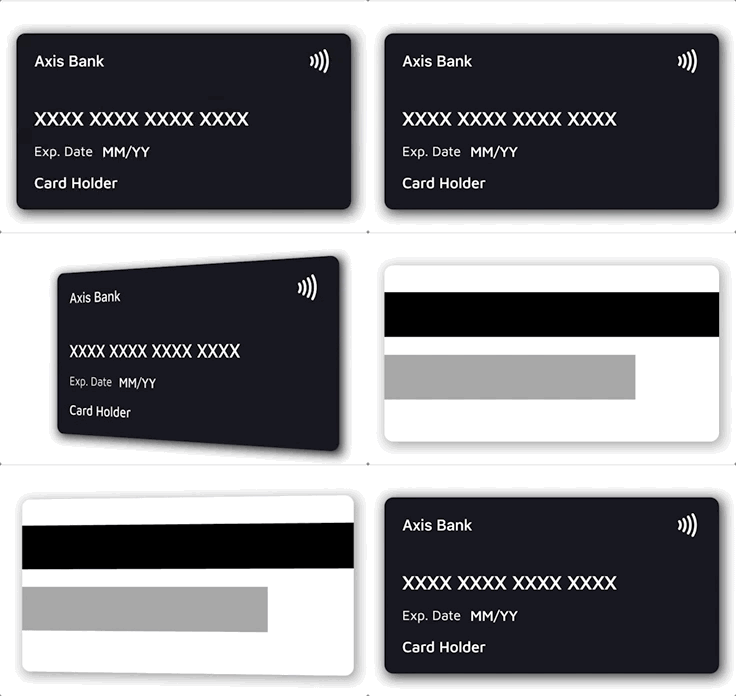
  • 💳 Realistic credit card widget with front and back sides
  • 🔄 Smooth 3D flip animation between front and back
  • 🔍 Automatic card brand detection from the number (Visa, Mastercard, Amex, RuPay, Elo, Discover, Diners Club, JCB, Maestro)
  • 🎭 Automatic number masking per brand (e.g. Amex XXXX XXXXXX XXXXX)
  • 🎨 Customizable backgrounds, text styles, labels, and fully custom layouts
  • 📏 Responsive — content scales down gracefully on narrow cards instead of overflowing
  • 📳 Optional contactless indicator and card shadow

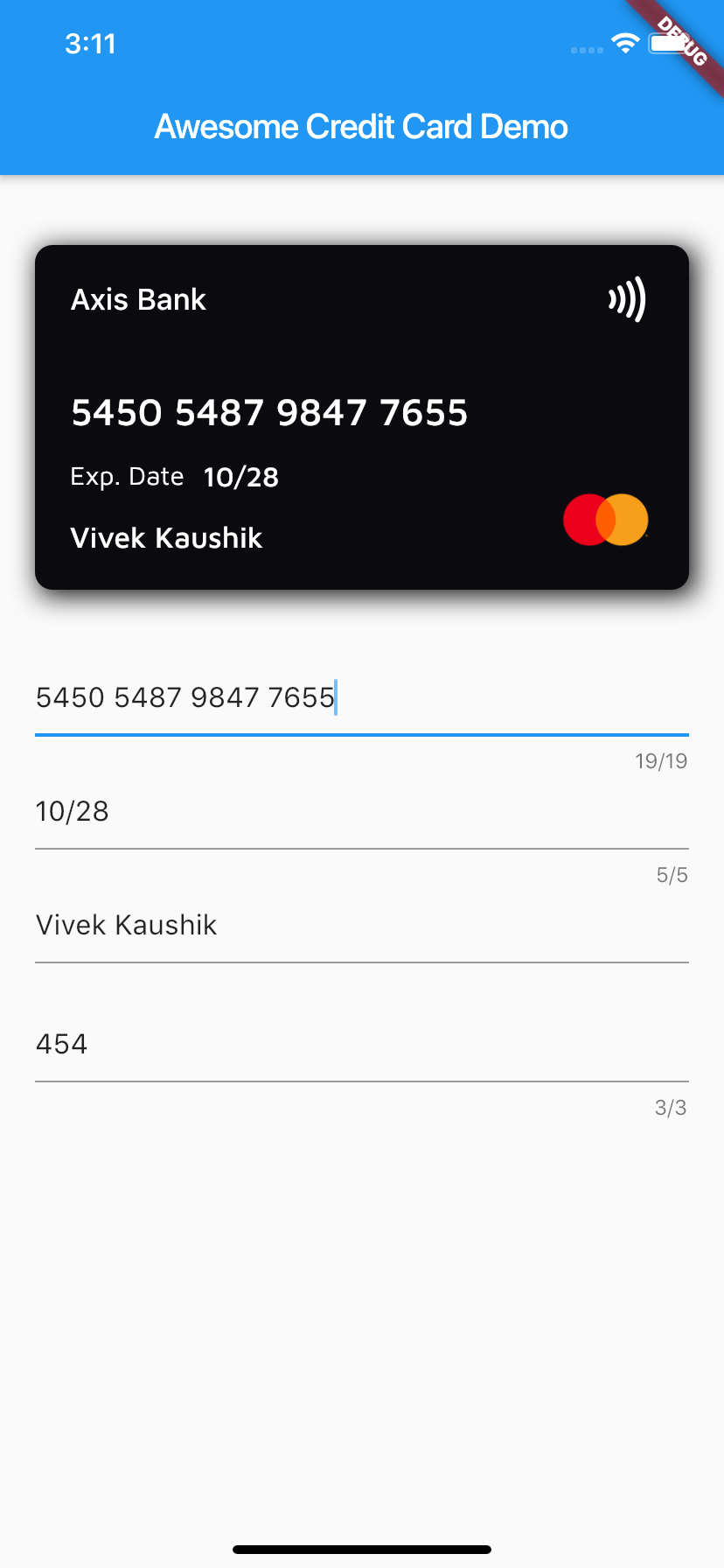
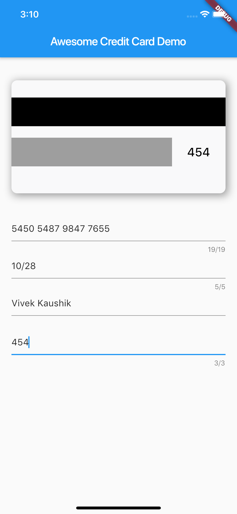
📱 Screenshots


⚙️ Installation

Add the dependency to your pubspec.yaml:

dependencies:
  awesome_card: ^1.2.0

Requires Dart 3 / Flutter 3.10 or newer.

Then import it in your Dart file:

import 'package:awesome_card/awesome_card.dart';

🚀 Quick start

The only required parameters are the two backgrounds — everything else has sensible defaults:

CreditCard(
  frontBackground: CardBackgrounds.black,
  backBackground: CardBackgrounds.white,
)

A fully configured card:

CreditCard(
  cardNumber: "5450 7879 4864 7854",
  cardExpiry: "10/25",
  cardHolderName: "Card Holder",
  cvv: "456",
  bankName: "Axis Bank",
  cardType: CardType.masterCard, // optional — auto-detected from cardNumber
  showBackSide: false,
  frontBackground: CardBackgrounds.black,
  backBackground: CardBackgrounds.white,
  showShadow: true,
  isContactless: true,
  textExpDate: 'Exp. Date',
  textName: 'Name',
  textExpiry: 'MM/YY',
)

🔄 Flipping the card

The card flips whenever showBackSide changes across a rebuild. A common pattern is to flip it while the CVV field has focus:

class _MyPageState extends State<MyPage> {
  bool showBack = false;
  late final FocusNode _cvvFocus;

  @override
  void initState() {
    super.initState();
    _cvvFocus = FocusNode()
      ..addListener(() => setState(() => showBack = _cvvFocus.hasFocus));
  }

  @override
  void dispose() {
    _cvvFocus.dispose();
    super.dispose();
  }

  @override
  Widget build(BuildContext context) {
    return Column(
      children: [
        CreditCard(
          cardNumber: cardNumber,
          cvv: cvv,
          showBackSide: showBack,
          frontBackground: CardBackgrounds.black,
          backBackground: CardBackgrounds.white,
        ),
        TextField(focusNode: _cvvFocus, /* CVV input */),
      ],
    );
  }
}

🎨 Customization

Text styles

Every text field's style can be overridden. Each style is merged over the default, so a partial override (e.g. only fontSize) keeps the default font, weight, and color for everything else:

CreditCard(
  // ...
  bankNameTextStyle: TextStyle(fontSize: 20),
  cardNumberTextStyle: TextStyle(fontSize: 24, letterSpacing: 2),
  cardExpiryTextStyle: TextStyle(fontStyle: FontStyle.italic),
  cardHolderNameTextStyle: TextStyle(fontWeight: FontWeight.bold),
  cvvTextStyle: TextStyle(color: Colors.red),
)

Text colors default to frontTextColor (white) on the front and backTextColor (black) on the back.

Backgrounds

Any widget works as a card background — a Container, gradient, or image:

// Built-in solid backgrounds
frontBackground: CardBackgrounds.black,
backBackground: CardBackgrounds.white,

// Solid color from a hex value
frontBackground: CardBackgrounds.custom(0xff1b447b),

// Anything else — e.g. a gradient
frontBackground: Container(
  decoration: BoxDecoration(
    gradient: LinearGradient(colors: [Colors.indigo, Colors.blueAccent]),
  ),
),
Fully custom layouts

To replace the entire front or back content (e.g. to center the card number or add extra elements), pass your own widget — it is stacked on top of the background and receives the full card area:

CreditCard(
  frontBackground: CardBackgrounds.black,
  backBackground: CardBackgrounds.white,
  frontLayout: MyCustomFront(),
  backLayout: MyCustomBack(),
)

🔍 Card type detection

When cardType is not provided, the brand is detected from cardNumber and the matching icon and number mask are applied automatically. Supported brands:

Brand Example prefixes
Visa 4
Mastercard 51–55, 2221–2720
American Express 34, 37
RuPay 60, 6521, 6522
Elo 401178, 431274, 6362, 6516, 6550, …
Discover 6011, 65, 644–649
Diners Club 300–305, 36, 38
JCB 35, 2131, 1800
Maestro 50, 56–69

The detection helpers are exported and can be used standalone:

CardType type = getCardType('4111111111111111');        // CardType.visa
String mask  = getCardTypeMask(cardNumber: '378282246310005'); // XXXX XXXXXX XXXXX
Widget icon  = getCardTypeIcon(cardNumber: '5555555555554444'); // Mastercard logo

To force a specific brand regardless of the number, pass cardType. To force a specific mask, pass mask.

Custom brands

Brands the package doesn't ship (regional or store cards) can be registered via customBrands. They are checked before the built-in detection and support their own icon and optional number mask:

CreditCard(
  cardNumber: cardNumber,
  customBrands: [
    CardBrand(
      name: 'troy',
      icon: Image.asset('assets/troy.png', width: 55, height: 40),
      pattern: RegExp(r'^9792'),
      mask: 'XXXX XXXX XXXX XXXX', // optional
    ),
  ],
  frontBackground: CardBackgrounds.black,
  backBackground: CardBackgrounds.white,
)

Precedence: explicit cardType → customBrands (first match wins) → built-in detection.

📖 Parameter reference

Parameter Type Default Description
frontBackground Widget required Background widget of the front side
backBackground Widget required Background widget of the back side
cardNumber String? — Card number; shown masked-style as typed. Empty shows the brand mask
cardExpiry String? — Expiry string, e.g. 10/25
cardHolderName String? — Cardholder name (ellipsized when too long)
cvv String? — CVV shown on the back side
bankName String '' Bank name shown at the top of the front
cardType CardType? auto Override the auto-detected brand
customBrands List<CardBrand>? — Custom brands checked before built-in detection
mask String? auto Override the auto-selected number mask
showBackSide bool false Which side is visible; changing it animates the flip
showShadow bool false Drop shadow behind the card
isContactless bool? true Show the contactless (NFC) icon
width double? screen width − margins Card width
height double? width / 2 + 24 Card height
horizontalMargin double 20 Horizontal margin used when width is not set
frontTextColor Color Colors.white Default text color on the front
backTextColor Color Colors.black Default text color on the back
textExpDate String? 'Exp. Date' Label above/next to the expiry
textExpiry String? 'MM/YY' Placeholder when cardExpiry is empty
textName String? 'Card Holder' Placeholder when cardHolderName is empty
bankNameTextStyle TextStyle? — Merged over the bank name style
cardNumberTextStyle TextStyle? — Merged over the card number style
cardExpiryTextStyle TextStyle? — Merged over the expiry style
cardHolderNameTextStyle TextStyle? — Merged over the holder name style
cvvTextStyle TextStyle? — Merged over the CVV style
frontLayout Widget? built-in Replaces the entire front content
backLayout Widget? built-in Replaces the entire back content

🧪 Example & tests

A complete demo app lives in example/ — card preview wired to text fields with live brand detection and the CVV-focus flip. Run it with:

cd example
flutter run

The package ships with a regression test suite (flutter test) covering brand detection, null-safety, text-style merging, and narrow-card layouts.

🤝 Contributing

Issues and pull requests are welcome! Please run flutter analyze and flutter test before submitting a PR.

🙍🏻‍♂️ Author

📄 License

Awesome Card is released under the MIT license. See LICENSE for details.

카테고리

소스 저장소

이 패키지를 사용하는 프로젝트

아직 데이터가 없습니다.