성공, 실패, 경고 및 도움 상태를 위한 시각적으로 매력적이고 테마 기반의 알림 메시지를 스낵바에 강화하는 플러터 패키지입니다. 현대적이고 사용자 정의 가능한 UI를 제공하여 다양한 플랫폼에서 사용자 피드백을 개선합니다. 안드로이드, iOS, 웹, macOS, 윈도우, 리눅스 등 여러 플랫폼을 지원하며 일관된 크로스플랫폼 경험에 이상적입니다. pub add를 통해 간단하게 통합할 수 있어 기본 스낵바 디자인과는 다른 돋보이는 알림을 빠르게 구현할 수 있습니다.
사용 사례
폼 제출 후 성공 메시지 표시
API 오류 발생 시 오류 경고 표시
유용한 팁이나 안내 제공
시스템 상태 변경에 대해 사용자에게 알림
매력적인 피드백으로 UX 향상
일관된 알림 스타일 만들기
주요 기능
테마 경고 유형: 성공, 실패, 경고, 도움말
사용자 지정 가능한 색상 및 아이콘
반응형 및 플랫폼 적응형 디자인
Flutter의 Scaffold와의 간편한 통합
다중 플랫폼 지원
내장 애니메이션 및 전환
적합한 대상
모바일 및 웹 앱 개발자
사용자 경험 중심 프로젝트
명확한 사용자 피드백이 필요한 앱
다듬어진 알림을 원하는 개발자
시각적 일관성을 우선시하는 팀
크로스 플랫폼 요구 사항이 있는 프로젝트
고려 사항
Flutter 2.5 이상이 필요합니다
기본적인 스낵바 기능에 한정
복잡한 레이아웃을 위해 추가 스타일링이 필요할 수 있습니다
간단하고 즉각적인 피드백에 가장 적합
지속적인 알림용이 아님
완전한 사용자 지정을 위해서는 외부 종속성에 의존합니다
원본 README
연결된 소스 저장소의 README 원문 스냅샷입니다. 최신 내용은 저장소에서 확인하세요.
A package that lets you uplift your SnackBar or MaterialBanner experience in the app.
🛠 Attributes
title: Top label that will be shown in the body
message: Body message reflecting some error message, success message etc.
color: Color of SnackBar body
contentType: ContentType class reflecting failure, success, help or warning.
inMaterialBanner: Simply configure the working according to showMaterialBanner
Below are the looks of various types in package used as Snackbar
🔴 Failure
✅ Success
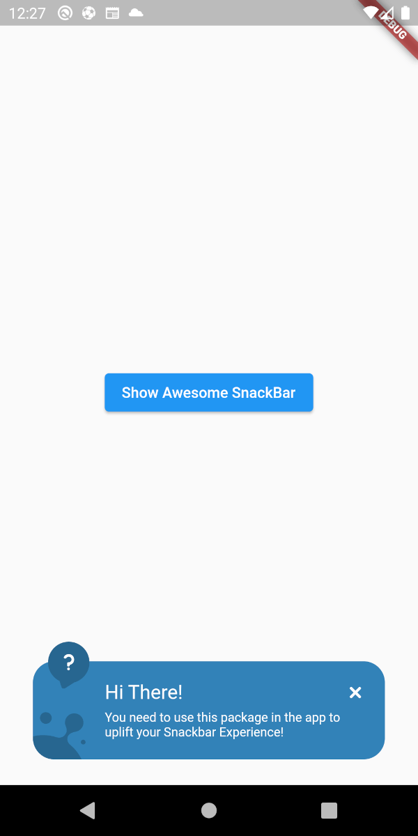
❔ Help
⚠ Warning
👀 Material Banner Looks
Below are the looks of various types in package used as Snackbar
🔴 Failure
✅ Success
❔ Help
⚠ Warning
💻 Example
Below is a basic example usage of the awesome_snackbar_content
import'package:flutter/material.dart';
import'package:awesome_snackbar_content/awesome_snackbar_content.dart';
classAweseomSnackBarExampleextendsStatelessWidget{
constAweseomSnackBarExample({Key? key}) : super(key: key);
@overrideWidgetbuild(BuildContext context) {
returnScaffold(
body: Center(
child: Column(
mainAxisSize: MainAxisSize.min,
children: [
ElevatedButton(
child: constText('Show Awesome SnackBar'),
onPressed: () {
final snackBar = SnackBar(
/// need to set following properties for best effect of awesome_snackbar_content
elevation: 0,
behavior: SnackBarBehavior.floating,
backgroundColor: Colors.transparent,
content: AwesomeSnackbarContent(
title: 'On Snap!',
message:
'This is an example error message that will be shown in the body of snackbar!',
/// change contentType to ContentType.success, ContentType.warning or ContentType.help for variants
contentType: ContentType.failure,
),
);
ScaffoldMessenger.of(context)
..hideCurrentSnackBar()
..showSnackBar(snackBar);
},
),
constSizedBox(height: 10),
ElevatedButton(
child: constText('Show Awesome Material Banner'),
onPressed: () {
final materialBanner = MaterialBanner(
/// need to set following properties for best effect of awesome_snackbar_content
elevation: 0,
backgroundColor: Colors.transparent,
forceActionsBelow: true,
content: AwesomeSnackbarContent(
title: 'Oh Hey!!',
message:
'This is an example error message that will be shown in the body of materialBanner!',
/// change contentType to ContentType.success, ContentType.warning or ContentType.help for variants
contentType: ContentType.success,
// to configure for material banner
inMaterialBanner: true,
),
actions: const [SizedBox.shrink()],
);
ScaffoldMessenger.of(context)
..hideCurrentMaterialBanner()
..showMaterialBanner(materialBanner);
},
),
],
),
),
);
}
}
🧑 Credits
This packages has been created in reference to Abu Anwar (GDE Flutter) YouTube video. So, make sure to check his work!