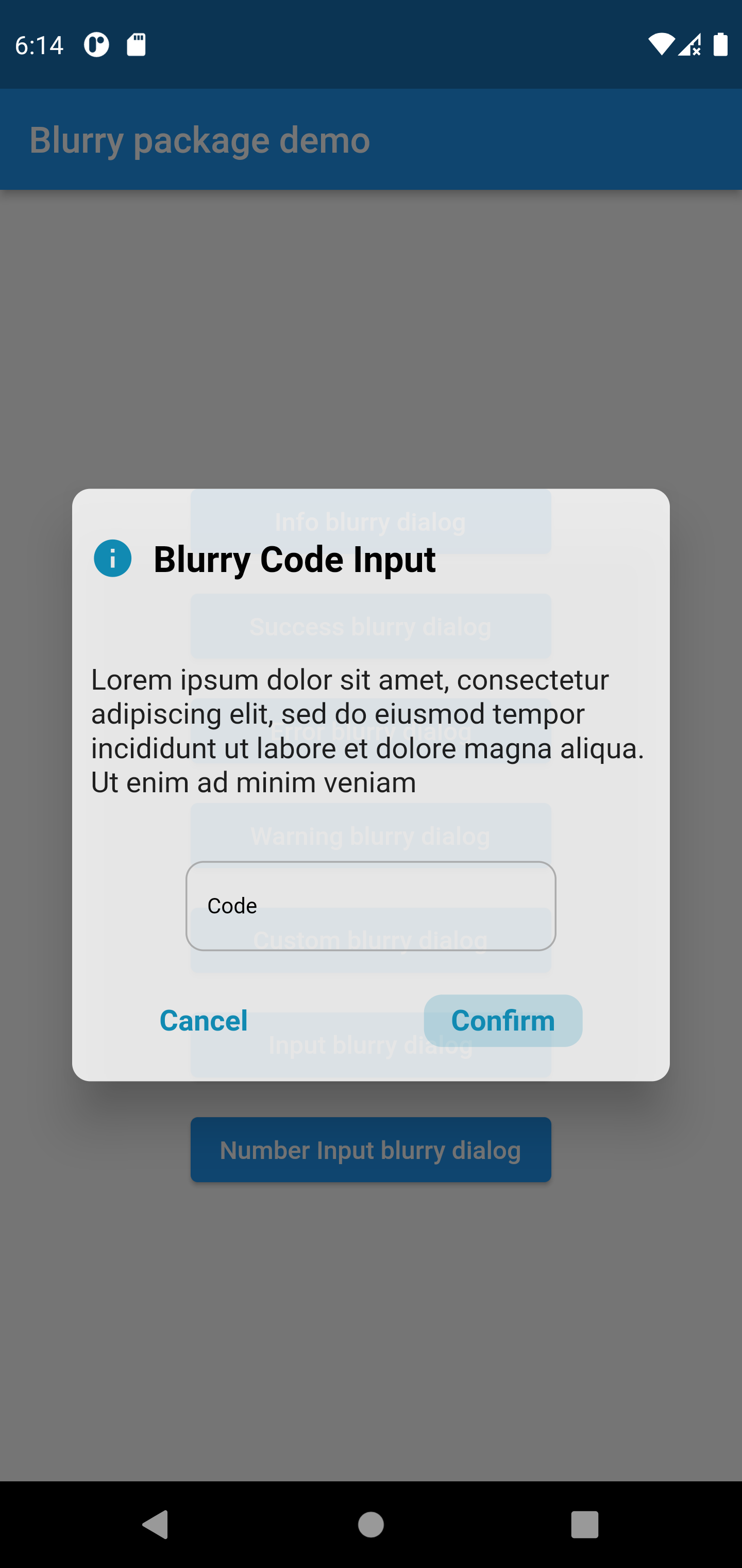
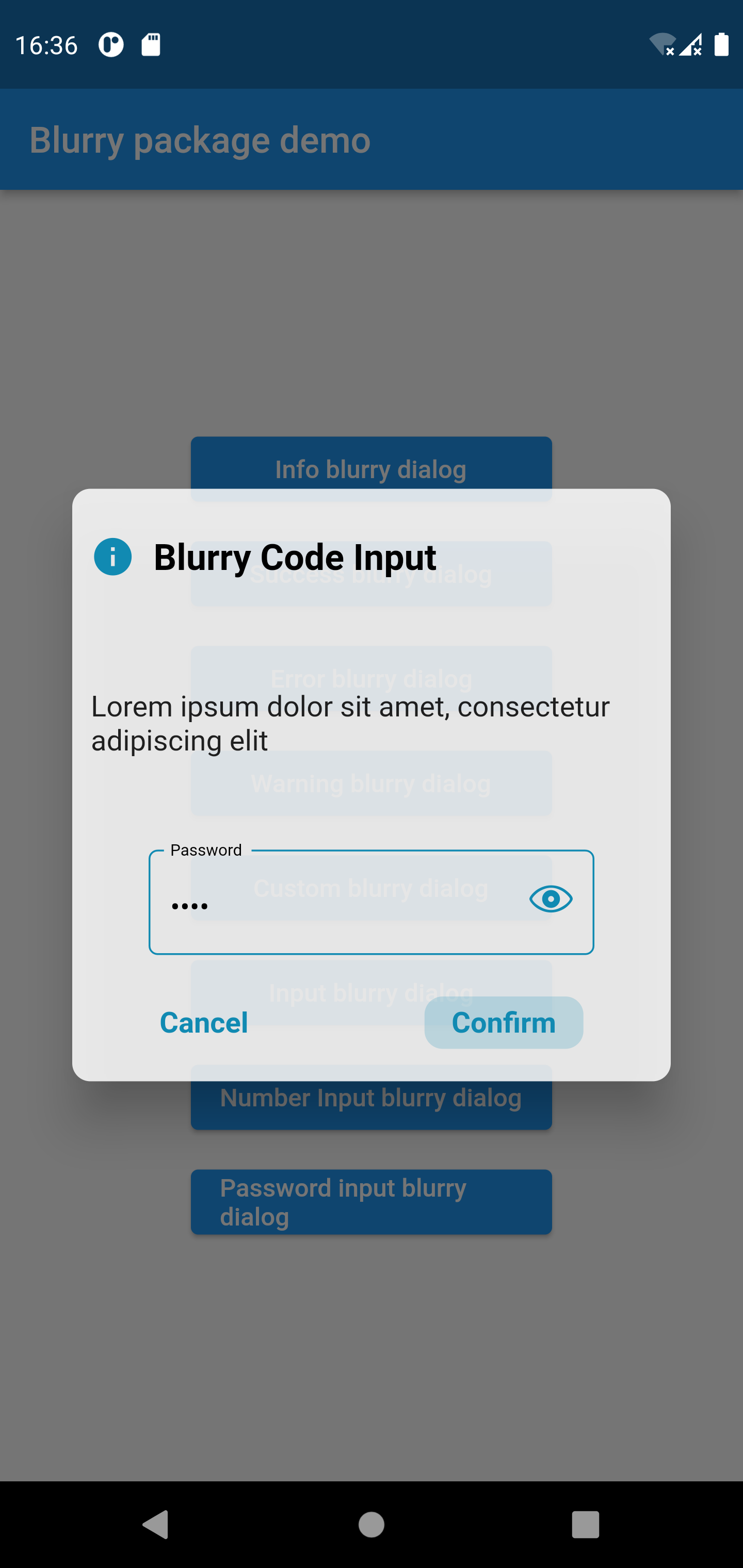
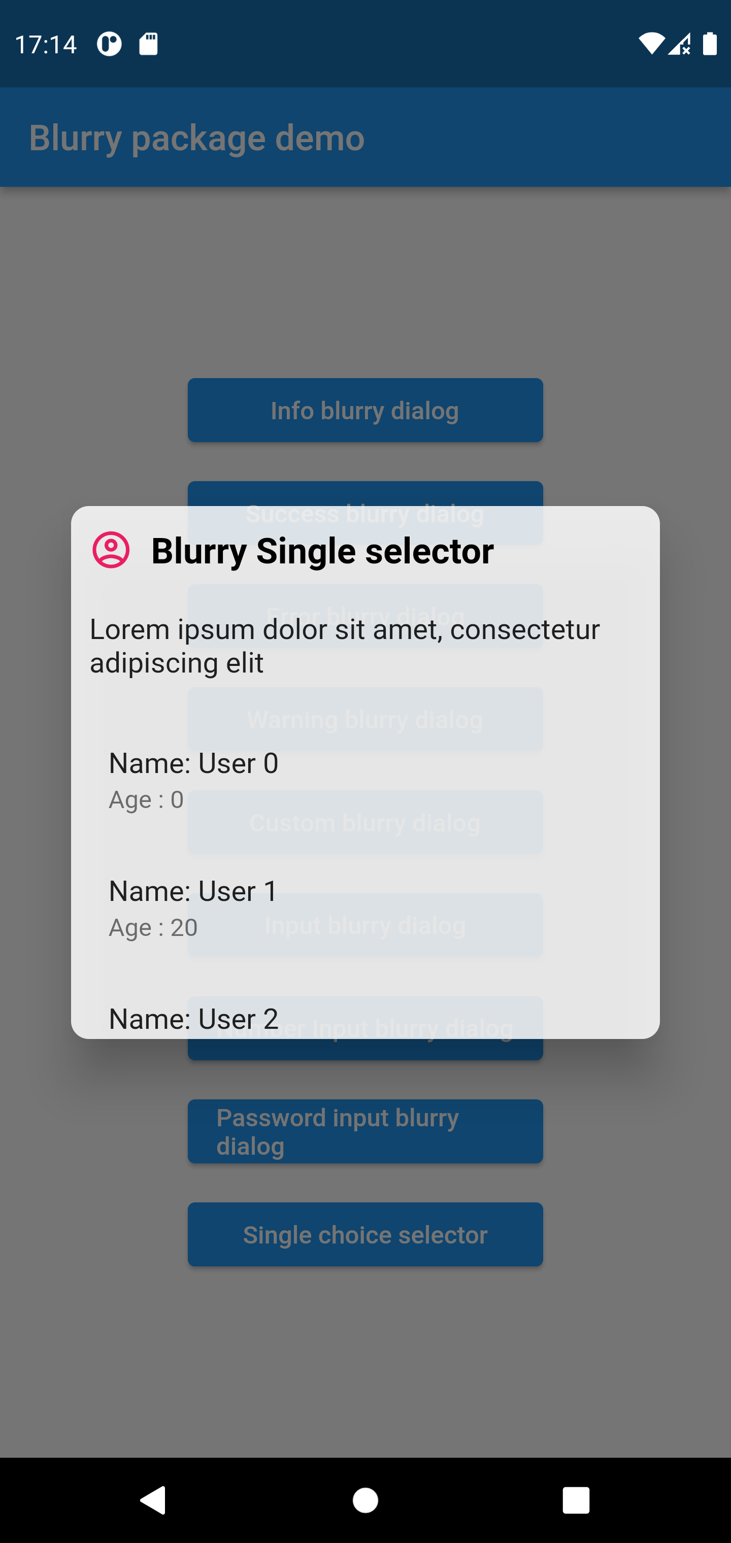
Blurry는 유리 모티브 디자인을 영감으로 삼아 시각적으로 매력적인 블러 효과를 가진 대화 상자 위젯을 제공하는 Flutter 패키지입니다. 내장된 테마로 쉽게 외관을 맞춤설정할 수 있어 현대적인 UI에 적합합니다. Android, iOS, Web, macOS, Windows, Linux 등 여러 플랫폼을 지원하여 다양한 기기에서 일관된 성능을 보장합니다. `flutter pub add blurry`를 통해 최소한의 설정만으로도 개발자는 앱에 세련되고 반투명한 대화 상자를 빠르게 통합할 수 있습니다. 이 패키지는 미묘한 시각적 깊이와 우아함을 통해 사용자 경험을 향상시킵니다.
사용 사례
현대적인 앱 대화 상자 만들기
글래스모포픽 UI 요소 구현
반투명 오버레이 추가
모바일 및 데스크톱 앱의 미적 요소 향상
몰입형 사용자 인터페이스 설계
주요 기능
대화 내용의 블러 효과
내장형 사용자 정의 테마
크로스 플랫폼 호환성
Flutter와의 간편한 통합
다중 운영 체제 지원
적합한 대상
현대적인 미학을 추구하는 UI 디자이너
글래스모픽 인터페이스를 구축하는 개발자
우아한 오버레이 대화상자를 필요로 하는 앱
다중 플랫폼을 대상으로 하는 프로젝트
시각적 완성도에 집중하는 팀
고려 사항
저사양 기기에서의 성능 영향
제공된 테마 외의 맞춤 설정이 제한적
높은 블러 강도로 인한 가독성 문제
색 대비 계획을 신중하게 세워야 합니다
모든 앱 디자인 스타일에 적합하지 않을 수 있습니다
원본 README
연결된 소스 저장소의 README 원문 스냅샷입니다. 최신 내용은 저장소에서 확인하세요.
Blurry Dialog
Features
Display simple blurry dialog popup
Offer built-in themes
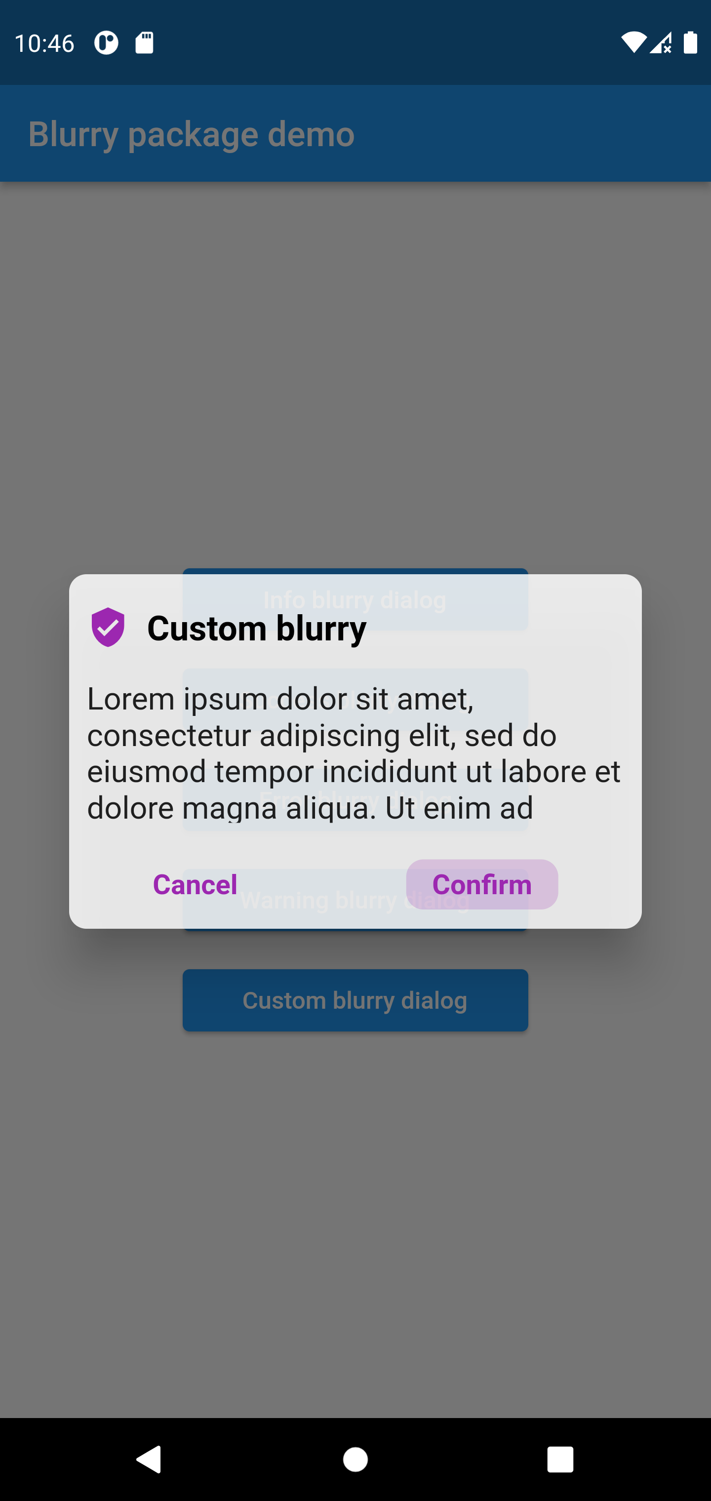
Possibility to create you custom dialog
Button click handler callbacks
Customizable text
Customizable barrier color and behavior
Customize popup size
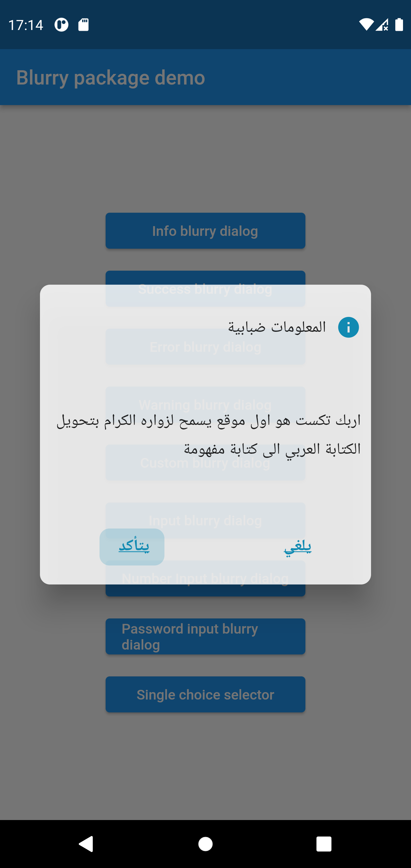
Customizable layout LTR, RTL, Center
Support arabic language
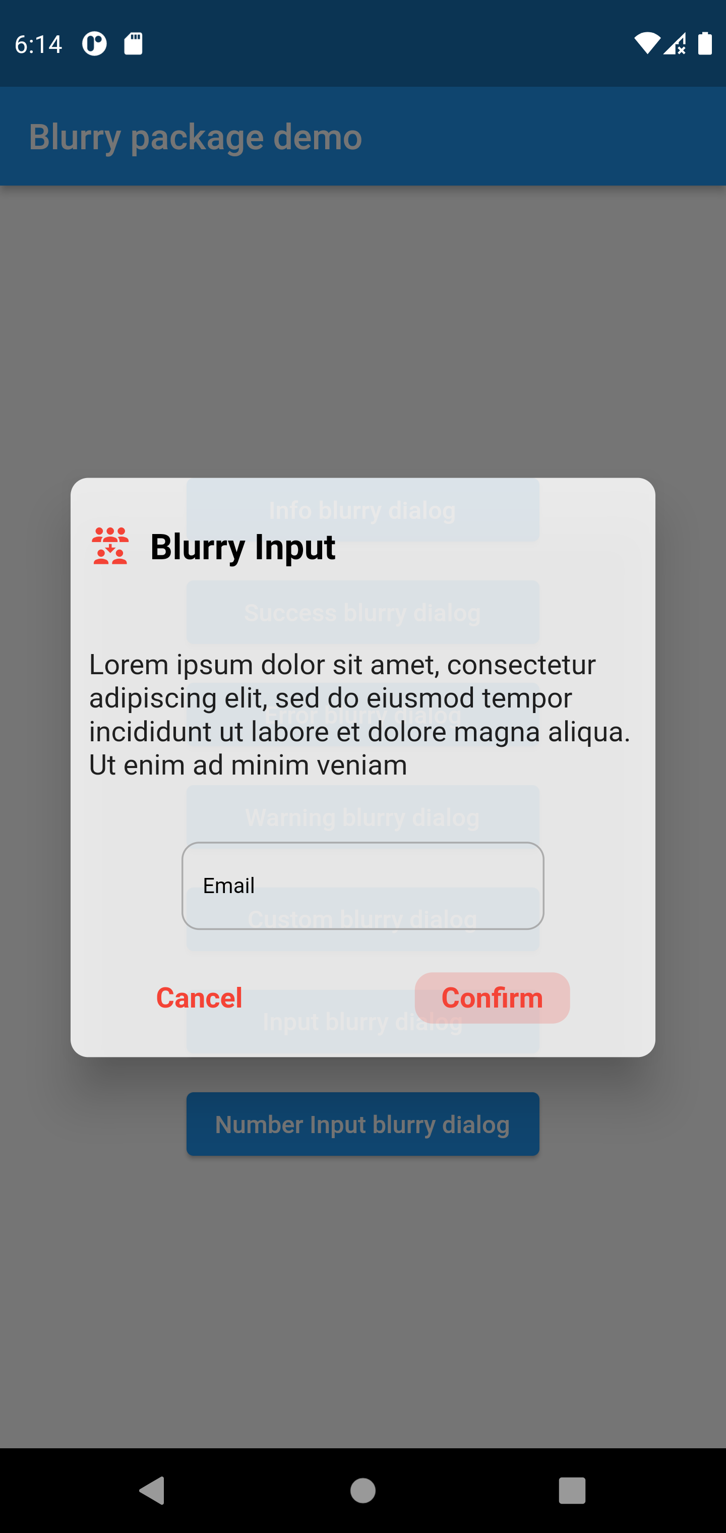
Input popup option with keyboard type
Customizable input style and input text style
Password popup type with eye icon to view password
Single item selector type
Getting started
To use the blurry dialog package you need to add it in pubspec.yaml file
dependencies:blurry:^1.4.2
Usage
Parameters
///the dialog popup title, required in all blurry class constructorsfinalString title;
///the dialog description text///required in all blurry class constructorsfinalString description;
///the cancel button text, by default it's 'Cancel'finalString cancelButtonText;
///the confirm button (primary button) text stringfinalString confirmButtonText;
///the dialog theme color///will be applied on buttons and icon///not available in default types constructors (info, error, warning, success)lateColor? themeColor;
///function invoked when the primary button is pressed///required in all constructorsfinalFunction onConfirmButtonPressed;
///the callback that will be invoked when pressing on cancel buttonfinalFunction? onCancelButtonPressed;
///the icon that will be rendered in the dialog///required only when using the default constructorlateIconData? icon;
///title text style, by default it's nullfinalTextStyle? titleTextStyle;
///description text style, by default it's nullfinalTextStyle? descriptionTextStyle;
///button text style, by default it's nullfinalTextStyle? buttonTextStyle;
///the blurry dialog popup heightfinaldouble? popupHeight;
///indicate whether the cancel button will be rendered or not///by default the cancel button is displayedfinalbool displayCancelButton;
///indicates whether the popup dialog is dismissable or not///by default [dismissable = true]finalbool dismissable;
///the color of the barrier of the burry dialog///if it's null the barrier color will be the default color [Colors.black54]finalColor? barrierColor;
///the layout rendering type, LTR, RTL or center///possible values/// - ltr/// - rtl/// - center/// by default is [LAYOUT_TYPE.ltr]final LAYOUT_TYPE layoutType;
/// the input label string, required when using the input constructorlateString? inputLabel;
/// the input text field text controller/// required when using the input constructorlateTextEditingController? inputTextController;
/// the input text style by default it's just black textlateTextStyle inputTextStyle;
/// the input label style by default it's just black textlateTextStyle inputLabelStyle;
/// text input type applied on input field/// available only when using the input constructorlateTextInputType textInputType;
/// the design type of the popup, available when using input constructor/// availabele options/// {/// info,/// success,/// error,/// warning/// }/// ```late BLURRY_TYPE? type;
/// indicate whether display visibility eye icon on password fields/// available only when using `Blurry.password` constructor/// by default it's 'true'bool withVisibilityEye = true;
///list items that will be rendered in the single selector blurry popup type///available only when using `singleChoiceSelector` constructor (should be not null and not empty)lateList<Widget>? items;
///invoked when pressing on item from the list///available only when using `singleChoiceSelector`///by default pressing an element from the list will close the popuplateFunction(int)? onItemSelected;
Examples
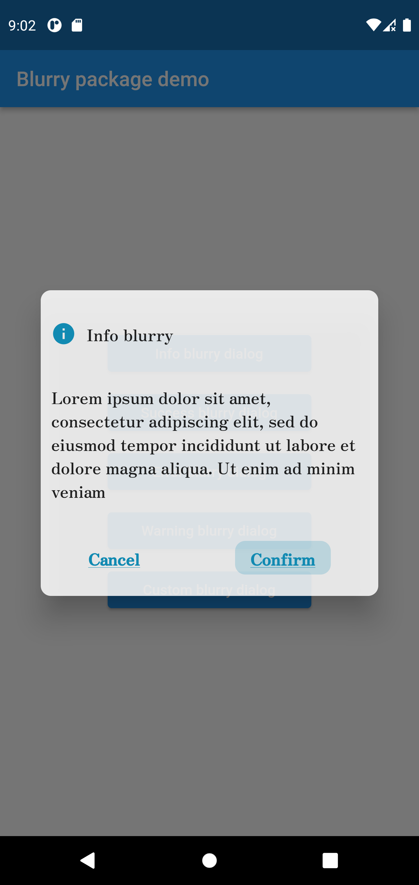
Info style blurry package
Blurry.info(
title: 'Info blurry',
description:'Lorem ipsum dolor sit amet, consectetur adipiscing elit, sed do eiusmod tempor incididuntut labore et dolore magna aliqua. Ut enim ad minim veniam',
confirmButtonText: 'Confirm',
titleTextStyle: constTextStyle(fontFamily: 'Zen'),
popupHeight: 300,
buttonTextStyle: constTextStyle(
decoration: TextDecoration.underline,
fontFamily: 'Zen'
),
descriptionTextStyle: constTextStyle(fontFamily: 'Zen'),
onConfirmButtonPressed: () {})
.show(context);
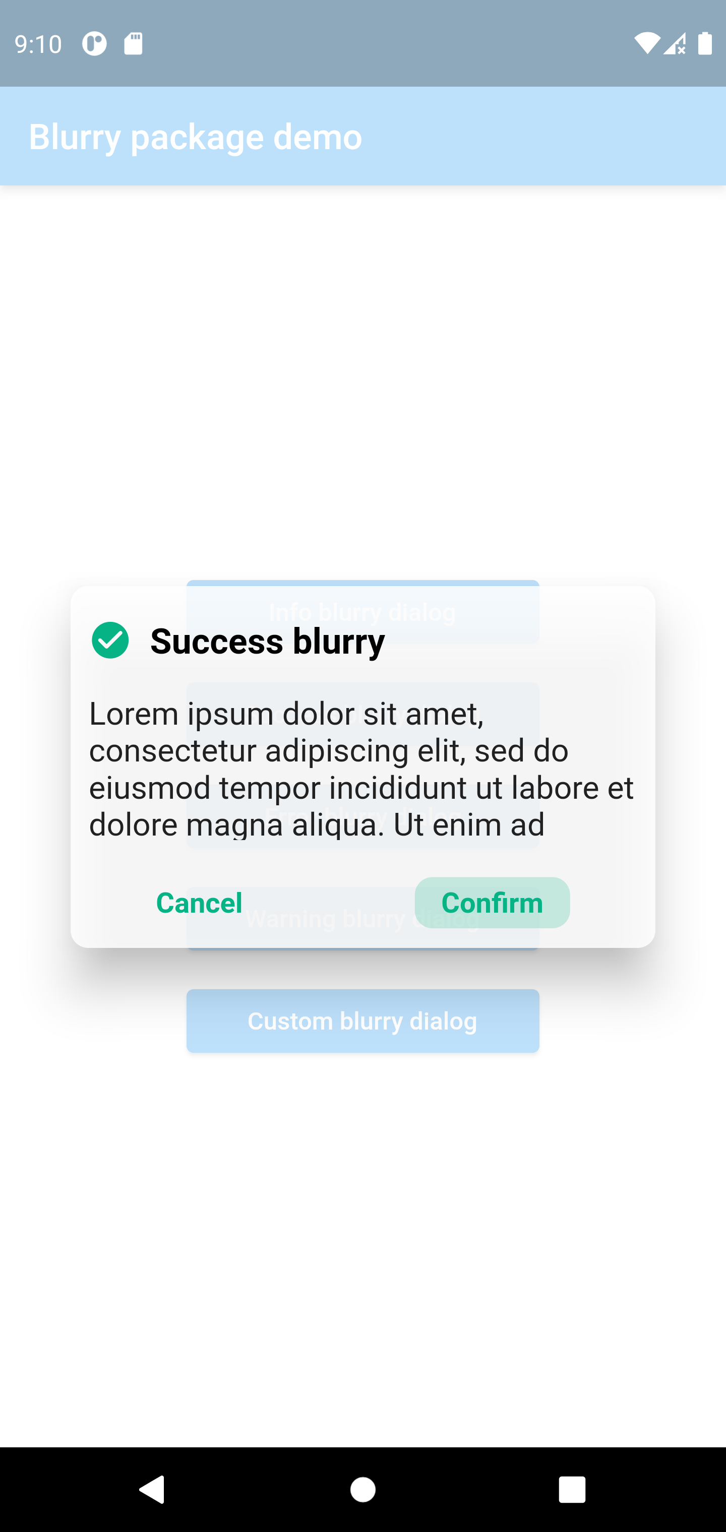
Success style blurry package
Blurry.success(
	title:  'Success blurry',
	description:
	'Lorem ipsum dolor sit amet, consectetur adipiscing elit, sed do eiusmod tempor incididunt ut labore et dolore magna aliqua. Ut enim ad minim veniam',
	confirmButtonText:  'Confirm',
	onConfirmButtonPressed: () {},
	barrierColor: Colors.white.withOpacity(0.7),
	dismissable:  false,
).show(context);
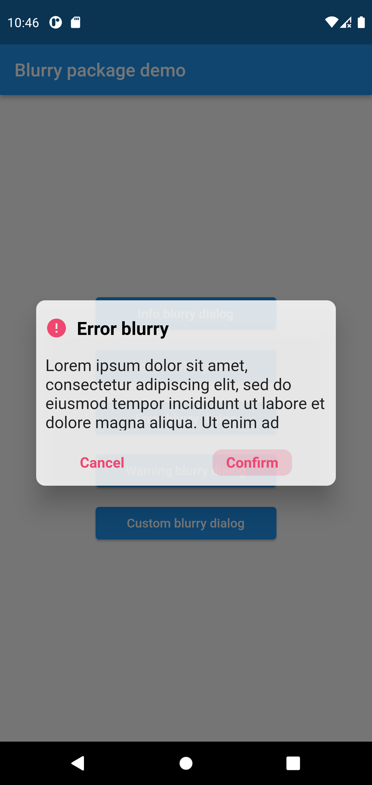
Error style blurry package
Blurry.error(
	title:  'Error blurry',
	description:'Lorem ipsum dolor sit amet, consectetur adipiscing elit, sed do eiusmod tempor incididun',
	confirmButtonText:  'Confirm',
	onConfirmButtonPressed: () {
		print('hello world');
	})
.show(context);
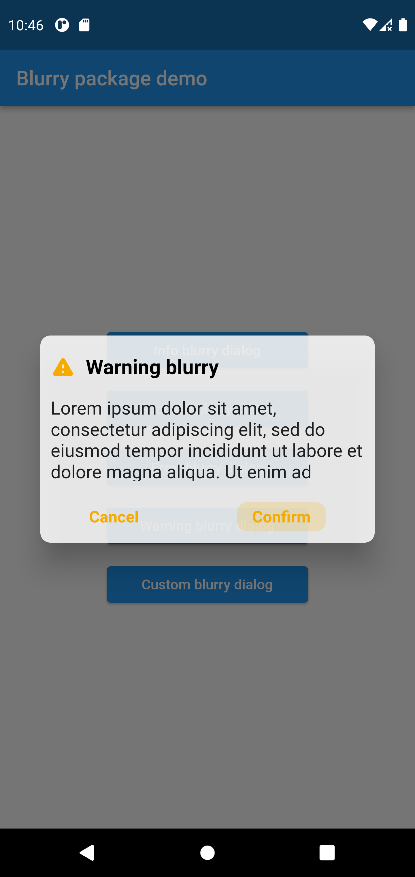
Warning style blurry package
Blurry.warning(
	title:  'Warning blurry',
	description:'Lorem ipsum dolor sit amet, consectetur adipiscing elit, sed do eiusmod tempor incididun',
	confirmButtonText:  'Confirm',
	onConfirmButtonPressed: () {
		print('hello world');
	})
.show(context);