패키지, 저장소 및 앱 카테고리 검색

bottom_bar 표지
패키지 상세v2.0.5

bottom_bar

바텀 바는 아름다운 애니메이션을 갖춘 최적화된 바텀 네비게이션 바를 만들 수 있도록 도와줍니다

AndroidiOSWebmacOSWindowsLinux
30일 다운로드
1.4천
좋아요
137
Pub 점수
160

패키지 설치

flutter pub add bottom_bar

패키지 개요

공개 정보를 바탕으로 생성한 선택 가이드입니다.

Bottom Bar는 개발자가 최적화되고 시각적으로 매력적인 하단 탐색 바를 부드러운 애니메이션과 함께 만들 수 있도록 해주는 Flutter 패키지입니다. 크로스 플랫폼 사용을 위해 설계되어 Android, iOS, 웹, macOS, Windows, Linux를 지원합니다. 사용자 정의 가능한 전환 효과, 반응형 디자인 및 내장된 접근성 기능을 통해 하단 탐색의 구현을 단순화합니다. 다양한 기기에서 직관적인 탐색 패턴을 제공하여 사용자 경험을 향상시킵니다. 현대적인 미학을 갖춘 지속적인 하단 탐색이 필요한 앱에 적합합니다.

사용 사례

  • 모바일 앱 탐색
  • 웹 애플리케이션 대시보드
  • 크로스 플랫폼 데스크톱 앱
  • 개선된 사용자 인터페이스 디자인
  • 반응형 탐색 레이아웃

주요 기능

  • 부드러운 애니메이션 전환
  • 사용자 정의 가능한 외관
  • 크로스 플랫폼 호환성
  • 접근성 지원
  • 반응형 디자인 통합

적합한 대상

  • 모바일 또는 웹 앱을 개발하는 개발자
  • 디자인 중심의 UI 구현
  • 일관된 탐색이 필요한 앱
  • 애니메이션 품질을 우선시하는 팀
  • 여러 플랫폼을 대상으로 하는 프로젝트

고려 사항

  • Flutter SDK 설정이 필요합니다
  • 기본 스타일링을 넘어서는 사용자 정의가 제한되어 있음
  • 추가 상태 관리가 필요할 수 있습니다
  • 복잡한 탭 구조에는 적합하지 않습니다
  • 업데이트를 위해 외부 저장소에 의존합니다

원본 README

연결된 소스 저장소의 README 원문 스냅샷입니다. 최신 내용은 저장소에서 확인하세요.

Bottom Bar

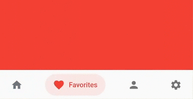
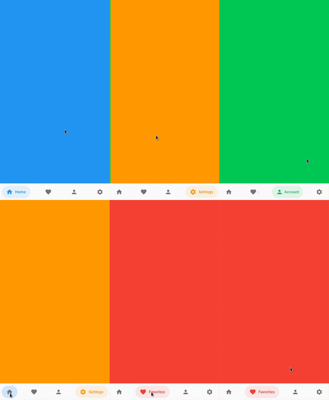
Bottom bar helps create an optimized bottom navigation bar with beautiful animations.

Bottom Bar

Content

Installation

Add bottom_bar to pubspec.yaml

dependencies:
  bottom_bar: ^2.0.5

Breaking Changes

  • darkActiveColor is removed to simplify the api. Instead, use PlatformBrightness to check dark mode and adjust the color accordingly

Usage

Import the Package

import 'package:bottom_bar/bottom_bar.dart';

Example

  int _currentPage = 0;
  final _pageController = PageController();

  @override
  Widget build(BuildContext context) {
    return Scaffold(
      body: PageView(
        controller: _pageController,
        children: [
          Container(color: Colors.blue),
          Container(color: Colors.red),
          Container(color: Colors.greenAccent.shade700),
          Container(color: Colors.orange),
        ],
        onPageChanged: (index) {
          // Use a better state management solution
          // setState is used for simplicity
          setState(() => _currentPage = index);
        },
      ),
      bottomNavigationBar: BottomBar(
        selectedIndex: _currentPage,
        onTap: (int index) {
          _pageController.jumpToPage(index);
          setState(() => _currentPage = index);
        },
        items: <BottomBarItem>[
          BottomBarItem(
            icon: Icon(Icons.home),
            title: Text('Home'),
            activeColor: Colors.blue,
          ),
          BottomBarItem(
            icon: Icon(Icons.favorite),
            title: Text('Favorites'),
            activeColor: Colors.red,
          ),
          BottomBarItem(
            icon: Icon(Icons.person),
            title: Text('Account'),
            activeColor: Colors.greenAccent.shade700,
          ),
          BottomBarItem(
            icon: Icon(Icons.settings),
            title: Text('Settings'),
            activeColor: Colors.orange,
          ),
        ],
      ),
    );
  }

Parameters

BottomBar

Creates a BottomBar that displays a list of BottomBarItem
Required:
Optional:
  • backgroundColor - Background Color of BottomBar
  • height - Height of BottomBar
  • padding - Padding of BottomBar container
  • mainAxisAlignment - Describes how BottomBarItems are horizontally laid out
  • curve - Curve of animation
  • duration - Duration of animation
  • border - Border of BottomBarItem's background color
  • boxShadow - BoxShadow of BottomBar
  • itemPadding - Padding of BottomBarItem's background color
  • textStyle - TextStyle of title widget
  • showActiveBackgroundColor - Shows the background color of a selected BottomBarItem if set to true

BottomBarItem

Contains information about the item that BottomBar has to display
Required:
  • icon - Icon of BottomBarItem
  • title - Title of BottomBarItem (Typically a Text widget)
  • activeColor - Primary color of a selected BottomBarItem
Optional:
  • activeIconColor - Icon color of a selected BottomBarItem
  • activeTitleColor - Text color of a selected BottomBarItem
  • backgroundColorOpacity - Opacity of a selected BottomBarItem background color (Defaults to 15%)
  • inactiveIcon- Icon to display when BottomBarItem is not active
  • inactiveColor - Primary color of BottomBarItem when it is NOT selected

FAQ

My phone's notch is overlapping with BottomBar. How do I fix this?
  • Simply wrap BottomBar with a SafeArea widget.
How do I change the overall color of BottomBarItem when in dark mode?
  @override
  Widget build(BuildContext context) {
    bool isDarkMode = MediaQuery.of(context).platformBrightness == Brightness.dark;

    BottomBarItem(
      activeColor: isDarkMode ? Colors.orange : Colors.blue, // Is dark mode true? (Yes -> Colors.orange | No -> Colors.blue)
    ),
  }

Community Support

If you have any suggestions or issues, feel free to open an issue

If you would like to contribute, feel free to create a PR

카테고리

소스 저장소

이 패키지를 사용하는 프로젝트