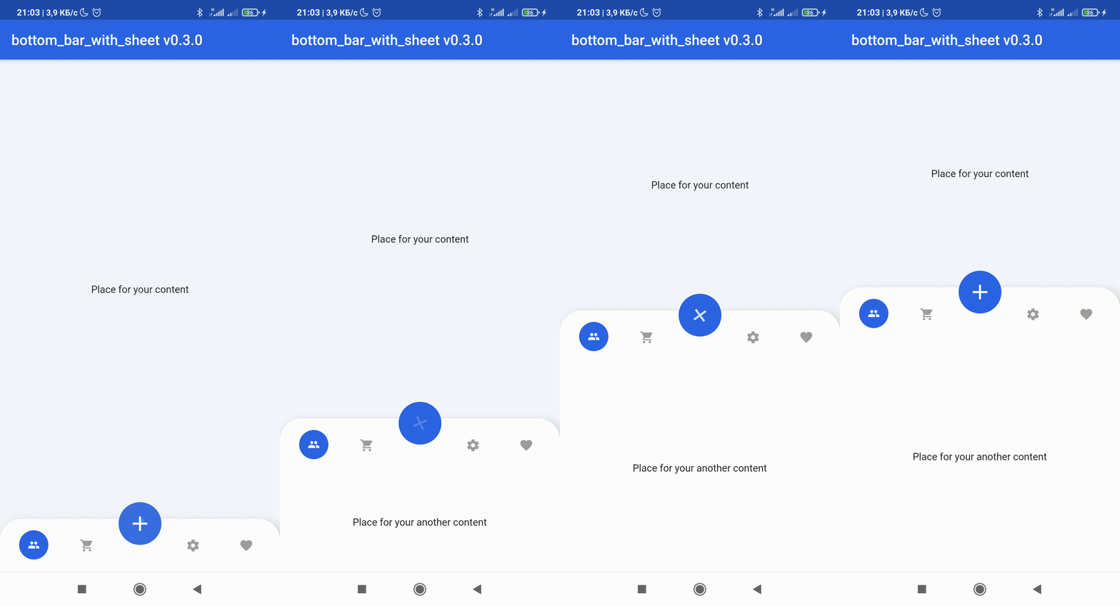
bottom_bar_with_sheet 패키지는 어떤 페이지에서도 하단 탐색 바와 FloatingActionButton을 쉽게 만들 수 있도록 도와줍니다. 이 버튼은 BottomSheet를 트리거합니다. 이를 통해 플랫폼 간에 일관되고 사용자 친화적인 방식으로 네비게이션과 추가 콘텐츠 접근을 간소화합니다. 현재 화면을 떠나지 않고도 빠르게 작업이나 메뉴에 접근해야 하는 앱에 적합합니다. 이 패키지는 Android, iOS, Web, macOS, Windows, Linux 등 주요 플랫폼을 모두 지원합니다.
사용 사례
BottomSheet를 통한 작업에 대한 빠른 액세스
여러 페이지에 걸친 일관된 탐색
플로팅 액션을 통한 사용자 상호작용 향상
앱에서 맥락 메뉴 통합하기
반응형 모바일 우선 인터페이스 구축
주요 기능
BottomNavigationBar 통합
FloatingActionButton이 BottomSheet를 트리거합니다
크로스 플랫폼 지원
설정을 위한 간단한 API
재사용 가능한 컴포넌트 구조
적합한 대상
모바일 앱 개발자
일관성을 찾는 UI/UX 디자이너
자주 액션에 접근이 필요한 앱
다중 플랫폼 앱을 위한 Flutter 사용 개발자
복잡한 탐색 요구 사항을 가진 프로젝트
고려 사항
독특한 디자인을 위해 맞춤 스타일링이 필요할 수 있습니다
하단 시트 기능만 사용 가능
Flutter의 매터리얼 디자인 시스템에 의존합니다
하단 시트 외의 상호작용에는 적합하지 않습니다
많은 중첩 시트로 인한 성능 영향 가능성
원본 README
연결된 소스 저장소의 README 원문 스냅샷입니다. 최신 내용은 저장소에서 확인하세요.
Bottom bar with Sheet
💥Non-standard way to use more space of screens in your application💥
😳Custom bottom Sheet under Bottom Navigation Bar😳
😩Sounds sucks? 😉 First of all look at screens!
If true the [BottomBarWithSheetItem]'s DO NOT automatically close the child sheet when pressed
disableMainActionButton
bool
disable MainActionButton if true , enable if false
sheetChild
Widget
that displayed on bottom of BottomBarWithSheet when isOpened == true
items
List BottomBarWithSheetItem
navigation buttons of BottomBarWithSheet
bottomBarTheme
BottomBarTheme
theme of BottomBarWithSheet
mainActionButtonTheme
MainActionButtonTheme
theme of Main Action Button
onSelectItem
Function
Callback Function works by clicking on one of items Return int index of selected button
duration
Duration
animation time of closing / opening BottomBarWithSheet
curve
Curve
the style of animation from the suggested ones of Curve
bottomBarMainAxisAlignment
MainAxisAlignment
The direction in which the widget content will line up
mainActionButtonBuilder
MainActionButton
Custom version of Main Action Button
Attributes of BottomBarTheme
Attribute
Type
Annotation
height
double
BottomBarWithSheet icons line height
heightOpened
double
BottomBarWithSheet height when isOpened == true
heightClosed
double
BottomBarWithSheet height when isOpened == false
decoration
BoxDecoration
decoration of BottomBarWithSheet
contentPadding
EdgeInsets
create padding between content of widget and sides
backgroundColor
Color
BottomBarWithSheet background color
selectedItemIconColor
Color
selected item icon color
itemIconColor
Color
unselected item icon color
selectedItemTextStyle
Color
selected item text style
itemTextStyle
Color
unselected item text style
selectedItemIconSize
double
size of item icon when item is pressed
mainButtonPosition
enum
filed that response for the position of MainActionButton position this field have 3 possible values: MainButtonPosition.left, MainButtonPosition.right , MainButtonPosition.Center
isVerticalItemLabel
bool
makes the labels of the items appear vertically or horizontally
Attributes of MainActionButtonTheme
Attribute
Type
Annotation
size
double
size of button
icon
Widget
icon that displayed in center of MainActionButton
color
Color
background color of widget circle
splash
Color
splash color of widget circle
margin
EdgeInsets
side paddings of Main Action Button
transform
Matrix4
This field can set transform location of Main Action Button
For help getting started with Flutter, view our
online documentation, which offers tutorials,
samples, guidance on mobile development, and a full API reference.