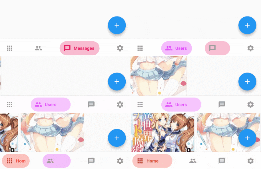
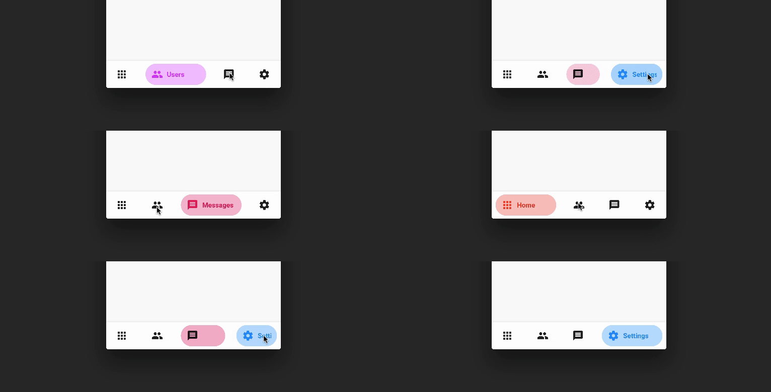
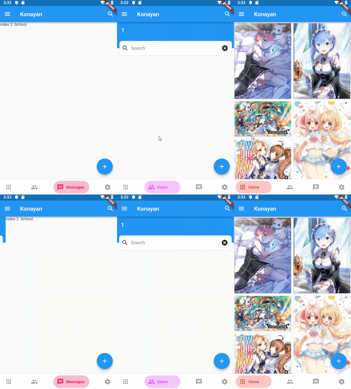
BottomNavyBar는 Flutter 애플리케이션용으로 시각적으로 매력적이고 애니메이션 효과가 있는 하단 탐색 바입니다. 앱의 현재 테마와 자연스럽게 통합되며, 색상, 아이콘 및 애니메이션에 대한 광범위한 사용자 정의 옵션을 제공합니다. 현대적인 UI를 위해 설계되었으며, 모든 플랫폼에서 부드러운 전환과 반응성 있는 피드백을 통해 사용자 경험을 향상시킵니다. Android, iOS, Web, macOS, Windows, Linux를 지원하여 크로스플랫폼 개발에 이상적입니다. 깔끔하고 직관적인 디자인은 세련된 하단 탐색 인터페이스가 필요한 앱에 완벽합니다.
사용 사례
하단 탐색이 있는 모바일 및 웹 앱
크로스 플랫폼 애플리케이션
현대적인 UI 디자인
전자상거래 및 소셜 미디어 앱
대시보드 인터페이스
주요 기능
애니메이션 탐색 전환
테마 인식 스타일링
사용자 지정 가능한 색상 및 아이콘
다양한 플랫폼 간 반응형 디자인
부드러운 사용자 상호작용
다중 플랫폼 대상 지원
적합한 대상
아름다운 하단 네비게이션 바를 찾는 개발자
다중 플랫폼을 대상으로 하는 앱
디자인 중심의 플러터 프로젝트
애니메이션 UI 요소가 필요한 프로젝트
사용자 경험을 우선시하는 팀
고려 사항
복잡한 테마에 대해 추가 스타일링이 필요할 수 있습니다
하단 탐색 사용 사례에 제한됨
애니메이션 성능은 저사양 기기에서 테스트해야 합니다
상단 또는 측면 탐색 레이아웃에 적합하지 않습니다
사용자 정의는 코드 복잡성을 증가시킬 수 있습니다
원본 README
연결된 소스 저장소의 README 원문 스냅샷입니다. 최신 내용은 저장소에서 확인하세요.
BottomNavyBar
A beautiful and animated bottom navigation.
The navigation bar uses your current theme, but you are free to customize it.
Preview
PageView
Customization (Optional)
BottomNavyBar
iconSize - the item icon's size
items - navigation items, required more than one item and less than six
selectedIndex - the current item index. Use this to change the selected item. Defaults to zero
onItemSelected - required to listen when an item is tapped it provides the selected item's index
backgroundColor - the navigation bar's background color
showElevation - if false the appBar's elevation will be removed
mainAxisAlignment - use this property to change the horizontal alignment of the items. It is mostly used when you have ony two items and you want to center the items
curve - param to customize the item change's animation
containerHeight - changes the Navigation Bar's height
showInactiveTitle - use this property show a Inactive titles. Defaults to false.
BottomNavyBarItem
icon - the icon of this item
title - the text that will appear next to the icon when this item is selected
activeColor - the active item's background and text color
inactiveColor - the inactive item's icon color
textAlign - property to change the alignment of the item title
activeBackgroundColor - the active item's background color
activeTextColor - the active item's text color
tooltipText - the tooltip text that will appear when the item is long pressed
Contributions of any kind are more than welcome! Feel free to fork and improve in any way you want, make a pull request, or open an issue.
See CONTRIBUTING.md for more info on how to contribute to this project.
License
This project is licensed under the Apache-2.0 License - see the LICENSE file for details.