패키지, 저장소 및 앱 카테고리 검색

패키지 상세v1.0.2

bottom_personalized_dot_bar

하단 사용자 정의 점 바, 모든 항목을 드래그 앤 드롭하고 최상의 방식으로 하단 탐색을 맞춤 설정하세요.

30일 다운로드
51
좋아요
98
Pub 점수
30

패키지 설치

flutter pub add bottom_personalized_dot_bar

패키지 개요

공개 정보를 바탕으로 생성한 선택 가이드입니다.

Flutter에서 사용할 수 있는 사용자 정의 가능한 하단 탐색 바로, 사용자가 항목을 드래그 앤 드롭하여 레이아웃을 개인화할 수 있습니다. 탐색 아이콘을 배열하는 데 동적이고 상호작용적인 경험을 제공하며, 외관과 동작에 대한 완전한 제어를 가능하게 합니다. 유연한 탐색 패턴이 필요한 앱에 적합하며, 직관적인 커스터마이징을 통해 사용자 참여도를 높입니다. 부드러운 전환과 반응형 디자인을 지원하여 현대적인 모바일 애플리케이션에 적합합니다.

사용 사례

  • 사용자 정의 가능한 앱 탐색
  • 사용자 중심의 인터페이스 레이아웃
  • 인터랙티브 하단 바
  • 모바일 앱 개인화
  • 동적 UI 재정렬

주요 기능

  • 드래그 앤 드롭 항목 재정렬
  • 완전히 사용자 정의 가능한 점 표시기
  • 반응형 디자인 지원
  • Flutter와의 간편한 통합
  • 사용자 정의 스타일링을 지원합니다

적합한 대상

  • 상호작용형 탐색을 찾는 개발자
  • 사용자 중심 디자인을 갖춘 앱
  • 사용자 정의 가능한 모바일 인터페이스
  • 동적 하단 바가 필요한 Flutter 프로젝트
  • 디자인 중심 애플리케이션 개발

고려 사항

  • 제한된 플랫폼별 문서
  • 기본 전환 외에는 내장 애니메이션이 없습니다
  • 상태 관리를 수동으로 처리해야 합니다
  • 대량의 항목에 대해 최적화되지 않음
  • 복잡한 테마에 대해 추가 스타일링이 필요할 수 있습니다

원본 README

연결된 소스 저장소의 README 원문 스냅샷입니다. 최신 내용은 저장소에서 확인하세요.

Bottom Personalized Dot Bar

A bottom navigation bar that you can customize with the options you need, without any limits. You can also customize the appearance of the navigation bar.

The development was inspired by the following design: personalized-tab-bar

You can see the source code of this lib inside the /lib folder.

Show some ❤️ and star the repo to support this project

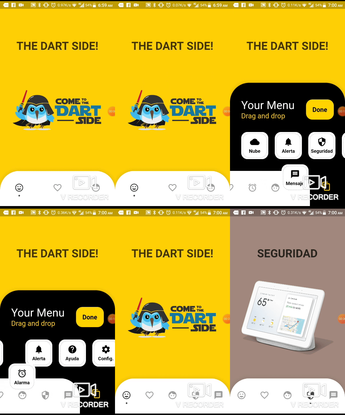
Demo example (Mobile)

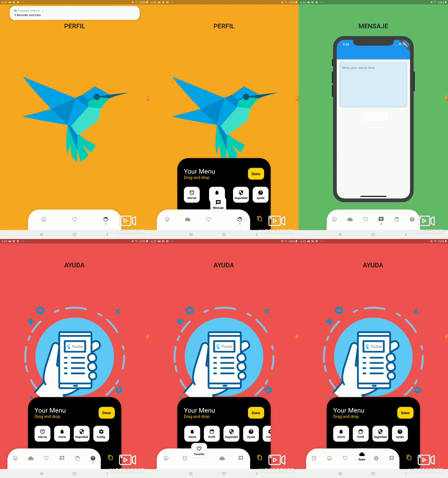
Demo example (Tablet 1)

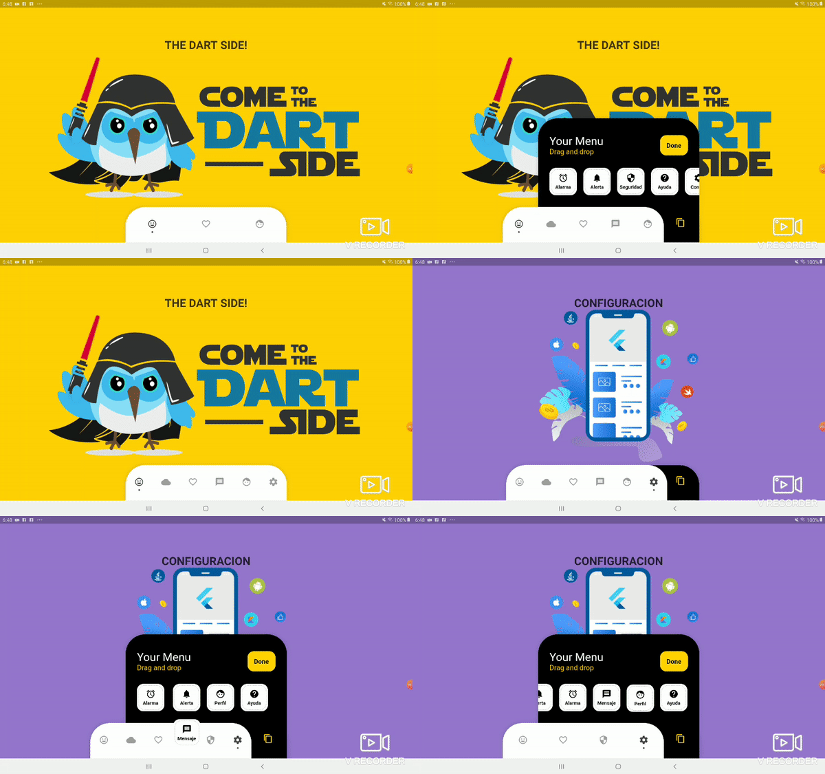
Demo example (Tablet 2)

Package overview

  • [x] Drag and Drop your options!
  • [x] Change icon colors
  • [x] Listen to events 'Sort, Insert and Delete'
  • [x] Dynamically change the selected option
  • [x] Custom options
  • [x] Unlimit options
  • [x] Option to define custom item background color
  • [x] And more ...

Getting Started

Add the plugin:
dependencies:
  ...
  bottom_personalized_dot_bar: ^1.0.2
Import the package
import 'package:bottom_personalized_dot_bar/bottom_personalized_dot_bar.dart';
How to use?

Important! dont use 'bottomNavigationBar' of Scaffold, because it occupies the entire screen, you need to add it inside a Stack.

To add the Options list, you must create BottomPersonalizedDotBarItem, and each must have the unique attribute 'keyItem'.

To modify the selected option, you must update the attribute keyItemSelected of the BottomPersonalizedDotBar

String _itemSelected = 'item-1';
...
..
.
Scaffold(
  body: Stack(
    children: <Widget>[
      .... // Your App Home
      BottomPersonalizedDotBar(
          keyItemSelected: _itemSelected,
          doneText: 'Done',
          settingTitleText: 'Your Menu',
          settingSubTitleText: 'Drag and drop options',
          iconSettingColor: const Color(0xFFFFD201),
          buttonDoneColor: const Color(0xFFFFD500),
          settingSubTitleColor: const Color(0xFFFECE02),
          hiddenItems: <BottomPersonalizedDotBarItem>[
              BottomPersonalizedDotBarItem('item-4', icon: Icons.cloud, name: 'Nube', onTap: (itemSelected) { /* event selected */ }),
              BottomPersonalizedDotBarItem('item-5', icon: Icons.access_alarm, name: 'Alarma', onTap: (itemSelected) { /* event selected */ }),
              BottomPersonalizedDotBarItem('item-6', icon: Icons.message, name: 'Mensaje', onTap: (itemSelected) { /* event selected */ }),
              BottomPersonalizedDotBarItem('item-7', icon: Icons.notifications, name: 'Alerta', onTap: (itemSelected) { /* event selected */ }),
              BottomPersonalizedDotBarItem('item-8', icon: Icons.security, name: 'Seguridad', onTap: (itemSelected) { /* event selected */ }),
              BottomPersonalizedDotBarItem('item-9', icon: Icons.help, name: 'Ayuda', onTap: (itemSelected) { /* event selected */ }),
              BottomPersonalizedDotBarItem('item-10', icon: Icons.settings, name: 'Config.', onTap: (itemSelected) { /* event selected */ }),
          ],
          items: <BottomPersonalizedDotBarItem>[
              BottomPersonalizedDotBarItem('item-1', icon: Icons.sentiment_very_satisfied, name: 'Flutter', onTap: (itemSelected) { /* event selected */ }),
              BottomPersonalizedDotBarItem('item-2', icon: Icons.favorite_border, name: 'Favorito', onTap: (itemSelected) { /* event selected */ }),
              BottomPersonalizedDotBarItem('item-3', icon: Icons.face, name: 'Perfil', onTap: (itemSelected) { /* event selected */ }),
          ],
      ),
    ],
  ),
);

Customization

BottomPersonalizedDotBar
Attribute Description
items List of items to be displayed in the navigation bar
hiddenItems List of items that will be hidden
keyItemSelected Item key that is selected
width Navigation bar width
height Navigation bar height
borderRadius Navigation bar radius
selectedColorIcon Selected Icon color
unSelectedColorIcon Unselected Icon color
navigatorBackground Navigator Container Background color
settingBackground Setting Container Background color (Hidden items)
iconSetting Settings button icon
iconSettingColor Settings button icon color
settingTitleText Setting Title Text
settingTitleColor Setting Title color
settingSubTitleText Setting Sub-Title Text
settingSubTitleColor Setting Sub-Title color
doneText Done button Text
textDoneColor Text Done Color
buttonDoneColor Button done color
hiddenItemBackground Background of hidden item
iconHiddenColor Icon Hidden Color
textHiddenColor Text Hidden Color
dotColor Selection Indicator Color (Dot
boxShadow Shadow of container
onOrderHideItems Event when you sort the hidden options, this has as parameter the list of hidden options with the new order. onOrderHideItems: (List<BottomPersonalizedDotBarItem> hiddenItems) { /* Your action */ }
onOrderItems Event when ordering browser options, this has as parameter the list of options with the new order onOrderItems: (List<BottomPersonalizedDotBarItem> items) { /* Your action */ }
onAddItem Event when you add a new option to the navigation bar, this has as parameters the item you add and the list of options. onAddItem: (BottomPersonalizedDotBarItem itemAdd, List<BottomPersonalizedDotBarItem> items) { /* Your action */ }
onRemoveItem Event when you delete an option from the navigation bar, this has as parameters the element to delete and the list of hidden options. onRemoveItem: (BottomPersonalizedDotBarItem itemRemove, List<BottomPersonalizedDotBarItem> hiddenItems) { /* Your action */ }
BottomPersonalizedDotBarItem
Attribute Description
keyItem Unique key
icon Item icon
name Item name
onTap Event with you press the item. onTap: (String keyItem) { /* Your action */ }

카테고리

의존성

의존성 목록 1 개

소스 저장소

이 패키지를 사용하는 프로젝트

아직 데이터가 없습니다.