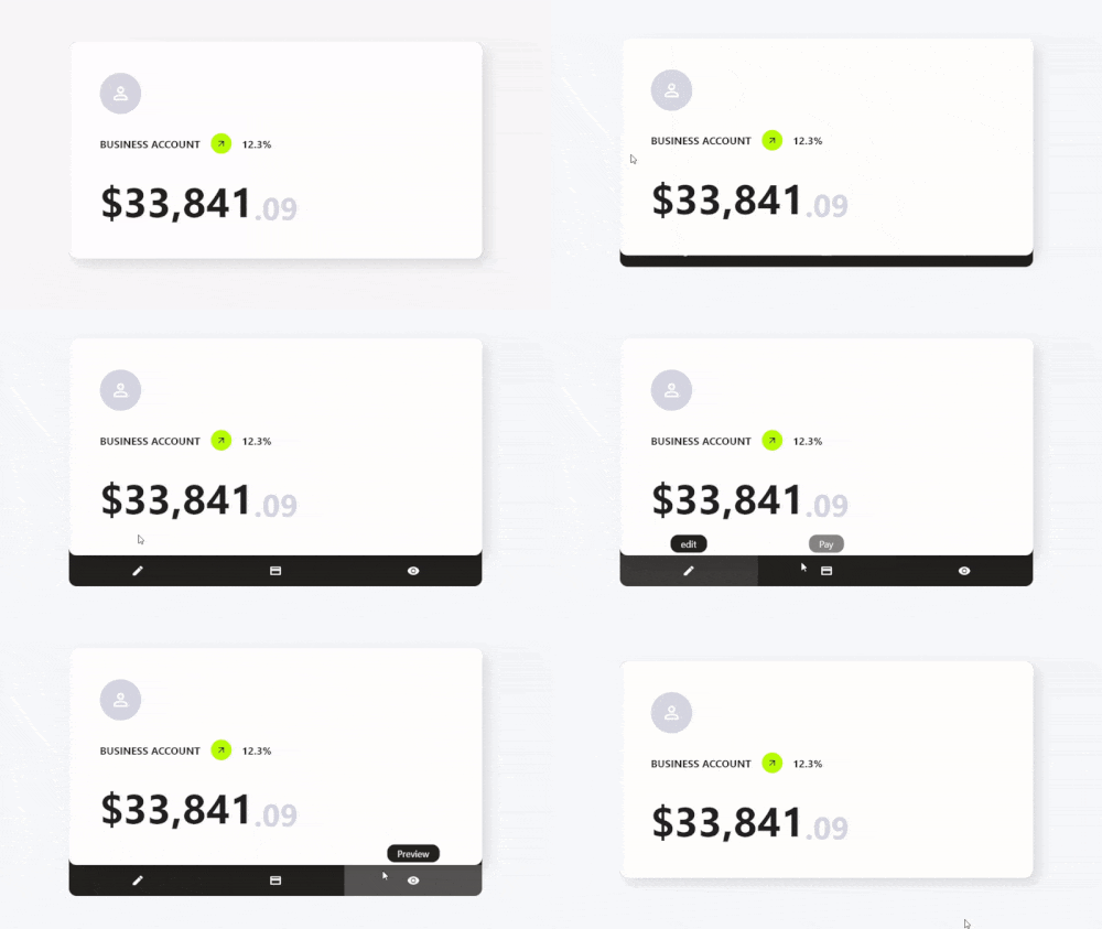
Card Actions는 카드 위젯에 사용자 정의 액션과 상호작용 기능을 강화하는 Flutter 패키지입니다. 개발자가 카드에 스와이프 제스처, 탭 인터랙션 및 동적 콘텐츠 변경을 추가할 수 있게 해주며, 사용자 참여도를 향상시킵니다. 리스트, 대시보드 또는 카드 기반 UI에서 사용하도록 설계되었으며, Android, iOS, Web, macOS, Windows, Linux 등 여러 플랫폼을 지원합니다. 간단한 pub add 명령어를 통해 기존 Flutter 프로젝트에 쉽게 통합할 수 있습니다. 가볍고 경량화된 디자인으로 성능과 사용 편의성에 중점을 두어, 현대적이고 반응형 카드 인터페이스에 이상적입니다.
사용 사례
인터랙티브 카드 스와이프
다이나믹 카드 콘텐츠 업데이트
제스처 기반 카드 상호작용
카드 기반 대시보드
카드 작업을 통한 사용자 피드백
크로스 플랫폼 카드 개선
주요 기능
스와이프 액션 지원
사용자 정의 가능한 탭 및 제스처 반응
경량이며 성능이 뛰어남
다중 플랫폼 호환성
Flutter와의 간편한 통합
확장 가능한 액션 핸들러
적합한 대상
카드 기반 UI를 구축하는 개발자
상호작용 카드 요소가 필요한 앱
크로스플랫폼 모바일 및 웹 앱
재사용 가능한 카드 컴포넌트로 디자인 시스템 설계하기
인터랙티브 레이아웃 프로토타이핑
고려 사항
Flutter 제스처 시스템에 대한 이해가 필요합니다
복잡한 상호작용을 위해 추가 스타일링이 필요할 수 있습니다
간단한부터 중간 정도의 복잡도의 카드 동작에 가장 적합
전체 화면 탐색을 위한 것이 아님
카드 수준의 상호작용에 제한됨
원본 README
연결된 소스 저장소의 README 원문 스냅샷입니다. 최신 내용은 저장소에서 확인하세요.
Features
✨ Simple Use
⚙️ Great Customization
🌍 Expand the functionality of your cards
🛑 Not use for mobile devices, will soon be available for use on those platforms.
Getting Started
To use this card actions package, you need to add the dependencies in pubspec.yaml file.
dependencies:card_actions:^0.0.1
Use
To use card actions is very simple, just wrap your card with our CardActions widget,
CardActions(
    ...
    child: YourCard() // here would be your card
)
Basic Setup
CardActions needs the parameters width, height and actions
width is the width of the widget
height is the height of the widget
actions is a list of CardActionButton.
CardActions(
    width: //your card width
    height: // your card height
    actions: <CardActionButton>[
        CardActionButton(
            icon: Icon(
                Icons.edit,
                color: Colors.white,
            ), // Icon
            label: 'edit',
            onPress: () {},
        ), // CardActionButton
    ]
    child: yourCard(), // here would be your card
)
If you want to change the direction of the hover, you can use the axisDirection property of the CardAction to change it.
the axisDirection property receives a enum of type CardActionAxis at the moment we only have bottom and right.
CardActionAxis.bottom
CardActionAxis.right
Example
To make this example, we will need to configure more things, but it will be very simple, the first thing is that we change the background color for it we have to use the property backgroundColor then an important part is that we change the design of the cursor when it is on top of the buttons and this we can do it in two ways:
In the CardAction we have the buttonsCursor property that serves to change the cursor to ALL the buttons.
In the CardActionButton we have the cursor property to change the cursor to that specific button.
Important.
If you use both options at the same time the button will prioritize its own cursor setting over the global setting with buttonsCursor.
and finally we add the necessary functions to the buttons by means of its onPress method.