패키지, 저장소 및 앱 카테고리 검색

cart_stepper 표지
패키지 상세v4.3.0

cart_stepper

카운트를 얻는 데 사용할 수 있는 완전히 사용자 정의 가능한 Flutter 위젯입니다. 전자상거래 앱에서 장바구니 카운트에 적용할 수 있습니다.

AndroidiOSWebmacOSWindowsLinux
30일 다운로드
717
좋아요
69
Pub 점수
160

패키지 설치

flutter pub add cart_stepper

패키지 개요

공개 정보를 바탕으로 생성한 선택 가이드입니다.

전자상거래 애플리케이션에 적합한 항목 수를 관리하고 표시하기 위해 설계된 완전히 사용자 정의 가능한 Flutter 위젯입니다. 부드러운 애니메이션을 통해 사용자가 수량을 증가 또는 감소시킬 수 있으며, 버튼, 텍스트 스타일 및 동작을 사용자 정의할 수 있습니다. 가볍고 여러 플랫폼에서 쇼핑카트나 제품 수량 선택기와 원활하게 통합됩니다.

사용 사례

  • 전자상거래 제품 수량 선택
  • 쇼핑카트 항목 수 관리
  • 양식 내 사용자 정의 숫자 입력
  • 모바일 및 웹 재고 추적
  • 실시간 주문 업데이트

주요 기능

  • 완전히 사용자 정의 가능한 외관
  • 부드러운 증가/감소 애니메이션
  • 모든 주요 플랫폼을 지원합니다
  • 사용자 정의 가능한 버튼 스타일 및 크기
  • 내장된 검증 및 경계 제어
  • 기존 UI와의 간편한 통합

적합한 대상

  • 전자상거래 앱을 개발하는 개발자
  • 인터랙티브 카운터가 필요한 UI 디자이너
  • 크로스플랫폼 모바일 및 웹 프로젝트
  • 직관적인 수량 입력이 필요한 앱

고려 사항

  • 상태 관리를 수동으로 처리해야 합니다
  • 범위를 초과한 내장 검증은 제한적입니다
  • 매우 큰 숫자에 최적화되지 않음
  • 복잡한 테마를 위해 추가 스타일링이 필요할 수 있습니다
  • 고급 기능을 위해 외부 종속성에 의존합니다

원본 README

연결된 소스 저장소의 README 원문 스냅샷입니다. 최신 내용은 저장소에서 확인하세요.

cart_stepper

pub package

A fully customizable Flutter Widget to get count. It can be applicable in e-commerce apps for getting cart count.

This package is Forked from AYNStepperView

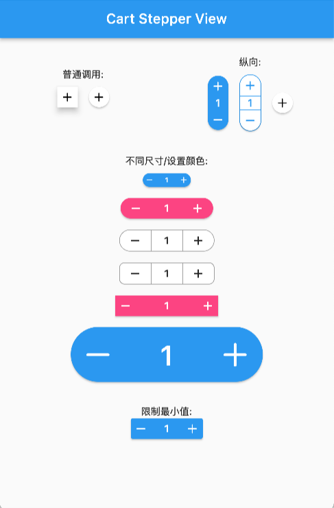
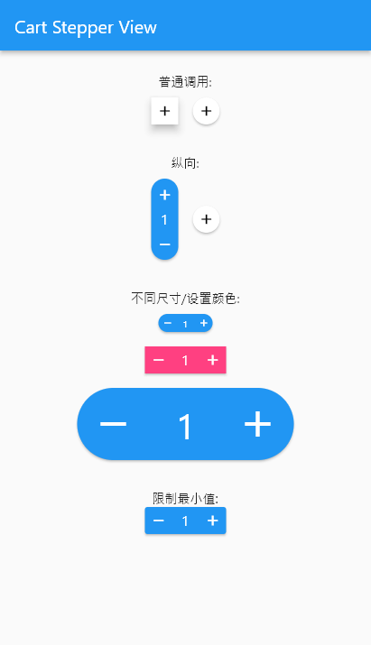
Preview

Arguments

  • count: int/double, the number to show
  • stepper: int/double, the number to increasing or decreasing
  • size: double, widget size
  • axis: Axis, layout direction
  • numberSize: double, number spacer, default 2
  • didChangeCount: Function, @required to set the release counter
  • style: CartStepperStyle
  • alwaysExpanded: bool, always expanded while value is 0
  • elevation: double, display a shadow around this widget

CartStepperStyle:

  • activeForegroundColor: Color, text color when counter > 0
  • activeBackgroundColor: Color, background color when counter > 0
  • foregroundColor: Color, text color when counter == 0
  • backgroundColor: Color, background color when counter == 0
  • shape: BoxShape,
  • radius: Radius, the borderRadius of this widget, default caculating a roundedRectAngle
  • BoxBorder: Border of the Widget
  • shadowColor: Color
  • textStyle,
  • iconTheme = const IconThemeData(),
  • iconPlus: IconData, customize the plus icon
  • iconMinus: IconData, customize the minus icon
  • buttonAspectRatio: plus & minux button's aspectRatio, default 1,
  • elevation: Widget's elevation,

Using

Create a widget to show and modify a number:

Widget _buildStepper() {
  return CartStepperInt(
        count: _counter,
        size: 30,
        style: CartStepperTheme.of(context).copyWith(activeForegroundColor: Colors.purple,)
        didChangeCount: (count) {
        setState(() {
        _counter = count;
        });
      },
  );
}

Migrating

// from 3.x to 4.x
// CartStepperStyle.
deActiveForegroundColor => foregroundColor
deActiveBackgroundColor => backgroundColor

OnlineDemo

카테고리

의존성

의존성 목록 1 개

소스 저장소

이 패키지를 사용하는 프로젝트

아직 데이터가 없습니다.