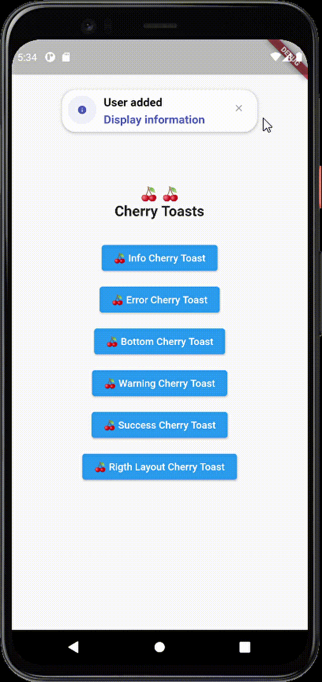
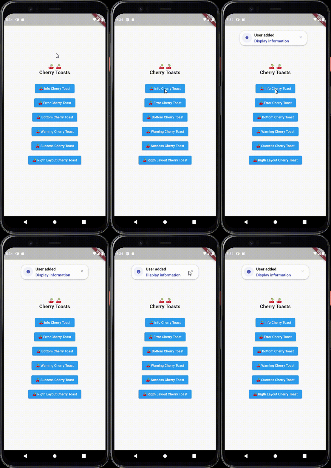
Cherry Toast는 부드러운 애니메이션과 사용자 정의 가능한 디자인을 갖춘 현대적이고 시각적으로 매력적인 토스트를 표시하는 데 사용할 수 있는 플러터 패키지입니다. 표준 플러터 토스트의 우아한 대안을 찾는 개발자를 위해 제작되었으며, 미묘하지만 세련된 피드백을 통해 사용자 경험을 향상시킵니다. 안드로이드, iOS, 웹, 맥OS, 윈도우, 리눅스 등 다양한 플랫폼을 지원하여 기기 간 일관된 동작을 보장합니다. 직관적인 API와 미학에 중점을 두어, Cherry Toast는 플러터 애플리케이션에 매력적인 알림을 쉽게 통합할 수 있도록 합니다.
사용 사례
작업 후 사용자 피드백 표시
성공 또는 오류 메시지 표시
애니메이션 알림으로 UI 개선
경량 상태 업데이트 제공
시각적 매력으로 앱의 완성도 향상
주요 기능
아름다운 현대적인 디자인
부드러운 애니메이션
크로스 플랫폼 지원
사용자 정의 가능한 외관
간단한 API 통합
다양한 토스트 유형을 지원합니다
적합한 대상
UI 미학을 우선시하는 플러터 개발자
정교한 사용자 피드백이 필요한 앱
현대적인 알림 스타일을 목표로 하는 프로젝트
사용하기 쉬운 토스트 솔루션을 원하는 개발자
사용자 경험 향상에 집중하는 팀
고려 사항
다크 모드용 추가 스타일링이 필요할 수 있습니다
기능이 풍부한 알림 시스템과 비교해 사용자 맞춤 설정이 제한됨
외부 애니메이션 라이브러리에 의존합니다
복잡한 알림 워크플로에 적합하지 않음
간단하고 짧은 메시지에 가장 적합
원본 README
연결된 소스 저장소의 README 원문 스냅샷입니다. 최신 내용은 저장소에서 확인하세요.
Cherry Toast
A new way to display toasts in Flutter in an elegant design and animations
Cherry Toast
Support all platforms
Top and Bottom display position
Customizable background color
Support RTL layout rendering (for arabic text)
Multiple built-in themes
Built-in animations
Support null safety
Elegant design
Full customizable
Heartbeat animation on icons
Customizable icon size and color and display
Dismissable notification
Customizable toast constraints, height and width
Installation
To add cherry toast to your project add this line to your pubspec.yaml file
dependencies:cherry_toast:^1.13.0
Parameters
/// Text widget displayed as a title in the toast/// required parameter for all toast typesfinalText? title;
/// Text widget displayed as a description in the toastfinalText? description;
/// The action button displayed below descriptionfinalText? action;
/// The toast icon, it's required when using the default constructorlateIconData icon;
/// The Icon color/// this parameter is only available on the default constructor/// for the built-in themes the color will be set automaticallylateColor iconColor;
/// Background color of containerfinalColor backgroundColor;
/// Box shadow color of containerfinalColor shadowColor;
/// Custom widget displayed at the place of the predefined iconsfinalWidget? iconWidget;
/// The icon size/// this parameter is available in default constructorlatedouble iconSize;
/// The toast display postion, possible values/// ```dart/// {/// top,/// bottom/// }/// ```finalPosition toastPosition;
/// The color that will be applied on the circle behind the icon/// for better rendering the action button must have the same colorlateColor themeColor;
/// The function invoked when clicking on the action buttonfinalFunction? actionHandler;
/// The duration of the animation by default it's 1.5 secondsfinalDuration animationDuration;
/// The animation curve by default it's set to `Curves.ease`.finalCubic animationCurve;
/// The animation type applied on the toast/// ```dart/// {/// fromTop,/// fromLeft,/// fromRight/// }/// ```finalAnimationType animationType;
/// Indicates whether the toast will be hidden automatically or not.finalbool autoDismiss;
/// The duration of the toast if [autoDismiss] is truefinalDuration toastDuration;
/// The layout of the toast/// ```dart/// {/// ltr,/// rtl/// }/// ```finalTextDirection textDirection;
/// Display / Hide the close button iconfinalbool displayCloseButton;
/// Define the border radius applied on the toastfinaldouble borderRadius;
/// Define whether the icon will be rendered or notfinalbool displayIcon;
/// Define wether the animation on the icon will be rendered or notfinalbool enableIconAnimation;
/// The attribute is declaring a final variable named "width" of type double with a nullable value./// width attribute define the toast widthfinaldouble? width;
/// The attribute is declaring a final variable named "height" of type double with a nullable type/// modifier./// height attribute define the toast heightfinaldouble? height;
/// Enable taost constraints customization (by default it's null)finalBoxConstraints? constraints;
/// Indicate whether the toast animation is enabled or not/// by default the toast animation is enabledfinalbool disableToastAnimation;
/// Indicate toast should inherit theme colors sheme, to apply in background/// and shadow color.finalbool inheritThemeColors;
/// Callback invoked when toast get dismissed (closed by button or dismissed automtically)finalFunction()? onToastClosed;
/// Horizontal alignment display of the toast contentfinalCrossAxisAlignment horizontalAlignment;
/// The space rendered between the title and description widgets.finaldouble titleDescriptionMargin;
/// The space rendered between the description and actions widgets.finaldouble descriptionActionMargin;