연결된 소스 저장소의 README 원문 스냅샷입니다. 최신 내용은 저장소에서 확인하세요.
collapsible_sidebar
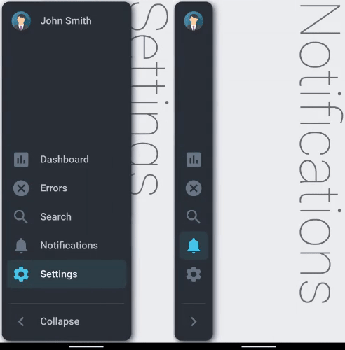
A collapsible sidebar for Flutter apps implementing the Material Design.

🌟 Version 2.0.7 ✨
Features
- Material Design
- Pre-built customizable tile widgets (CollapsibleItems)
- Smooth Animation
- Supports both LTR & RTL languages
- Supports MULTI-LEVEL Menu
- Alert Badges on CollapsibleItems
Supported platforms
- Flutter Android
- Flutter iOS
- Flutter web
- Flutter desktop
Contributors
A big thank you to all the contributors without whom this project would be impossible to maintain and enhance. 👏👏👏

Live preview
https://drunkonbytes.github.io/flutter_collapsible_sidebar
Note: this page is built with flutter-web. For a better user experience, please use a mobile device to open this link.
Installation
Add collapsible_sidebar: ^2.0.7 to your pubspec.yaml dependencies. And import it:
import 'package:collapsible_sidebar/collapsible_sidebar.dart';
How to use
- Create a list of
CollapsibleItems named _items (or whatever fancy name you like)
For a collapsible item with sub-items to be the default selected item MARK ALL OF ITS SUB-ITEMS WITH THE isSelected: true property.
List<CollapsibleItem> get _items {
return [
CollapsibleItem(
text: 'Shop',
iconImage: AssetImage("assets/shop_icon.png"),
icon: Icons.ac_unit,
onPressed: () => setState(() => _headline = 'Shop'),
onHold: () => ScaffoldMessenger.of(context).showSnackBar(
SnackBar(content: const Text("Shop"))
),
isSelected: true,
subItems: [
CollapsibleItem(
text: 'Cart',
icon: Icons.shopping_cart,
onPressed: () => setState(() => _headline = 'Cart'),
onHold: () => ScaffoldMessenger.of(context).showSnackBar(
SnackBar(content: const Text("Cart"))
),
isSelected: true,
)
]
),
CollapsibleItem(
text: 'Dashboard',
badgeCount: 7,
icon: Icons.assessment,
onPressed: () => setState(() => _headline = 'DashBoard'),
onHold: () => ScaffoldMessenger.of(context).showSnackBar(
SnackBar(content: const Text("DashBoard"))
),
),
CollapsibleItem(
text: 'Ice-Cream',
icon: Icons.icecream,
onPressed: () => setState(() => _headline = 'Ice-Cream'),
onHold: () => ScaffoldMessenger.of(context).showSnackBar(
SnackBar(content: const Text("Ice-Cream"))
),
),
CollapsibleItem(
text: 'Search',
icon: Icons.search,
onPressed: () => setState(() => _headline = 'Search'),
onHold: () => ScaffoldMessenger.of(context).showSnackBar(
SnackBar(content: const Text("Search"))
),
),
];
}
- Define the body of the app (the widget where the main working of the app will be) and name it say
_body.
Widget _body(Size size, BuildContext context) {
    return Container(
      height: double.infinity,
      width: double.infinity,
      color: Colors.blueGrey[50],
      child: .........,
    );
  }
- Finally completely define the
CollapsibleSidebar widget by adding the list of CollapsibleItems named _items, the body of the app named _body and the customizable parameters as needed:
CollapsibleSidebar(
  items: _items,
  avatarImg: _avatarImg,
  title: 'John Smith',
  body: _body(size, context),
)
Also you can use the isCollapsed condition depending how you want the state of the sidebar to change (collapsed/expanded)
for example [size.width]
CollapsibleSidebar(
  isCollapsed: MediaQuery.of(context).size.width <= 800,
  items: _items,
  avatarImg: _avatarImg,
  title: 'John Smith',
  body: _body(size, context),
)
Parameters (customizable attributes)
| Name |
Data Type |
Default Value |
Description |
isCollapsed |
bool |
true |
can set condition to control state of sidebar (collapsed/expanded) on some property change |
collapseOnBodyTap |
bool |
true |
flag to enable/disable tapping on the body of the app (area other than the sidebar) to collapse the sidebar |
items |
List<CollapsibleItems> |
--- |
List of CollapsibleItems |
showTitle |
bool |
true |
can set to false to hide title and avatar Image |
title |
String |
--- |
Title of the Collapsible Sidebar |
titleBack |
bool |
false |
set to 'true' to use a back icon instead of avatar picture |
titleBackIcon |
Icons |
Icons.arrow_back |
the back icon is 'arrow_back' by default (customizable) |
onTitleTap |
Function |
--- |
custom callback function called when title avatar or back icon is pressed |
onHoverPointer |
SystemMouseCursors |
SystemMouseCursors.click |
the default hover mouse pointer is set to 'click' type by default (customizable) |
textStyle |
TextStyle |
--- |
custom style for sidebar title |
titleStyle |
TextStyle |
--- |
custom style for collapsible items text |
toggleTitleStyle |
TextStyle |
--- |
custom style for toggle button title |
avatarImg |
Image |
--- |
Image to be displayed |
body |
Widget |
--- |
The main body of the app (the underlying main widget other than the sidebar) |
height |
double |
double.infinity |
height of the Sidebar |
minWidth |
double |
80 |
Width of Sidebar when Collapsed |
maxWidth |
double |
270 |
Width of Sidebar when Expanded |
borderRadius |
double |
15 |
Radius of the borders |
iconSize |
double |
40 |
Size of the icons |
customContentPaddingLeft |
double |
-1 |
Padding to the left of CollapsibleItems (keep value less than 0 for default padding) |
toggleTitle |
String |
'Collapse' |
title text of Toggle Button |
toggleButtonIcon |
Icons |
Icons.chevron_right |
Icon of the Toggle button |
backgroundColor |
Color |
Color(0xff2B3138) |
The background color |
avatarBackgroundColor |
Color |
Color(0xff6A7886) |
The avatar background color |
selectedIconBox |
Color |
Color(0xff2F4047) |
Color of Icon Box when selected |
selectedIconColor |
Color |
Color(0xff4AC6EA) |
Color of Icon when selected |
selectedTextColor |
Color |
Color(0xffF3F7F7) |
Color of text when selected |
unselectedIconColor |
Color |
Color(0xff6A7886) |
Color of Icon when not selected |
unselectedTextColor |
Color |
Color(0xffC0C7D0) |
Color of text when not selected |
badgeBackgroundColor |
Color |
Color(0xffFF6767) |
Background color of badges on Collapsible Items |
badgeTextColor |
Color |
Color(0xffF3F7F7) |
Badge Text color of badges on Collapsible Items |
duration |
Duration |
Duration(milliseconds: 500) |
Animation duration for collapsed->expanded & vice-versa |
curve |
Curves |
Curves.fastLinearToSlowEaseIn |
Animation curve for collapsed->expanded & vice-versa |
screenPadding |
double |
4 |
Padding to the screen |
topPadding |
double |
0 |
space between image avatar and icons |
bottomPadding |
double |
0 |
space between icons and toggle button |
itemPadding |
double |
10 |
space between collapsible items |
customItemOffsetX |
double |
-1 |
X axis offset for collapsible items (keep value less than 0 for default offset) |
fitItemsToBottom |
bool |
true |
fit all icons to the end of the space between image avatar and toggle button |
showToggleButton |
bool |
true |
flag to enable/disable showing the toggle button |
sidebarBoxShadow |
List<BoxShadow> |
[BoxShadow(color: Colors.blue, blurRadius: 10, spreadRadius: 0.01, offset: Offset(3, 3),),] |
Just like the "BoxDecoration" parameter of a "Container" |
License
Apache 2.0