패키지, 저장소 및 앱 카테고리 검색

convex_bottom_bar 표지
패키지 상세v3.2.0

convex_bottom_bar

하단 바에 볼록 탭을 표시하기 위해 ConvexAppBar를 구현하는 Flutter 패키지입니다. 테마 지원됨.

AndroidiOSWebmacOSWindowsLinux
30일 다운로드
1.8만
좋아요
3천
Pub 점수
150

패키지 설치

flutter pub add convex_bottom_bar

패키지 개요

공개 정보를 바탕으로 생성한 선택 가이드입니다.

ConvexBottomBar는 부드러운 애니메이션과 사용자 정의 테마를 제공하는 시각적으로 독특한 볼록형 하단 네비게이션 바를 제공하는 Flutter 패키지입니다. Android, iOS, Web, macOS, Windows, Linux 플랫폼에서 뛰어난 원형 동적 탭 디자인을 통해 표준 하단 네비게이션 경험을 향상시킵니다. 테마 커스터마이징을 지원하여 개발자가 바의 외관을 앱의 디자인 언어와 일치시킬 수 있습니다. 현대적이고 매력적인 네비게이션 인터페이스를 원하는 앱에 이상적입니다.

사용 사례

  • 현대적인 모바일 앱 탐색
  • 사용자 정의 가능한 하단 탭
  • 크로스 플랫폼 UI 일관성
  • 시각적 디자인을 통한 사용자 참여도 향상
  • 미적 매력에 중점을 둔 앱

주요 기능

  • 볼록형 탭 디자인
  • 내장 애니메이션 효과
  • 테마 지원
  • 크로스 플랫폼 호환성
  • Flutter 앱과의 간편한 통합
  • 반응형 탭 상호작용

적합한 대상

  • 디자인 중심의 플러터 애플리케이션
  • 독특한 탐색을 목표로 하는 모바일 앱
  • 애니메이션 바텀바를 원하는 개발자
  • 여러 플랫폼을 대상으로 하는 프로젝트
  • Flutter를 사용하는 UI/UX 디자이너

고려 사항

  • 복잡한 테마에 대해 추가 스타일링이 필요할 수 있습니다
  • 저사양 장치에 대한 성능 영향
  • 내장 옵션을 넘어서는 사용자 정의가 제한적입니다
  • 미니멀리스트 디자인에 적합하지 않습니다
  • 다른 위젯과의 레이아웃 충돌 가능성

원본 README

연결된 소스 저장소의 README 원문 스냅샷입니다. 최신 내용은 저장소에서 확인하세요.

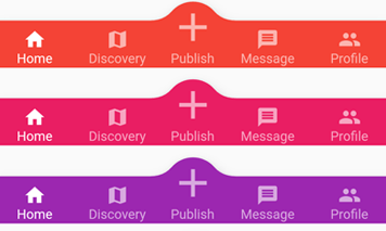
appBar preview

pub.dev github coverage likes popularity build status license

English | 简体中文


The official BottomAppBar can only display a notch FAB with an app bar, and sometimes we need a convex FAB. BottomAppBar and NotchShape's implementation inspires this ConvexAppBar.

Online example can be found at https://appbar.codemagic.app.

convex_bottom_bar is now a Flutter Favorite package!

Here are some supported style:

fixed react badge chip
fixedCircle reactCircle flip
textIn titled tab image
button fixed corner

How to use

Typically ConvexAppBar can work with Scaffold by setup its bottomNavigationBar.

The ConvexAppBar has two constructors. The ConvexAppBar() will use the default style to simplify the tab creation.

Add this to your package's pubspec.yaml file, use the latest version Pub:

dependencies:
  convex_bottom_bar: ^latest_version
import 'package:convex_bottom_bar/convex_bottom_bar.dart';

Scaffold(
  bottomNavigationBar: ConvexAppBar(
    items: [
      TabItem(icon: Icons.home, title: 'Home'),
      TabItem(icon: Icons.map, title: 'Discovery'),
      TabItem(icon: Icons.add, title: 'Add'),
      TabItem(icon: Icons.message, title: 'Message'),
      TabItem(icon: Icons.people, title: 'Profile'),
    ],
    onTap: (int i) => print('click index=$i'),
  )
);

Flutter Version Support
As Flutter is developing fast. There can be breaking changes. We will be trying to support the stable version and beta version through different package versions.

Stable Flutter Version Package Version More
>=3.7.0 >=3.2.0 Since v3.7.0, the stable version changed the DefaultTabController api
>=1.20 >=2.4.0 Since v1.20, the stable version changed the Stack api
<1.20 <=2.3.0 Support for stable version such as v1.17, v1.12 is not going to be updated

Features

  • Provide multiple internal styles
  • Ability to change the theme of AppBar
  • Provide builder API to customize a new style
  • Add badge on the tab menu
  • Elegant transition animation
  • Provide hook API to override some of the internal styles
  • RTL support

Table of contents

Theming

The bar will use default style, you may want to theme it. Here are some supported attributes:

Attributes Description
backgroundColor AppBar background
gradient gradient will override backgroundColor
height AppBar height
color tab icon/text color
activeColor tab icon/text color when selected
curveSize size of the convex shape
top top edge of the convex shape relative to AppBar
cornerRadius draw the background with topLeft and topRight corner; Only work with fixed tab style
style style to describe the convex shape: fixed, fixedCircle, react, reactCircle, ...
chipBuilder custom badge builder, use ConvexAppBar.badge for default badge

Badge

If you need to add a badge on the tab, use the ConvexAppBar.badge to get it done.

badge demo

ConvexAppBar.badge({0: '99+', 1: Icons.assistant_photo, 2: Colors.redAccent},
  items: [
    TabItem(icon: Icons.home, title: 'Home'),
    TabItem(icon: Icons.map, title: 'Discovery'),
    TabItem(icon: Icons.add, title: 'Add'),
  ],
  onTap: (int i) => print('click index=$i'),
);

The badge() method accepts an array of badges; The badges is a map with tab items. Each value of entry can be either String, IconData, Color or Widget.

Single Button

If you only need a single button, checkout the ConvexButton.

button

Scaffold(
  appBar: AppBar(title: const Text('ConvexButton Example')),
  body: Center(child: Text('count $count')),
  bottomNavigationBar: ConvexButton.fab(
    onTap: () => setState(() => count++),
  ),
);

Style Hook

Hook for internal tab style. Unlike the ConvexAppBar.builder, you may want to update the tab style without defining a new tab style.

Warning:
This hook is limited and can lead to overflow broken if the size you provide does not match with internal style.

StyleProvider(
  style: Style(),
  child: ConvexAppBar(
    initialActiveIndex: 1,
    height: 50,
    top: -30,
    curveSize: 100,
    style: TabStyle.fixedCircle,
    items: [
      TabItem(icon: Icons.link),
      TabItem(icon: Icons.import_contacts),
      TabItem(title: "2020", icon: Icons.work),
    ],
    backgroundColor: _tabBackgroundColor,
  ),
)
class Style extends StyleHook {
  @override
  double get activeIconSize => 40;

  @override
  double get activeIconMargin => 10;

  @override
  double get iconSize => 20;

  @override
  TextStyle textStyle(Color color) {
    return TextStyle(fontSize: 20, color: color);
  }
}

RTL Support

RTL is supported internally, and if you define the TextDirection inside the app, the AppBar should work fine. Both RTL and LTR can be configured through Directionality:

Directionality(
  textDirection: TextDirection.rtl,
  child: Scaffold(body:ConvexAppBar(/*TODO ...*/)),
)

Custom Example

If the default style does not match your situation, try with ConvexAppBar.builder(), allowing you to custom nearly all the tab features.

Scaffold(
  bottomNavigationBar: ConvexAppBar.builder(
    count: 5,
    backgroundColor: Colors.blue,
    itemBuilder: Builder(),
  )
);

// user defined class
class Builder extends DelegateBuilder {
  @override
  Widget build(BuildContext context, int index, bool active) {
    return Text('TAB $index');
  }
}

Full custom example can be found at example.

FAQ

Please file feature requests and bugs at the issue tracker.

Donate

You like the package ? Buy me a coffee :)

ko-fi

카테고리

소스 저장소

이 패키지를 사용하는 프로젝트

순위