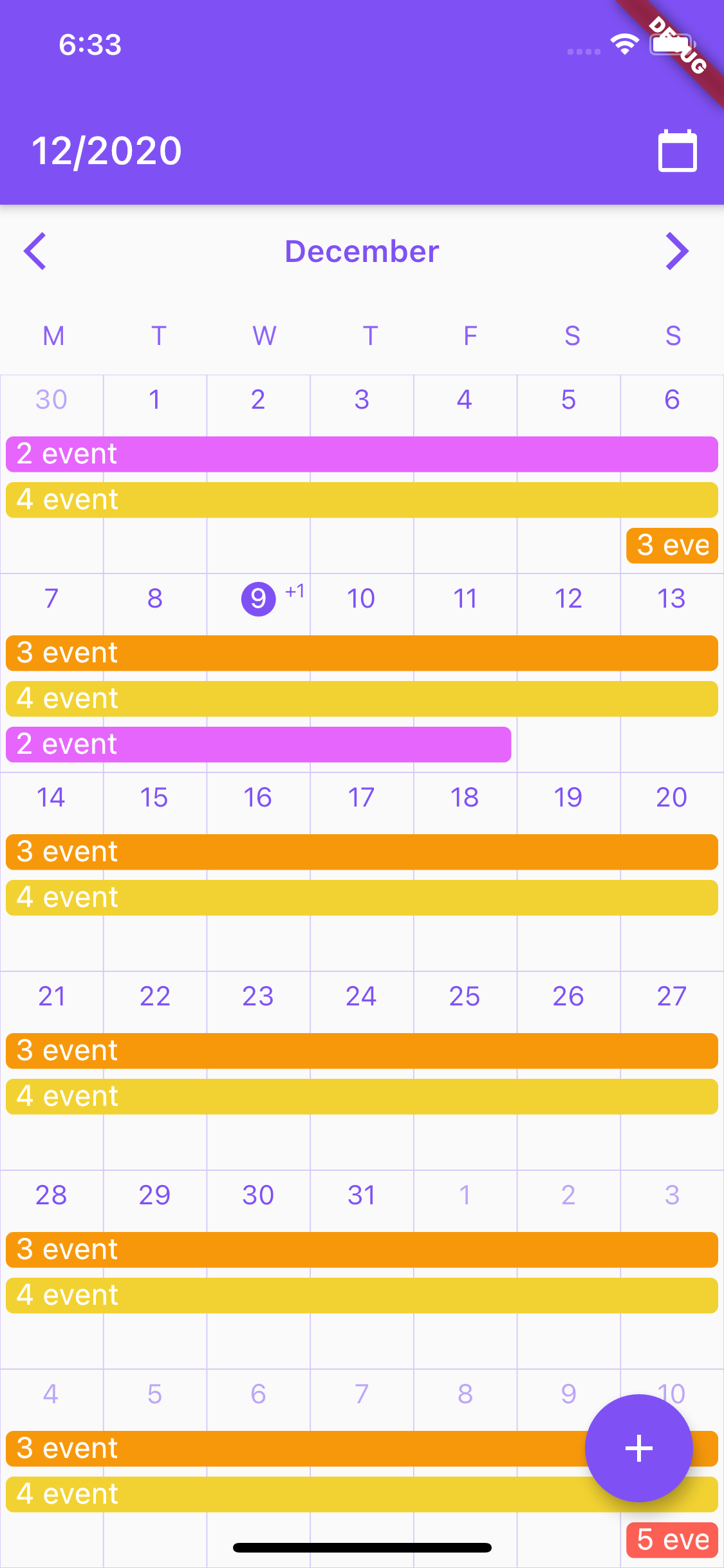
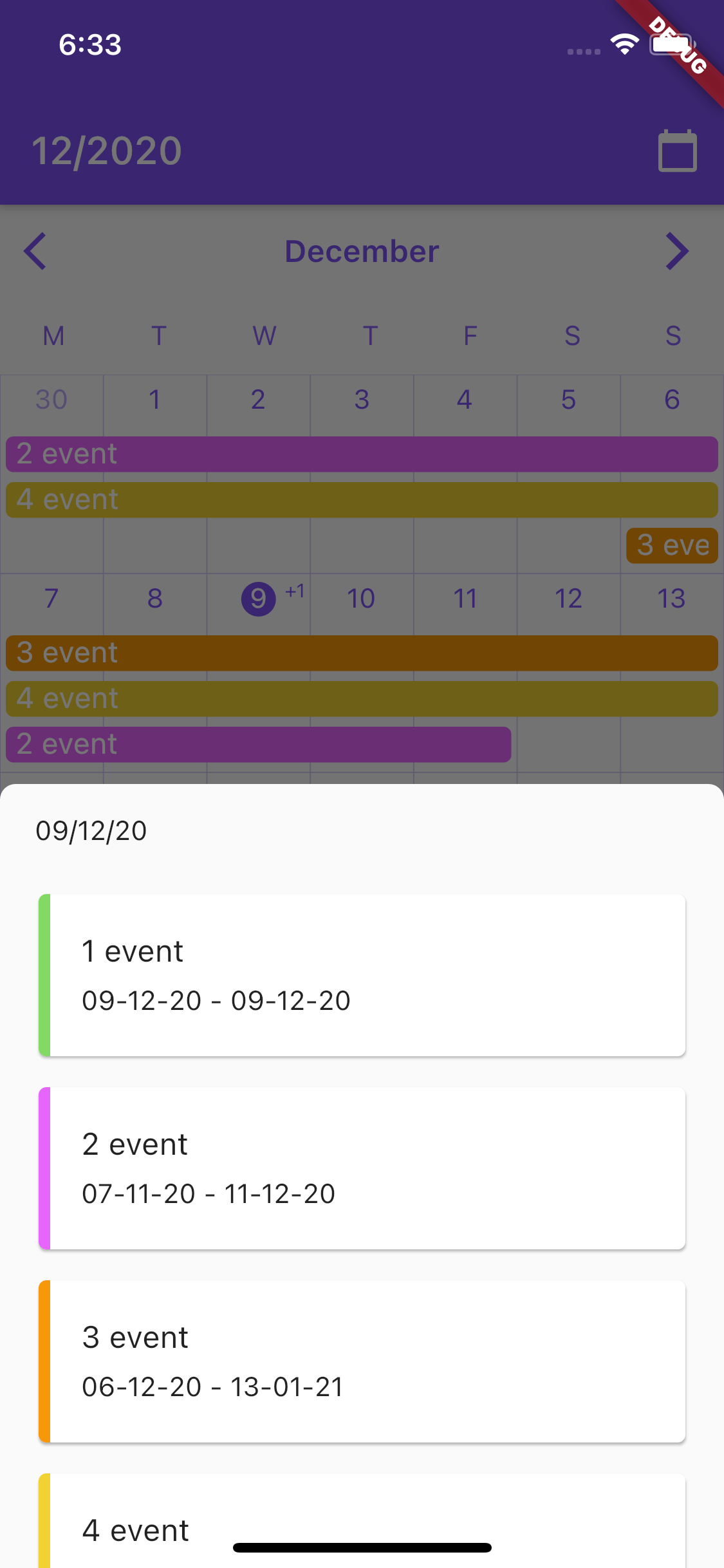
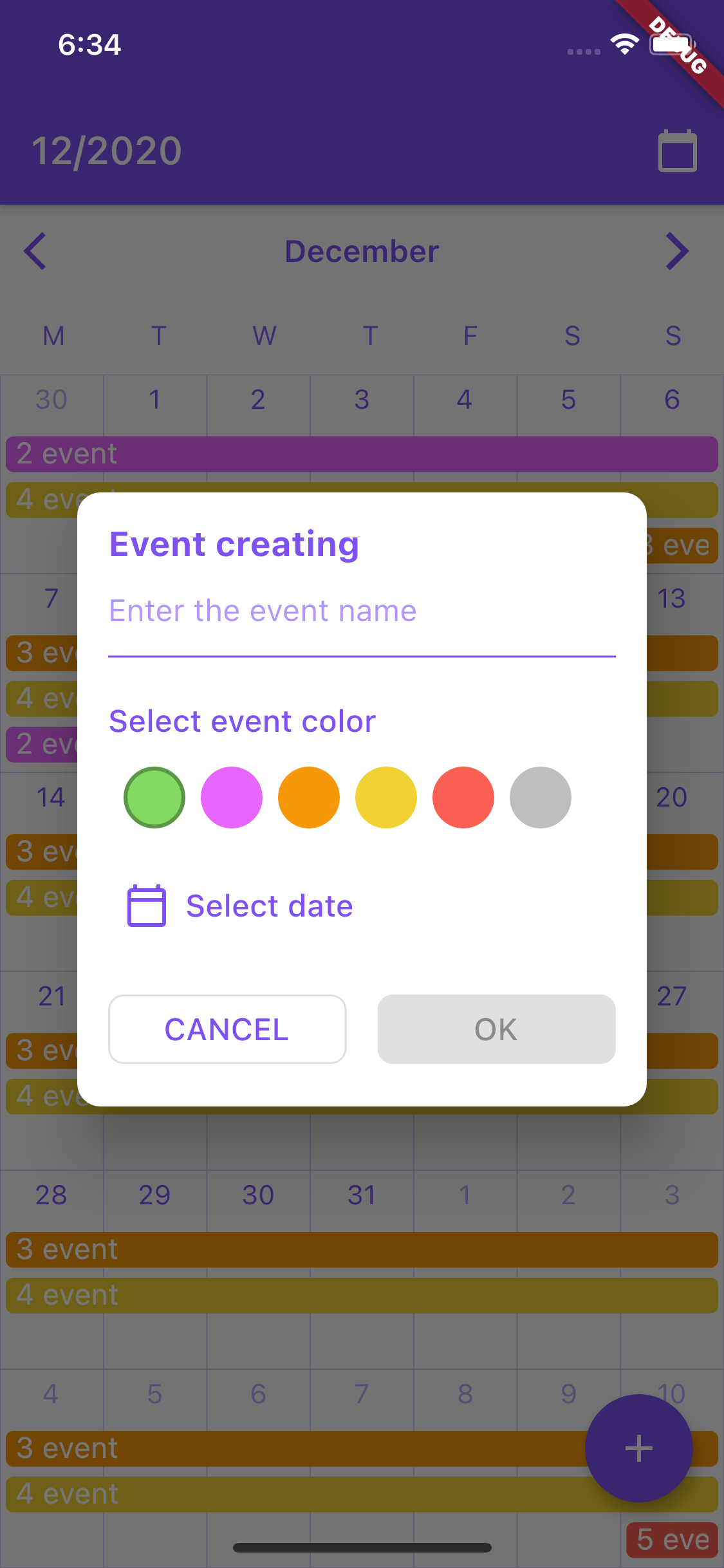
cr_calendar은 범위 선택, 이벤트 강조 및 광범위한 스타일링 옵션을 지원하는 사용자 정의 가능한 Flutter 캘린더 패키지입니다. Android, iOS, Web, macOS, Windows, Linux 등 여러 플랫폼에서 날짜와 이벤트를 표시하기 위한 깔끔하고 현대적인 인터페이스를 제공합니다. 개발자는 스케줄링, 예약 시스템 또는 개인 일정 계획과 같은 다양한 용도에 맞게 캘린더의 외관과 동작을 조정할 수 있습니다. 날짜 범위 및 이벤트 마커에 대한 내장된 지원으로 Flutter 애플리케이션에서 날짜 관리를 간소화합니다.
사용 사례
예약 일정 조정
예약 시스템
이벤트 추적
개인 계획자
기간 범위 선택
캘린더 기반 대시보드
주요 기능
사용자 지정 가능한 UI
범위 날짜 선택
이벤트 마킹
다중 플랫폼 지원
유연한 날짜 형식
테마 통합
적합한 대상
예약 앱을 개발하는 개발자
예약 인터페이스를 만드는 팀
날짜 시각화가 필요한 앱
캘린더가 필요한 Flutter 프로젝트
사용자 인터페이스 중심의 날짜 선택기
고려 사항
수동 이벤트 데이터 관리가 필요합니다
제한된 내장 로컬라이제이션
네이티브 시간 선택 없음
스타일링에는 사용자 정의 코드가 필요할 수 있습니다
플랫폼별 렌더링 세부 사항
외부 상태 관리에 의존
원본 README
연결된 소스 저장소의 README 원문 스냅샷입니다. 최신 내용은 저장소에서 확인하세요.
CrCalendar
Customizable Flutter calendar inspired by Google Calendar app.
Features:
CrCalendar widget for displaying horizontally scrollable month view, with events lines over days.
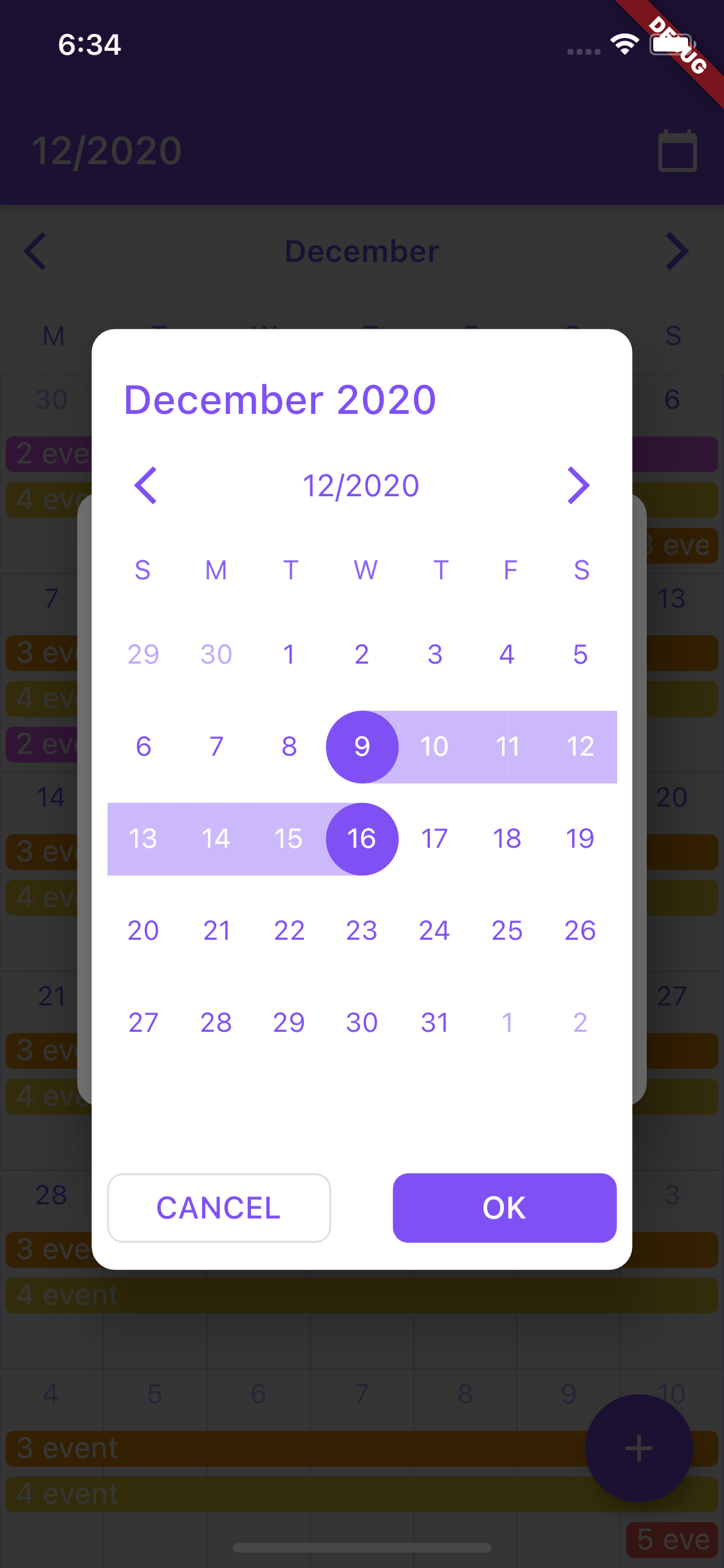
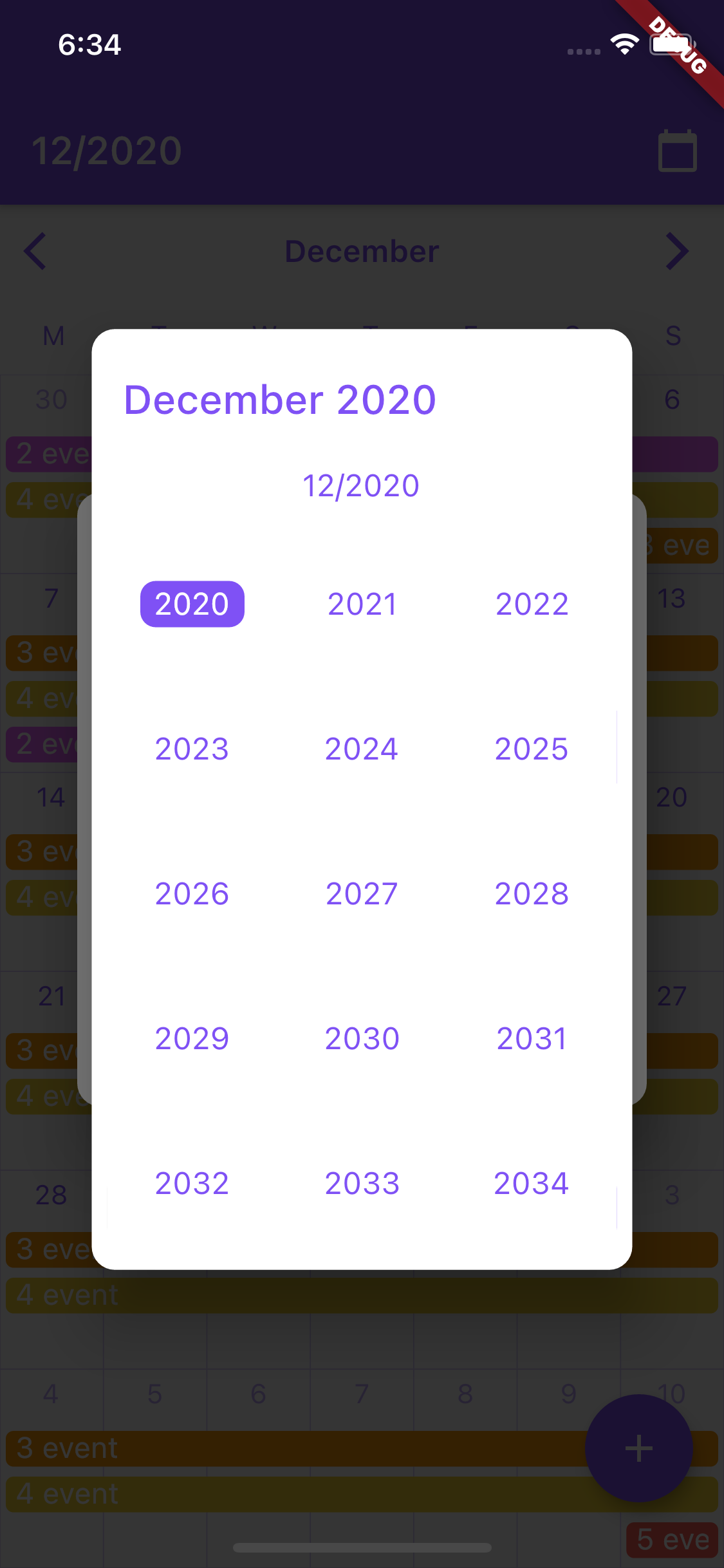
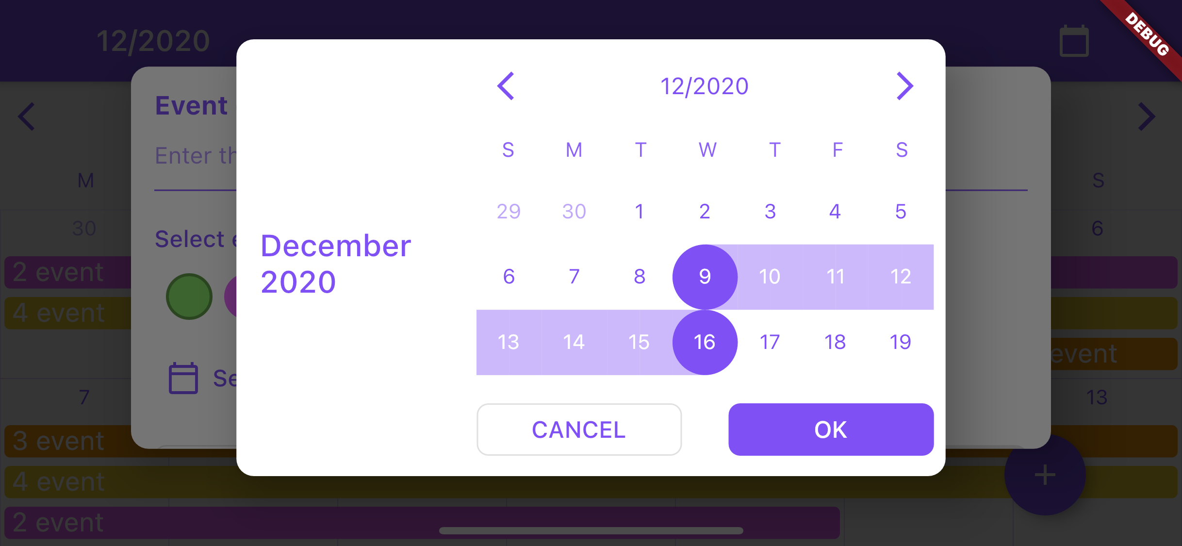
date selection dialog (uses CrCalendar widget in range selection mode) with customization of buttons, texts and look of the CrCalendar widget.
Note: avoid using setState calls frequently on the page where the CrCalendar widget is used to improve performance.
Usage of CrCalendar date picker dialog
DatePickerProperties parameters:
Type
Name
Description
Default value
Color
backgroundColor
Background color for date picker dialog and year selection widget.
Colors.white
DateTime
initialPickerDate
Initial date to be opened on dialog creation.
-
EdgeInsets
padding
Picker dialog padding.
EdgeInsets.all(8)
DayItemBuilder
dayItemBuilder
Builder for day item in dialog.
-
TouchMode
pickerMode
Picker selection mode.
-
WeekDaysBuilder
weekDaysBuilder
Builder for row of days over month view.
-
DateTitleBuilder
pickerTitleBuilder
Title builder for widget on top of picker dialog.
-
Alignment
pickerTitleAlignInLandscape
Alignment of picker title in landscape mode.
Alignment.centerLeft
Widget
backButton
Back button for picker control bar.
-
Widget
forwardButton
Forward button for picker control bar.
-
DateTitleBuilder
controlBarTitleBuilder
Builder for control bar title showed between backButton and forwardButton.
-
bool
showControlBar
Option for hiding control bar.
true
YearPickerItemBuilder
yearPickerItemBuilder
Builder for confirm selection button.
-
PickerButtonBuilder
okButtonBuilder
Builder for confirm selection button.
-
PickerButtonBuilder
cancelButtonBuilder
Builder for cancel button.
-
bool
forceSixWeek
Force showing six week rows in month view.
false
WeekDays
firstWeekDay
First day of date picker calendar.
WeekDays.sunday
DateTime
minDate
Earliest allowable date.
-
DateTime
maxDate
Latest allowable date.
-
LandscapeDaysResizeMode
landscapeDaysResizeMode
LandscapeDaysResizeMode.adaptive - days cells will change their height according to parent height LandscapeDaysResizeMode.scrollable - days cells will change their height according to parent height as long as it is larger than the cells width. The month scrolls if there is not enough space
LandscapeDaysResizeMode.adaptive
Base usage:
/// Show calendar in pop up dialog for selecting date range for calendar event.void_showDatePicker(BuildContext context) {
showCrDatePicker(
context,
properties: DatePickerProperties(
firstWeekDay: WeekDays.monday,
okButtonBuilder: (onPress) =>
ElevatedButton(child: constText('OK'), onPressed: onPress),
cancelButtonBuilder: (onPress) =>
OutlinedButton(child: constText('CANCEL'), onPressed: onPress),
initialPickerDate: DateTime.now(),
),
);
}