패키지, 저장소 및 앱 카테고리 검색

패키지 상세v0.4.0

cue

물리 중심의 Flutter 애니메이션과 조합 가능한 타임라인 기반 API

AndroidiOSWebmacOSWindowsLinux
30일 다운로드
1.2만
좋아요
218
Pub 점수
160

패키지 설치

flutter pub add cue

패키지 개요

공개 정보를 바탕으로 생성한 선택 가이드입니다.

Cue는 물리 기반의 애니메이션 라이브러리로, 조합 가능하고 타임라인 기반의 API를 통해 자연스럽고 현실적인 움직임을 강조합니다. 성능과 개발자 경험을 고려하여 설계되었으며, 시간, 이징 및 물리 기반 행동에 대한 직관적인 제어를 통해 애니메이션 시퀀스를 연결하고 결합하여 복잡한 애니메이션을 만들 수 있게 해줍니다. 간단한 전환부터 복잡한 인터랙티브 애니메이션까지 모두 지원하며, 주요 플랫폼의 모든 Flutter 앱에 원활하게 통합됩니다.

사용 사례

  • 물리 기반의 부드러운 UI 전환 만들기
  • 인터랙티브한 제스처 기반 애니메이션 만들기
  • 복잡한 애니메이션 타임라인 구성
  • 반응형 미세 상호작용 구현
  • 재사용 가능한 애니메이션 컴포넌트 설계
  • 현실감 있게 레이아웃 변경 애니메이션화

주요 기능

  • 물리 기반 애니메이션 엔진
  • 조합 가능한 애니메이션 빌딩 블록
  • 타임라인 기반의 순서 지정
  • 자연스러운 이징 및 운동량 시뮬레이션
  • 크로스 플랫폼 일관성
  • 복잡한 애니메이션을 위한 최소한의 보일러플레이트

적합한 대상

  • 현실적인 애니메이션을 찾는 Flutter 개발자
  • 상호작용 또는 제스처 반응형 움직임이 필요한 앱
  • 애니메이션 유지보수를 우선시하는 팀
  • 복잡한 애니메이션 워크플로우를 가진 프로젝트
  • 선언형 애니메이션 접근 방식을 원하는 개발자

고려 사항

  • 물리 기반 애니메이션 원리에 대한 이해가 필요합니다
  • 초보자에게 학습 곡선이 있을 수 있습니다
  • 애니메이션 품질이 중요한 프로젝트에 적합
  • 매우 간단하고 정적인 전환에 적합하지 않음
  • 성능은 애니메이션의 복잡성에 따라 달라집니다

원본 README

연결된 소스 저장소의 README 원문 스냅샷입니다. 최신 내용은 저장소에서 확인하세요.


Cue

MIT License stars pub version

Buy Me A Coffee

Physics-first Flutter animations with a composable, timeline-driven API for building polished transitions, expressive UI motion, and reusable animation systems without wiring imperative controllers through your widget tree.

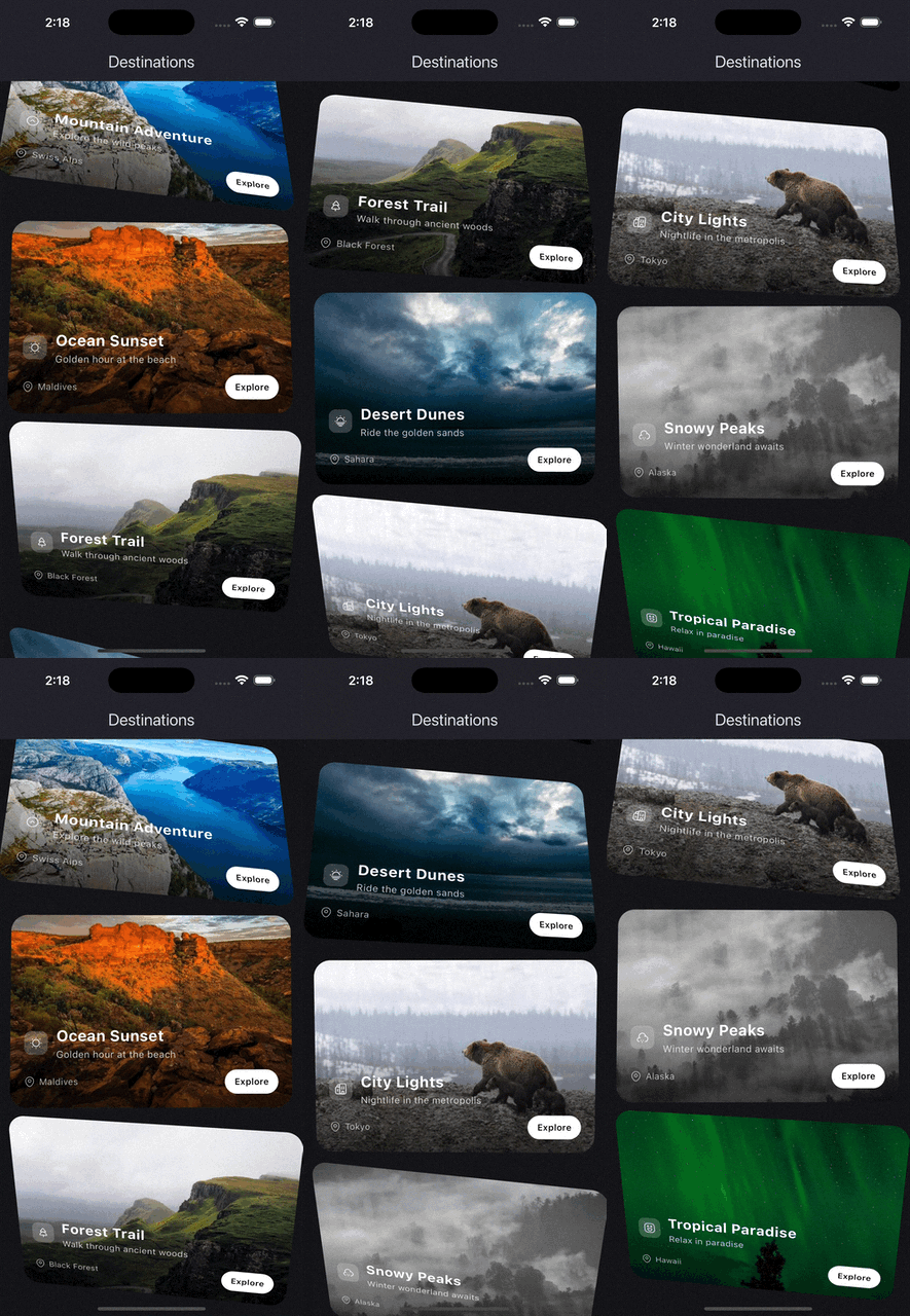
On scroll demo
source
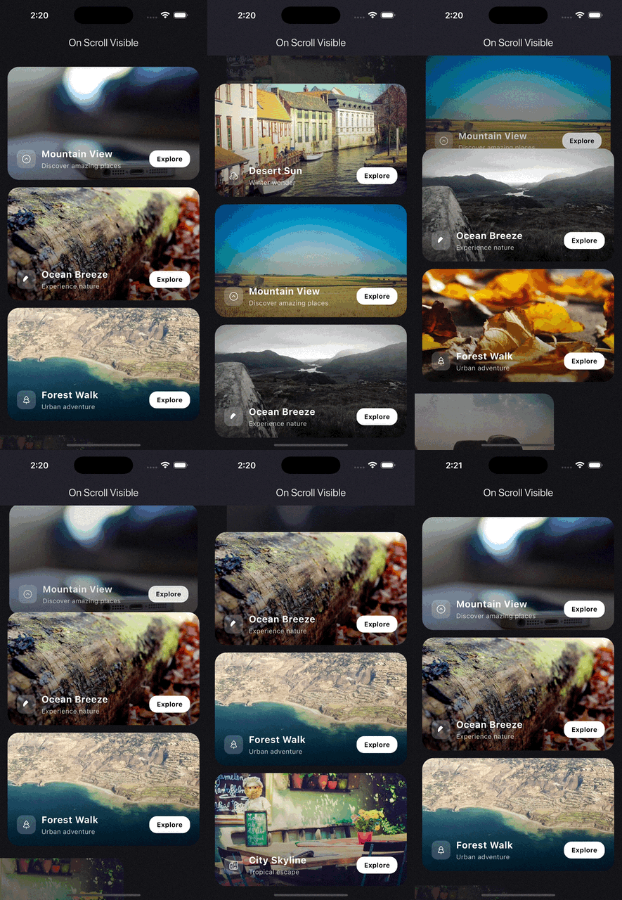
On scroll visible demo
source
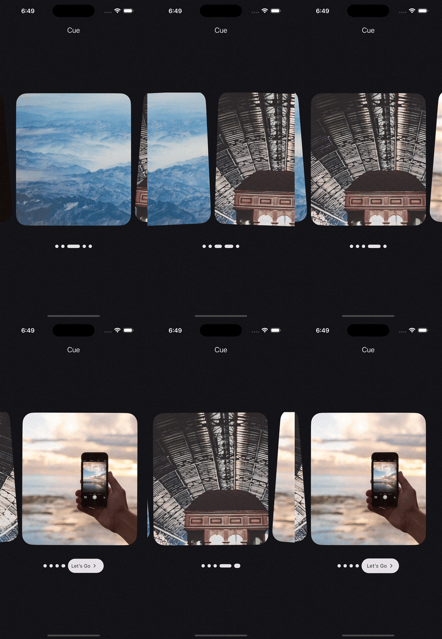
Page view demo
source
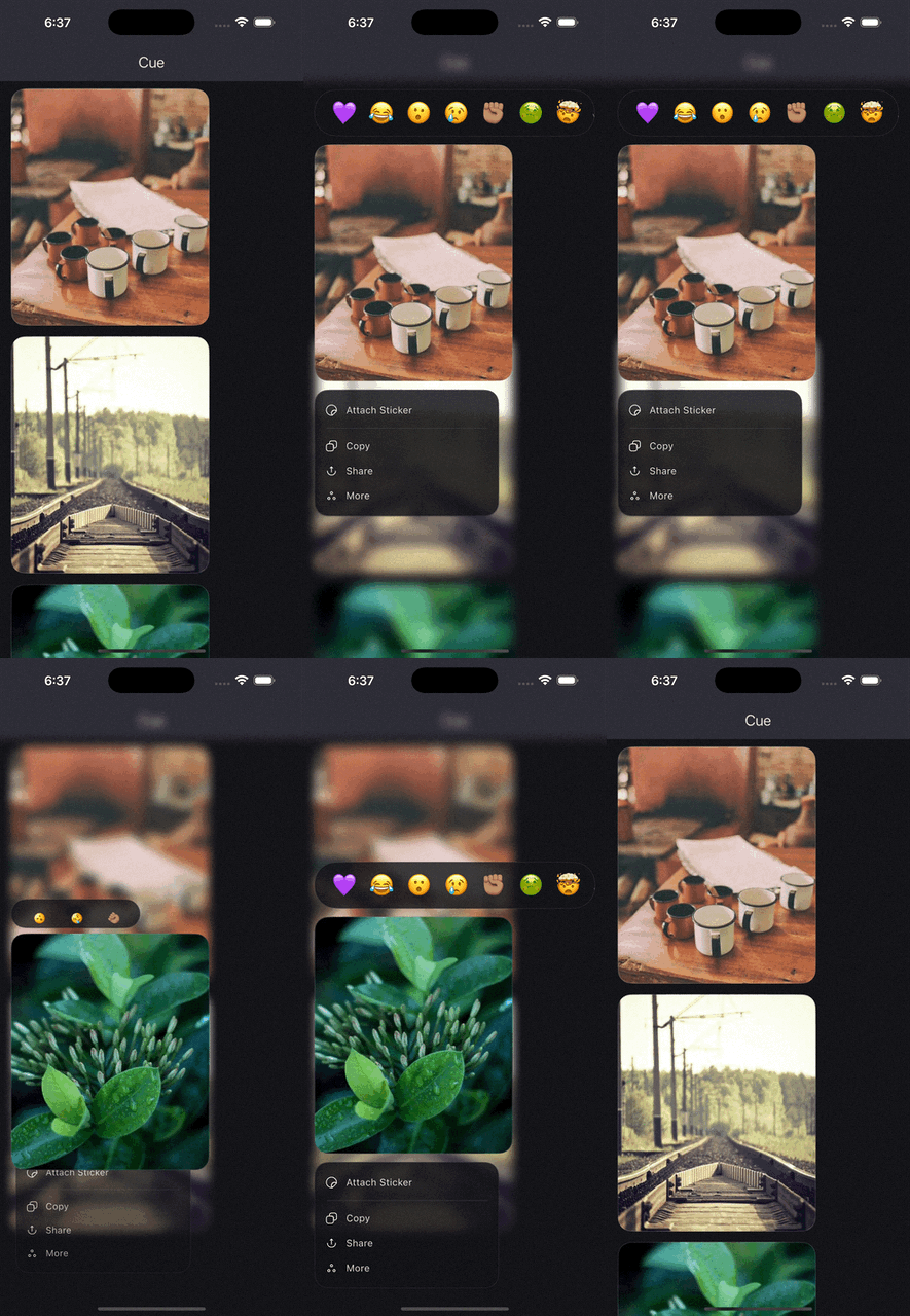
iOS context menu demo
source
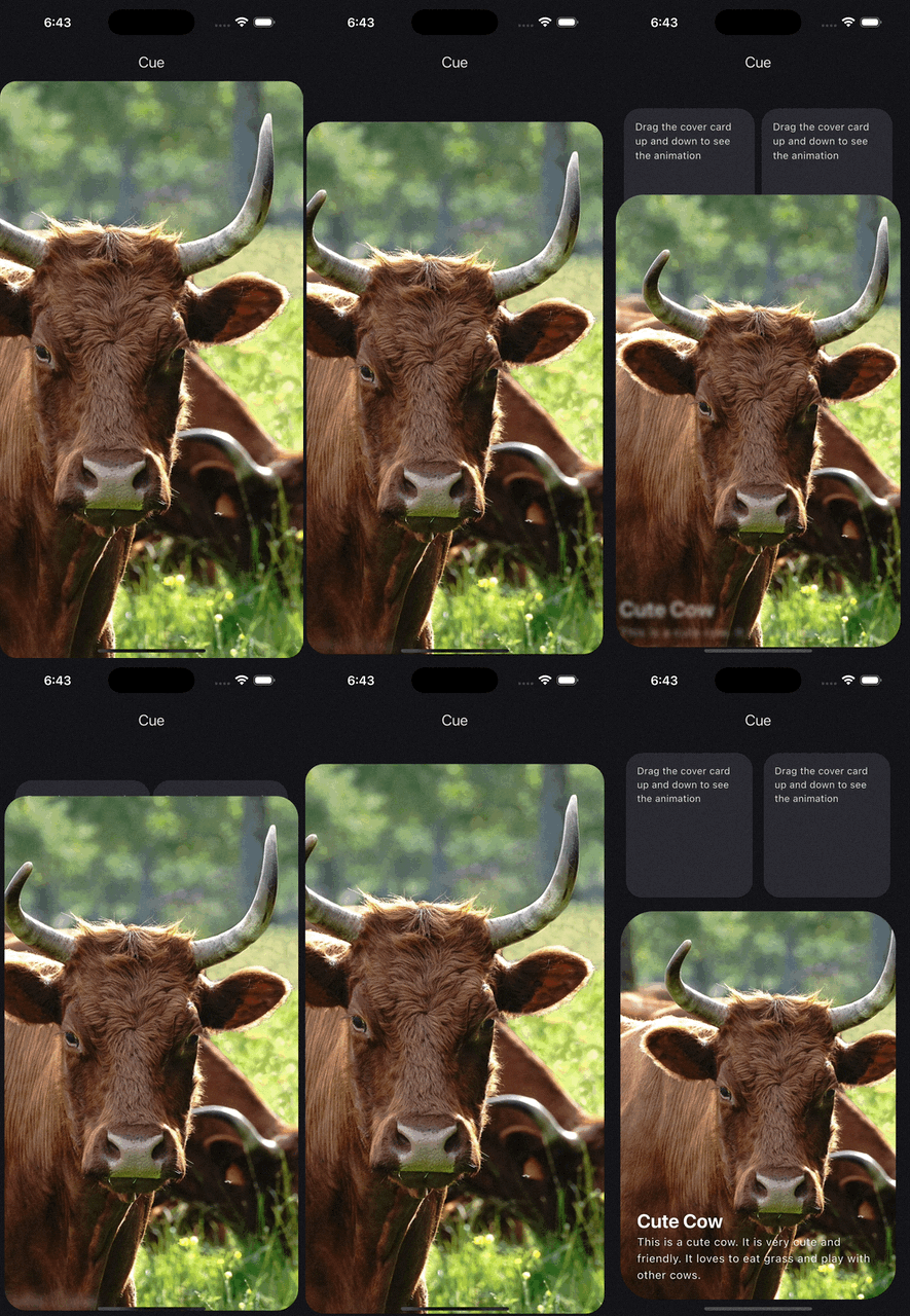
Draggable panel demo
source
Indicator to button demo
source
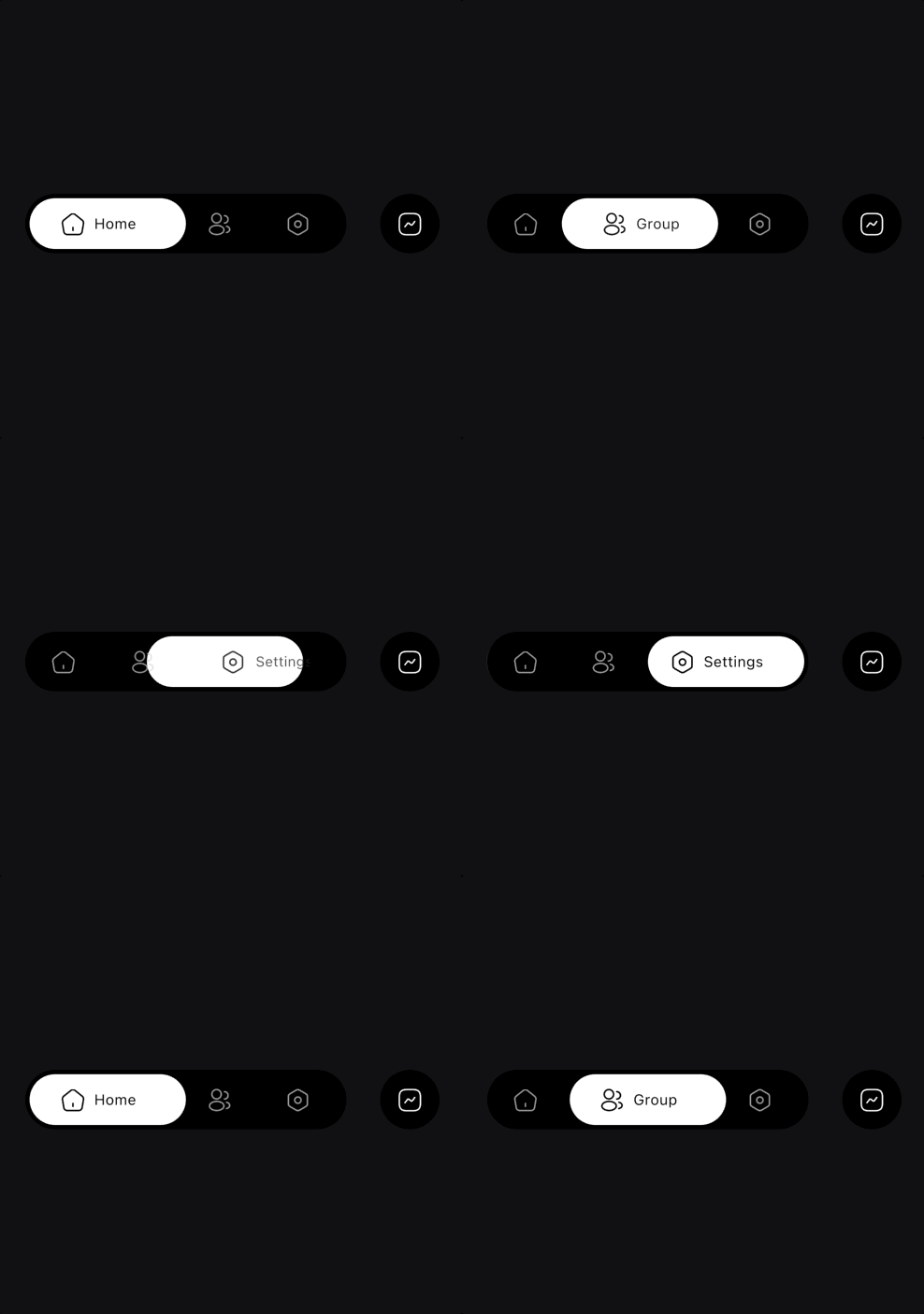
Bottom bar demo
source
Delete confirmation demo
source
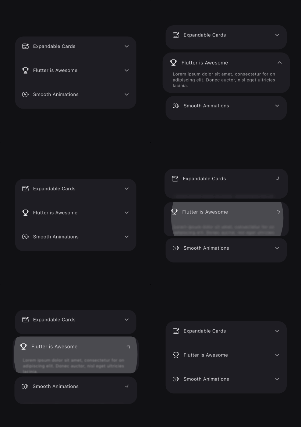
Expanding cards demo
source
Horizontally expanding cards demo
source
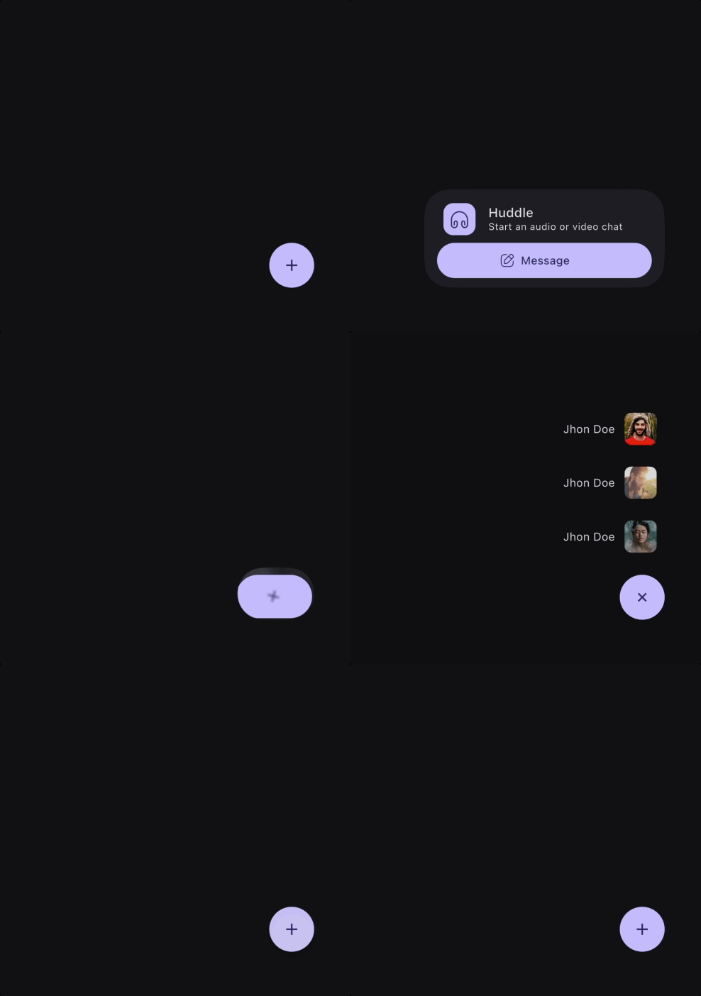
Slack style fab demo
source
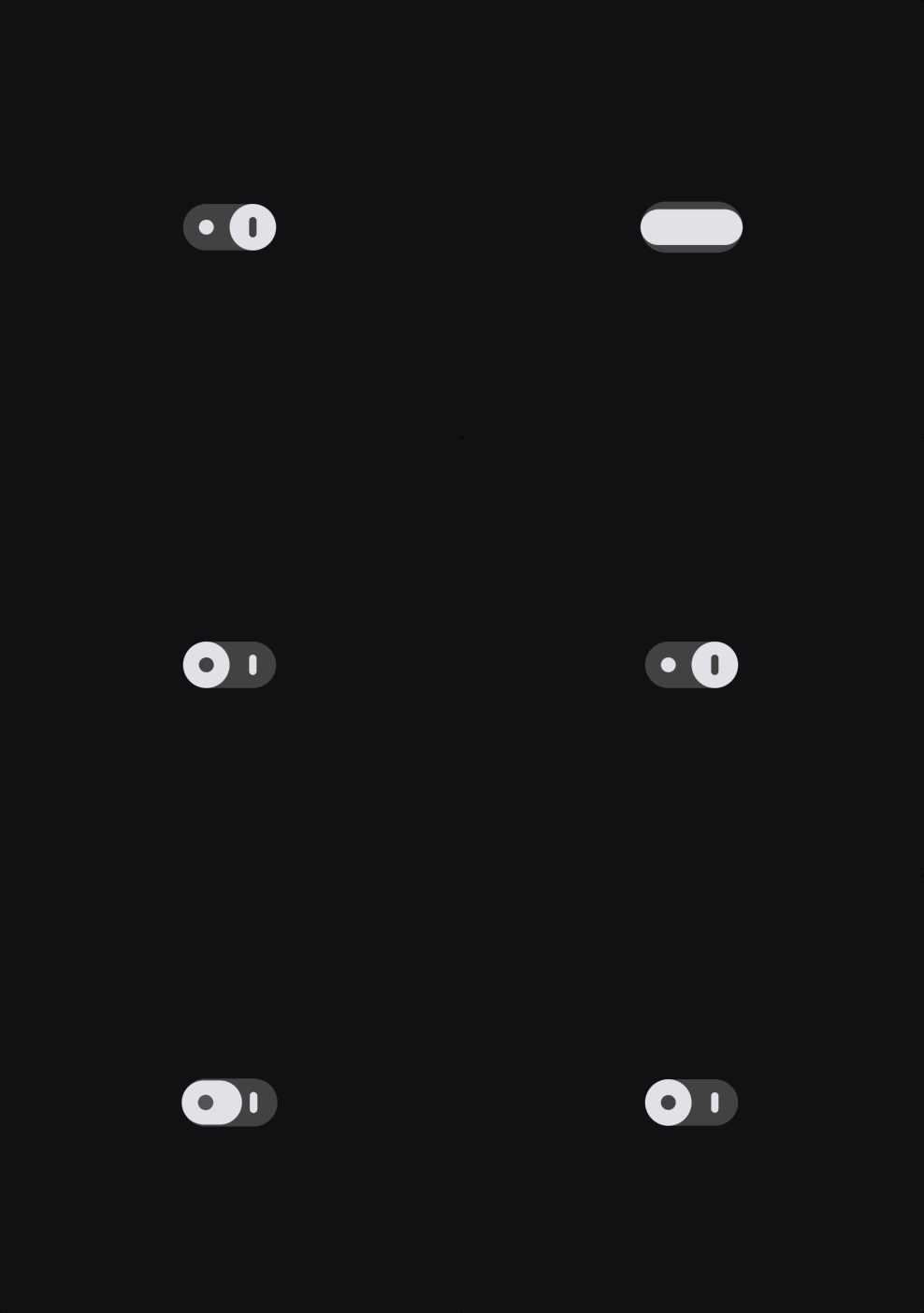
Smooth switch demo

source
Three dots action demo
source

Usage

Cue separates animation into a few small pieces:

  • Cue decides when an animation should run.
  • Actor decides which widget is animated.
  • Act describes the effect that is applied.
  • CueMotion describes how it moves, whether that is spring-based or timed with a curve.
  • Keyframes describe multi-step motion.

That separation keeps animation code readable, reusable, and easy to scale across a subtree.

Quick Start

Cue.onMount(
  motion: .smooth(),
  child: Actor(
    acts: [
      .fadeIn(),
      .slideY(from: 0.2),
      .scale(from: 0.96),
    ],
    child: const Text('Hello Cue'),
  ),
)

For a single animated child, you can skip the explicit Actor and pass acts directly to Cue:

Cue.onMount(
  motion: .smooth(),
  acts: [
    .fadeIn(),
    .slideY(from: 0.2),
  ],
  child: const Text('Hello Cue'),
)

If you are exploring animations during development, enable CueDebugTools right after you get the basic setup working. It gives you a scrubber for completed Cue animations and is best wrapped in a kDebugMode check:

MaterialApp(
  builder: (context, child) {
    if (kDebugMode) {
      return CueDebugTools(child: child!);
    }
    return child!;
  },
)

The Building Blocks

1. Cue: the trigger

Cue publishes a CueController to its subtree through CueScope. Any Actor below it can use it to build animations.

Use the factory that matches the trigger you want:

Direction matters here:

  • Cue.onMount plays forward when the widget is inserted into the tree. It is a one-way entrance trigger unless you opt into repeat behavior.
  • Cue.onToggle plays forward when toggled becomes true, and plays in reverse when toggled becomes false.
  • Cue.onChange restarts from 0 and plays forward each time the tracked value changes. It does not reverse based on the old and new values.
  • Cue.onHover plays forward on pointer enter, and reverses on pointer exit.
  • Cue.onFocus plays forward when the widget gains focus, and reverses when it loses focus.
  • Cue.onScroll is scrubbed by scroll position. It does not simply fire forward or reverse once; progress is continuously mapped to where the widget is in the viewport.
  • Cue.onScrollVisible maps visibility to animation progress. It moves forward as the widget enters the viewport and reverses as the widget exits it.
  • Cue.onProgress is scrubbed by an external progress source. The listenable drives the current value directly, so direction depends on whether the external progress is increasing or decreasing.
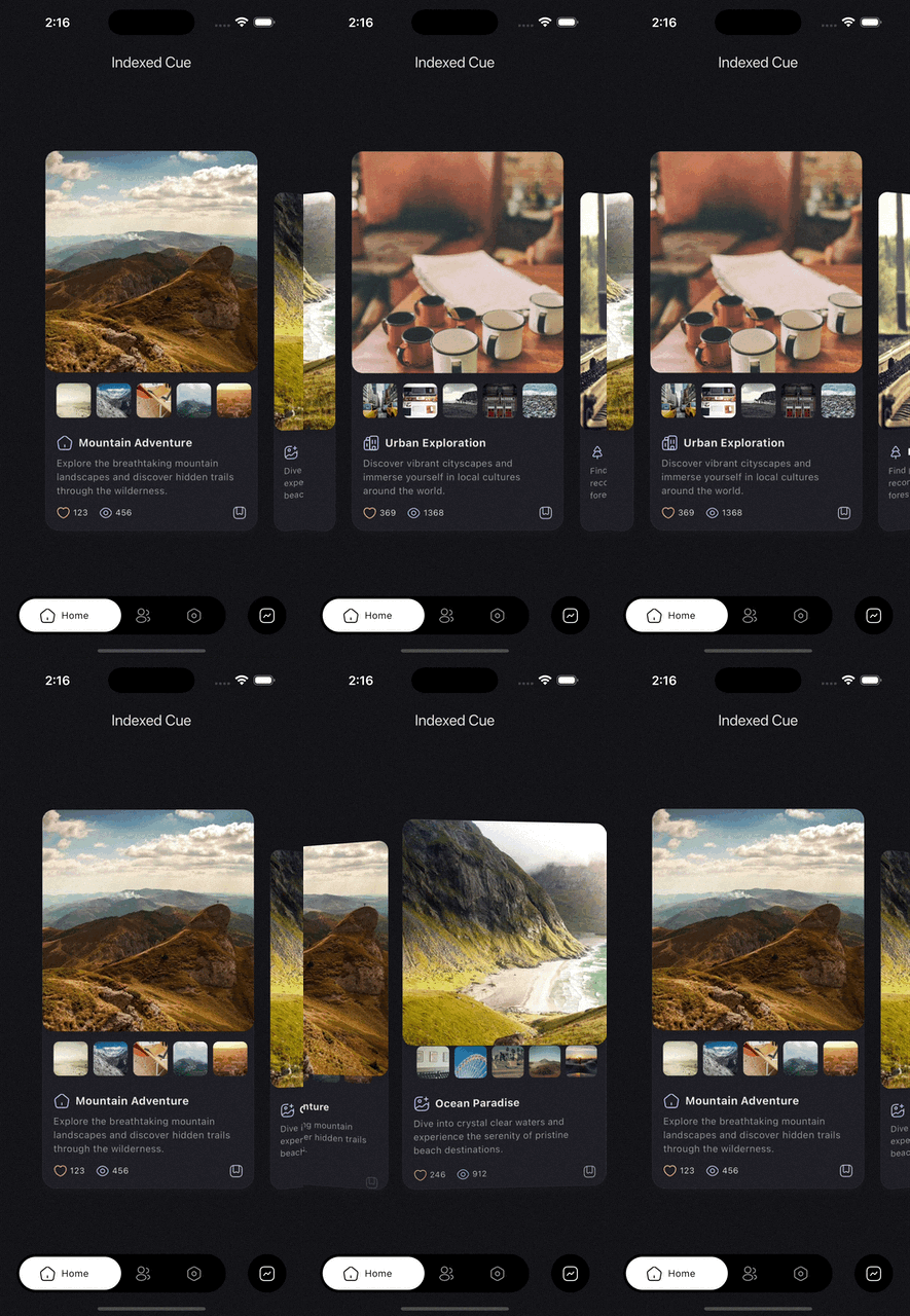
  • Cue.indexed is driven by an indexed controller. Items ahead of the active offset move forward, while items behind it move in reverse as the controller moves between indices.
  • Cue(...) gives you full imperative control. You decide the direction by calling methods such as forward, reverse, animateTo, or by setting progress directly on your controller.

In sliver layouts (for example CustomScrollView), animate the non-sliver widget you render inside each sliver (such as a SliverToBoxAdapter child or SliverList item). For SliverAppBar headers, use CueFlexibleSpaceBar.

Example:

Cue.onToggle(
  toggled: isExpanded,
  motion: .smooth(),
  reverseMotion: .snappy(),
  child: Column(
    children: [
      Actor(
        acts: [.rotate(to: 180)],
        child: const Icon(Icons.expand_more),
      ),
      Actor(
        delay: 50.ms,
        acts: [.fadeIn(), .slideY(from: 0.15)],
        child: const Text('Details'),
      ),
    ],
  ),
)
2. Actor: the renderer

Actor is the visual building block. It takes a child plus one or more acts and applies them using the nearest Cue.

Important rules:

  • Actor is passive. Without an ancestor Cue, it will throw.
  • One Actor can apply multiple acts at once.
  • Acts eventually resolve into nested widget wrappers around the child, so ordering matters. For example, clipping before transforming is not always the same as transforming before clipping.
  • Only one act per act key is allowed in the same Actor. For example, two slide variants in one Actor are not allowed because they share the same key.
  • motion on an act overrides Actor.motion, which overrides the parent Cue motion.

You can also attach acts inline with the widget extension:

ElevatedButton(
  onPressed: onPressed,
  child: const Text('Save'),
).act([
  .fadeIn(),
  .slideUp(),
])
3. Act: the effect

An Act is an immutable description of one animated property. Prefer the shorthand factories in normal app code.

Actor(
  acts: [
    .fadeIn(),
    .scale(from: 0.9),
    .slideY(from: 0.2),
  ],
  child: child,
)

The direct class constructors still exist, but the shorthand reads better and keeps call sites clean. Prefer:

  • .smooth() over Spring.smooth() when the type is inferred.
  • .fadeIn() over Act.fadeIn().
  • .key(...) over Keyframe(...).
  • .fractional([...]) where shorthand is available.

This is the style Cue is designed around.

4. CueMotion: how it moves

CueMotion controls timing and feel. In most UI, spring motion is the default choice because it handles interruption naturally.

Common presets:

  • .smooth() fast, clean, no overshoot. Best default.
  • .snappy() near-instant micro-interactions.
  • .bouncy() visible overshoot for emphasis.
  • .gentle() slower, softer motion.
  • .wobbly() exaggerated playful motion.
  • .interactive() responsive drag and hover feel.
  • .spatial() tuned for layout movement.
  • .effect() tuned for decorative changes.
  • .linear(250.ms), .easeIn(250.ms), .easeOut(250.ms) for fixed-duration timing.
Cue.onHover(
  motion: .interactive(),
  child: Actor(
    acts: [.scale(to: 1.03)],
    child: const Chip(label: Text('Hover me')),
  ),
)
5. Keyframes: multi-step animation

Use keyframes when a transition needs more than one target value.

Motion-based keyframes:

Actor(
  acts: [
    ScaleAct.keyframed(
      frames: Keyframes([
        .key(0.92),
        .key(1.06, motion: .bouncy()),
        .key(1.0),
      ], motion: .smooth()),
    ),
  ],
  child: child,
)

Fractional keyframes:

Actor(
  acts: [
    TranslateAct.keyframed(
      frames: .fractional([
        .key(const Offset(0, 24), at: 0.0),
        .key(const Offset(0, -8), at: 0.7),
        .key(Offset.zero, at: 1.0),
      ], duration: 450.ms),
    ),
  ],
  child: child,
)

Common Trigger Patterns

Enter on mount
Cue.onMount(
  motion: .smooth(),
  acts: [
    .fadeIn(),
    .slideY(from: 0.15),
  ],
  child: const Card(child: Padding(
    padding: EdgeInsets.all(16),
    child: Text('Mounted content'),
  )),
)
Animate state changes
Cue.onToggle(
  toggled: selected,
  motion: .smooth(),
  child: Actor(
    acts: [
      .scale(to: 1.04),
      .decorate(
        color: .tween(Colors.white, Colors.blue.shade50),
        borderRadius: .fixed(.circular(16)),
      ),
    ],
    child: child,
  ),
)
Re-animate when data changes

Cue.onChange is useful when the target value changes but the trigger is not a simple boolean.

Cue.onChange(
  value: currentTab,
  motion: .smooth(),
  fromCurrentValue: true,
  acts: [
    .fadeIn(),
    .slideY(from: 0.08),
  ],
  child: Text(labels[currentTab]),
)
Hover and focus
Cue.onHover(
  motion: .interactive(),
  acts: [.scale(to: 1.02)],
  child: Cue.onFocus(
    motion: .smooth(),
    acts: [.decorate(borderRadius: .fixed(.circular(14)))],
    child: child,
  ),
)
Animate pages with CuePageController

Cue.indexed is commonly used with CuePageController, where each page gets its own indexed cue and can animate multiple children as the page moves in and out.

final controller = CuePageController(viewportFraction: 0.8);

PageView.builder(
  controller: controller,
  itemCount: pages.length,
  itemBuilder: (context, index) {
    final page = pages[index];
    return Cue.indexed(
      controller: controller,
      index: index,
      child: Column(
        mainAxisAlignment: MainAxisAlignment.center,
        children: [
          Actor(
            acts: [
              .fadeIn(),
              .slideY(from: 0.12),
            ],
            child: Text(page.title),
          ),
          Actor(
            delay: 60.ms,
            acts: [
              .scale(from: 0.96),
              .fadeIn(),
            ],
            child: Card(
              child: SizedBox(
                height: 220,
                child: Center(child: Text(page.subtitle)),
              ),
            ),
          ),
        ],
      ),
    );
  },
)

Common Act Families

Cue ships a large set of acts. Most apps can think about them in a few groups.

Transform
  • .scale(), .zoomIn(), .zoomOut()
  • .rotate(), .rotate3D(), .flipX(), .flipY()
  • .translate(), .translateX(), .translateY()
  • .slide(), .slideX(), .slideY(), .slideUp(), .slideDown()
  • .stretch(), .skew(), .transform()
  • .parallax()
Visual
  • .opacity(), .fadeIn(), .fadeOut()
  • .blur(), .focus(), .unfocus()
  • .backdropBlur()
  • .colorTint()
Layout and clipping
  • .sizedBox()
  • .sizedClip()
  • .fractionalSize()
  • .padding()
  • .align()
  • .clipHeight(), .clipWidth(), .clip(), .circularClip()
Style and decoration
  • .decorate()
  • .textStyle()
  • .iconTheme()
Positional and specialized
  • .position() for stack-based layout animation
  • CardAct and CardActor
  • PaintAct and PaintActor
  • PathMotionAct

Motion, Delay, and Reverse Behavior

Acts, Actors, and Cues can all contribute timing.

  • Use motion to control forward timing.
  • Use reverseMotion on Cue or Actor when reverse should feel different.
  • Use delay and reverseDelay to offset animation starts.
  • Use ReverseBehavior on an act when reverse should target a different value or be disabled.
Actor(
  motion: .smooth(),
  reverseMotion: .linear(160.ms),
  delay: 80.ms,
  acts: [
    .fadeIn(
      reverse: .mirror(delay: 40.ms),
    ),
    .scale(
      to: 1.06,
      reverse: .to(0.98),
    ),
  ],
  child: child,
)

Controllers and Imperative Use

Use the trigger factories first. Reach for controllers when you need explicit orchestration.

CueController is an AnimationController backed by a CueTimeline. It keeps Cue's motion and track system available even when you are driving animation manually.

Important differences from a normal AnimationController:

  • Duration is derived from the timeline motion. You do not set duration or reverseDuration directly.
  • The timeline manages tracks, and each track can have its own motion.
  • To remove a track from the timeline, every obtainer of that track must release it.
  • If you rebuild the timeline with a new default motion, previously obtained tracks become stale and must be obtained again.

Available controller types include:

  • CueController for direct control.
  • CuePageController and CueTabController for navigation-driven progress.
  • CueIndexController and IndexedCueController for sequences and staggered lists.
  • SelfAnimatedCue for self-contained animation ownership.

When working manually with CueController, there are two levels of API:

  • High-level: pass the controller into Cue(controller: ...) and let Actors consume it through CueScope.
  • Low-level: obtain tracks with obtainTrack, tweenTrack, or keyframedTrack when you need typed imperative animations outside the normal widget helpers.
late final CueController controller;

@override
void initState() {
  super.initState();
  controller = CueController(vsync: this, motion: .smooth());
}


@override
Widget build(BuildContext context) {
  return Cue(
    controller: controller,
    acts: [.fadeIn(), .slideY(from: 0.2)],
    child: child,
  );
}

If you obtain typed animations directly, remember that they hold timeline tracks underneath:

late final CueController controller;
late final CueAnimation<double> opacity;
late final CueAnimation<double> scale;

@override
void initState() {
  super.initState();
  controller = CueController(vsync: this, motion: .smooth());
  opacity = controller.tweenTrack<double>(
    from: 0,
    to: 1,
  );
  scale = controller.keyframedTrack<double>(
    frames: Keyframes([
      .key(0.92),
      .key(1.06),
      .key(1.0),
    ], motion: .smooth()),
  );
}

@override
void dispose() {
  controller.dispose();
  super.dispose();
}

If the controller itself is being disposed, you do not need to release those tracks manually. Disposing the controller disposes the timeline and everything attached to it.

If the controller stays alive but a specific imperative animation is no longer needed, release that animation so its underlying track can be removed when no other obtainers still hold it.

Track lifecycle matters here:

  • obtainTrack returns a track plus a ReleaseToken.
  • tweenTrack and keyframedTrack wrap that same mechanism and expose CueAnimation.release().
  • A track is only removed after every token for it has been released.

If you call rebuildTimeline(...) because the default motion changed, all previously obtained tracks become stale, including tracks that had their own motion override. Re-obtain them after rebuilding.

Cue widgets handle all of this automatically. These details only matter when you use the controller as a low-level imperative API.

Higher-Level Helpers

Cue also includes higher-level widgets for common transition patterns.

showCueDialog and CueDialogRoute

Use Cue-powered route transitions for dialogs and overlays. Actors inside the route automatically pick up the route controller through CueScope.

showCueDialog(
  context: context,
  motion: .smooth(),
  reverseMotion: .snappy(),
  builder: (context) => Actor(
    acts: [
      .fadeIn(),
      .slideY(from: 0.12),
    ],
    child: const AlertDialog(title: Text('Hello')),
  ),
)
CueModalTransition

Use this when a trigger should expand into contextual modal content. The builder receives the trigger rectangle, so it is easy to animate size and position from the original source.

CueModalTransition(
  motion: .smooth(),
  reverseMotion: .snappy(),
  hideTriggerOnTransition: true,
  triggerBuilder: (context, open) {
    return IconButton(
      onPressed: open,
      icon: const Icon(Icons.more_horiz),
    );
  },
  builder: (context, rect) {
    return Actor(
      acts: [
        .translateFromGlobalRect(rect),
        .sizedClip(from: .size(rect.size), to: .width(240)),
      ],
      child: const Card(child: SizedBox(height: 180)),
    );
  },
)
CueModalRouteMixin

Use route integration when modal transitions should be driven by Cue instead of a one-off animation builder.

CueDragScrubber

Attach drag-based scrubbing to any subtree driven by a Cue controller.

Cue(
  controller: _controller,
  child: CueDragScrubber(
    scrubForwardDirection: CueScrubAxis.down,
    distance: 200,
    child: DecoratedBoxActor(...),
  ),
)
  • scrubForwardDirection (required) defines which drag direction maps to forward progress. Use CueScrubAxis.start/.end for logical directions that adapt to text direction (LTR/RTL), or .left/.right/.up/.down for absolute physical directions.
  • distance must be positive. To reverse the drag direction, use the opposite CueScrubAxis instead of a negative distance.
CueFlexibleSpaceBar

A drop-in replacement for Flutter's FlexibleSpaceBar that provides cue animations driver through context, the animations are driven by the collapse progress of the flexible space bar.

CueFlexibleSpaceBar(
  background: Center(child: 
    Actor(
    acts: [.fadeIn(), .zomeIn()], 
    child: Image.asset('header.jpg'),
    ),
  ),
  title: const Text('Title'), // can animate anyting here as well
)

Does not react to SliverAppBar.expandedHeight changes at runtime. Use a ValueKey if you have dynamic heights.

Custom Animations

When the built-in acts are not enough, there are two main paths:

  • Build your own Act when you want a reusable effect that fits naturally into normal Actor(acts: [...]) composition.
  • Use TweenActor<T> when you want to animate a custom value and render it directly with a builder.

TweenActor is the simplest custom entry point. You provide from, to, and a builder, and Cue gives you an animation you can use to drive any widget tree:

TweenActor<double>(
  from: 0,
  to: 1,
  motion: .smooth(),
  builder: (context, animation) {
    return FadeTranstion(
      opacity: animation,
      child: const Text('Custom animation'),
    );
  },
)

Cue also ships composed actor helpers for common cases where the act and widget shape already belong together:

  • PositionedActor for animating Position inside a Stack
  • DecoratedBoxActor for animated box decoration
  • CardActor for animated card properties
  • PaintActor for painting with animation progress

Use those when they match the job, and build your own Act or TweenActor when they do not.

Recommended Style

Cue works best when call sites stay terse.

  • Prefer Cue.onToggle(motion: .smooth(), ...) over verbose class-qualified constructors when type inference is clear.
  • Prefer .fadeIn(), .slideY(), .scale() and other shorthand act factories in act lists.
  • Prefer Cue.acts or widget.act([...]) for single-child cases.
  • Use an explicit Actor when you need multiple animated descendants with different delays or motions.
  • Put one Cue high enough in the tree to coordinate related actors.

In short: use the shorthand named constructors whenever possible. That is the cleanest API Cue offers.

AI Agent Skills

Cue ships animation skills that give AI coding agents deep knowledge of the Cue API for accurate code generation, act suggestions, and motion guidance.

Quick Install (Recommended)

Install the skills package and get the cue animation skill:

skills get cue
Manual Installation

Copy the skill from the Cue/skills folder into your project's AI agent skills directory:

  • GitHub Copilot: Copy to .github/skills/cue-animations/SKILL.md
  • Kilo: Copy to .kilo/skill/cue-animations.md
  • Other agents: Check your agent's documentation for the correct skills path

카테고리

의존성

의존성 목록 1 개

소스 저장소

이 패키지를 사용하는 프로젝트

아직 데이터가 없습니다.