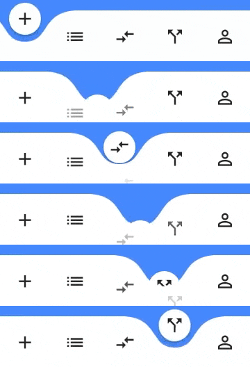
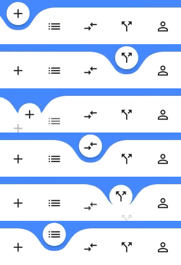
Flutter 앱을 위한 시각적으로 매력적이고 애니메이션 효과가 있는 곡선 네비게이션 바입니다. 사용자 정의 가능한 색상, 배경 톤, 애니메이션 곡선 및 지속 시간 설정을 통해 동적이고 현대적인 하단 네비게이션 경험을 제공합니다. 탭 간의 부드러운 전환을 원하는 고유하고 유연한 인터페이스를 찾는 앱에 이상적입니다. 이 패키지는 Android, iOS, Web, macOS, Windows, Linux 등 여러 플랫폼을 지원합니다.
items: List of Widgets index: index of NavigationBar, can be used to change current index or to set initial index color: Color of NavigationBar, default Colors.white buttonBackgroundColor: background color of floating button, default same as color attribute backgroundColor: Color of NavigationBar's background, default Colors.blueAccent onTap: Function handling taps on items animationCurve: Curves interpolating button change animation, default Curves.easeOutCubic animationDuration: Duration of button change animation, default Duration(milliseconds: 600) height: Height of NavigationBar, min 0.0, max 75.0 maxWidth: Allows to set the width of the navigation bar lower than the entire screen width by default letIndexChange: Function which takes page index as argument and returns bool. If function returns false then page is not changed on button tap. It returns true by default\
Change page programmatically
//State classint _page = 0;
GlobalKey<CurvedNavigationBarState> _bottomNavigationKey = GlobalKey();
@overrideWidgetbuild(BuildContext context) {
returnScaffold(
bottomNavigationBar: CurvedNavigationBar(
key: _bottomNavigationKey,
items: <Widget>[
Icon(Icons.add, size: 30),
Icon(Icons.list, size: 30),
Icon(Icons.compare_arrows, size: 30),
],
onTap: (index) {
setState(() {
_page = index;
});
},
),
body: Container(
color: Colors.blueAccent,
child: Center(
child: Column(
children: <Widget>[
Text(_page.toString(), textScaleFactor: 10.0),
ElevatedButton(
child: Text('Go To Page of index 1'),
onPressed: () {
//Page change using state does the same as clicking index 1 navigation buttonfinalCurvedNavigationBarState? navBarState =
_bottomNavigationKey.currentState;
navBarState?.setPage(1);
},
)
],
),
),
));
}