패키지, 저장소 및 앱 카테고리 검색

custom_image_crop 표지
패키지 상세v0.1.1

custom_image_crop

사용자 정의 가능한 이미지 자르기 도구입니다. 제스처 또는 컨트롤러를 통해 회전, 확대/축소 및 이동할 수 있습니다.

AndroidiOSWebmacOSWindowsLinux
30일 다운로드
1.2만
좋아요
89
Pub 점수
150

패키지 설치

flutter pub add custom_image_crop

패키지 개요

공개 정보를 바탕으로 생성한 선택 가이드입니다.

사용자가 직관적인 제스처나 컨트롤러를 사용하여 이미지를 회전, 확대/축소, 이동할 수 있도록 해주는 Flutter용 고도로 사용자 정의 가능한 이미지 자르기 도구입니다. 여러 플랫폼 간 원활한 통합을 위해 설계되었으며, 자르기 경험에 대한 세밀한 제어를 제공합니다. 반응형이고 상호작용적인 인터페이스를 갖춘 고급 이미지 조작이 필요한 앱에 적합합니다. 이 패키지는 Android, iOS, Web, macOS, Windows, Linux를 지원하여 광범위한 호환성을 보장합니다.

사용 사례

  • 사진 앱에서 사용자 지정 이미지 편집
  • 사용자 프로필 사진 자르기
  • 인터랙티브 이미지 선택 도구
  • 디자인 앱에서의 동적 이미지 크기 조정
  • 머신 러닝 워크플로우를 위한 이미지 전처리

주요 기능

  • 제스처 기반 회전, 스케일링 및 변환
  • 컨트롤러 기반 이미지 조작
  • 크로스 플랫폼 지원
  • 높은 사용자 정의가 가능한 UI 컴포넌트
  • 자르기 중 실시간 미리보기
  • 모든 화면 크기에 대응하는 반응형 디자인

적합한 대상

  • 이미지 편집 기능을 구축하는 개발자
  • 정확한 이미지 자르기 기능이 필요한 앱
  • 다중 플랫폼 이미지 조작 도구
  • 이미지 처리 기능을 갖춘 인터랙티브 사용자 인터페이스
  • 고급 이미지 편집 워크플로우 프로토타이핑

고려 사항

  • 성능 문제를 방지하기 위해 큰 이미지 처리에 주의가 필요합니다
  • 복잡한 사용 사례를 위해 추가 상태 관리가 필요할 수 있습니다
  • 초기 설정에는 제스처 감지기와 컨트롤러에 대한 이해가 필요합니다
  • 다운샘플링 없이 매우 높은 해상도 이미지에 최적화되지 않음
  • 제한된 내장 사전 설정; 특정 작물 비율을 위해 사용자 정의가 필요

원본 README

연결된 소스 저장소의 README 원문 스냅샷입니다. 최신 내용은 저장소에서 확인하세요.

custom_image_crop

An Image cropper that is customizable

pub package Build Status Coverage Status MIT license

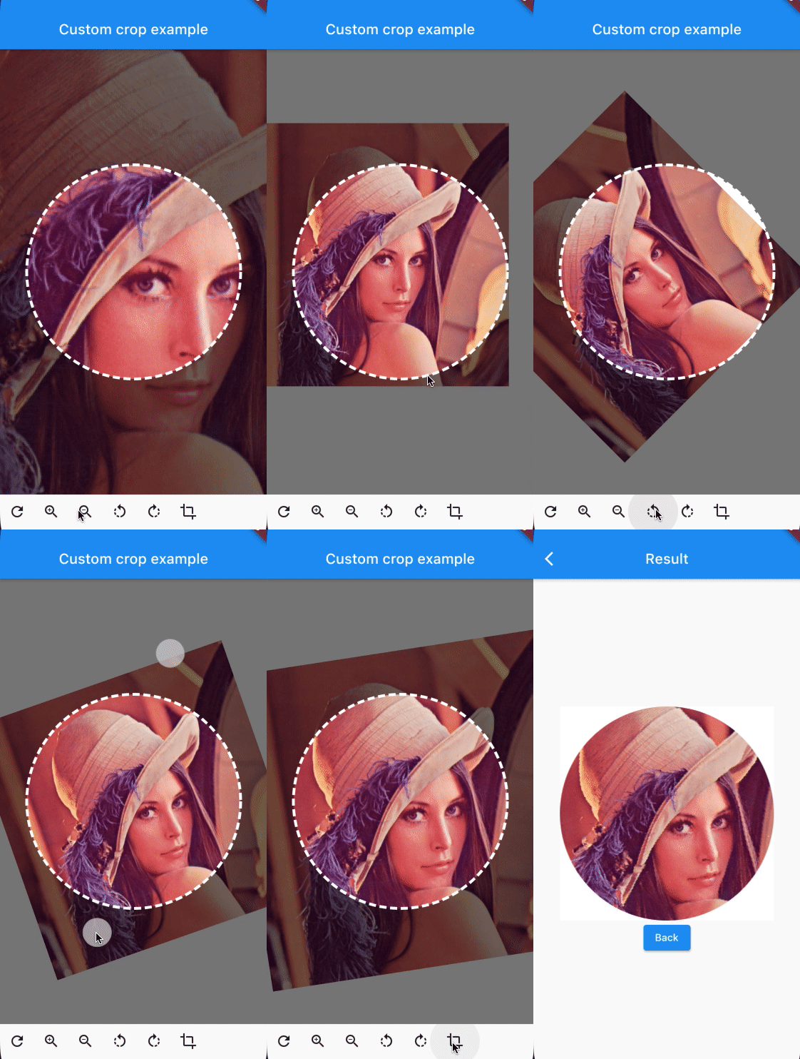
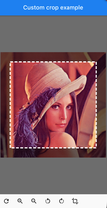
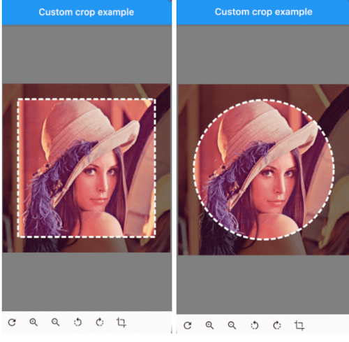
customcropcircle customcropsquare customcropcircle

CustomImageCrop

CustomImageCrop(
  cropController: controller,
  image: const AssetImage('assets/test.png'),
),

You can provide the image using any Imageprovider.

Parameters

required image

The image that needs to be cropped

cropController

The controller used to adjust the image and crop it.

overlayColor

The color above the image that will be cropped

backgroundColor

The color behind the image. This color will also be used when there are gaps/empty space after the cropping

shape

The shape of the cropping path.

maskShape

The shape of the UI masking.

cropPercentage

How big the crop should be in regards to the width and height available to the cropping widget.

drawPath

How the border of the crop should be painted. default DottedCropPathPainter.drawPath and SolidCropPathPainter.drawPath are provided, but you can create/provide any CustomPaint.

pathPaint

Custom painting for the crop area border style.

canRotate

Whether to allow the image to be rotated.

customProgressIndicator

Custom widget for progress indicator.

ratio

Ratio of the cropping area. If shape`` is set to CustomCropShape.Ratio, this property is required. For example, to create a square crop area, use [Ratio(width: 1, height: 1). To create a rectangular crop area with a 16:9 aspect ratio, use [Ratio(width: 16, height: 9)`.

borderRadius

The radius for rounded corners of the cropping area.

forceInsideCropArea

Whether image area must cover clip path.

Controller Methods

addTransition

void addTransition(CropImageData transition)

Add the position, angle and scale to the current state. This can be used to adjust the image with sliders, buttons, etc.

setData

void setData(CropImageData data)

Set the position, angle and scale to the specified values. This can be used to center the image by pressing a button for example.

reset

void reset()

Reset the image to its default state

onCropImage

Future<MemoryImage> onCropImage()

Crops the image in its current state, this will return a MemoryImage that contains the cropped image

Example

See example/lib

class MyHomePage extends StatefulWidget {
  final String title;

  MyHomePage({
    required this.title,
    Key? key,
  }) : super(key: key);

  @override
  _MyHomePageState createState() => _MyHomePageState();
}

class _MyHomePageState extends State<MyHomePage> {
  late CustomImageCropController controller;

  @override
  void initState() {
    super.initState();
    controller = CustomImageCropController();
  }

  @override
  void dispose() {
    controller.dispose();
    super.dispose();
  }

  @override
  Widget build(BuildContext context) {
    return Scaffold(
      appBar: AppBar(
        title: Text(widget.title),
        brightness: Brightness.dark,
      ),
      body: Column(
        children: [
          Expanded(
            child: CustomImageCrop(
              cropController: controller,
              image: const AssetImage('assets/test.png'), // Any Imageprovider will work, try with a NetworkImage for example...
            ),
          ),
          Row(
            children: [
              IconButton(icon: const Icon(Icons.refresh), onPressed: controller.reset),
              IconButton(icon: const Icon(Icons.zoom_in), onPressed: () => controller.addTransition(CropImageData(scale: 1.33))),
              IconButton(icon: const Icon(Icons.zoom_out), onPressed: () => controller.addTransition(CropImageData(scale: 0.75))),
              IconButton(icon: const Icon(Icons.rotate_left), onPressed: () => controller.addTransition(CropImageData(angle: -pi / 4))),
              IconButton(icon: const Icon(Icons.rotate_right), onPressed: () => controller.addTransition(CropImageData(angle: pi / 4))),
              IconButton(
                icon: const Icon(Icons.crop),
                onPressed: () async {
                  final image = await controller.onCropImage();
                  if (image != null) {
                    Navigator.of(context).push(MaterialPageRoute(builder: (BuildContext context) => ResultScreen(image: image)));
                  }
                },
              ),
            ],
          ),
          SizedBox(height: MediaQuery.of(context).padding.bottom),
        ],
      ),
    );
  }
}

카테고리

의존성

의존성 목록 2 개

소스 저장소

이 패키지를 사용하는 프로젝트

아직 데이터가 없습니다.