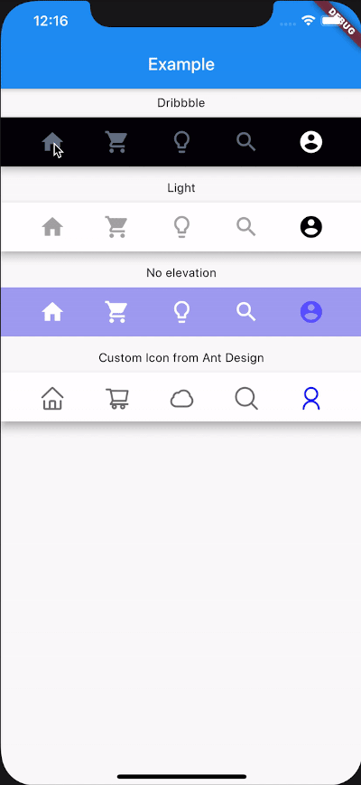
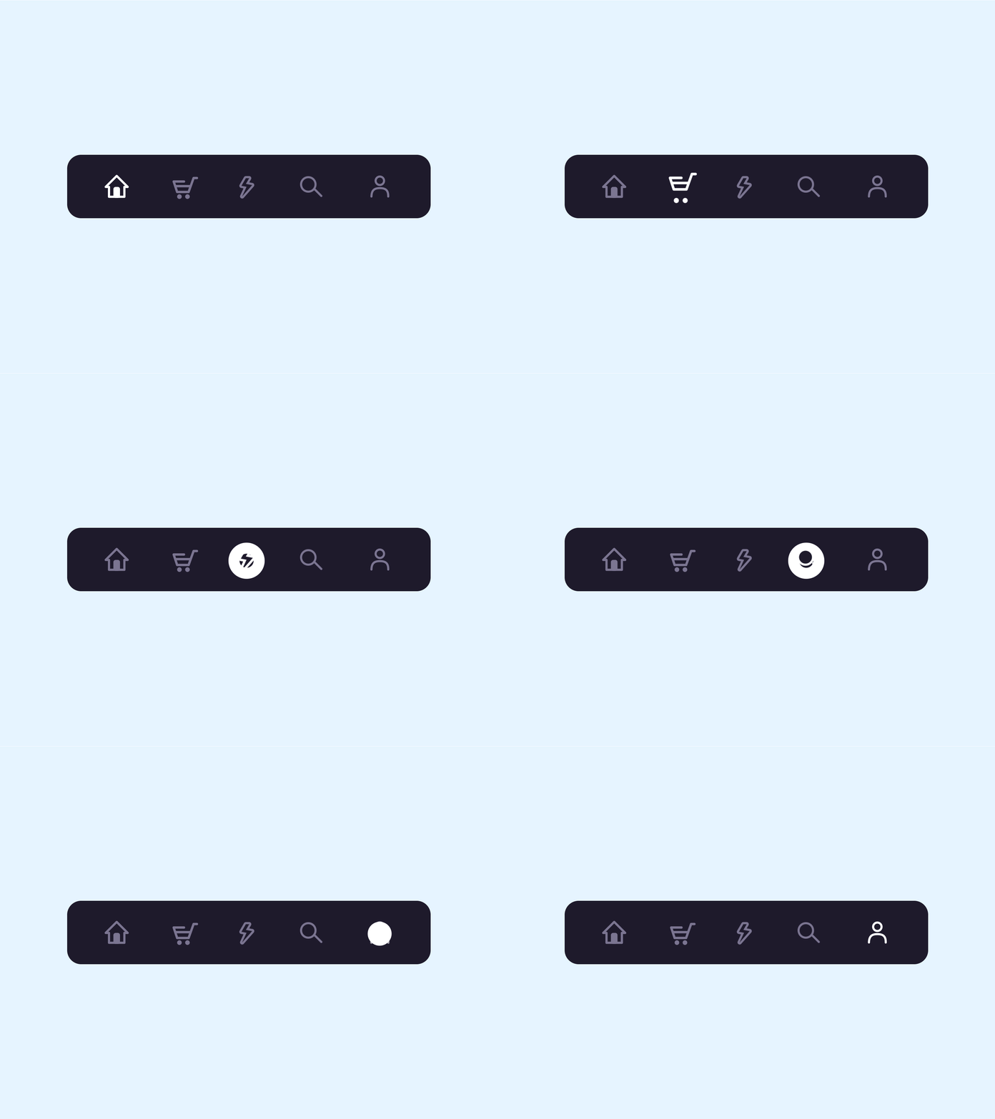
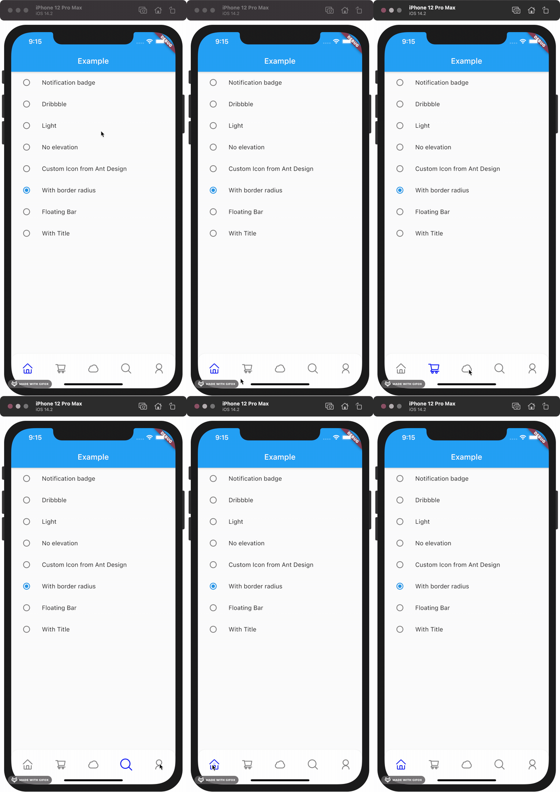
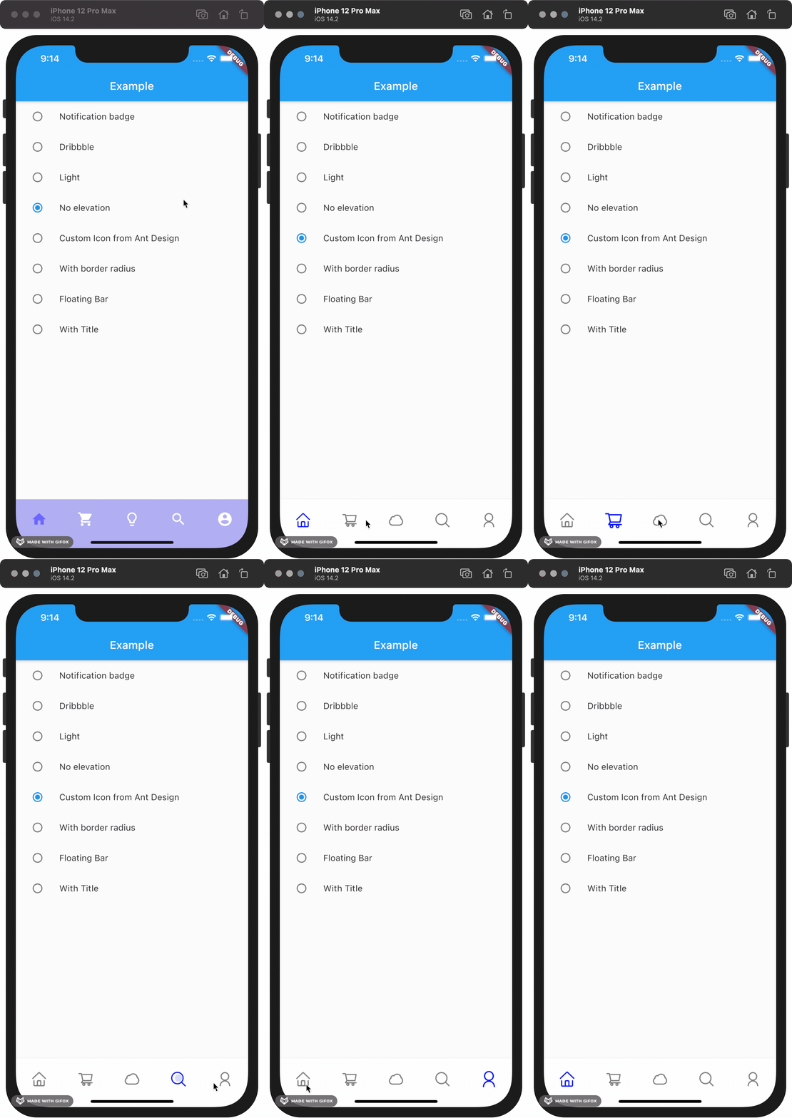
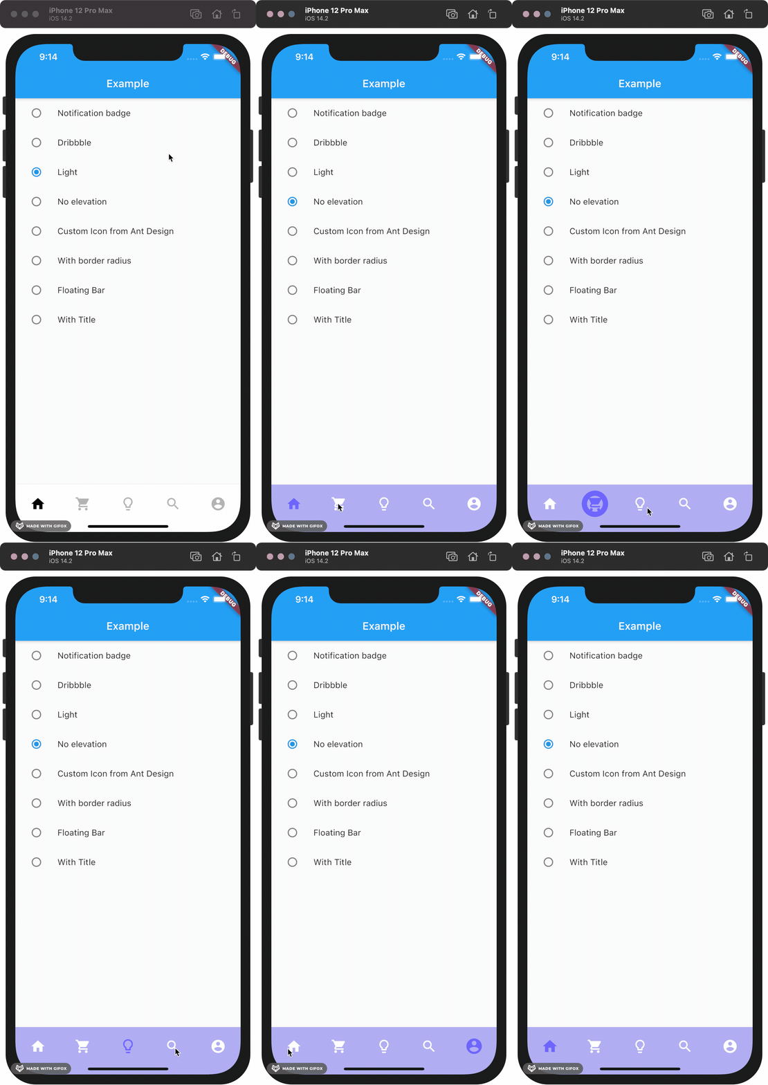
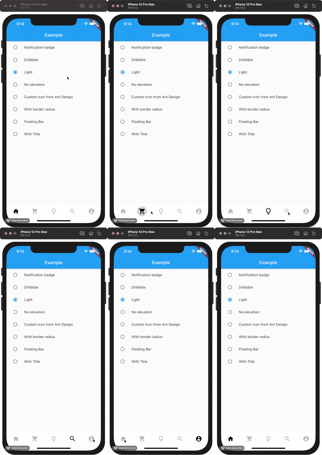
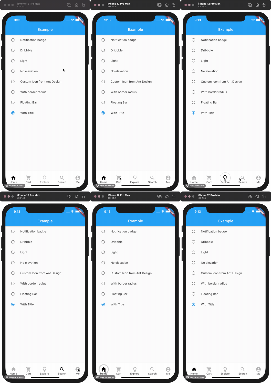
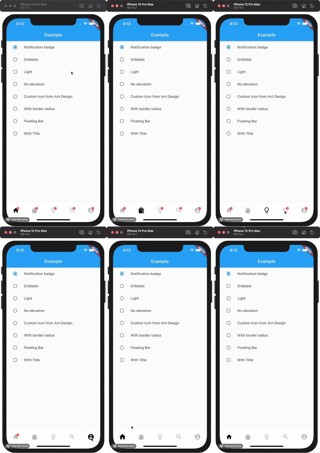
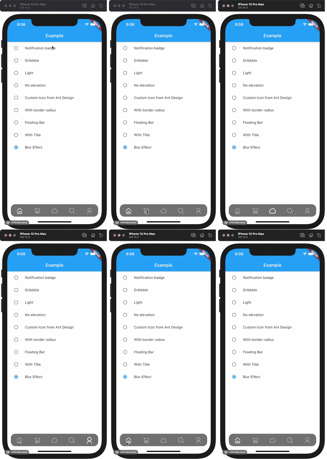
The Boring Flutter Development Show EP. 35 에서 영감을 받은 버블 클릭 효과를 갖춘 사용자 정의 가능한 하단 네비게이션 바입니다. 부드러운 애니메이션과 탭 시 시각적 피드백을 통해 사용자 상호작용을 향상시킵니다. 이 패키지는 Android, iOS, Web, macOS, Windows, Linux 등 여러 플랫폼을 지원하여 크로스플랫폼 앱에 적합합니다. 개발자는 앱의 디자인 언어에 맞게 외관과 동작을 쉽게 조정할 수 있습니다.
This package gives you a cute bubble effect when you click on the navigation bar.
Dribbble:
Implemented:
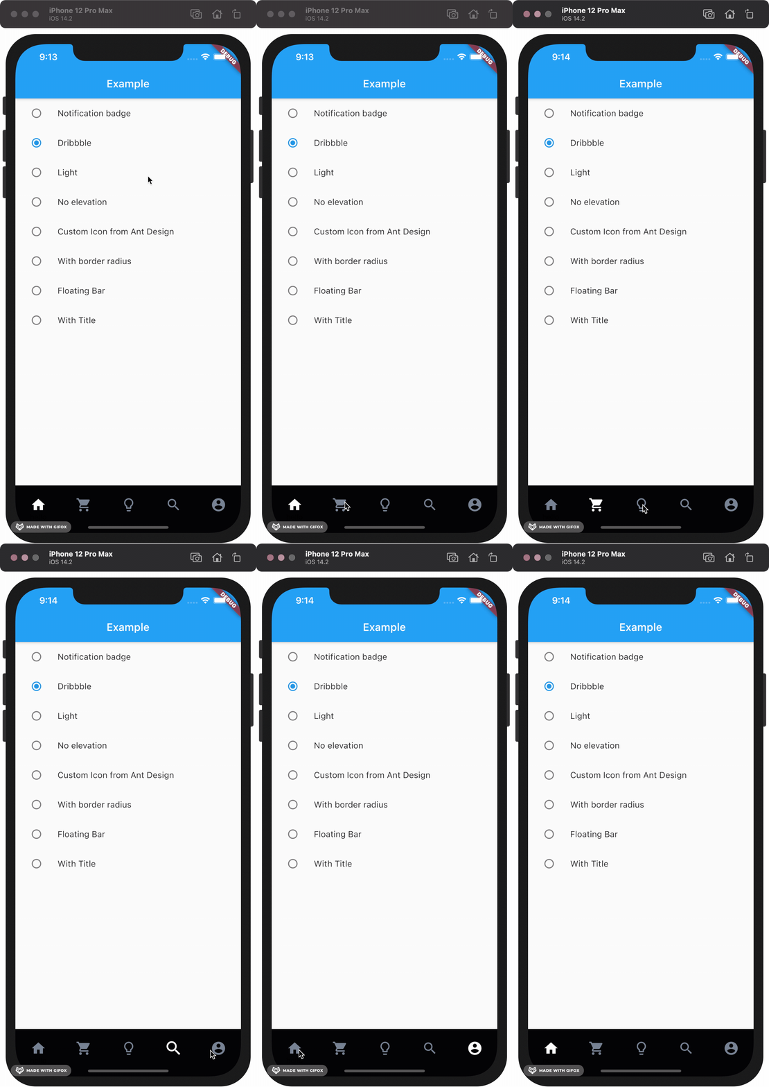
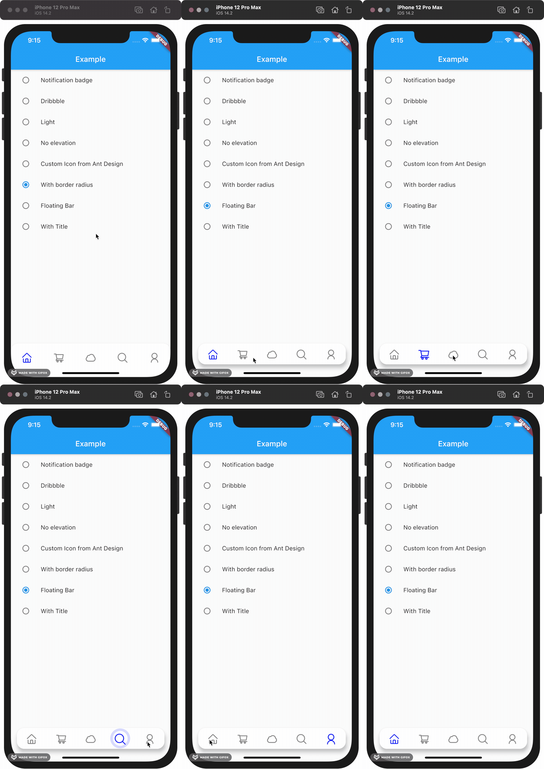
Gallery
How to install
Add this to your package's pubspec.yaml file:
dependencies:custom_navigation_bar:lastestversion
Documentation
Attention
If you update from version under 0.6.0, there are some breaking changes in the version 0.6.0. The icon in CustomNavigationBarItem has changed from IconData to Widget.
old version
CustomNavigationBarItem(
{@requiredthis.icon,
IconData selectedIcon,
this.selectedTitle,
this.unSelectedTitle,
this.badgeCount = 0,
this.showBadge = true})
: selectedIcon = selectedIcon ?? icon;
////// The icon of the item/// Typically the icon is an [Icon].///finalIconData icon;
new version
CustomNavigationBarItem(
{@requiredthis.icon,
Widget selectedIcon,
this.title,
Text selectedTitle,
this.badgeCount = 0,
this.showBadge = false})
: selectedIcon = selectedIcon ?? icon,
selectedTitle = selectedTitle ?? title;
////// The icon of the item/// Typically the icon is an [Icon].///finalWidget icon;
You can customize these attributes in the navigation bar.
Attributes
Type
Description
Default
scaleFactor
double
scale factor for the icon scale animation.
0.2
elevation
double
The z-coordinate of this CustomNavigationBar
8.0
items
List
item data in CustomNavigationBar
required
selectedColor
Color
[Color] when [CustomNavigationBarItem] is selected
[blueAccent]
unSelectedColor
Color
[Color] when [CustomNavigationBarItem] is not selected.
grey[600]
onTap
Function(int)
callback function when item tapped
null
currentIndex
int
current index of navigation bar.
0
iconSize
double
size of icon. also represent the max radius of bubble effect animation.
24.0
backgroundColor
Color
Background color of [CustomNavigationBar]
Colors.white
strokeColor
Color
stroke color
blueAccent
bubbleCurve
Curve
animation curve of bubble effect
linear
scaleCurve
Curve
animation curve of scale effect
linear
borderRadius
Radius
border radius of navigation bar
Radius.zero
isFloating
bool
control if CustomNavigationBar is floating
false
blurEffect
bool
control if CustomNavigationBar show blur effect
false
opacity
double
control CustomNavigationBar blur effect opacity when blurEffect is true
0.8
brightness
Brightness
describes the contrast of a theme or color palette. If you want adaptive system display setting like iOS dark mode , you should set Brightness.dark or Brightness.light . if this attribute be set , other attributes with "*Color" (like selectedColor) will not take effect , should use lightThemeData or darkThemeData
null
lightThemeData
CustomNavigationBarThemeData
when brightnessis light,you can custom the light theme color if you want it
null
darkThemeData
CustomNavigationBarThemeData
when brightnessis dark,you can custom the dark theme color if you want it
null
Attention: If you set isFloating to true, I would recommand you to set extendBody to true in Scaffold for a better performance.
And for customize icon in the navigation bar, just put the icons you want in the CustomNavigationBarItem like this.