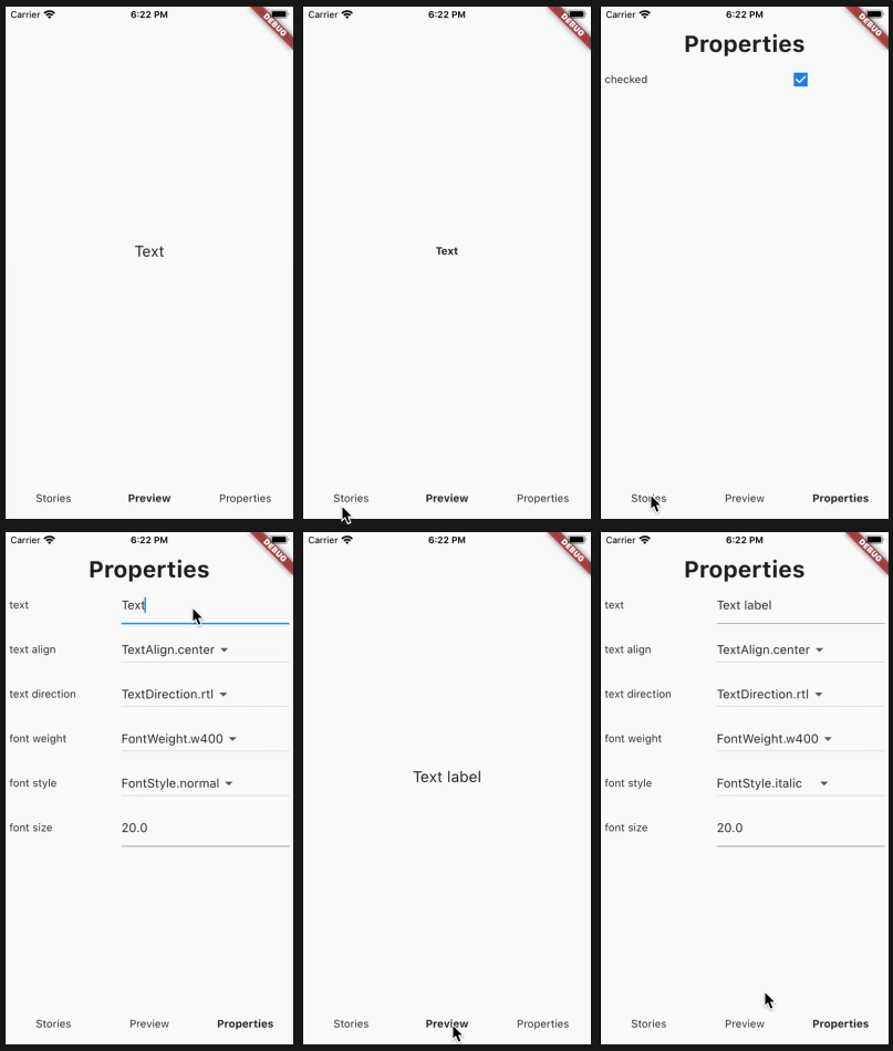
연결된 소스 저장소의 README 원문 스냅샷입니다. 최신 내용은 저장소에서 확인하세요.
Dashbook

Dashbook is a UI development tool for Flutter, it works as a development enviroment for the project widgets and also a showcase for common widgets on the app, it is heavly inspired by Storybook library, so it should be very easy for people who has already used Storybook, to use Dashbook.
It currently supports both mobile and web, having a friendly layout built to work nice on web and large resolutions.
Have any questions or ideas? Join our Discord.
How to use
Add the dependency to your pubspec.yaml
flutter pub add dashbook
Tip ℹ️: If you use mason, a basic Dashbook brick called
dashbook_gallery is available in brickhub.dev, which creates a basic gallery in seconds.
A Dashbook instance has a collection of the app widgets (Stories) and its variants (Chapters). Here you can see a very simple example of how to use it.
import 'package:flutter/material.dart';
import 'package:dashbook/dashbook.dart';
void main() {
final dashbook = Dashbook();
dashbook
.storiesOf('Text')
.decorator(CenterDecorator())
.add('default', (ctx) {
return Container(width: 300, child: Text(
ctx.textProperty("text", "Text Example"),
textAlign: ctx.listProperty(
"text align",
TextAlign.center,
TextAlign.values,
),
textDirection: ctx.listProperty(
"text direction",
TextDirection.rtl,
TextDirection.values,
),
style: TextStyle(
fontWeight: ctx.listProperty(
"font weight",
FontWeight.normal,
FontWeight.values,
),
fontStyle: ctx.listProperty(
"font style",
FontStyle.normal,
FontStyle.values,
),
fontSize: ctx.numberProperty("font size", 20)),
));
});
dashbook
.storiesOf('ElevatedButton')
.decorator(CenterDecorator())
.add('default', (ctx) => ElevatedButton(child: Text('Ok'), onPressed: () {}));
runApp(dashbook);
}
Actions
Dashbook also provides a way for easily calling methods from its UI, these callbacks can be used for more complex examples which demands user interaction.
For example, a Dialog is something that isn't directly rendered on a page, but rather shows upon an action, an example for a CustomDialog widget could be achieved on Dashbook by using the following code:
final dashbook = Dashbook();

dashbook
  .storiesOf('CustomDialog')
  .add('default', (ctx) {
    ctx.action('Open dialog', (context) {
      showDialog(
        context: context,
        builder: (_) => CustomDialog(),
      );
    });

    return SizedBox();
  });
Example information
Often an example may not be intuitive enough and the user may be lost without some instruction on how to interact with it. To mitigate that, text information can be linked to an example to serve as a guide, or to show any other relevant information.
To do so, simply use the info parameter on the add method of a story:
final dashbook = Dashbook();

dashbook
  .storiesOf('CustomDialog')
  .add('default',
    (ctx) {
      ctx.action('Open dialog', (context) {
        showDialog(
          context: context,
          builder: (_) => CustomDialog(),
        );
      });

      return SizedBox();
    },
    info: 'Use the actions button on the side to show the dialog.',
  );
This will present a small i icon on the side toolbar that once clicked will present the information to the user.
Dashbook also offers the possibility to directly show the information on the preview area, removing the necessity for the user to click on the icon. To do so, pass true to the pinInfo parameter.
final dashbook = Dashbook();
dashbook
.storiesOf('CustomDialog')
.add('default',
(ctx) {
},
info: 'Use the actions button on the side to show the dialog.',
pinInfo: true,
);
Preview area
By default Dashbook will provide the whole screen area for the preview, which means that its controll icons will appear floating above the example.
That behavior can be changed with the use of the usePreviewSafeArea parameter on Dashbook constructors, when setting this parameter to true, Dashbook will make sure that its icons will not appear floating above the example creating a safe area for the example preview.
Managing themes
Dashbook offers three of ways to let you change themes when viewing your stories. Dashbook iteself is built to use the provided theme to stylize its own UI, so whatever theme is provided, the Dashbook UI show works nice.
Single theme
Using the default constructor of the Dashbook, use the optional theme parameter to set the theme.
final dashbook = Dashbook(theme: ThemeData());
Dual theme
When your app has two theme, the dualTheme constructor can be used. Two parameters light and dark can be informed to set which ThemeData represents a light theme, and which represents the dark theme, an additional parameter initWithLight can be used to tell Dashbook which theme should be used initially (defaults to true).
When using this, Dashbook will present an icon for the user to toggle between light and dark themes
final dashbook = Dashbook.dualTheme(
  light: YourLightTheme(),
  dark: YourDarkTheme(),
);
Multiple themes
When an app have more than two themes, the multiTheme contructor can be used. It receives a themes parameter, which is a Map<String, ThemeData>, and an optional parameter initialTheme to inform which theme should be used initially (defaults to the first entry of the map).
When using this, Dashbook will present an icon, which shows a modal with a dropdown menu to enable the user to choose between the informed themes
final dashbook = Dashbook.multiTheme(
  themes: {
    'theme1': Theme1(),
    'theme2': Theme2(),
    'theme3': Theme3(),
  }
);
Visibility control properties
Some more complex Widgets may feature several fields, which can lead to a very long list of properties which will in turn can create a confusing example.
This can be improved by the use of visibility control properties. This API allows a property to be shown or hidden according to the value of another property.
For example, let's imagine a Widget which can show both an information and an error message, controlled by a property called type, this widget also allows the user to customize both the error and information color, with visibility control properties the error color property can be shown only when the type is error.
Example:
dashbook.storiesOf('MessageCard').decorator(CenterDecorator()).add(
'default',
(ctx) => MessageCard(
message: ctx.textProperty('message', 'Some cool message'),
type: ctx.listProperty('type', MessageCardType.info, MessageCardType.values),
errorColor: ctx.colorProperty(
'errorColor',
const Color(0xFFCC6941),
visibilityControlProperty: ControlProperty('type', MessageCardType.error),
),
infoColor: ctx.colorProperty(
'infoColor',
const Color(0xFF5E89FF),
visibilityControlProperty: ControlProperty('type', MessageCardType.info),
),
),
);
Example
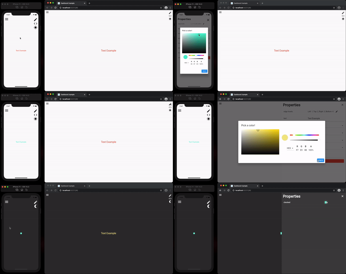
Structure
Dashbook is just a widget, so it can be ran in any way wanted, as there is no required structure that must be followed, although, we do recommend the following approach:
- Create a file named
main_dashbook.dart on the root source of your project (e.g. lib/main_dashbook.dart)
- Create the Dashbook instance inside that file, calling the
runApp method in the end (look on the example above)
- Run it with the command
flutter run -t lib/main_dashbook.dart