연결된 소스 저장소의 README 원문 스냅샷입니다. 최신 내용은 저장소에서 확인하세요.


Implement designs just like in Figma. Arrange your widgets in a grid and make your designer happy.
Design Grid streamlines your workflow and saves time. Easily configure multiple devices and screen sizes while reducing boilerplate code. Its user-friendly design makes integration effortless, allowing you to focus on your project's core.
The classic use-case of implementing a colum-based design. Use ResponsiveDesignGrid to implement a bootstrap-like design system where every element has a different column-span based on breakpoints.
Need to implement a design based on the strict rules of Material Layout? Use the MaterialDesignGrid to get an exact implementation of the Material Design Layout guide.
🔗 Table of Contents
✨ Features
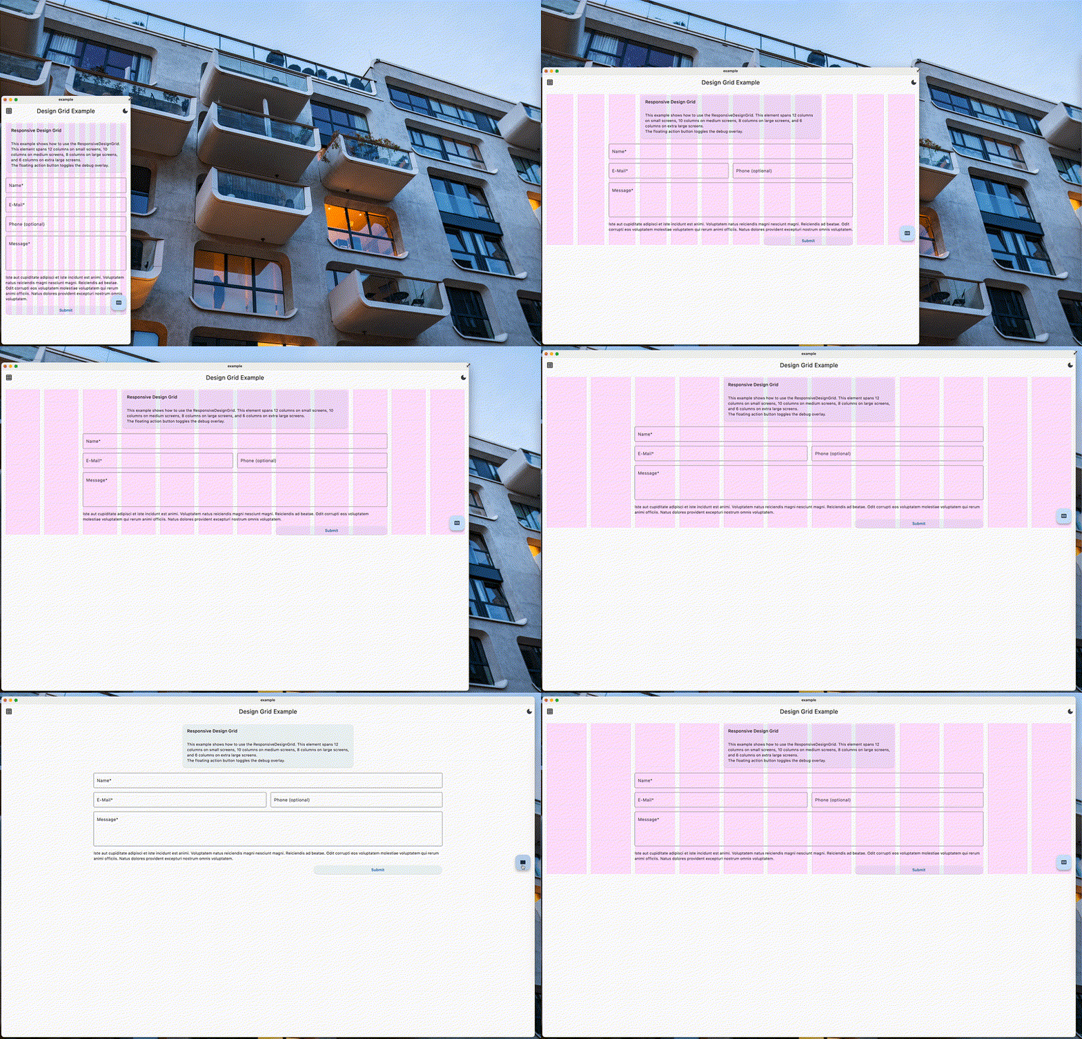
Responsive Design Grid
Implement a column-based design with different column-spans for every breakpoint.
Responsive design grid widgets can be indefinitely nested.
Create small and clean widgets that use ResponsiveDesignGrid for layout.
They will fit, no matter how deeply nested you use them.
You can customize:
- Breakpoints
- Column-spacing
- Row-spacing
- Grid-padding
- Amount of columns
Material Design Grid
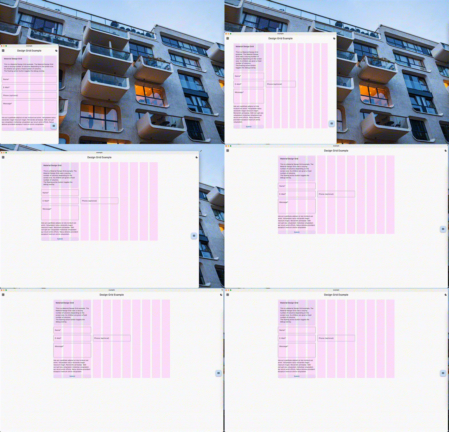
Implement a design based on the Material Design guidelines.
Material Design Grid is not meant to be used nested.
You can customize:
- Breakpoints
- Column-spacing
- Row-spacing
- Grid-padding
- Amount of columns per breakpoint
🎉 Getting started
Decide whether you need to use the ResponsiveDesignGrid or the MaterialDesignGrid.
Speak with your designer to build a common understanding.
🏗️ Usage
Responsive Design Grid
ResponsiveDesignGridConfig is required only once in your app, it provides the ResponsiveDesignGridTheme.
You can however always add an extra ResponsiveDesignGridTheme widget if you really need to. Beware, that this is not recommended.
You can nest design grids indefinitely. To keep performance high, make sure to nest them directly in a ResponsiveDesignGridItem.
If you get any errors, you might have to pass the parameter shouldCalculateLayout: true to the ResponsiveDesignGrid widget.
This might happen most likely when the design grid does not get the full width of the app, or if you nested it inside another ResponsiveDesignGridItem and it doesn't get the full width there.
ResponsiveDesignGridRow widget will wrap its children, your rows should have as little children as possible. Avoid large Rows since this will impact performance.
Basic Usage
@override
Widget build(BuildContext context){
    return ResponsiveDesignGridConfig(
        child: ResponsiveDesignGrid(
            children: [
                ResponsiveDesignGridRow(
                    children: [
                        ResponsiveDesignGridItem(
                            columns: ResponsiveDesignGridColumns(
                                small: 12,
                                medium: 10,
                                large: 8,
                                extraLarge: 6,
                            ),
                            child: Placeholder(),
                        ),
                    ],
                )
            ],
        ),
    );
}
Adjusting Breakpoints
To change the default breakpoints values, you can use the breakpoints property in ResponsiveDesignGridConfig constructor which takes an instance of ResponsiveDesignGridBreakpoints class.
@override
Widget build(BuildContext context){
    return ResponsiveDesignGridConfig(
            breakpoints: const ResponsiveDesignGridBreakpoints(
            small: 375,
            medium: 768,
            large: 1280,
            extraLarge: 1920,
        ),
        child: ResponsiveDesignGrid(
            children: [
                ResponsiveDesignGridRow(
                    children: [
                        ResponsiveDesignGridItem(
                            columns: ResponsiveDesignGridColumns(
                                small: 12,
                                medium: 10,
                                large: 8,
                                extraLarge: 6,
                            ),
                            child: Placeholder(),
                        ),
                    ],
                )
            ],
        ),
    );
}
Customizing the grid
To change the amount of columns, the column spacing, the row spacing or the grid padding, you can use the theme property in ResponsiveDesignGridConfig constructor which takes an instance of ResponsiveDesignGridThemeData class.
@override
Widget build(BuildContext context){
    return ResponsiveDesignGridConfig(
        theme: ResponsiveDesignGridThemeData(
            columns: 12,
            columnSpacing: 16.0,
            rowSpacing: 16.0,
            gridPadding:16.0,
        ),
        child: ResponsiveDesignGrid(
            children: [
                ResponsiveDesignGridRow(
                    children: [
                        ResponsiveDesignGridItem(
                            columns: ResponsiveDesignGridColumns(
                                small: 12,
                                medium: 10,
                                large: 8,
                                extraLarge: 6,
                            ),
                            child: Placeholder(),
                        ),
                    ],
                )
            ],
        ),
    );
}
Material Design Grid
MaterialDesignGridTheme is required only once in your app, above the MaterialDesignGrid widget.
MaterialDesignGrid is not meant to be used nested due to material specifications.
MaterialDesignGridRow widget will wrap its children, you should size your rows as small as possible. Avoid large Rows since this will impact performance.
@override
Widget build(BuildContext context) {
    return MaterialDesignGridTheme(
        child: MaterialDesignGrid(
            children: [
                MaterialDesignGridRow(
                    children: [
                        MaterialDesignGridItem(
                            columns: 4,
                            child: Placeholder(),
                        ),
                    ],
                )
            ],
        ),
    );
}
📚 Additional information
All classes and exposed properties are well documented. If you find the documentation to be lacking, please create an issue 😊
Implementing a custom design grid approach
The base widgets used for both the ResponsiveDesignGrid as well as the MaterialDesignGrid can be found in lib/src/widgets.
You can extend those to create your super-fancy very own custom design grid implementation 🥳.
