연결된 소스 저장소의 README 원문 스냅샷입니다. 최신 내용은 저장소에서 확인하세요.
diagram_editor
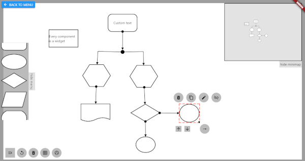
Flutter library for building interactive diagram editors. Create, connect, and manipulate nodes and links with pan, zoom, and full gesture support.
Quick Start
import 'package:diagram_editor/diagram_editor.dart' ;
import 'package:flutter/material.dart' ;
class MyDiagram extends StatelessWidget MyDiagram ({super .key});
final controller = DiagramController <void , void >();
@override
Widget build (BuildContext context) {
return DiagramEditor <void , void >(
controller: controller,
componentBuilder: (context, component) => Container (
color: Colors .blue,
child: Center (child: Text (component.id)),
),
onCanvasTapUp: (details) {
controller.addComponent (ComponentData (
size: const Size (96 , 72 ),
position: controller.fromCanvasCoordinates (details.localPosition),
));
},
onComponentTap: (id) => controller.removeComponent (id),
);
}
}
Pan, zoom, link joints, and link control all work out of the box.
Type-Safe Custom Data
Use generic type parameters to attach typed data to components and links:
class MyNodeData final Color color;
final String label;
MyNodeData ({required this .color, required this .label});
}
final controller = DiagramController <MyNodeData , void >(
componentDataCodec: JsonCodec (
encode: (d) => {'color' : d.color.toHex (), 'label' : d.label},
decode: (j) => MyNodeData (
color: Color (int .parse (j['color' ] as String , radix: 16 )),
label: j['label' ] as String ,
),
),
);
controller.addComponent (ComponentData (
data: MyNodeData (color: Colors .blue, label: 'Start' ),
size: const Size (96 , 72 ),
));
final node = controller.getComponent ('id' );
final color = node.data?.color;
Connecting Components
final linkId = controller.connect (
sourceComponentId: 'node-1' ,
targetComponentId: 'node-2' ,
linkStyle: LinkStyle (
arrowType: ArrowType .arrow,
lineWidth: 2 ,
color: Colors .grey,
),
);
Configuration
DiagramEditor <MyNodeData , void >(
controller: controller,
componentBuilder: (context, data) => MyNodeWidget (data),
canvasConfig: const CanvasConfig (
backgroundColor: Color (0xFFF5F5F5 ),
minScale: 0.2 ,
maxScale: 5.0 ,
),
linkEndpointAlignment: LinkAttachment .oval (),
enableDefaultPanZoom: true ,
enableDefaultLinkControl: true ,
enableDefaultJointControl: true ,
linksOnTop: true ,
onCanvasTapUp: (details) { },
onComponentTap: (id) { },
onComponentScaleUpdate: (id, details) { },
onLinkTap: (id) { },
backgroundBuilder: (context) => [CustomPaint (painter: GridPainter ())],
foregroundBuilder: (context) => [],
componentOverlayBuilder: (context, data) => ,
);
Serialization
final json = controller.serialize ();
controller.deserialize (json);
Custom data is serialized via the JsonCodec passed to the controller.
API Overview
DiagramController
The central class managing all diagram state.
Category
Methods
Components
addComponent, removeComponent, moveComponent, getComponent, componentExists, components, componentsSorted
Links
connect, removeLink, getLink, linkExists, links
Z-order
bringToFront, sendToBack, setComponentZOrder
Parent-child
setComponentParent, removeComponentParent
Canvas
setCanvasPosition, panCanvas, zoomCanvas, resetCanvasView, fromCanvasCoordinates, toCanvasCoordinates
Joints
insertLinkJoint, removeLinkJoint, showLinkJoints, hideLinkJoints
Serialization
serialize, deserialize
Link Endpoint Alignment
Strategy
Method
Rectangular
LinkAttachment.rectangular() (default)
Oval
LinkAttachment.oval()
Crystal/Diamond
LinkAttachment.crystal()
Center
LinkAttachment.center()
Link Styles
Arrow types: none, arrow, pointedArrow, circle, centerCircle, semiCircleLine types: solid, dashed, dotted
Built-in Painters
GridPainter — canvas grid backgroundComponentHighlightPainter — selection highlightDeleteIconPainter — delete icon overlay
Migration from v0.x
See the full Migration Prompt for a detailed mapping of every old API surface to its new equivalent, including complete before/after examples.
Key changes:
PolicySet with mixins -> DiagramEditor with callbackscanvasWriter.model.addComponent(...) -> controller.addComponent(...)componentData.data as MyType -> componentData.data (typed generics)provider dependency removed (uses built-in ListenableBuilder)