패키지, 저장소 및 앱 카테고리 검색

dot_navigation_bar 표지
패키지 상세v1.0.2

dot_navigation_bar

간단하고 부드러운 애니메이션으로 아름답고 깔끔한 UI/UX 바텀 네비게이션 바를 제공합니다.

AndroidiOSWebmacOSWindowsLinux
30일 다운로드
1.2천
좋아요
436
Pub 점수
150

패키지 설치

flutter pub add dot_navigation_bar

패키지 개요

공개 정보를 바탕으로 생성한 선택 가이드입니다.

부드러운 전환과 깔끔한 UI/UX 디자인을 갖춘 세련된 애니메이션 바텀 네비게이션 바를 제공하는 플러터 패키지입니다. 미세한 도트 기반의 인디케이터를 통해 앱 내 탐색을 강화하며, 전통적인 탭 바에 대한 우아한 대안을 제시합니다. 다양한 플랫폼에서 현대적이고 미니멀한 탐색 패턴을 원하는 앱에 이상적입니다. 안드로이드, iOS, 웹, 맥OS, 윈도우, 리눅스 등 모든 주요 플랫폼을 지원하여 일관된 사용자 경험을 보장합니다. pub add를 통한 최소한의 설정으로 기존 프로젝트에 원활하게 통합됩니다.

사용 사례

  • 모바일 앱 탐색
  • 웹 애플리케이션 인터페이스
  • 크로스 플랫폼 데스크톱 앱
  • 미니멀리스트 UI 디자인
  • 애니메이션을 통한 사용자 경험 향상

주요 기능

  • 부드러운 애니메이션
  • 클린한 도트 기반 디자인
  • 크로스 플랫폼 지원
  • 간편한 통합
  • 사용자 정의 가능한 외관
  • 반응형 레이아웃

적합한 대상

  • UI/UX를 우선시하는 개발자
  • 간단한 탐색 기능이 필요한 앱
  • 경량 컴포넌트가 필요한 프로젝트
  • 디자인 중심 애플리케이션
  • 다중 플랫폼 플러터 앱

고려 사항

  • 기본 스타일링을 넘어서는 사용자 정의가 제한되어 있음
  • 복잡한 탐색 구조에 적합하지 않을 수 있습니다
  • 3~5개 탭을 가진 앱에 최적
  • 높은 상호작용성의 네비게이션 바에는 적합하지 않음
  • 색 대비 계획을 신중히 세워야 합니다

원본 README

연결된 소스 저장소의 README 원문 스냅샷입니다. 최신 내용은 저장소에서 확인하세요.

Dot Navigation Bar


undefined undefined
undefined undefined undefined undefined undefined
undefined undefined

A bottom navigation bar that you can customize with the options you need, without any limits. You can also customize the appearance of the navigation bar with simple smooth animations, providing a nice and clean UI/UX.

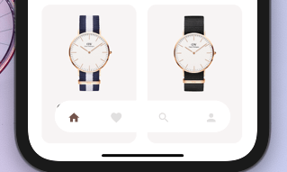
style1 Example flutter project


NEW


  • Round nav bar
  • Example file
  • Floating nav bar
  • shadow to Floating nav bar

Getting Started

To install, add it to your pubspec.yaml file:

dependencies:
    dot_navigation_bar:

import 'package:dot_navigation_bar/dot_navigation_bar.dart';

How to use it

call DotNavigationBar's constructor:

If you want to show body behind the navbar, it should be true

      extendBody: true,

if you are not intersted inmaking round nav bar with show body behind the navbar you have to make that

      extendBody: false,
Widget build(BuildContext context) {
  return Scaffold(
    body: Center(),
    extendBody: true,//<------like this 
    bottomNavigationBar:  DotNavigationBar(
          currentIndex: _SelectedTab.values.indexOf(_selectedTab),
          onTap: _handleIndexChanged,
          dotIndicatorColor: Colors.black,
          // enableFloatingNavBar: false
          items: [
            
            
          ],
        ),
  );
}

basic implementation

   Widget build(BuildContext context) {
    return Scaffold(
      body: Container(
        child: Image.asset("assets/IMG.png"),
      ),
      bottomNavigationBar:  DotNavigationBar(
          currentIndex: _SelectedTab.values.indexOf(_selectedTab),
          onTap: _handleIndexChanged,
          // dotIndicatorColor: Colors.black,
          items: [
            /// Home
            DotNavigationBarItem(
              icon: Icon(Icons.home),
              selectedColor: Colors.purple,
            ),

            /// Likes
            DotNavigationBarItem(
              icon: Icon(Icons.favorite_border),
              selectedColor: Colors.pink,
            ),

            /// Search
            DotNavigationBarItem(
              icon: Icon(Icons.search),
              selectedColor: Colors.orange,
            ),

            /// Profile
            DotNavigationBarItem(
              icon: Icon(Icons.person),
              selectedColor: Colors.teal,
            ),
            
          ],
        ),
    );
  }

The constructor has 18 attributes related to the Widget:

  • items: A list of tabs to display, ie Home, Profile,Cart, etc
  • currentIndex: The tab to display.
  • onTap:Returns the index of the tab that was tapped.
  • selectedItemColor:The color of the icon and text when the item is selected.
  • unselectedItemColor: The color of the icon and text when the item is not selected.
  • margin:A convenience field for the margin surrounding the entire widget.
  • itemPadding:The padding of each item.
  • duration: The transition duration.
  • curve: The transition curve.
  • dotIndicatorColor:The color of the Dot indicator.
  • marginR:margin for the bar to give some radius .
  • paddingR:padding for the bar to give some radius.
  • borderRadius:border radius for nav bar.
  • backgroundColor:bgd colors for the nav bar.
  • boxShadow: floating nav bar shadow ,it takes List of BoxShadow
  • enableFloatingNavBar: make Floating nav bar enabled.
  • enablePaddingAnimation: enable the animation on item during item change.
  • splashColor: Color of the item's Splash Color. To disable, use Colors.transparent.

default values

marginR = const EdgeInsets.symmetric(horizontal: 50, vertical: 20),

paddingR = const EdgeInsets.only(bottom: 5, top: 10),

borderRadius = 30,

backgroundColor = Colors.white, enableFloatingNavBar=true, enablePaddingAnimation=true

Contributors

@iamvivekkaushik @buraktabn @Zheng Xiangrui

카테고리

소스 저장소

이 패키지를 사용하는 프로젝트
