연결된 소스 저장소의 README 원문 스냅샷입니다. 최신 내용은 저장소에서 확인하세요.
drop_down_list
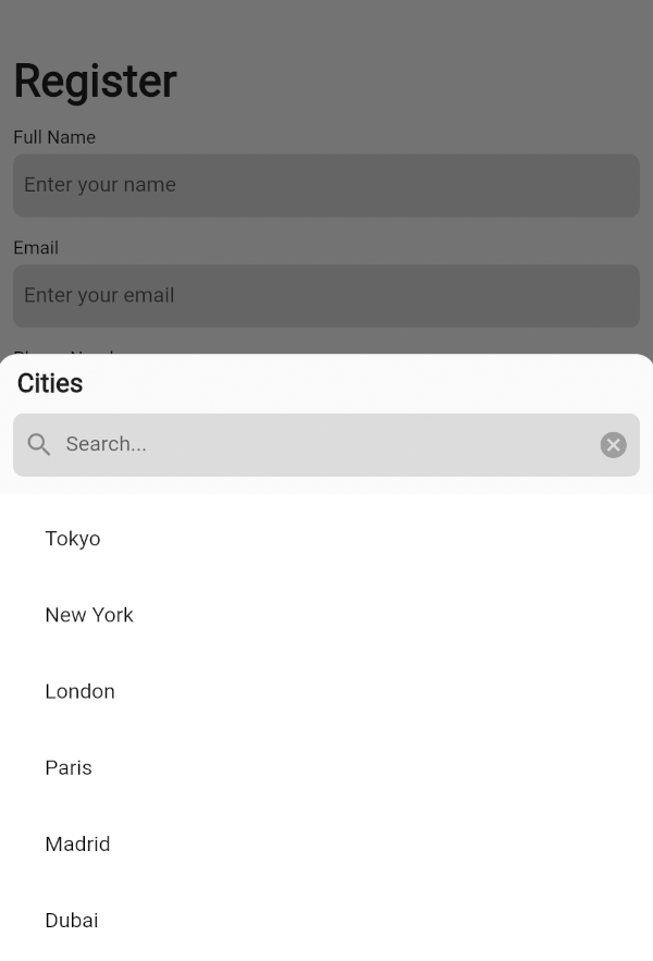
A customizable dropdown widget supporting single/multiple selection, integrated search in a bottom
sheet, generic support for flexible, type-safe handling of custom data.
Preview
Dropdown with a Multiple Selection
Dropdown with a Single Selection
Basic Usage
Import it to your project file
import 'package:drop_down_list/drop_down_list.dart' ;
And add it in its most basic form like it:
DropDownState <String >(
dropDown: DropDown <String >(
data: <SelectedListItem <String >>[
SelectedListItem <String >(data: 'Tokyo' ),
SelectedListItem <String >(data: 'New York' ),
SelectedListItem <String >(data: 'London' ),
],
onSelected: (selectedItems) {
List <String > list = [];
for (var item in selectedItems) {
list.add (item.data);
}
ScaffoldMessenger .of (context).showSnackBar (
SnackBar (
content: Text (
list.toString (),
),
),
);
},
),
).showModal (context);
Required parameters of DropDown
Parameter
Description
List<SelectedListItem<T>> dataThe list of generic data items to be displayed in the dropdown
Optional parameters of DropDown
Parameter
Description
ItemSelectionCallBack<T>? onSelectedA callback function triggered when items are selected from the list
ListItemBuilder<T>? listItemBuilderA function that takes an [index] and [dataItem] as a parameter and returns a custom widget to display for the list item at that index
int? maxSelectedItemsThe maximum number of items that can be selected when [enableMultipleSelection] is true
VoidCallback? onMaxSelectionReachedA callback function triggered when the maximum selection limit is reached
EdgeInsets? listViewPaddingThe padding applied to the ListView that contains the dropdown items
Widget? listViewSeparatorWidgetThe widget used as a separator between items in the dropdown list
EdgeInsets? listTileContentPaddingThe padding applied to the content of each ListTile in the dropdown list
BottomSheetListener? bottomSheetListenerA listener that monitors events bubbling up from the BottomSheet
EdgeInsets? dropDownPaddingThe padding applied to the dropdown container
EdgeInsets? dropDownHeaderPaddingThe padding applied to the dropdown header
Widget? bottomSheetTitleThe widget displayed as the title of the bottom sheet
ButtonStyle? submitButtonStyleDefines a button style to display as the style of the submit button when [enableMultipleSelection] is true
ButtonStyle? clearButtonStyleDefines a button style to display as the style of the clear button when [enableMultipleSelection] is true
EdgeInsets? searchTextFieldPaddingThe padding applied to the search text field
TextFormField? searchWidgetDefines a custom widget to display the text box for searching
EdgeInsets? selectAllTextButtonPaddingThe padding applied to the "select all" and "deselect all" TextButtons
Widget? selectAllTextButtonChildDefines a custom widget to display as the child of the selectAll text button when [enableMultipleSelection] and [isSelectAllVisible] is true
Widget? deSelectAllTextButtonChildDefines a custom widget to display as the child of the deSelectAll text button when [enableMultipleSelection] and [isSelectAllVisible] is true
SearchDelegate<T>? searchDelegateA delegate used to configure the custom search functionality in the dropdown
Optional parameters of DropDown with Default value
Parameter
Default
Description
bool enableMultipleSelectionfalse
Enables single or multiple selection for the drop down list items
Color listTileColorColors.transparent
Defines the background color of each ListTile in the dropdown list
Widget selectedListTileTrailingWidgetIcon(Icons.check_box)
The widget displayed as a trailing icon when a list item is selected
Widget deSelectedListTileTrailingWidgetIcon(Icons.check_box_outline_blank)
The widget displayed as a trailing icon when a list item is not selected
bool useRootNavigatorfalse
Specifies whether a modal bottom sheet should be displayed using the root navigator
bool enableDragtrue
Specifies whether the bottom sheet can be dragged up and down and dismissed by swiping downwards
bool isDismissibletrue
Specifies whether the bottom sheet will be dismissed when the user taps on the scrim
double initialChildSize0.7
The initial fractional value of DraggableScrollableSheet
double minChildSize0.3
The minimum fractional value of DraggableScrollableSheet
double maxChildSize0.9
The maximum fractional value of DraggableScrollableSheet
Color dropDownBackgroundColorColors.transparent
Sets the background color of the dropdown
String submitButtonText'Submit'
Specifies the text displayed on the submit button when [enableMultipleSelection] is true
String clearButtonText'Clear'
Specifies the text displayed on the clear button when [enableMultipleSelection] is true
bool isSearchVisibletrue
Controls the visibility of the search widget
String searchHintText'Search'
Specifies the text displayed on the search widget as hint text
Color searchFillColorColors.black12
This is the fill color for the input field
Color searchCursorColorColors.black
This is the cursor color for the input field
bool isSelectAllVisibletrue
Controls the visibility of the "select all" widget when [enableMultipleSelection] is true
String selectAllButtonText'Select All'
Specifies the text displayed on the selectAll text button when [enableMultipleSelection] and [isSelectAllVisible] is true
String deSelectAllButtonText'Deselect All'
Specifies the text displayed on the deSelectAll text button when [enableMultipleSelection] and [isSelectAllVisible] is true
Required parameters of DropDownState
Parameter
Description
DropDown<T> dropDownThe DropDown configuration object that defines the behavior, appearance, and other properties of the dropdown menu
Optional parameters of DropDownState
Parameter
Description
ShapeBorder? shapeBorderThe shape of the bottom sheet
Method of DropDownState
Method
Description
void showModal(BuildContext context)Displays the dropdown menu as a modal bottom sheet
Guideline for contributors
Contributions to our repository are always welcome! We encourage contributors to submit pull
requests for development and improvements.
Guideline for Reporting an Issue or Feature Request
To help us better understand and resolve the issue, please include the following details when
reporting:
Library version
Code snippet
Logs (if applicable)
Device specifications (e.g., manufacturer, OS version)
Screenshot or video with steps to reproduce the issue
Any other relevant libraries used
LICENSE!
drop_down_list
is MIT-licensed.
Let us know!
We’d be really happy if you send us links to your projects where you use our open-source libraries.
Just send an email to [sales@mindinventory.com](mailto:sales@mindinventory.com) And do let us know
if you have any questions or suggestion regarding our work.
Visit our website mindinventory.com
Let us know if you are interested to building Apps or Designing Products.